

My living room had nice furniture and decent lighting but it still felt like a waiting room. Took me embarrassingly long to realize the exterior of my house had the same problem. Everything was the same tone, no focal point, and the facade read flat from the street. Changing one trim color and adding wood details fixed that feeling outside as well as inside.
These ideas lean transitional with a touch of modern farmhouse. Budgets run from small switch-ups around $50 to full facades at $600 or more. These combos work for front facades, porches, garages, and small-lot homes where proportion matters.
Crisp White Facade With Black Trim, Modern Entry
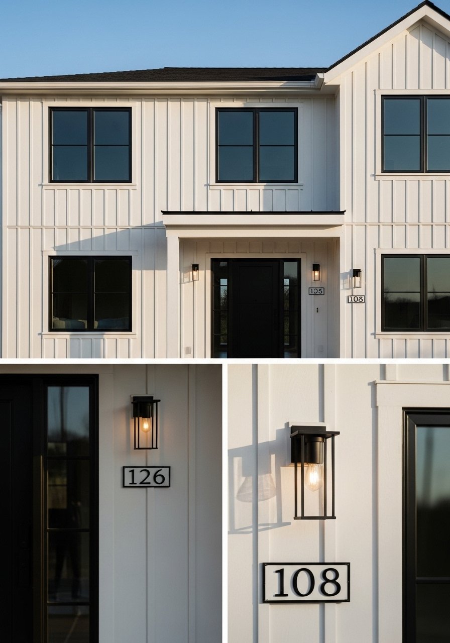
White with black trim pins architectural lines clearly. I used this on my bungalow and the windows suddenly read sharper. It follows the 80/20 color rule, with white as the 80 percent body and black as the 20 percent accent on trim and doors. For hardware try an outdoor wall light in black to match frames. Common mistake is painting trim the exact same black as shutters. Instead go one shade deeper than the body so windows read defined but not heavy. For small lots, stick to softer white to avoid the boxy shadow trap.
Light Blue-Gray Siding for Soothing Curb Appeal
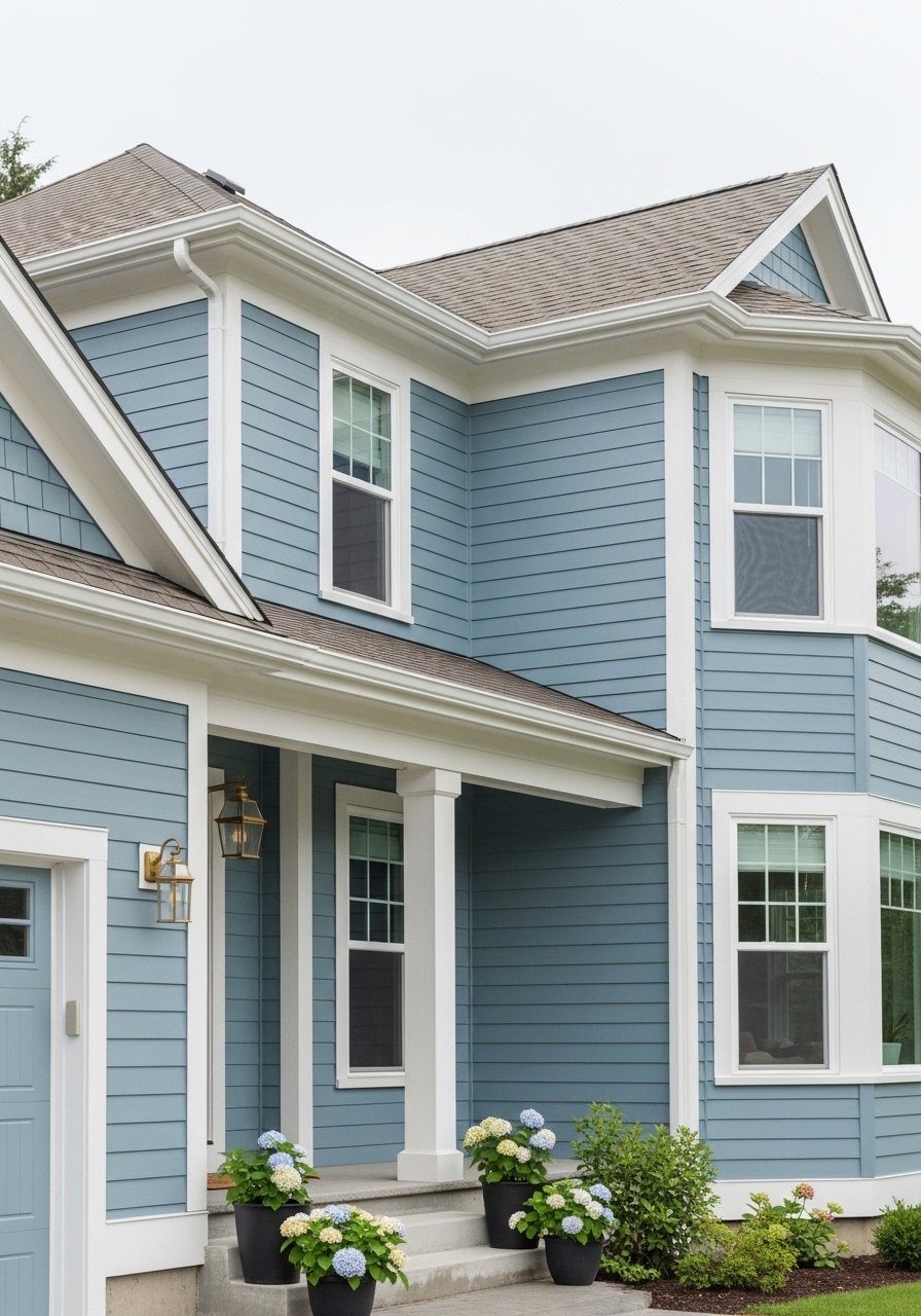
Light blue-gray softens angles and works amazingly with older roofs that you do not want to replace. I painted my in-law suite this color to calm a very dark roof. It looks best when the body covers at least 70 percent of the facade and wood accents take 20 to 30 percent. Try a sample first and use an exterior paint sample kit rather than trusting the swatch. A small product that helped me was an outdoor paint sample set. Mistake people make is picking a blue that reads cold in shade. Walk the block at different times before deciding.
Bold Charcoal With Warm Wood Garage Door
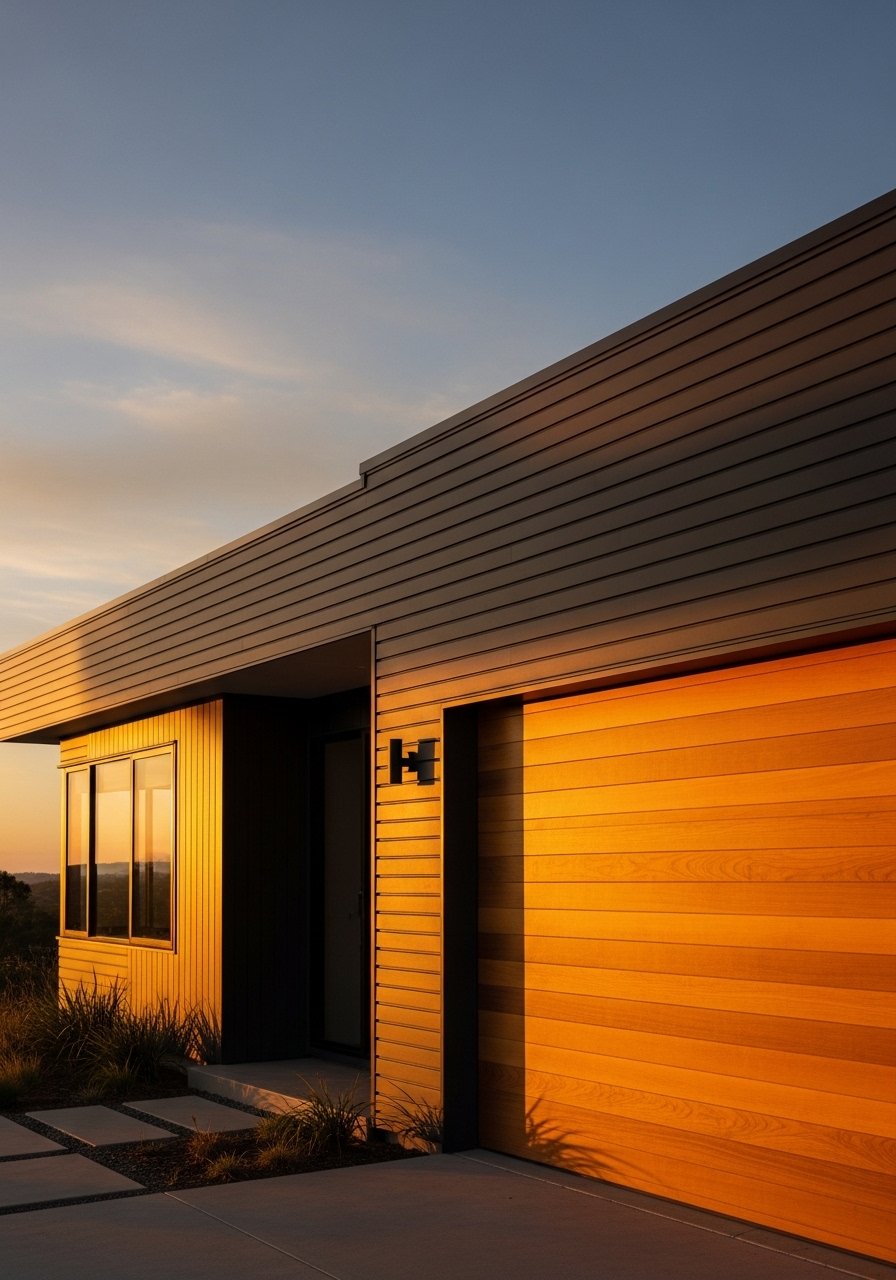
Charcoal gives real depth and the wood garage door keeps it warm and lived-in. I swapped my painted steel door for a wood-look panel and my whole street stopped calling it the "box house." Use wood for roughly 20 to 30 percent of the visible facade so it reads intentional. If you cannot install real wood, a wood-grain stain kit saved me on a budget. Watch for fading in strong sun and plan re-stain cycles sooner on west-facing facades. Gray siding is everywhere on new builds now, but adding wood avoids the all-gray monotone look.
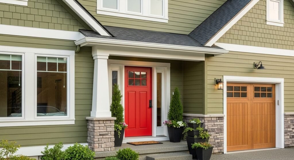
Olive Green Base With White Trim and Red Door
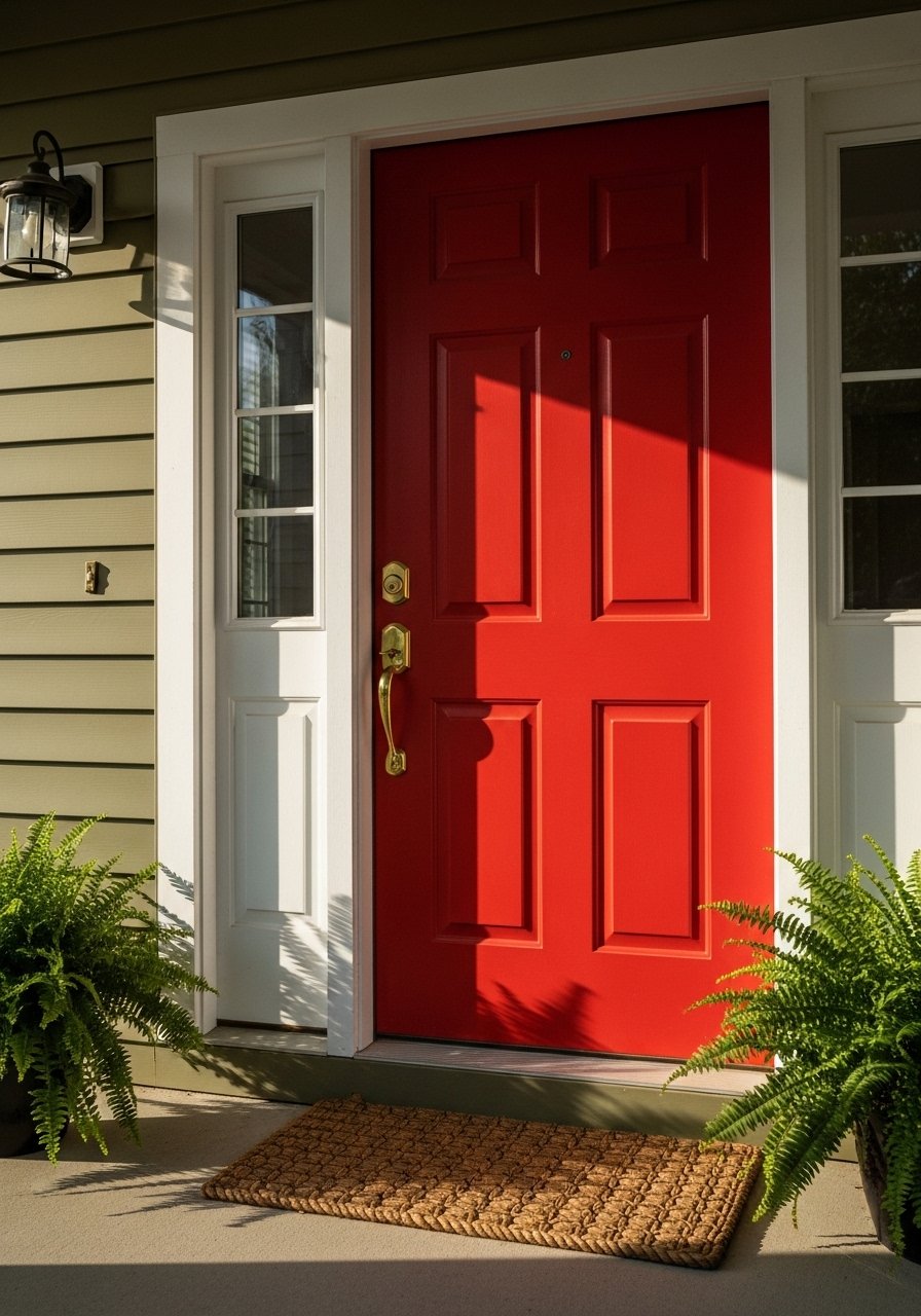
Olive green grounds a house in a way pale grays do not. I used it on a cottage next to a big green lawn and the white trim kept edges crisp while the red door became a real focal point. Follow the 80/20 rule and make the door your 20 percent. For renters or short-term fixes try a removable door decal if you cannot repaint. A mistake is oversaturating every trim detail in white. Keep some small elements in a warmer neutral to avoid the house looking like a paint swatch.
Warm Taupe Siding Over Brick Base
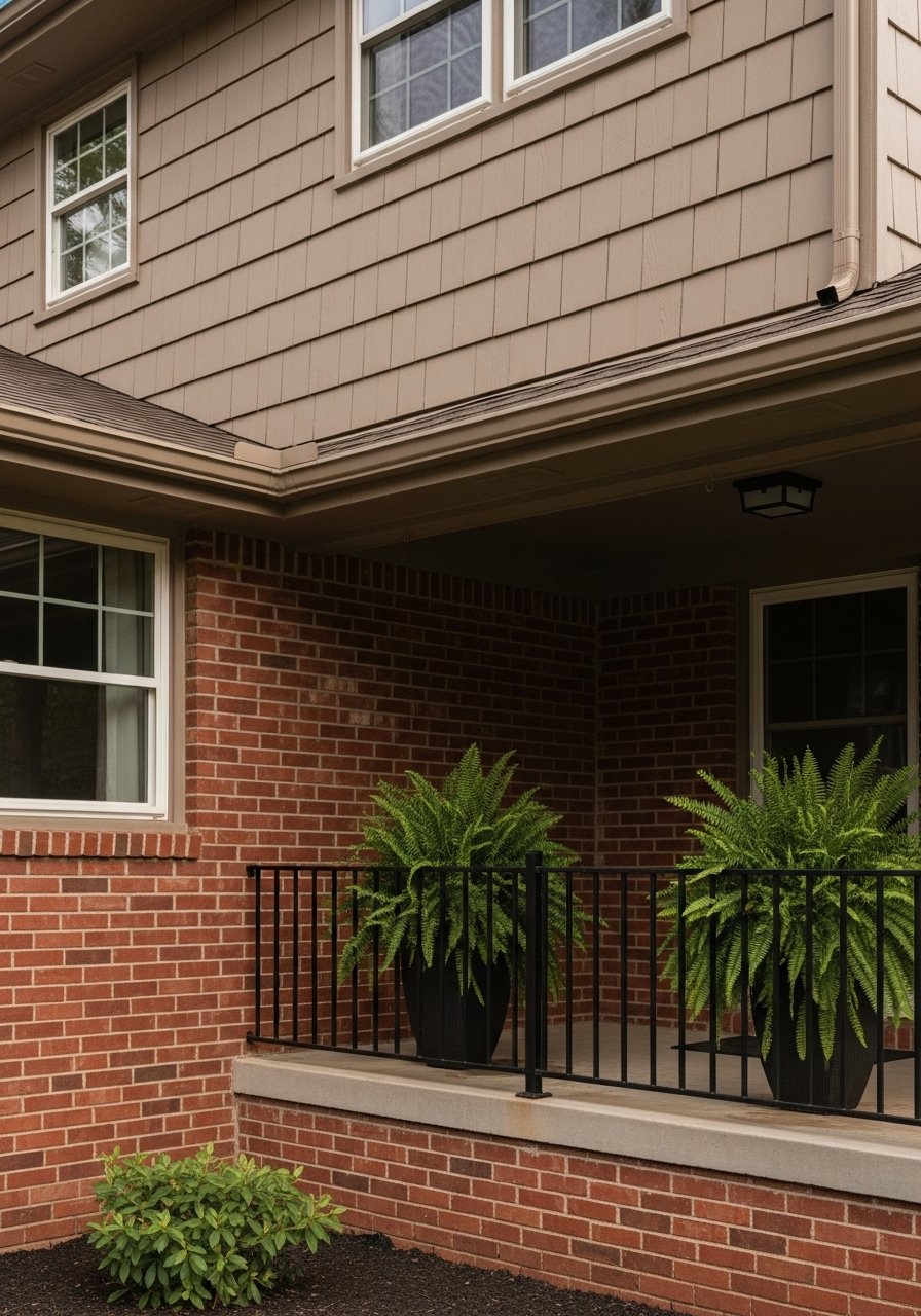
When you have existing brick, taupe is your friend. I re-coated lap siding over a brick foundation and the taupe tied the warm brick tones together instantly. Use the brick 1/3 to 2/3 ratio, with brick as roughly one third of the visible facade to ground the look. A good detail most people skip is testing the taupe next to damp brick because sunlight alters perceived warmth. For hardware try a set of stainless steel house numbers that read well over both materials.
Gray Owl Body With Concord Ivory Door for Classic Calm
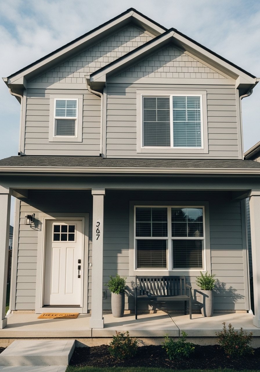
Gray Owl keeps things neutral without going cold. I used this combination on a rental and it aged well. Over half go neutral body with a door kick. That single ivory door gives entry contrast without being jarring. A common mistake is painting every trim element the same white. Instead pick one trim accent like the door and step up the cornice by one shade. For a quick refresh try a satin exterior door paint and plan for touch-ups in the sun-exposed spots.
White Facade With Dark Brown Accent Stripe, Studio-Style
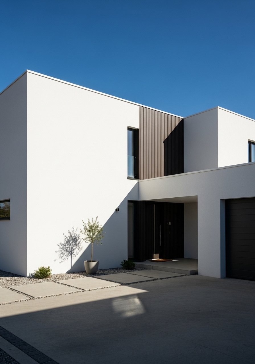
A dark brown stripe on a white body reads architectural and not fussy. I did this on a narrow facade to visually break the box. Use the stripe as part of the 20 percent accent area so it does not compete. People often try stripes that are too thin. Go at least 18 to 24 inches for a stripe to read as a design element instead of a scuff. For matching tones, a weatherproof wood stain sample helps pair the brown to existing timber.
Mixed Shake and Lap Siding Over Brick Base
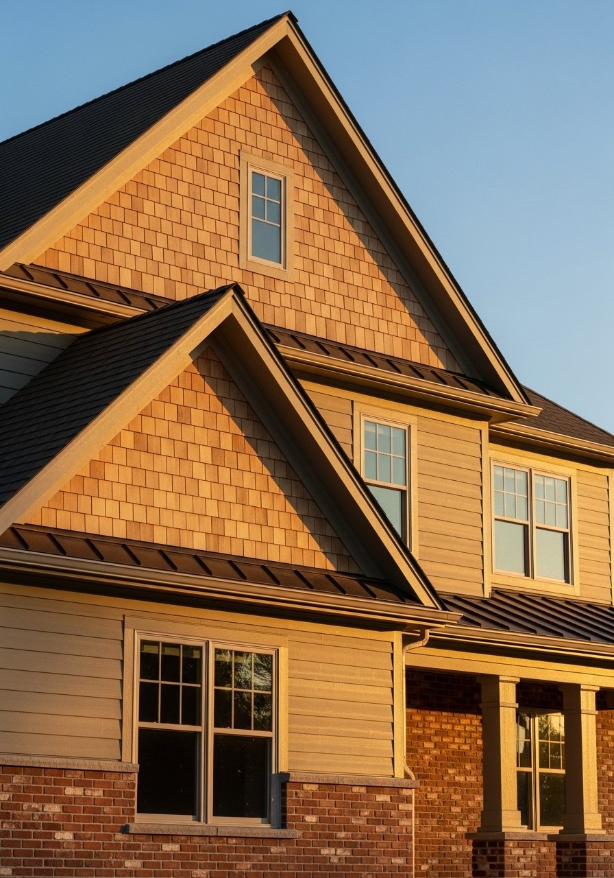
Texture is underrated. I mixed shake and lap siding to add depth to a long facade and it made the house read smaller and friendlier. Stick with the shake in the upper third and lap for the larger lower planes to follow the 1/3 brick base rhythm. One detail people miss is that shake shows wear faster near gutters, so choose durable claddings near rooflines. A small splurge that paid off was a set of cedar-look shakes that resist rot and still look authentic.
Muted Moss Green With Soft Gray Accents
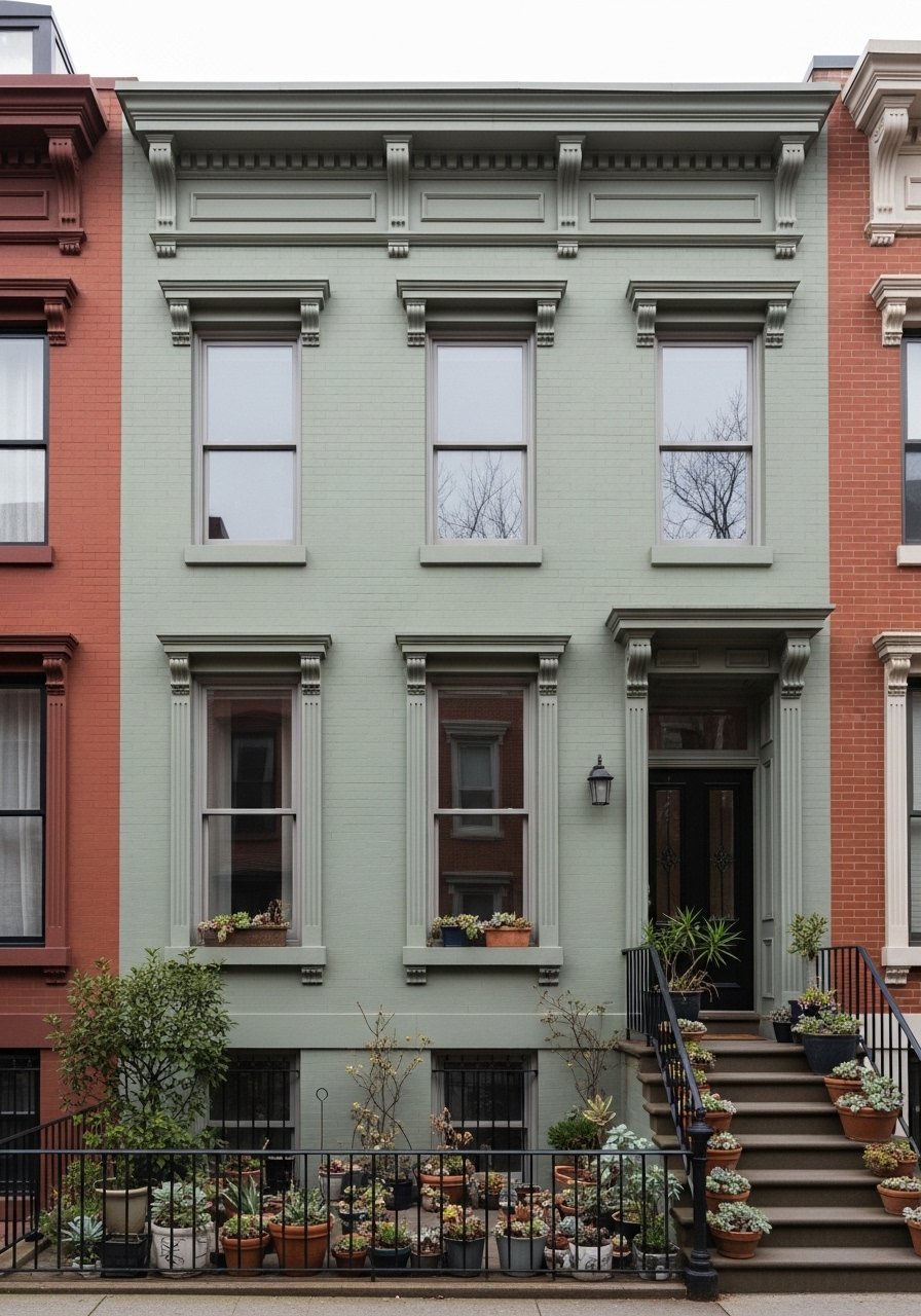
Muted moss reads natural without looking trendy. I used it on a townhouse and it played well with neighborhood trees. Use gray for trim to keep the palette calm. The real trick is choosing moss that drops toward gray, not yellow. A common frustration is greenery swallowing pale neutrals. This pairing keeps plants visible against the facade. For an inexpensive finishing touch try a set of galvanized planters to add texture without competing colors.
Neutral Shell With Red and Blue Accent Panels
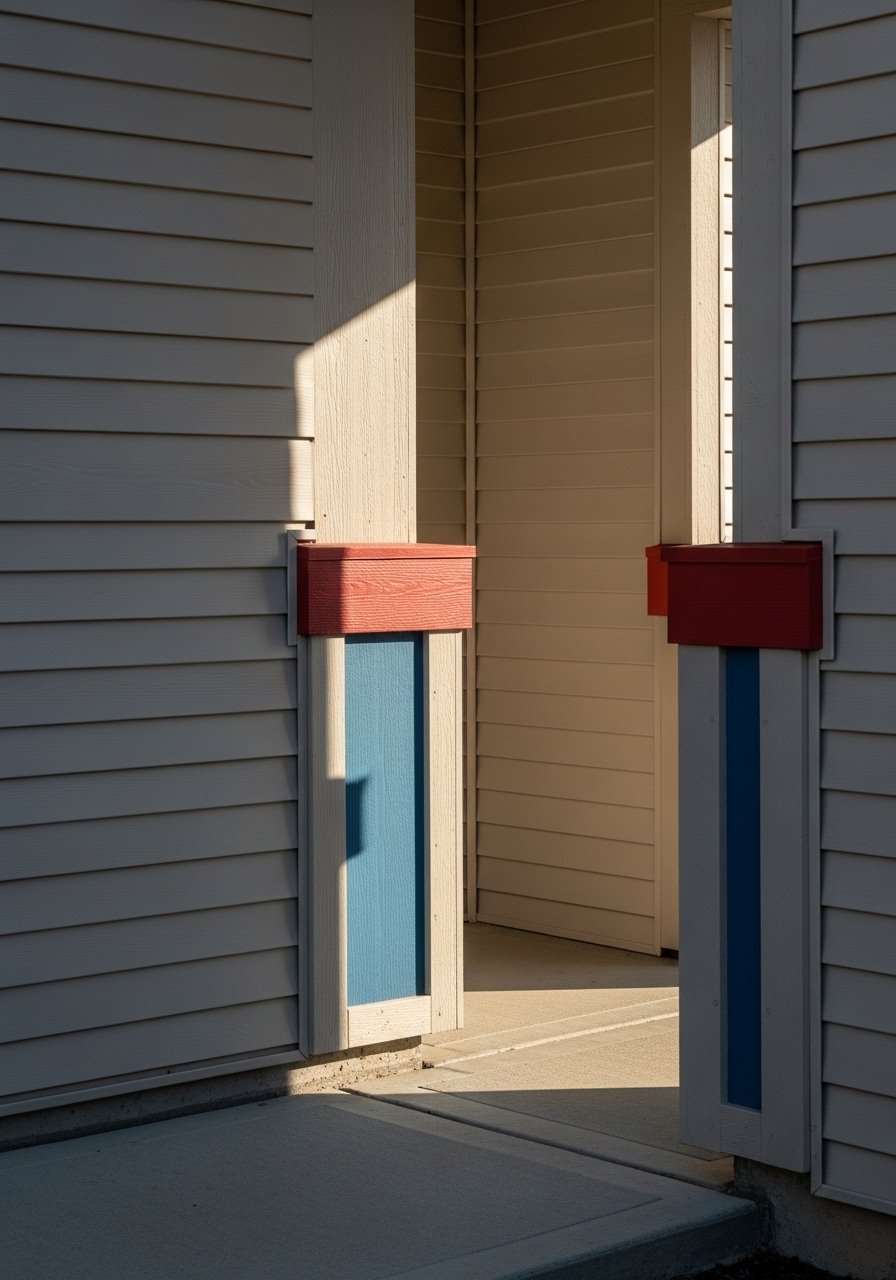
This is the daring one I only recommend if you love color. I added a red panel near the entry and a small blue shutter accent on the side to give a traditional shell a modern wink. Keep the neutral body at 80 percent so the accents feel intentional and not chaotic. Most houses look off because people try to cover every plane in color. A simple product to experiment is an exterior paint peel-and-stick sample so you can live with color for a few weeks before committing. Pair red with a muted blue to avoid high school team energy.
Soft White Body With Charcoal Trim and Natural Wood
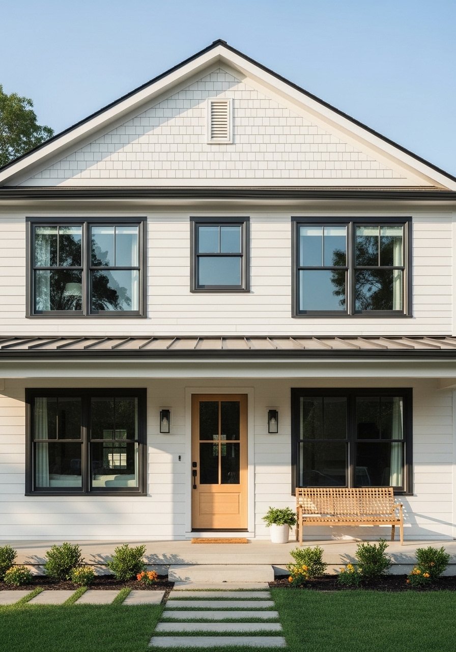
Soft white with charcoal and wood is probably the easiest to live with long term. I used this combo when I wanted a fresh look that did not scream modern. The wood door should occupy about 20 to 30 percent of the focal facade area so it reads as warmth, not a stain spot. A mistake I see is choosing wood that is too dark next to charcoal. Pick a lighter natural oak tone. For hardware try a brushed brass door handle that reads warm without being loud.
Neutral Lap Siding Anchored by Brick Foundation
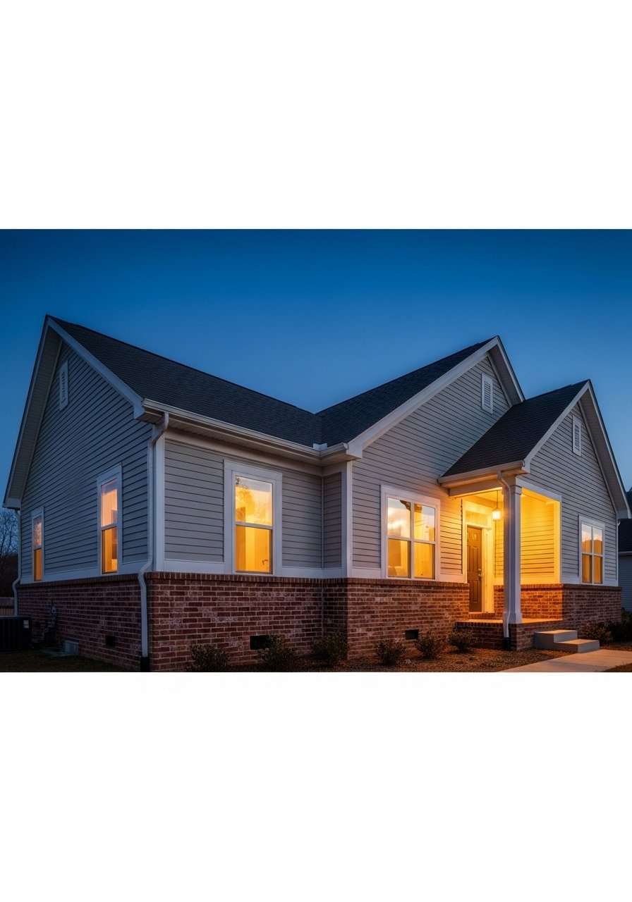
Lap over brick is a go-to because it reads layered and substantial. When I swapped a squeaky old facade, lap siding softened the silhouette and the brick base kept it grounded. Maintain the brick at about one third of the total visible exterior for scale. For pet owners pick lap materials that resist scratching and scuffs. I used an engineered lap siding option for durability. People underestimate how much kids and dogs touch the lower siding, so pick finishes that clean easily.
November Skies Blue With Silver Accents, Scandi Influence
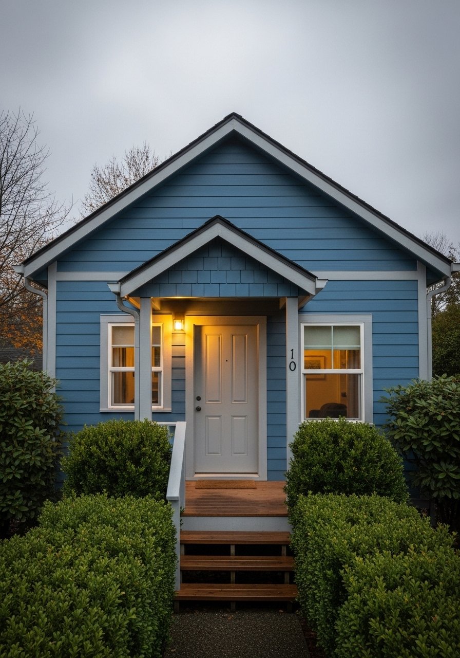
This cooler blue reads calm next to greenery and scales well on narrow lots. I painted a small guest suite this shade and it made the shrubs pop. Silver-gray accents keep the blue from feeling coastal. A detail many skip is testing the blue at dusk. Colors can deepen and look almost teal at night. For a low-risk approach try a sample-sized exterior paint and view it across an entire day. Most folks repaint every 5 years or so, so start with samples before committing.
Your Decor Shopping List
Textiles and Small Fixes
- Honestly the best $40 I have spent. Outdoor doormat in coir 30×18 inches, natural tone, knocks the entry into place
- Weatherproof throw blanket in charcoal, 50×60 inches, for draping over a porch bench
Hardware and Lighting
- Outdoor wall light in black metal, 12-inch height, fits modern and farmhouse porches
- Brushed brass door handle entry set, corrosion resistant, pairs with warm taupe and white
Planters and Greenery
- Galvanized planters set 12-inch and 16-inch, weatherproof, neutral for any palette
- 6-foot faux fiddle leaf fig for corners that need height without upkeep
Paint and Samples
- Exterior paint sample set small cups in five shades, saves time and mistakes
- Peel-and-stick paint samples for trying accent panels without a contractor
Durability
- Wood-grain stain kit for faux or real wood garage doors
- Engineered lap siding option brochure request sample pieces for high-traffic lower walls
Similar at Target or HomeGoods for seasonal planters and doormats if you prefer to shop in person.
Shopping Tips
White oak beats dark wood in 2026. Design feeds have shifted completely. White oak floating shelves look current, not dated.
Grab outdoor wall lights in black for consistent trim contrast. Matching light finish to trim keeps the facade feeling intentional.
Curtain-free porches need texture. A weatherproof throw gives instant softness and is easy to swap seasonally.
Everyone buys five small succulents. One single 6-foot fiddle leaf fig has ten times the visual impact.
Use sample cans and live with them on the house for a week. Exterior paint sample set removes the guesswork and reduces repaint cravings later.
Frequently Asked Questions
Q: How do I pick a trim color that defines windows without overwhelming the facade?
A: Go one to two shades deeper than the body and keep most of the facade neutral. Dark trim defines lines at dusk and dawn without swallowing the house.
Q: Can renters try any of these ideas?
A: Yes. Try removable door decals, peel-and-stick accent panels, and potted plants. Peel-and-stick paint samples are renter-friendly ways to test accents.
Q: My brick looks dated. Should I paint it or match the siding?
A: If the brick has warm red tones, pick taupe or warm neutrals for siding to tie it together. Keep brick as roughly one third of the visible facade or it will overpower the lap siding above.
Q: How often will exterior paint show wear in sun-exposed areas?
A: Expect touch-ups sooner on west-facing facades. Most folks repaint every 5 years or so. Use durable finishes and plan small touch-up kits for high-sun spots.
Q: I have a tiny lot. What color makes my house feel larger?
A: Light grays and soft whites reduce the boxy shadow effect. Keep the body light and use darker trim sparingly so the house reads taller but not heavier.
Q: Should I mix metals on exterior hardware?
A: Mix them. It reads intentional and layered. Use a main metal for big elements like lights and door hardware, then introduce a second finish on smaller items like mail slots or house numbers.