
My tiny galley kitchen used to feel cold and efficient, but not welcoming. One weekend I swapped glossy white hardware for warm brass and added a few wooden elements. The space finally felt lived in and calm. Small changes matter more than a full renovation. I found neutral pieces that work hard and age gracefully.
These ideas focus on neutral, timeless styling with tactile materials. Budget ranges run from under $25 for textiles to $600 for a solid surface counter. Most suggestions fit kitchens, breakfast nooks, and small apartments. Everywhere I look this year the move is toward layered neutrals with a mix of natural wood and soft metallic accents.
What You'll Need to Get This Look
Textiles and Soft Goods.
- chunky knit throw. I drape mine over a bench seat. $35-55 and perfect for adding softness
- linen blend curtains 84-inch. Filter light while keeping privacy. $30-50 a panel. Similar at Target
Wall Decor and Shelving.
- set of 3 floating shelves white oak. Stagger heights for balance. $45-70 and looks like a splurge
- 36-inch round mirror. Use above a console or small breakfast bar. $80-120
Lighting.
- rattan pendant light shade. Swapping shades updates a fixture for under $60
- LED Edison bulbs warm white. $15-20 for a pack. I use warm bulbs everywhere
Plants and Storage.
- artificial fiddle leaf fig 6ft. Tall greenery beats many small pots. $60-90
- woven seagrass baskets set. Great for open shelf storage. $25-40
Budget-Friendly Finishes.
- peel and stick wallpaper neutral panels. Commit to one accent wall. $20-35 per roll
Hardware and Smalls.
- brass cabinet pulls set of 10. Instant polish for $30-50. Try mixing finishes with caution
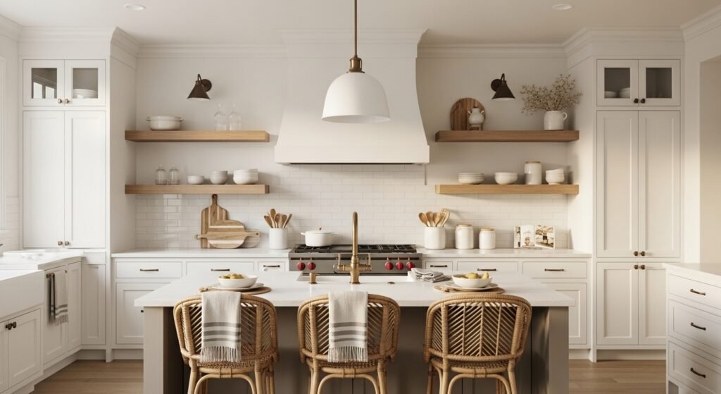
Layered Neutrals with Warm Wood Accents
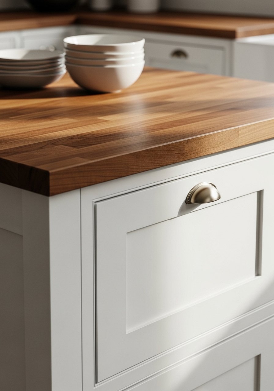
The moment I introduced a warm wood counter surface the whole room stopped feeling sterile. I use a 60-30-10 rule here. Sixty percent light cabinets, thirty percent wood, ten percent darker accents. That ratio keeps the palette calm but interesting. For small kitchens pick narrow butcher blocks around 18 inches deep. Avoid overly glossy woods. They read cheap in photos and show scratches in real life. Worth trying: butcher block counter top edge sample for testing.
Matte White Cabinetry with Brass Pulls for a Modern Farmhouse Feel
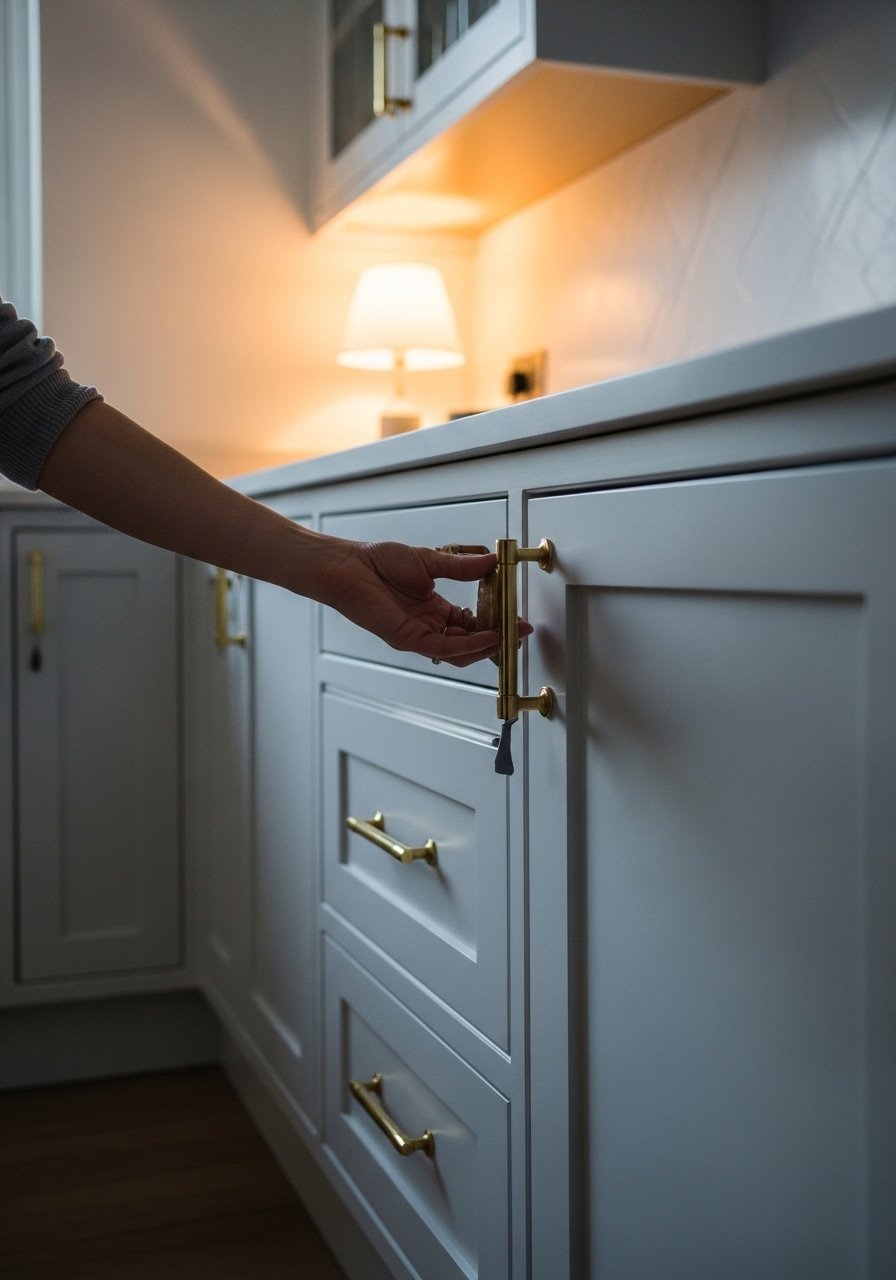
Most people buy shiny hardware and regret it. Matte white paint looks current in photos and holds up in person. I swapped standard knobs for brushed brass pulls and it read like a custom upgrade. Budget range was $30 to $120 total. A common mistake is mixing finishes that clash. If your faucet is warm brass keep at least one other metal warm. Try brass cabinet pulls paired with a stainless sink for balance. In small kitchens choose pulls that are 3 to 4 inches long for the right scale.
Open Shelving Styled with Everyday Ceramics
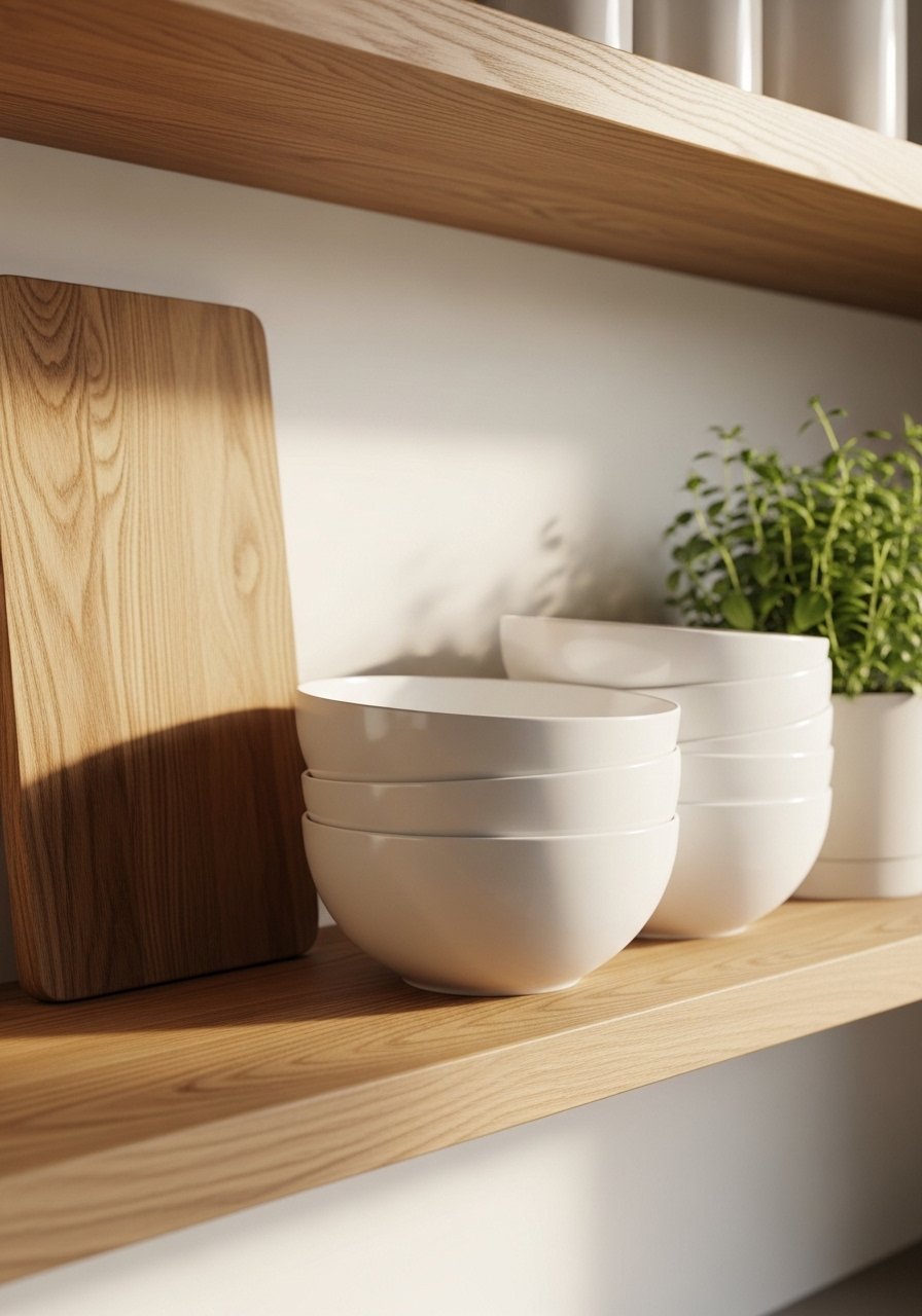
I keep seeing white oak shelves in every feed I follow. Open shelving is about edit, not excess. Use odd numbers when grouping items, three bowls, five plates. In photos this looks airy. In real kitchens dust gathers and clutter accumulates. My trick was to mix thrifted ceramics with one matching set to ground the shelves. Grab white ceramic mixing bowls and display three. Avoid using too many small pieces. They make shelves read busy in a tiny space.
Textured Backsplash in Soft Greige for Depth
A friend asked me about grout color last week and I realized grout makes or breaks a backsplash. Choosing warm greige grout keeps subway tiles from feeling clinical. In photos it reads as a soft canvas. In real life it hides splatter better than bright white. For an elevated look pick a textured tile like hand-pressed. I paid about $8 per square foot for mine. Avoid thin grout lines. They look perfect in photos but show dirt fast. Try greige subway tile samples before committing.
Natural Stone Countertop Alternatives for a Timeless Look
I used to think marble was the only timeless choice, but quartz alternatives held up better to daily life. They offer consistent veining that photographs well and resists staining in real kitchens. For a busy family choose a honed finish. Honed surfaces hide scratches better. Budget runs from $40 to $120 per square foot depending on brand. One mistake is choosing a vein that is too bold. Subtle veining looks classic. See quartz color samples to compare.
Subtle Patterned Floor Tile in Neutral Tones for Interest
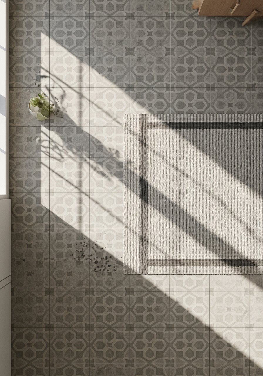
There is something about patterned tile that anchors a neutral kitchen. My feed is full of kitchens with subtle geometric floors. On the ground use 60-30-10 for tiles versus other surfaces. In photos the pattern pops. In daily life it hides crumbs and traffic marks better than plain stone. For small kitchens pick a repeat that reads small at arm's length. Avoid high-gloss finishes. They show wear faster. Neutral patterned floor tile samples helped me narrow options.
Understated Pendant Lighting Over Island for Focused Glow
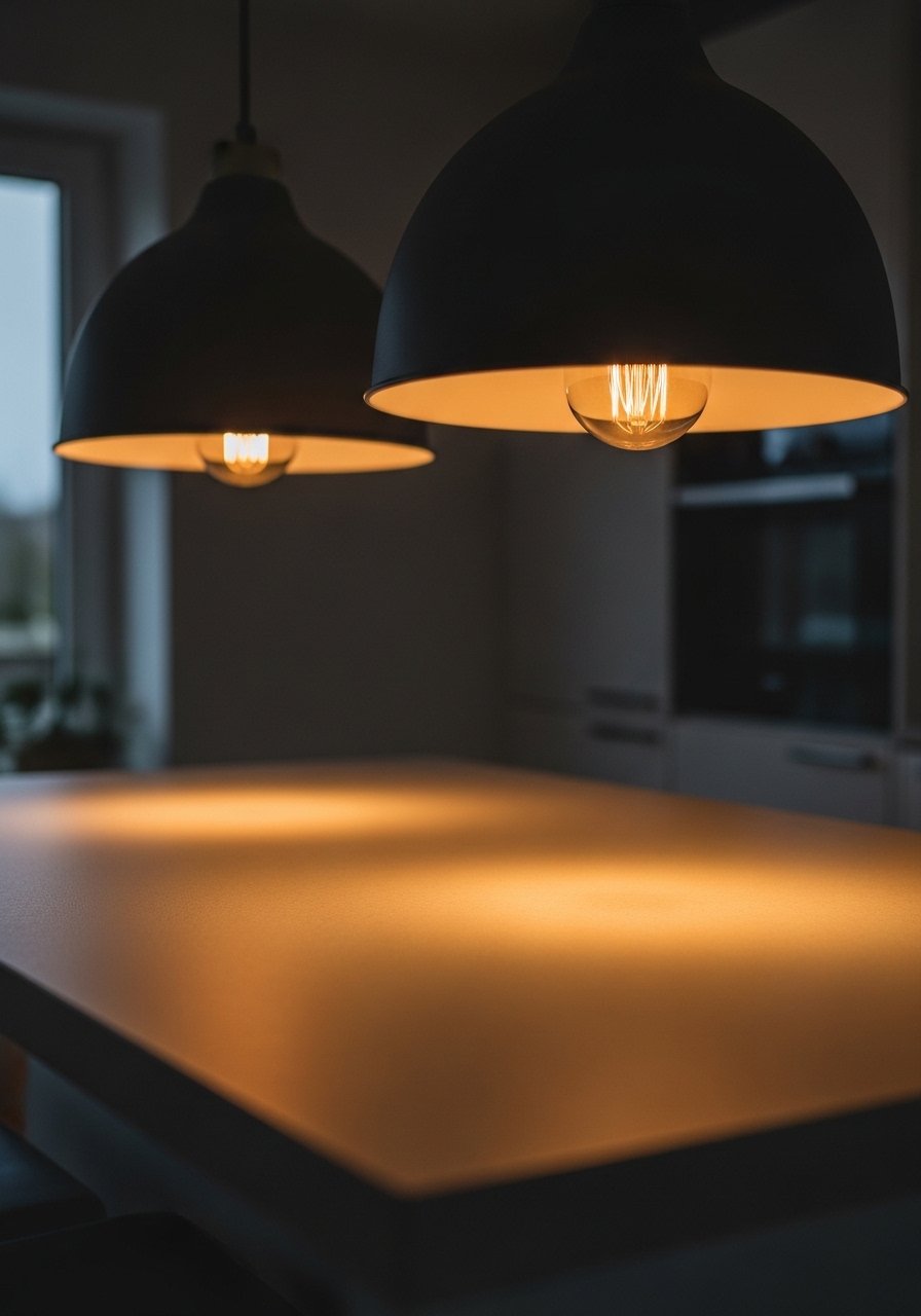
I switched to low-profile pendants six months ago and the island stopped feeling like a workspace and started feeling like a gathering spot. Choose pendants that are 12 to 16 inches in diameter for narrow islands. Pendant height should be 30 to 36 inches above the counter. Too low and they block sightlines. Too high and they look like hatboxes. My pick was a rattan pendant for texture. Try rattan pendant lights. Avoid overly ornate fixtures. They date quickly.
Farmhouse Sink with Minimalist Faucet for Functional Charm
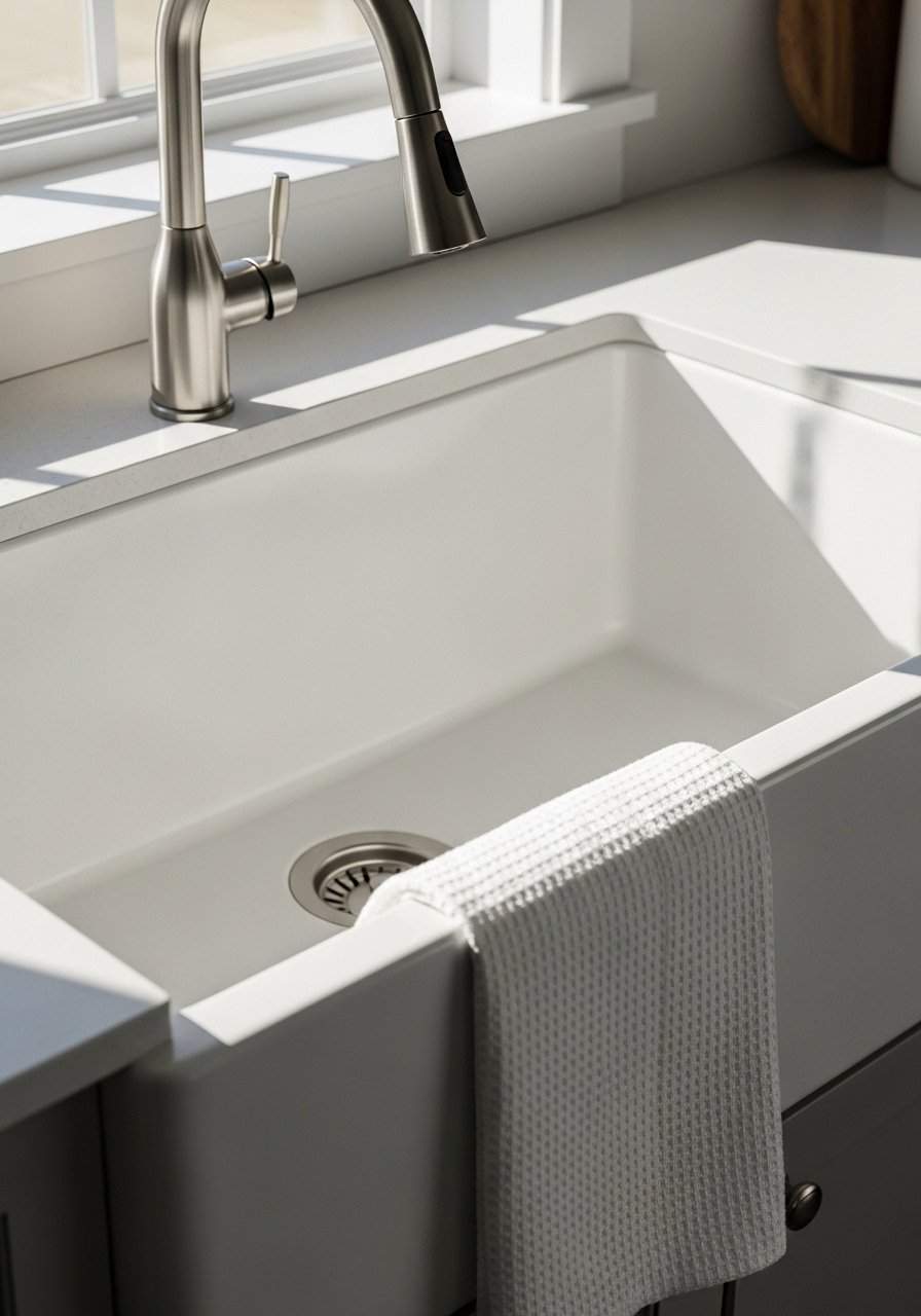
My sink area used to feel like an afterthought. Switching to a simple farmhouse sink made chores feel nicer. An undermount or apron front in fireclay cleans well and looks classic. Pair with a minimalist pull-down faucet in brushed nickel for contrast. For small kitchens choose a 30 to 33 inch single basin. A common mistake is buying a deep, heavy sink that needs extra reinforcement. Test sample sizes and see how they fit your cabinet. Farmhouse apron-front sink options can be surprisingly affordable.
Hidden Appliance Garage for Clutter-Free Counters
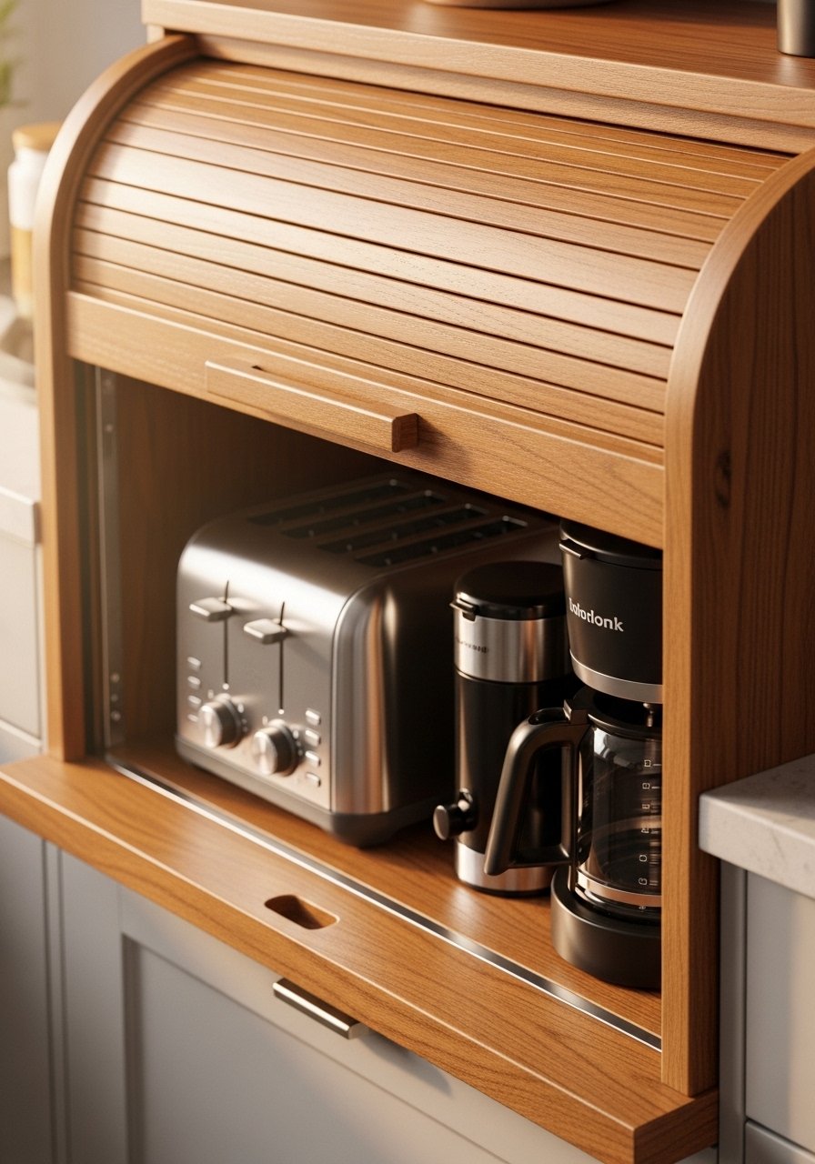
I used to leave the toaster out and the counters always looked messy. An appliance garage hides small appliances while keeping them accessible. In photos it reads very clean. In everyday life it keeps crumbs contained. Measure the height you need for a slow cooker before buying. Choose a roll-up tambour door or a sliding panel for narrow spaces. Common pitfall is forgetting ventilation. Leave a small gap for airflow. Find compact appliance garages that match your cabinet finish.
Linen Curtains to Soften Morning Light in Breakfast Nooks
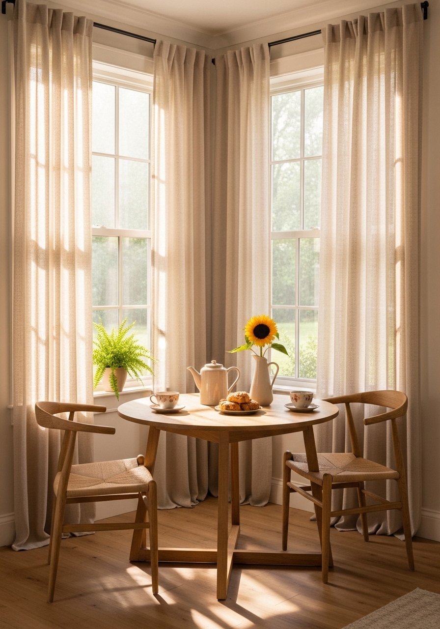
A friend walked into my kitchen and said the curtains made the room feel calm. I keep seeing linen everywhere this year. Linen filters light in a way that photos show as airy and real life shows as warm. For a standard window use 84-inch panels. For taller ceilings go 96 inches. The mistake is hanging them at the frame. Hang at the ceiling or just below crown molding to add height. Linen curtain panels are affordable and renter-friendly.
Monochrome Utensil Wall for Visual Interest
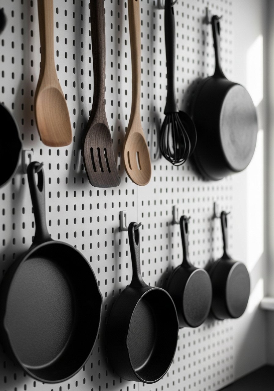
One quick fix I use is a monochrome utensil wall. Gathering tools in one tone keeps the wall from looking chaotic. Use an odd number of elements and vary heights for rhythm. In photos it looks editorial. In real life it keeps frequently used items within reach. Avoid mixing bright plastic colors, they break the calm. I bought a set of wooden spoons and hung five. Wooden kitchen utensil set works well.
Mixed Textures on a Neutral Kitchen Rug to Ground the Space
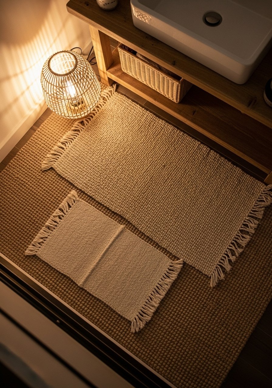
My floor used to feel cold. Layering a low-pile jute rug with a soft wool runner solved it. For styling use odd number placement, like one large rug and a smaller runner. In photos layers add depth. In reality rugs protect the floor and create comfortable standing zones. In small kitchens keep rugs narrow, about 2.5 feet wide. Avoid shag in high-traffic zones. Jute area rug 8×10 is durable and neutral.
Neutral Gallery Wall with Recipe Prints Near the Coffee Station
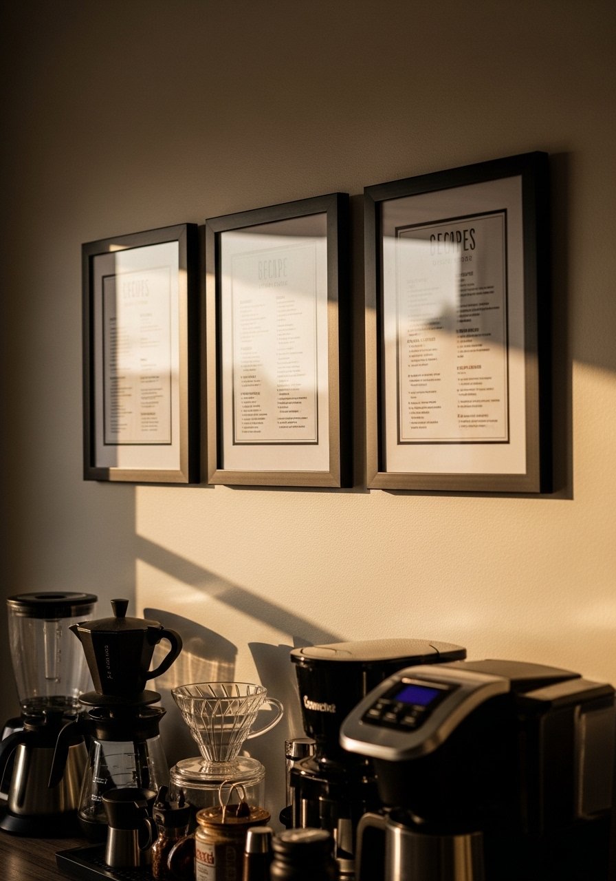
I used to put random prints on the wall and it looked scattershot. Grouping three recipe prints in matching frames makes a focused vignette. My feed is full of black frames lately. In photos the look reads cohesive. In daily life keep frames at eye level and stagger heights for energy. Avoid using frames that are too small. They disappear in photos and on the wall. I like black picture frames with white mats for a clean look.
Brass and Matte Black Mixed Hardware for Modern Contrast
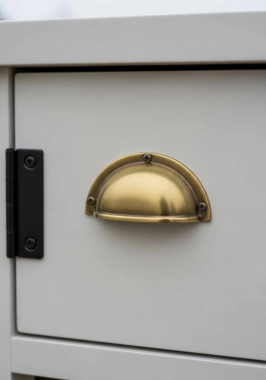
Every showroom I walk into has mixed metals on display. Mixing brass and matte black creates a layered, intentional look. Use a primary metal on big pieces and a secondary on small hardware. I put brass on main cabinet pulls and matte black on drawer knobs. In photos it looks designer. In real life it reads curated if you limit to two primary finishes. Avoid three or more different metals. Try matte black knobs with brass pulls.
Woven Baskets for Open Cabinet Storage That Still Looks Styled
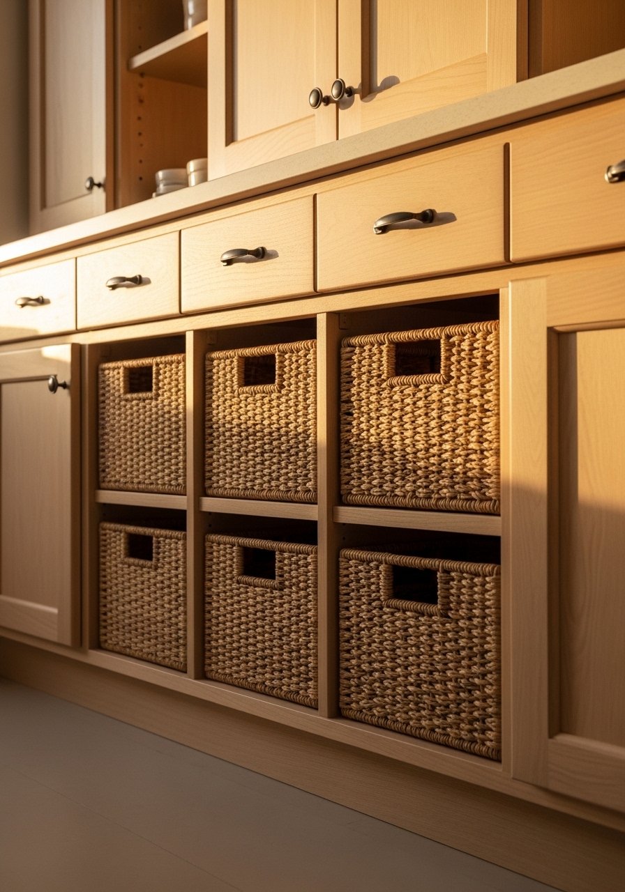
I keep seeing baskets replacing plastic bins. They hide pantry items while adding texture. In photos woven baskets soften cabinetry. In practice they let you grab breakfast items quickly. Use baskets sized to slide in and out easily. One mistake is picking baskets that are too deep. They become black holes. Label them with small tags if you need order. I liked seagrass storage baskets set for the price.
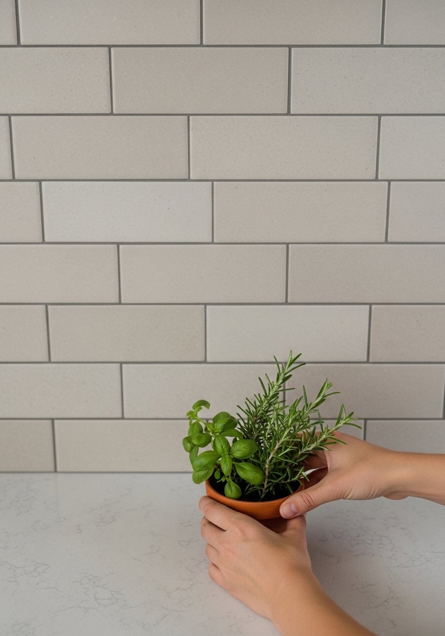
Minimalist Window Herb Garden for Freshness and Visual Life
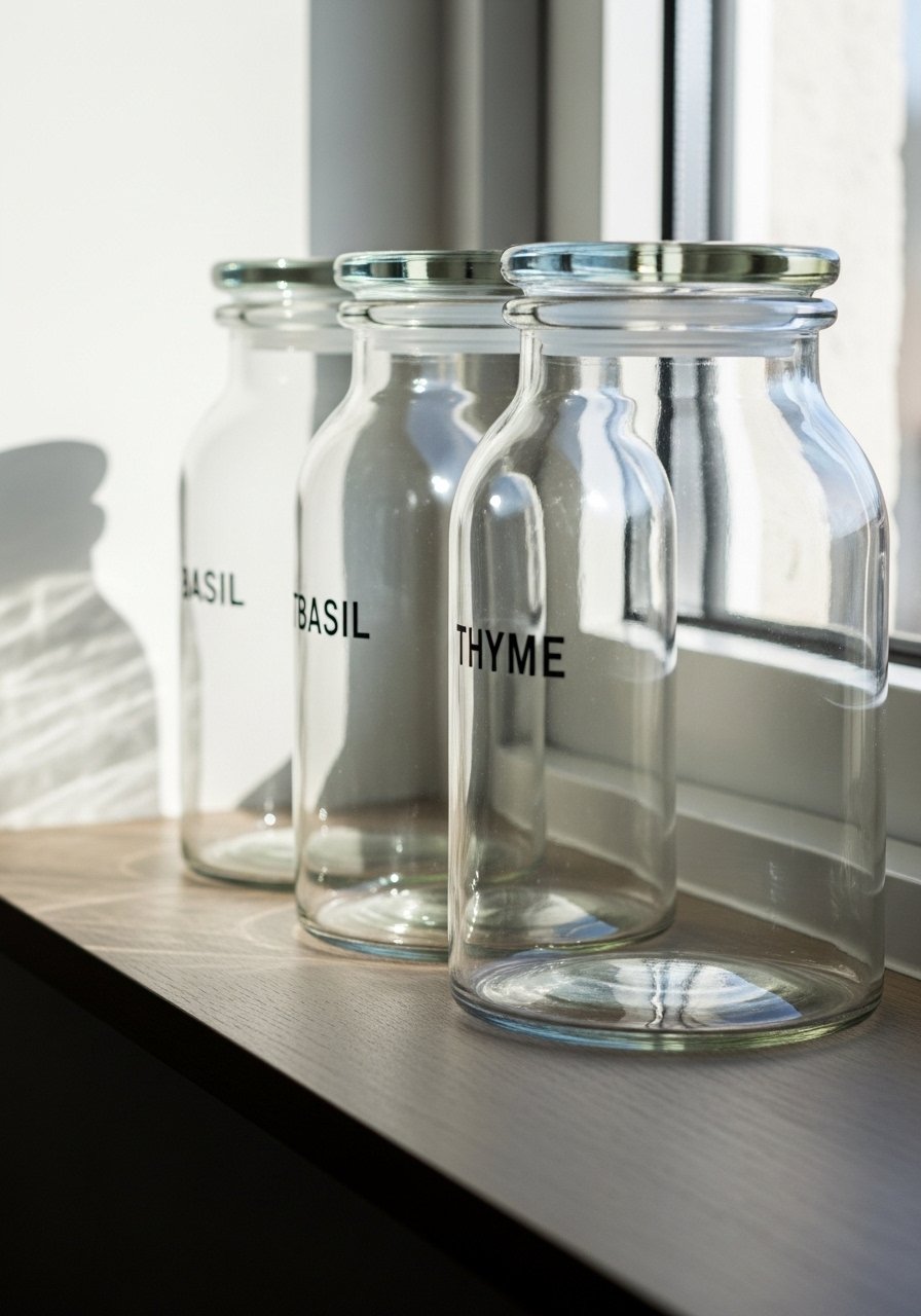
A friend asked me about fresh herbs and now I always keep three windowsill pots. Labels matter in photos and real life. I use clear jars labeled 'Basil', 'Thyme', and 'Parsley' in sans-serif. Keep pots small and rotate every eight weeks. For rental kitchens pick a compact LED grow light. The mistake is overplanting. One or two healthy herbs look better than five sad ones. Glass herb jars with labels are my go-to.
Cornice-Free Floating Shelves in White Oak for a Minimal Look
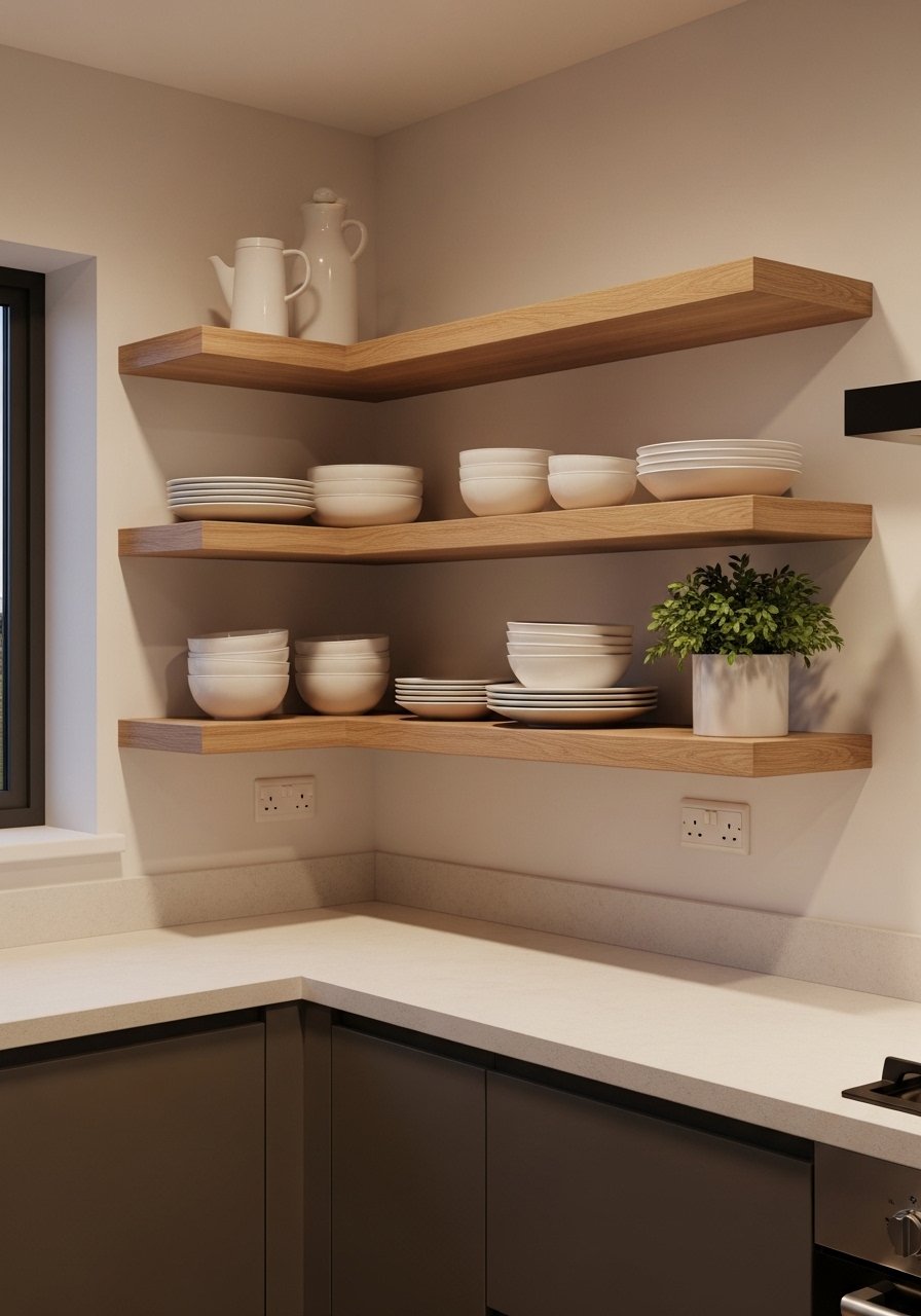
I used to have bulky cornices that ate visual space. Switching to white oak floating shelves opened the wall and modernized the look. In photos the clean lines read current. In real life choose shelves with a 1 to 2 inch thickness for sturdiness. Mount them into studs or use quality anchors. A common mistake is overloading them. Keep three to five items per shelf for balance. Try white oak floating shelves set.
Tone-On-Tone Subway Tile Grout Trick to Soften White Kitchens
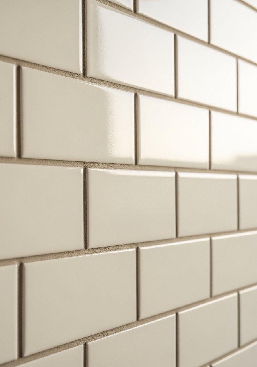
My feed is full of white kitchens with the same grout trick. Using a cream grout with white tiles gives warmth without reading colored. Photos show subtle depth. In daily life it hides specks better than pure white. The wrong grout turns modern tile into a dated look. Match grout to your floor tone for cohesion. I ordered cream grout sample kit before tiling.
Vintage Finds Mixed with Modern Pieces for Character
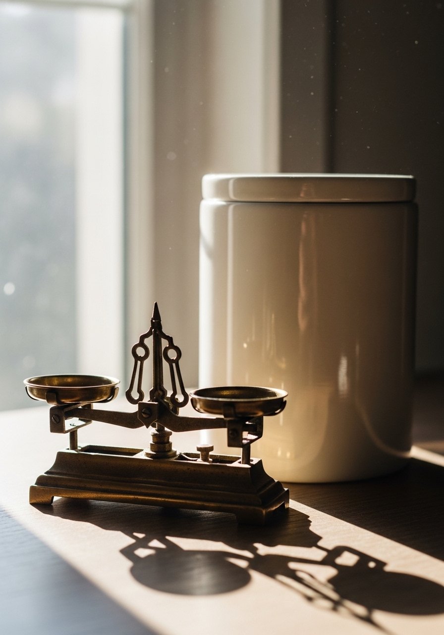
I love mixing a $12 Goodwill find with a new ceramic canister. It keeps a neutral kitchen from feeling too staged. In photos the mix reads collected. In real life vintage pieces often have better patina. A mistake is matching era for era. Instead mix eras for contrast. Clean brass without polishing away patina. I recommend vintage brass scales lookalike when a flea market is not an option.
Neutral Chalkboard Menu in Entry Nook for Functional Style
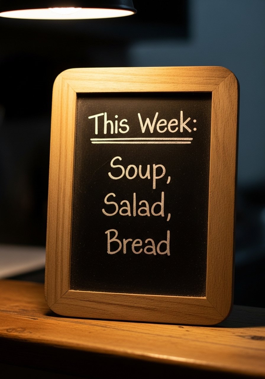
A chalkboard menu adds personality without color. I wrote 'This Week: Soup, Salad, Bread' and it became a tiny focal point. In photos chalk looks tactile. In practice update it weekly and avoid tiny handwriting. Use a 12×18 inch board for small walls. The wrong writing instrument smudges. I use stick chalk and a thin wipeable frame. Small framed chalkboard menu works for renters.
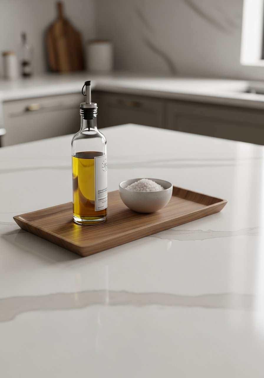
Curated Countertop Styling with Trays to Control Clutter
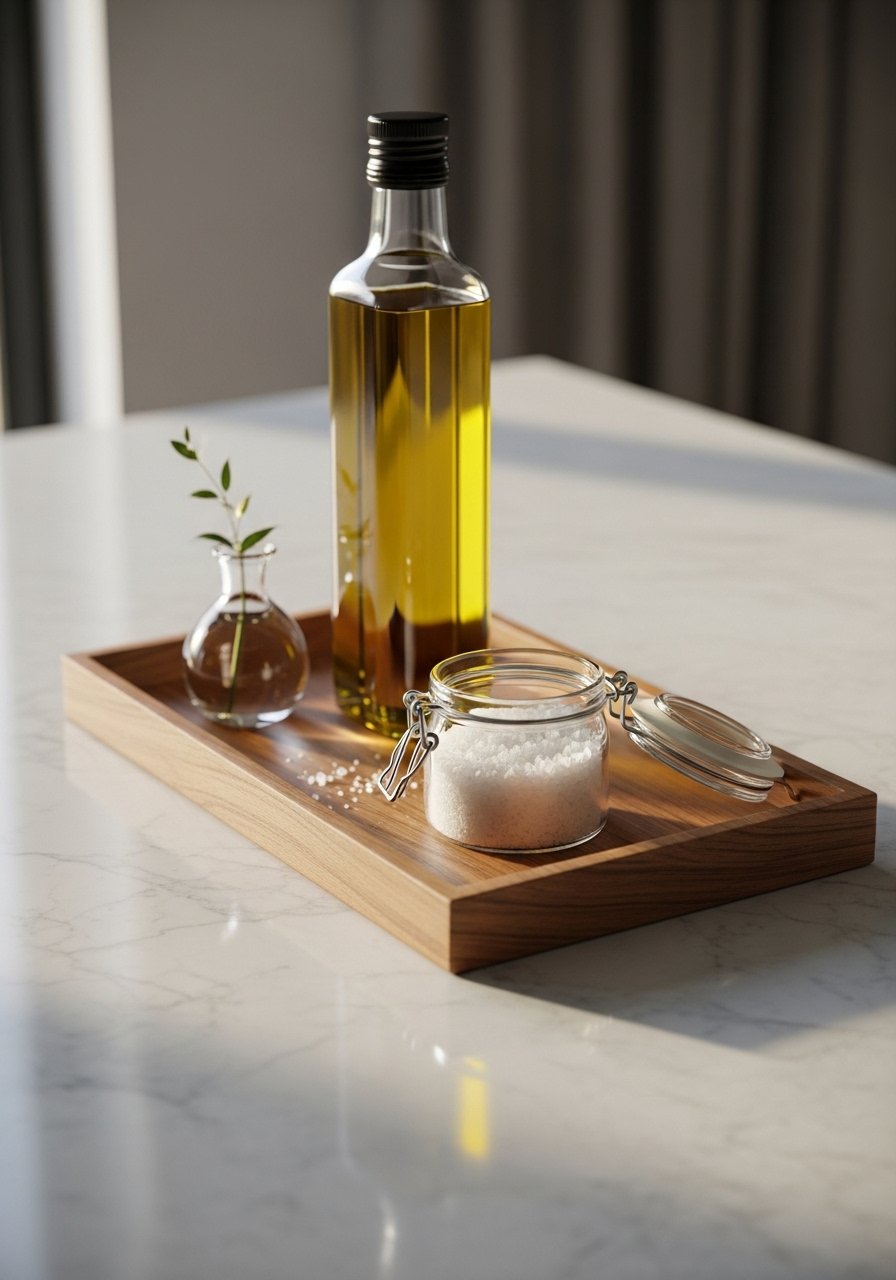
The last three homes I visited all had tray vignettes. A tray corrals everyday items and makes counters look intentional. Use one tray about 12 by 18 inches near the stove. In photos it reads layered and tidy. In real life it prevents oils from spreading. A common mistake is trying to style the whole counter. Start with one small zone. I use wooden serving tray.
Soft Ambient Lighting with Dimmers for Evening Atmosphere
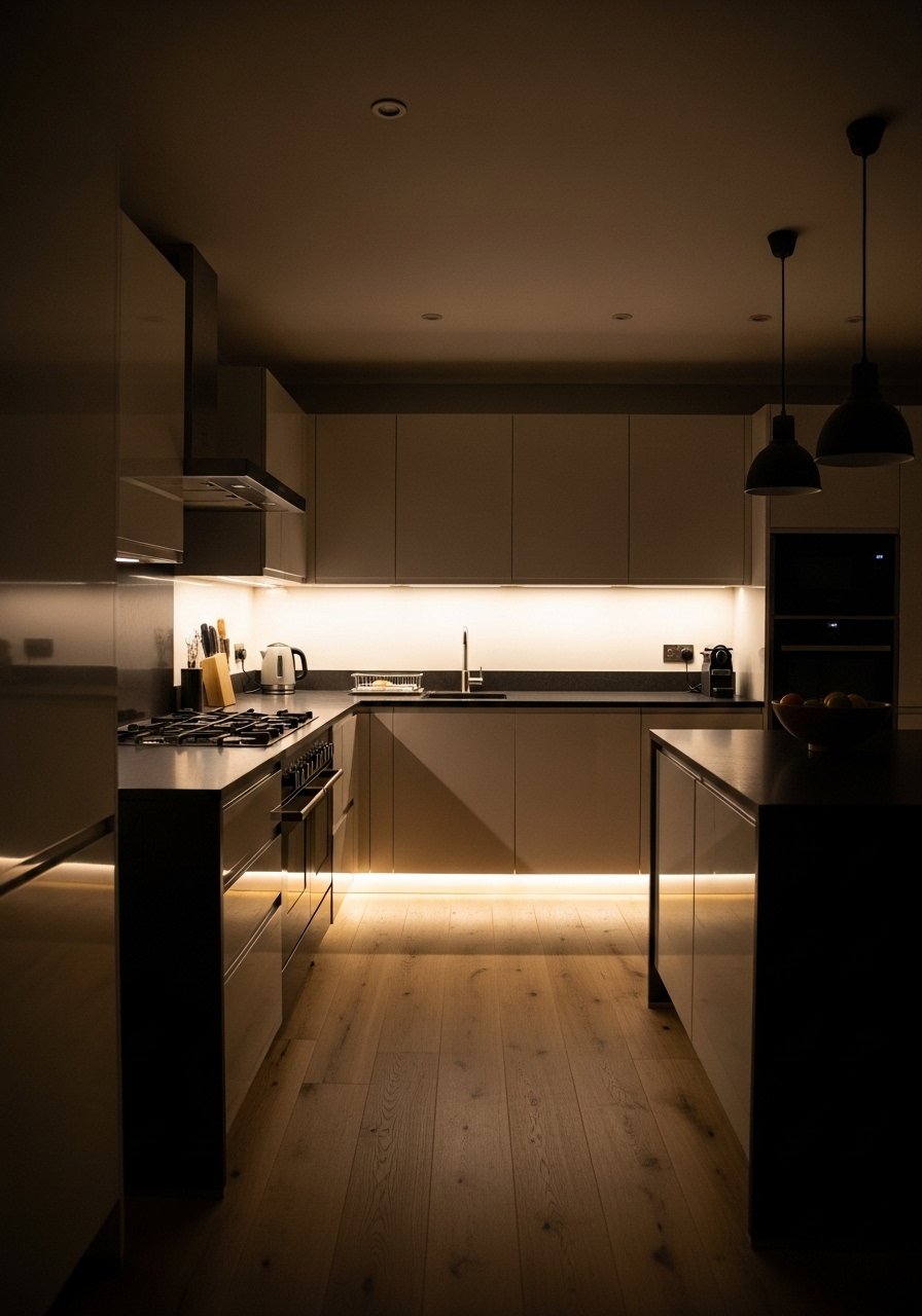
I switched to dimmers and the kitchen felt like a room you want to linger in. Layered light is essential. Use under-cabinet LEDs for task light and pendants for mood. In photos dim light reads cozy. In daily life it prevents glare when prepping dinner. Avoid harsh cool white bulbs. Pick warm white 2700K to 3000K. Plug-in dimmer switch kit made the upgrade painless.
Shopping Tips for These Looks
Mix textures deliberately. Grab this chunky knit throw for $40 and layer it on a bench or stool to add depth.
Buy sample sizes first. Quartz and tile samples cost under $15. I test them on different days to see how light affects color.
Curtains should touch or puddle slightly. These 96-inch panels are right for taller windows.
One tall plant beats five small ones. Consider a realistic fiddle leaf fig 6ft if you lack sunlight.
Start with hardware. Swapping cabinet pulls updates the entire kitchen for under $60.
Buy washable rugs for kitchen zones. Jute runners with a washable pad are practical and neutral.
Frequently Asked Questions
Q: Can I mix boho textiles with modern cabinet styles without it looking messy?
A: Yes. Balance is key. Use a neutral base like matte white cabinets and add one or two boho elements, such as a textured runner or woven basket. Keep colors within a 60-30-10 ratio. For textiles try neutral woven runner and limit pattern scale.
Q: What grout color should I choose for a white tile backsplash?
A: Pick a warm greige grout to soften the white. It photographs well and hides splatters. I ordered a cream grout sample kit and tested it on the tile in different lights.
Q: How do I make a small neutral kitchen feel higher and more spacious?
A: Hang curtains up near the ceiling and pick narrow floating shelves. Use a 36-inch round mirror to reflect light. Round wall mirror 36-inch works wonders.
Q: Are faux plants acceptable in a neutral timeless kitchen?
A: Yes, if they look realistic. Place one tall faux ficus in a corner and real herbs on the sill for balance. I use artificial fiddle leaf fig 6ft where sunlight is limited.
Q: Should I match metal finishes like brass and black across all fixtures?
A: No. Mixing two finishes creates depth. Keep the majority metal consistent and introduce a second finish sparingly. Try matte black knobs with brass pulls for contrast.
Q: What rug size is best for an open-plan kitchen dining area?
A: Go bigger than you think. An 8×10 rug under a small dining table keeps chairs on the rug when pulled out. I prefer a neutral jute like jute area rug 8×10 for durability.