
Neutral home decor never fades because it creates calm, balance, and long-term comfort. In 2026, the shift is clear. Warm neutrals like beige, greige, taupe, sand, and earthy browns are replacing stark whites and cool grays. The secret is texture. When neutrals feel flat, it’s rarely the color. It’s the lack of layers. Fabric, wood, stone, and soft contrast bring depth without noise. This list focuses on timeless ideas that work in real homes, on real budgets. Each tip is practical, affordable, and easy to apply without major changes.
1. Warm Beige Walls That Feel Soft, Not Plain
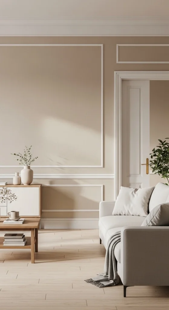
Beige walls work when the tone leans warm. Skip flat builder beige. Look for shades with a hint of cream or sand. These read calm instead of dull. Beige acts as a backdrop that lets furniture and textures stand out. If repainting feels expensive, start small. Paint one main wall. Or repaint a hallway to test the shade. Use eggshell or satin finishes for gentle light bounce. Pair beige walls with wood frames, off-white curtains, and woven accents. This avoids a washed-out look. Beige also hides wear better than white, making it practical for busy homes. A simple DIY trick is painting sample boards and moving them around the room during the day. Light changes everything. Beige that looks right in the morning can shift at night. Choose the one that stays warm across lighting changes.
2. Greige Paint for Balanced, Everyday Rooms
Greige sits between gray and beige, making it easier to live with long term. It feels calm without looking cold. This makes it ideal for bedrooms, hallways, and open spaces. Greige works well when paired with natural textures. Think linen bedding, cotton throws, and wood furniture. If your space gets little sunlight, choose a greige with beige undertones. For brighter rooms, a slightly cooler greige works fine. Budget tip: repaint furniture instead of walls. A greige dresser or console can refresh a room without full repainting. Keep surrounding decor simple. Too many cool accents can pull greige toward gray. Stick with warm metals and soft whites. Greige is forgiving, which makes it great for renters who want a neutral base that still feels personal.
3. Off-White Trim Instead of Stark White

Pure white trim can feel harsh next to warm neutrals. Off-white trim softens edges and creates flow. It helps rooms feel calm rather than sharp. Look for shades with cream or ivory undertones. You don’t need to repaint everything at once. Start with door frames or baseboards in one room. This small change has a big visual impact. Off-white trim also hides scuffs better, which saves time and repainting costs. Pair it with neutral walls and warm wood floors for a cohesive look. If repainting trim isn’t an option, swap white accessories for softer whites. Lampshades, curtains, and bedding all help balance contrast.
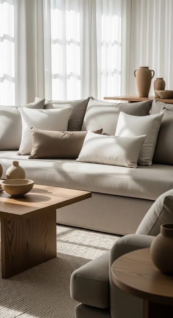
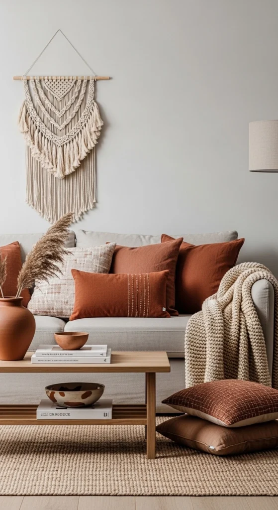
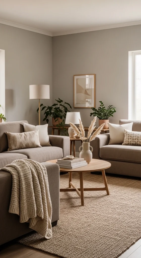
4. Layered Neutral Textiles for Depth
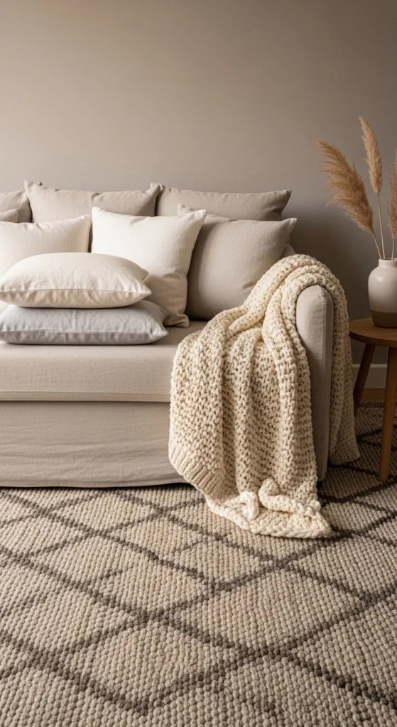
Neutral rooms rely on layers to avoid feeling flat. Start with one base fabric, like cotton or linen. Add a second with texture, such as boucle or knit. Finish with something structured like canvas or wool. This creates contrast without color. You don’t need to buy everything new. Mix what you already own. Rotate cushions between rooms. Drape throws casually instead of folding them neatly. This feels more relaxed. Stick to a tight color range to keep things calm. Three to four tones are enough. Texture does the rest of the work.
5. Natural Wood Furniture That Grounds the Room

Wood adds warmth instantly. Light oak feels airy. Walnut feels rich. Pine feels casual. Choose what fits your space. You don’t need matching sets. Mixing wood tones works when the rest of the palette stays neutral. Budget tip: refinish old furniture instead of buying new. Sanding and oiling can bring life back to tired wood. Avoid glossy finishes. Matte or satin looks more natural. Keep wood visible. Don’t cover every surface with decor. Let the grain show.
6. Linen Curtains That Filter Light Gently
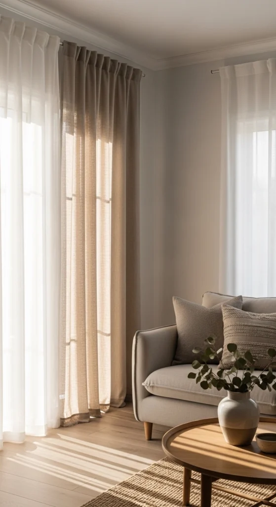
Linen curtains soften light without blocking it. They add texture and movement. Choose neutral shades like flax, sand, or soft taupe. Hang curtains higher than the window frame to make ceilings feel taller. This trick costs nothing extra. If linen feels pricey, look for cotton-linen mixes. They offer a similar look at a lower cost. Skip heavy pleats. Simple panels feel timeless and relaxed.
7. Neutral Rugs with Subtle Pattern
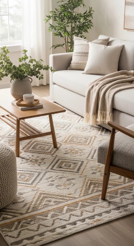
A rug anchors the room. In neutral spaces, pattern matters more than color. Look for low-contrast designs. Small geometrics or faded motifs work well. They add interest without pulling focus. Flatweave rugs are budget-friendly and easy to clean. Layering a smaller textured rug over a larger neutral one adds depth. This works especially well in living rooms and bedrooms.
8. Black Accents for Gentle Contrast
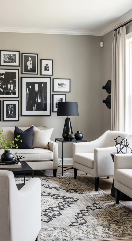
A touch of black adds structure to soft palettes. Use it sparingly. Picture frames, lamp bases, or cabinet handles are enough. Black keeps neutrals from feeling washed out. Avoid large black furniture unless the room is bright. Balance black with wood and soft fabrics to keep the mood calm.
9. Brass and Warm Metal Details
Warm metals add glow without adding color. Brass works well with beige and greige. Use it in small doses. Drawer pulls, mirrors, or lighting fixtures are easy upgrades. If new hardware feels costly, spray paint old pieces with a warm metallic finish. Keep finishes consistent within one room to avoid visual clutter.
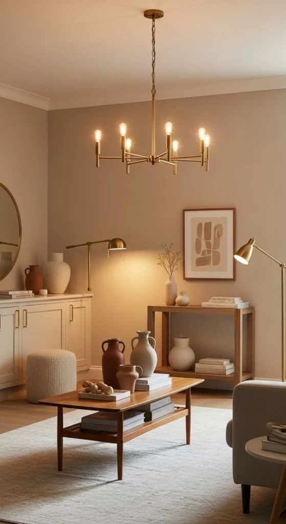
10. Sculptural Lighting as a Focal Point
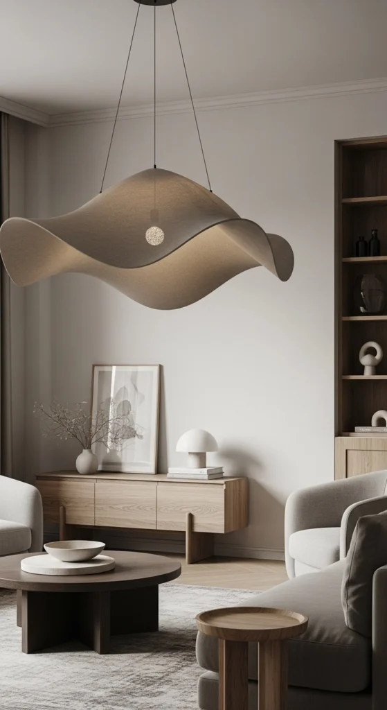
Lighting shapes the mood. Sculptural lights act like art without color. Look for simple shapes in neutral finishes. Paper, fabric, and ceramic materials work well. Swap one overhead light instead of adding more decor. This keeps the space calm and intentional.
11. Earthy Accent Colors Used Sparingly
Earthy tones like clay, ochre, or soft brown add warmth when used lightly. Think cushions, throws, or small decor. Keep accents under control. One or two pieces per room is enough. This keeps neutrals timeless instead of trend-heavy.
12. Vintage Pieces for Quiet Character
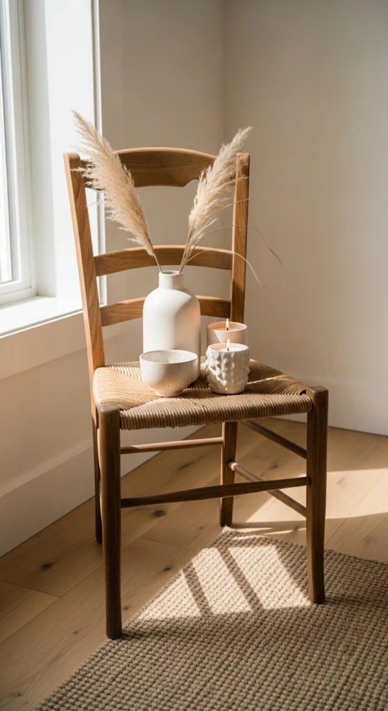
Vintage items add story and texture. Look for wood stools, ceramic bowls, or mirrors. Thrift stores and flea markets are great sources. Don’t worry about perfection. Small flaws add charm. Use vintage pieces as accents, not the main focus.
13. Neutral Art with Texture
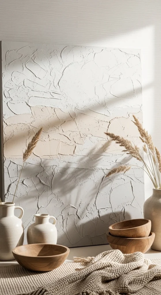
Art doesn’t need bold color to stand out. Look for textured pieces. Canvas, plaster, or fabric art works well. Even framed neutral fabric can act as wall art. This keeps walls interesting without visual noise.
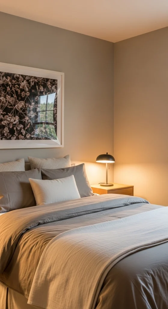
14. Layered Bedding in Soft Neutrals
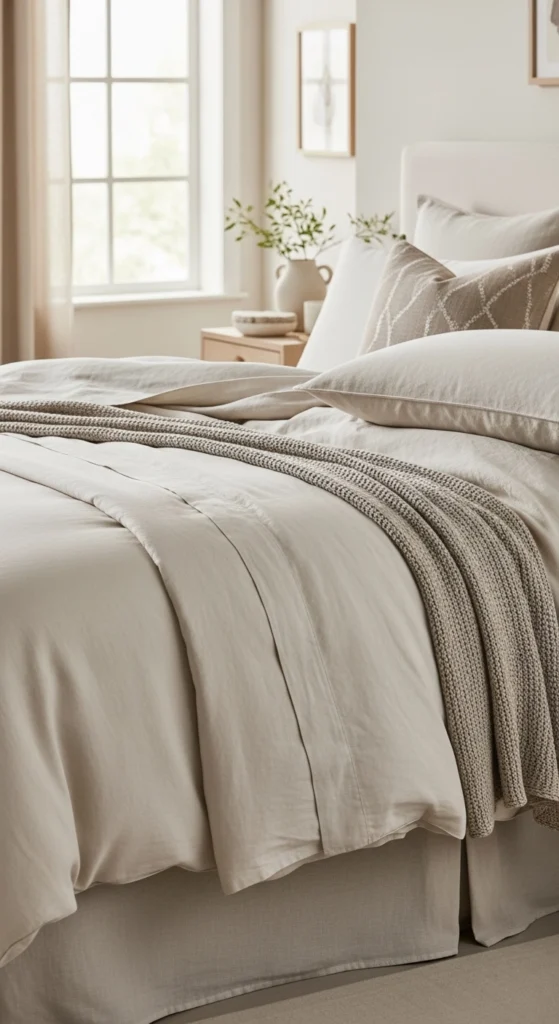
Bedrooms benefit most from layering. Start with neutral sheets. Add a slightly darker duvet. Finish with a textured throw. Stick to warm tones to keep the space restful. This setup feels inviting and works year-round.
15. Woven Baskets for Storage
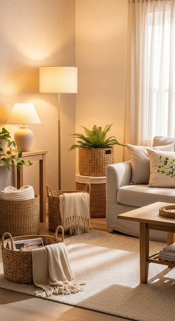
Baskets add texture and hide clutter. Use them for throws, magazines, or toys. Natural fibers like seagrass or jute work best. They fit easily into neutral rooms without standing out.
16. Neutral Kitchens with Warm Undertones
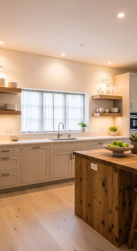
Neutral kitchens stay relevant longer. Choose cabinet colors with warmth. Pair them with wood shelves or counters. Open shelving works well when items stay neutral. This keeps the space calm and practical.
17. Soft Taupe Upholstery
Taupe upholstery hides wear better than lighter shades. It also pairs easily with other neutrals. Choose simple silhouettes. Add interest with cushions and throws instead of bold furniture shapes.
18. Organic Shapes in Decor
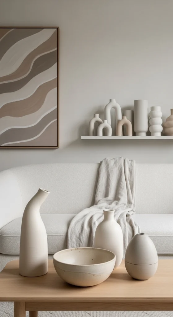
Curved shapes soften straight lines. Use rounded vases, bowls, or mirrors. These small details make rooms feel more relaxed without changing color schemes.
19. Neutral Bathrooms with Texture

Bathrooms benefit from texture. Use waffle towels, stone trays, or wood stools. Keep colors soft and warm. This makes the space feel calm and comfortable.
20. Layered Neutrals in Entryways
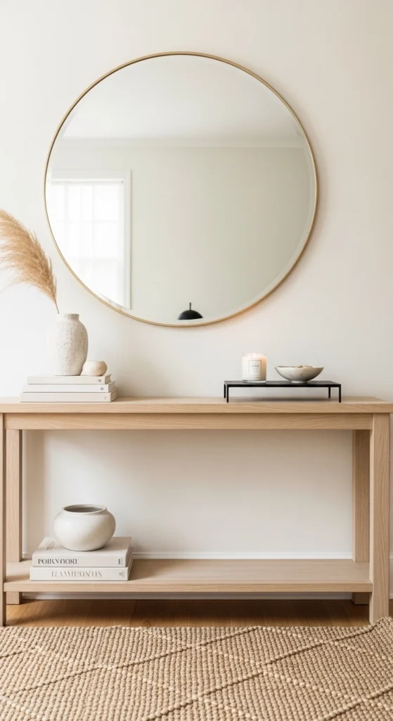
Entryways set the tone. Use a neutral rug, wood console, and simple mirror. Add one textured element like a basket or ceramic bowl. Keep it simple and welcoming.
21. Neutral Home Office That Feels Calm
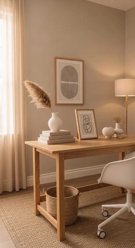
A neutral office helps focus. Stick to warm shades. Use texture instead of color for interest. Fabric chairs and wood desks balance comfort and function.
22. Layered Neutral Dining Spaces
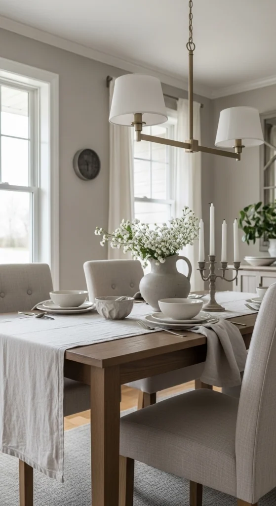
Dining spaces feel timeless with neutrals. Linen tablecloths, wood chairs, and simple lighting keep things grounded. Small changes like placemats or runners refresh the look without effort.
23. Neutral Decor That Evolves Slowly

The best neutral homes grow over time. Add pieces slowly. Swap textiles seasonally. Keep the base consistent. This approach saves money and keeps spaces personal without feeling dated.
Conclusion
Neutral home decor lasts because it works with real life. Warm tones, texture, and simple layers create spaces that feel calm and comfortable year after year. You don’t need major changes to get there. Small updates, thoughtful choices, and patience make the difference. Start with one idea. Build slowly. Let your home settle into a style that feels steady, warm, and easy to live with.