
I used to fight my kitchen every weekend. I painted cabinets white, bought matching white jars, and still it felt cold and cluttered. Everything looked like a showroom, and then the crumbs and mail showed up and the room sighed. That was when I realized the problem was not color alone, it was the way I placed things and the textures I avoided.
I tried adding bright accents, then wood, then a million accessories. The third try finally clicked when I let go of perfection and chose a soft palette with clear rules for spacing, texture, and one deeper tone to anchor the eye. It made the kitchen feel calm and actually useful.
Step 1: Clear everything, measure your key planes
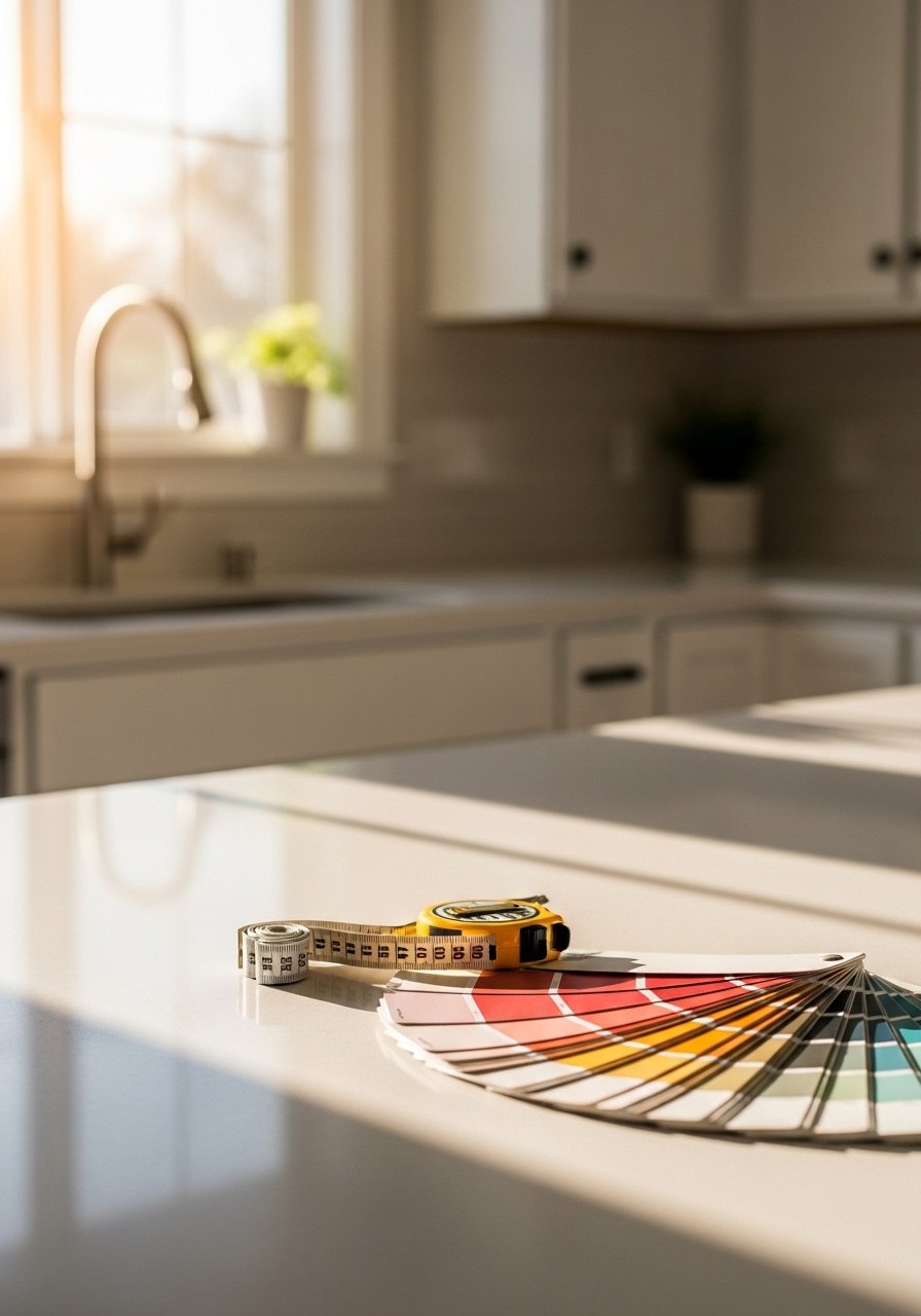
Strip the counters and open shelves down to essentials so you can see shape and light. I measure the longest clear run near the stove and aim to keep about two thirds of that straight edge visually clear. That number helps when you are tempted to put every gadget back out. Leave 2 to 3 inches of breathing room around objects on open shelves. I ignored this at first and everything looked crammed because I was afraid of empty space.
What changes visually is immediate. Counters feel longer, light reads better, and you can pick one place to style instead of everything competing. Sensory note, the empty counter feels cool and smooth in the morning. It is easier to decide what needs to live on the surface.
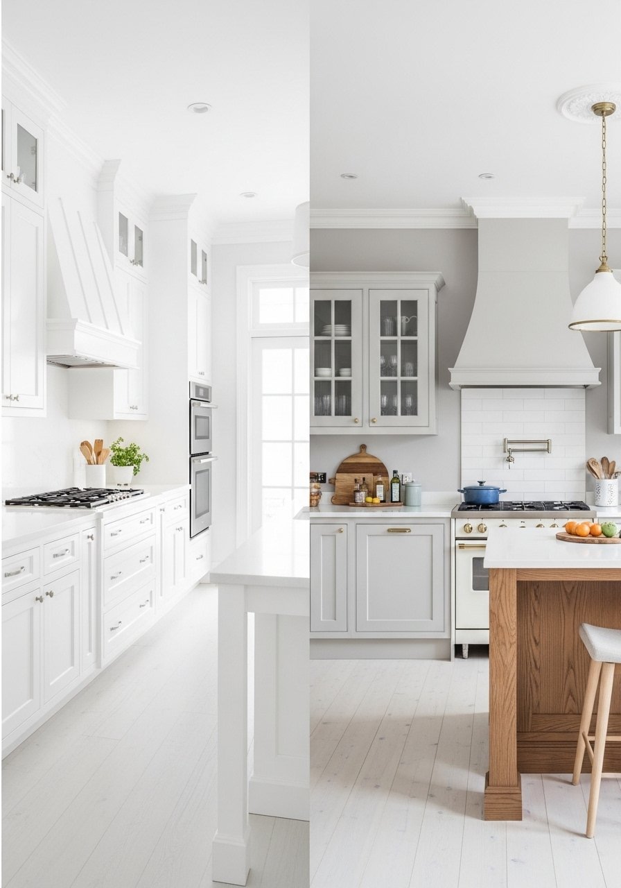
Step 2: Pick a soft palette and follow the 60-30-10 rule
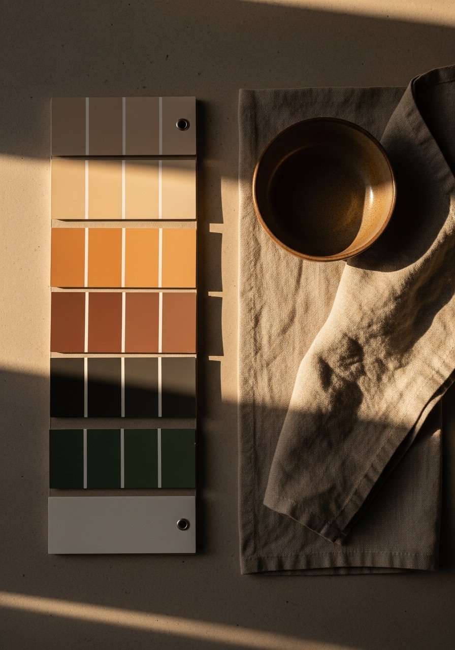
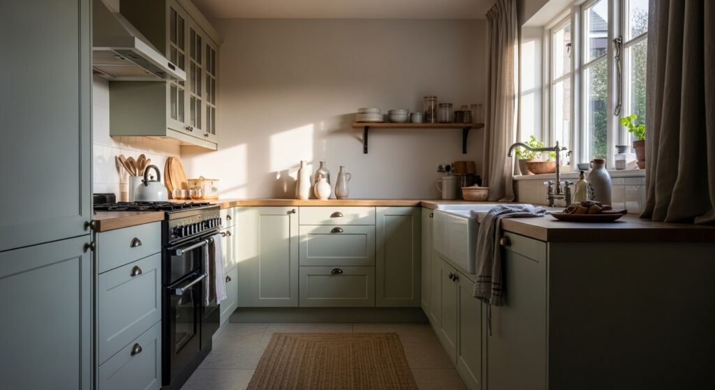
Decide which soft color will be dominant, which will be secondary, and which will be your accent. Use the 60-30-10 ratio. For example, 60 percent warm off-white on walls, 30 percent pale sage on lower cabinets or a backsplash, and 10 percent blush or warm terracotta in accessories. The rule keeps things from feeling muddled.
I once tried three competing pastels and everything flattened. Commit to the palette, sample a 2-foot square patch of paint near the sink, and live with it for a weekend. The paint sheen matters too. I use eggshell on walls because it hides small marks and still reads soft in daylight.
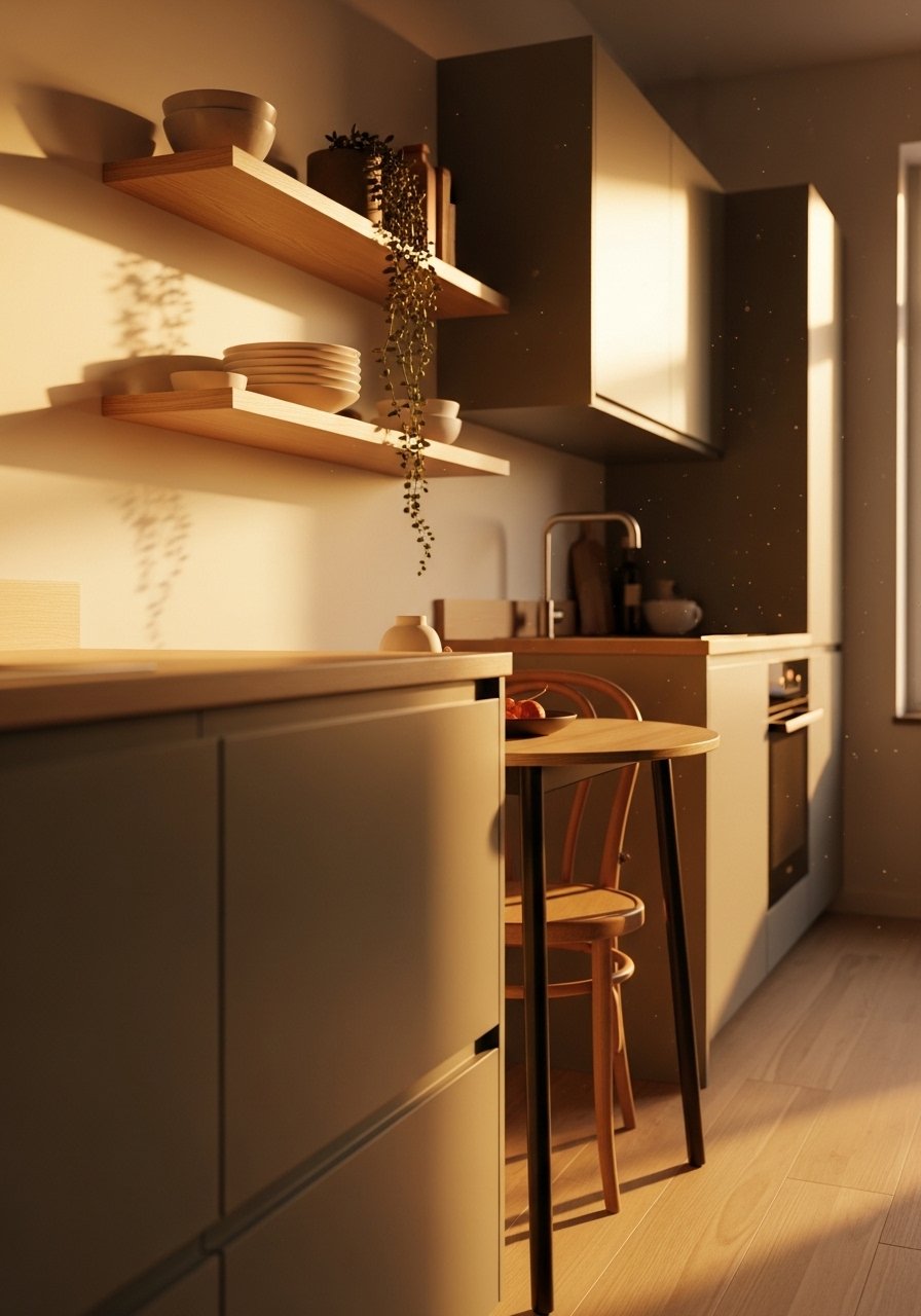
Step 3: Layer texture and one small metal finish
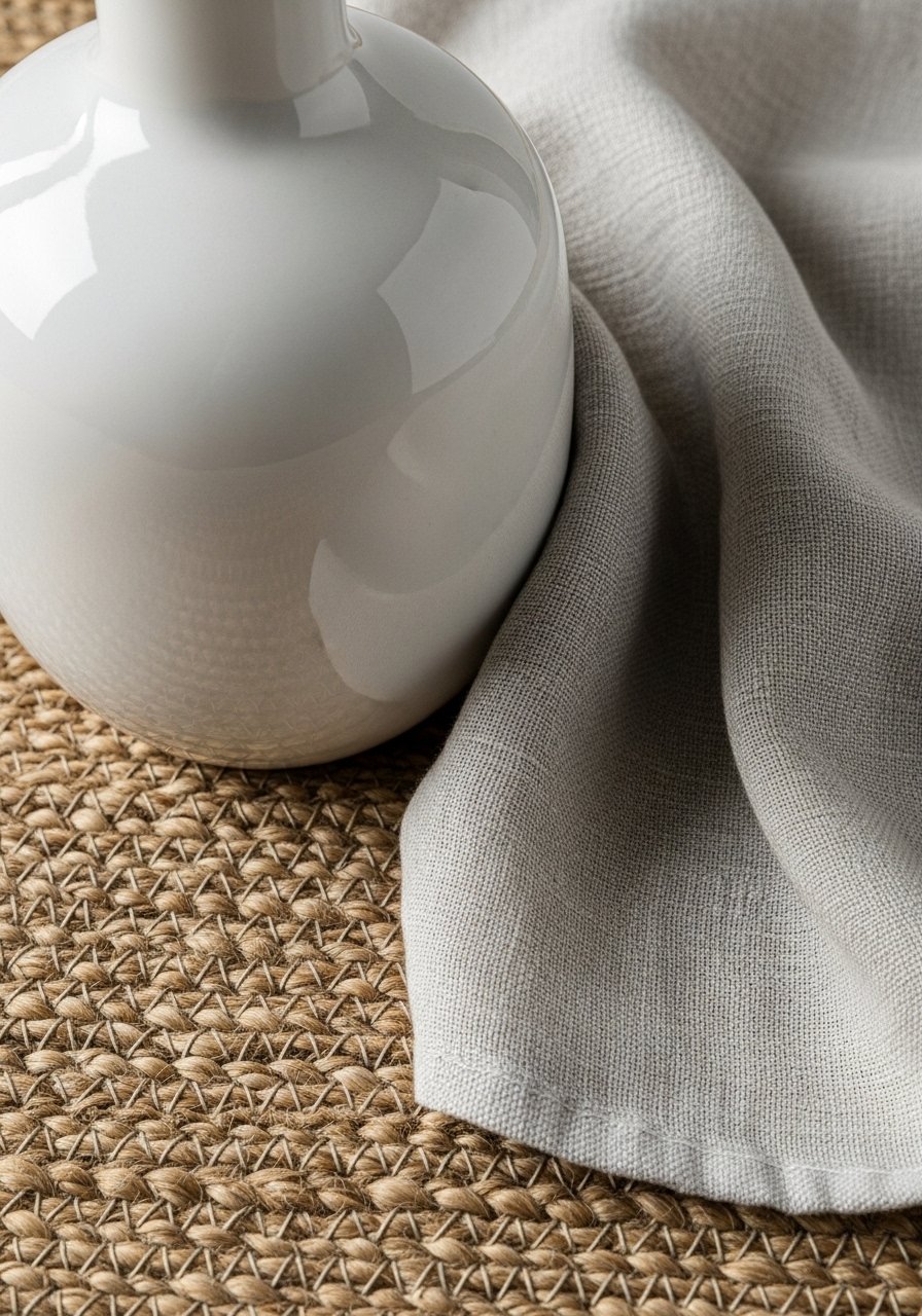
If the room still feels flat, add texture and a single metal finish. Think linen curtains that feel cool to the touch, a jute runner that is rough underfoot, and a matte ceramic vase that feels weighty in your hands. Keep metals minimal, one finish only, for example brushed brass for hooks and a single pendant. That small catch of metal prevents the room from washing out visually.
I used all smooth glass the first time and the kitchen looked sealed in plastic. Adding a nubby textile fixed the flatness. For height variety use three levels, like a low bowl, a medium plant, and a tall vase roughly 6, 12, and 18 inches tall.
Step 4: Style shelves and counters with purposeful gaps
Group objects in odd numbers and leave negative space. Aim for groups of three to five on a shelf, not a row of everything you own. Put the tallest object on one side, a cluster in the middle, and a low piece on the far side. Walk away for ten minutes. When you come back you will see where it needs breathing room.
Common mistakes fixed here are over-symmetry and fear of empty space. My partner hated the asymmetrical shelves at first. He admitted a week later it looked better than the perfectly even version. Side note, if you have cats skip the low open shelf that becomes a jump station.
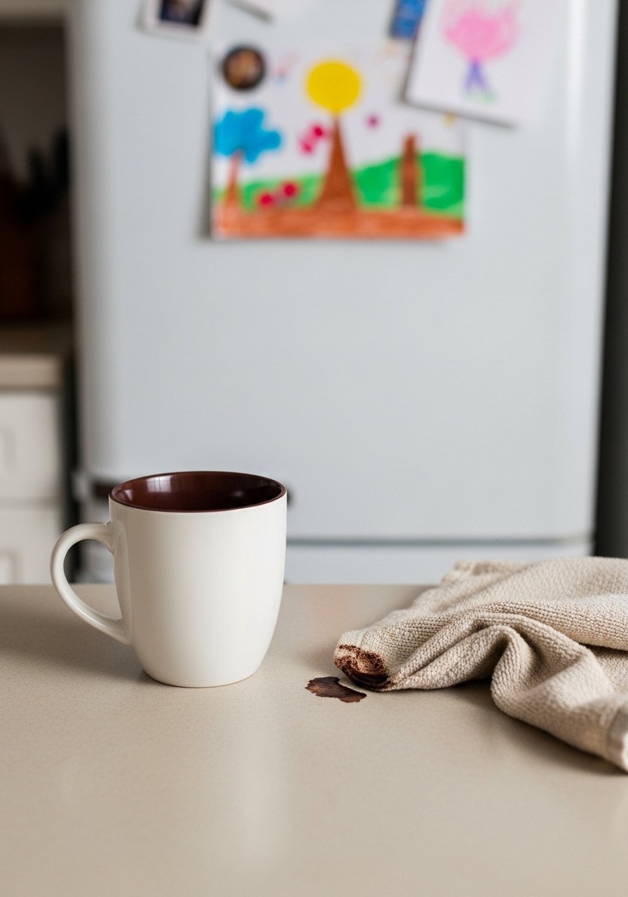
Step 5: Finish with textiles, lighting, and a wear test
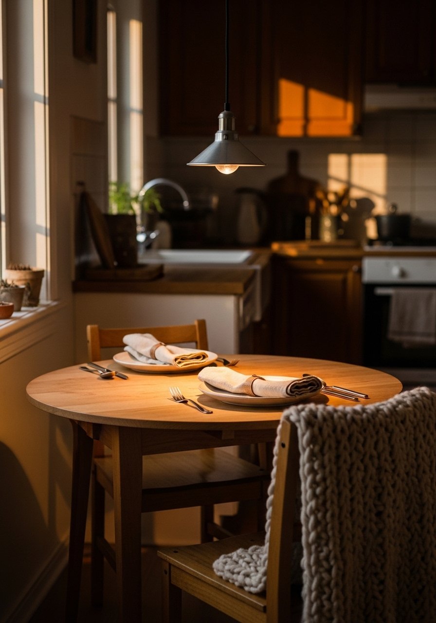
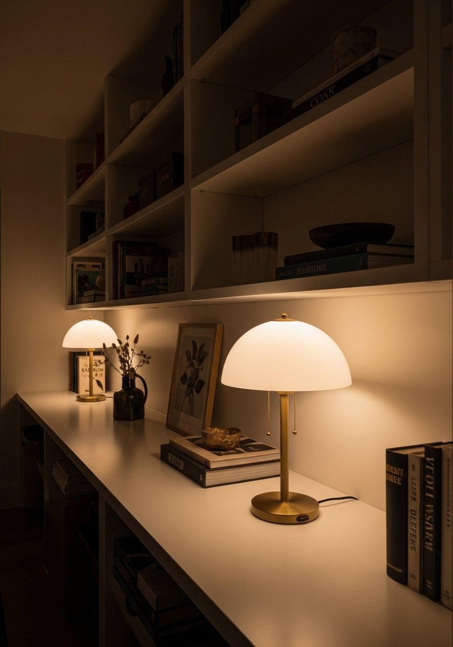
Bring in washable textiles and test them in real life. A 5×8 jute rug under a small dining table or an 8×10 runner in a galley anchors the floor. Hang curtains so the rod sits 6 to 12 inches above the window to make the room feel taller. Check pendant height if you have one, 28 to 34 inches above the table is my go-to for balance.
I almost skipped the wear test and regretted it when the first coffee spill stained an unwashed napkin. Living with your choices for a week reveals what you actually need to add or remove. The room will feel calm and lived-in, not staged.
The Kitchen Colors Shopping List You Will Use
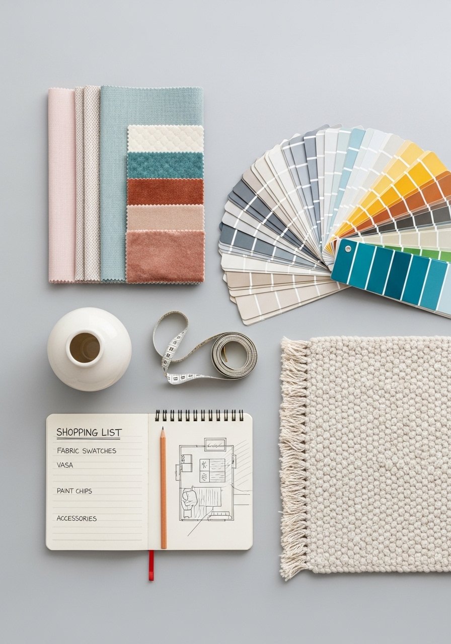
- Chunky knit throw in oatmeal, 50×60 ($40-65). Great for a chair or to drape over a bench, used in Step 5.
- Linen curtains in natural, 52×84 pair ($35-70). Cool to the touch, used in Step 5.
- Jute area rug, 5×8 ($60-120). Anchors a small dining area, referenced in Step 5.
- Matte white ceramic vase set, varying heights ($25-40). For the three-height grouping in Step 3.
- Brushed brass wall hooks, pack of 6 ($15-30). One metal finish, used in Step 3.
- Pale sage paint sample, one pint ($7-15). Test a 2-foot spot as suggested in Step 2.
- Wood cutting board, walnut, 18×12 ($25-50). Serves as a warm anchor on counters, mentioned in Steps 1 and 4.
- Soft linen dish towels, set of 4, blush ($18-30). Practical textile for Step 5, washable and soft.
Most of these have similar options at Target or HomeGoods if you prefer to see them in person.
Why Soft Kitchens Still Look Washed Out
The common mistake is too much low-contrast pale color with no anchor. The fix is one deeper tone or natural wood to tie things together. Add a walnut cutting board, a darker shelf, or a single backsplash tile in a muted terracotta. That single element gives your eye a place to rest.
Another problem I ran into was the wrong finish. Flat paint on trim ages poorly in a kitchen. Use eggshell on walls, and a satin or semi-gloss for cabinet faces if you cook a lot. Small changes in finish make the space feel intentional and lived-in rather than faded.
Making This Work in a Small Kitchen
Small spaces need fewer objects and sharper rules. I use a short list when space is tight.
- Keep floating shelves no deeper than 10 to 12 inches so they do not crowd counter space.
- Limit counter accessories to one functional station, for example coffee or chopping, occupying no more than one third of the main counter.
- Use a 5×8 rug rather than an 8×10 in narrow kitchens to keep a sense of flow.
Try the 60-30-10 rule on a smaller scale. Make the 10 percent your accent in a single bowl or towel so color reads intentional, not chaotic.
What This Looks Like After a Week of Real Life
After a week you will see what works and what does not. The jute runner will hide crumbs but show spills. Linen towels will clean up coffee without leaving lint. The pale paint shows finger marks near the stove, which told me to move a small washable mat to that spot.
I found that one ceramic vase needed to move away from the edge because a roommate knocked it twice. The living test is where styling meets mess. Adjust by moving fragile pieces higher and keeping functional textiles within arm’s reach.
Start with One Counter or Corner
Pick the smallest area you touch every day and style that first. A 12-inch corner with a walnut board, one ceramic vase about 12 inches tall, and a linen towel will tell you more than restyling the whole kitchen at once. It is low risk and quick to change.
Give it a week, live with it, and then expand. You will find the room becomes calmer without losing usefulness, and that small corner will make the whole kitchen feel softer and more inviting.