
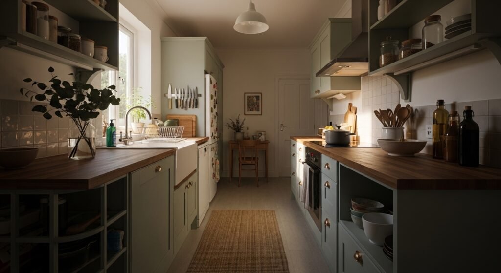
I hated walking into our kitchen because it felt loud in a way cabinets and appliances should not be loud. I tried crisp white, then bright blue, then a bland beige. Each time something felt off. The surfaces either read sterile or tired. It took me too many paint samples and two awkwardly arranged open shelves to notice the real issue was contrast and texture, not more color.
After the third redo I stopped adding stuff and started measuring visual weight instead. Once I leaned into calm color proportions and tactile mixes, the room finally felt like a place to breathe.
Step 1: Pick a calming base and stick to the 60-30-10 rule
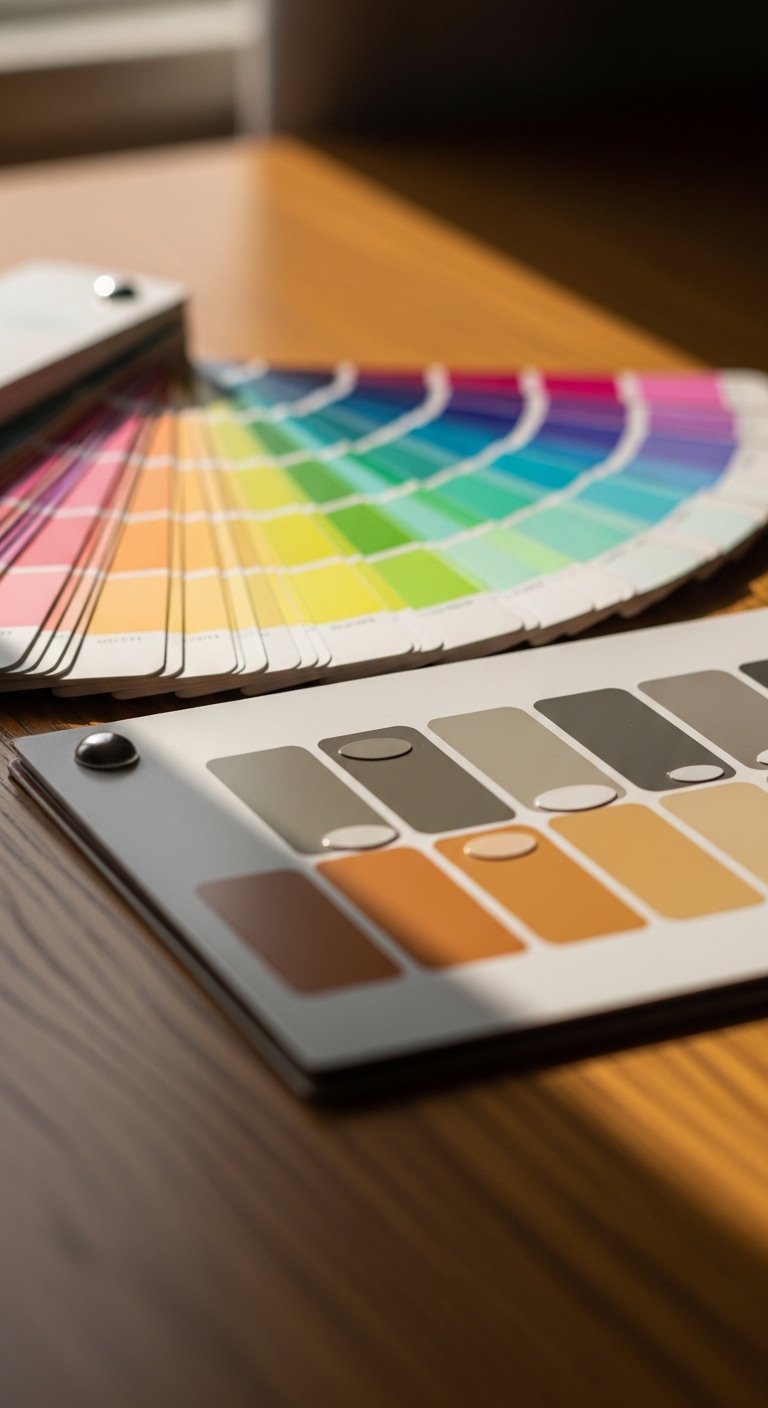
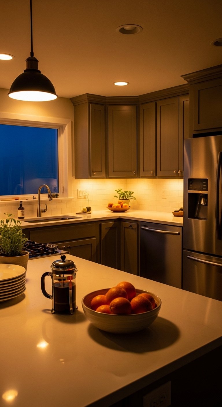
Start with one dominant color for about 60 percent of the room. For me that was a soft warm white on the ceiling and upper cabinets. Use 30 percent for your secondary color, I chose sage on lower cabinets and a small wall. Save 10 percent for accents, like a deep charcoal kettle or a terracotta bowl. I learned this after painting half the kitchen three different ways. The formula keeps things calm while still interesting. Texture matters here, so pick a matte paint for walls and a satin for trim. Matte reads softer in low light, while satin catches the clean lines.
Step 2: Anchor the space with warm wood and a low-commitment rug
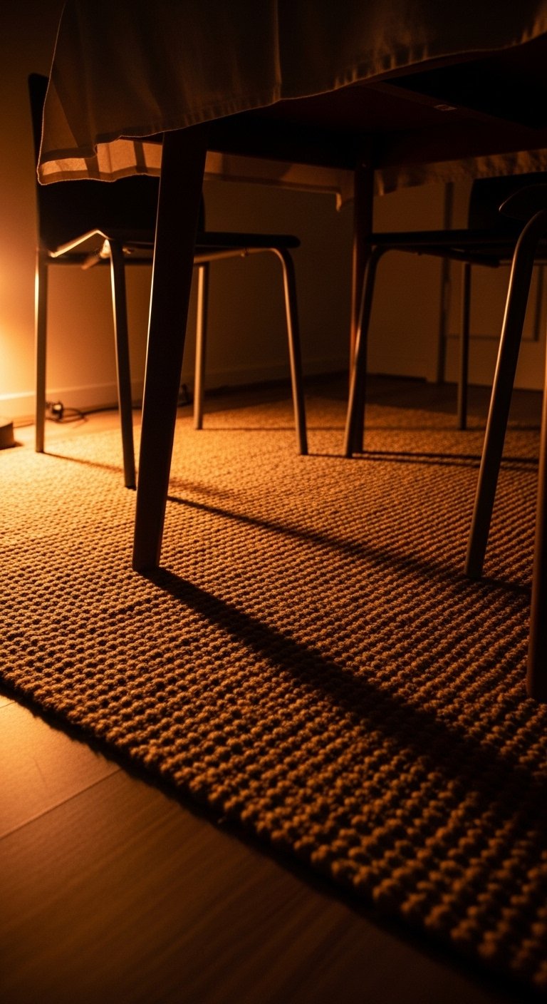
Most people skip the floor and then wonder why a room feels unmoored. I bought an 8×10 jute rug and it tied the kitchen to the breakfast nook. The rug is coarse underfoot and cool in summer, which balances the smooth, warm wood of the counters. If you have a small kitchen, choose a runner instead, about 2 feet wide and long enough to cover the prep zone. The tactile contrast between natural fiber and smooth tile made the whole room feel calmer. Side note, if you have cats, jute catches claws fast. I switched to a low-pile wool runner where mine sit.
Step 3: Layer in soft textiles and weighted objects, not more stuff
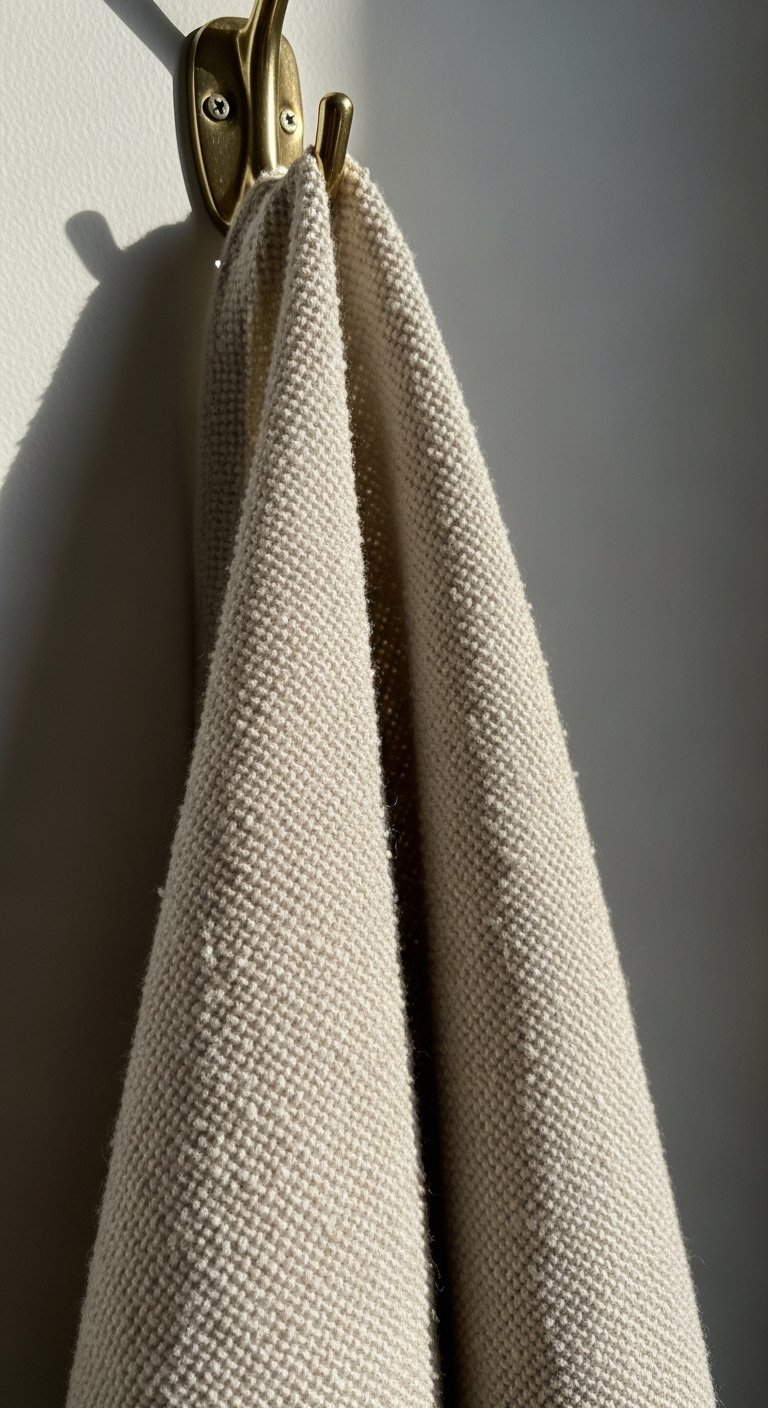
This is the step where the kitchen stops being styled and starts feeling lived in. Add one chunky tea towel in linen for a nubby, cool-to-the-touch layer and a small 12 to 14 inch ceramic vase for visual weight. I used a matte white vase that feels pleasantly heavy in your hands, and a wool seat cushion that breathes. Resist filling every shelf. Leave about one third of an open shelf empty so the objects around it breathe. My first arrangement looked crammed because I was afraid of empty space. Walk away for ten minutes when you think it is done, then come back and remove the first thing you notice.
Step 4: Use contrast and scale, place the tallest item at two-thirds height
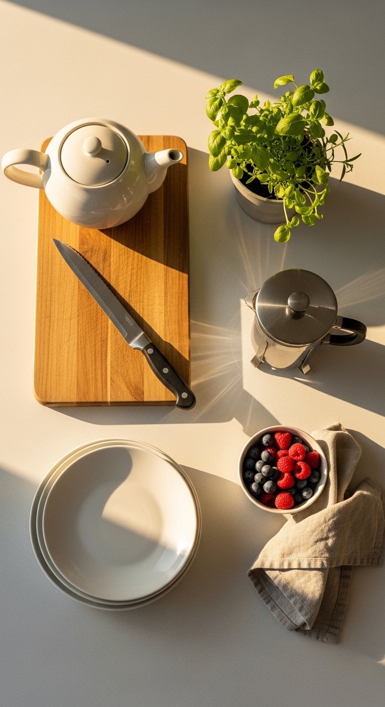
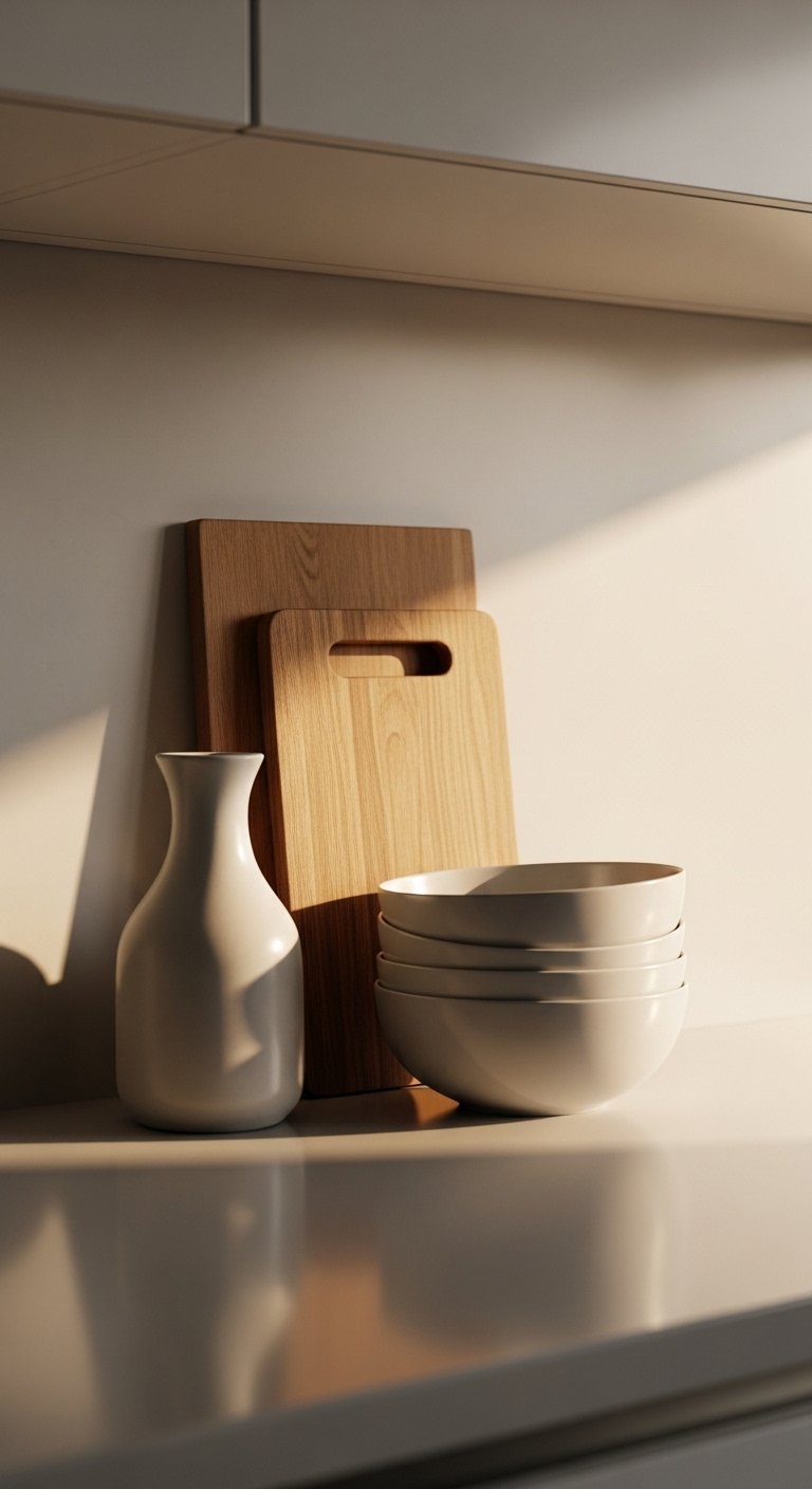
Most people start with the biggest item, but I learned it works better to plan scale first. Place the tallest object so its top falls near two thirds of the vertical visual plane. That might be a 18-inch cutting board or a 14-18 inch vase. Group items in odd numbers for the shelf and counter clusters, like three jars or five cookbooks. The visual result is balanced tension, not symmetrical stiffness. Common mistake: matching every metal finish. Mixing a little brass with matte black creates depth without fuss. I admit I hesitated over mixing metals, then it became the detail that made the palette feel intentional.
Step 5: Control light and finish choices so colors read calm in real life
Paint samples can lie under store fluorescents. Test your chosen colors on a full-size board and view them in the kitchen at two times of day. A warm white with a slight yellow undertone reads inviting in morning and stays soft under bulbs. Pick finishes that match the room function, like washable eggshell on lower cabinets and matte on walls. If your kitchen has little natural light, add a warm bulb with a color temperature around 2700K to keep cool greens from looking gray. I got the lighting wrong the first time and had to repaint the lower cabinets a tad warmer.
Your Kitchen Calm Shopping List
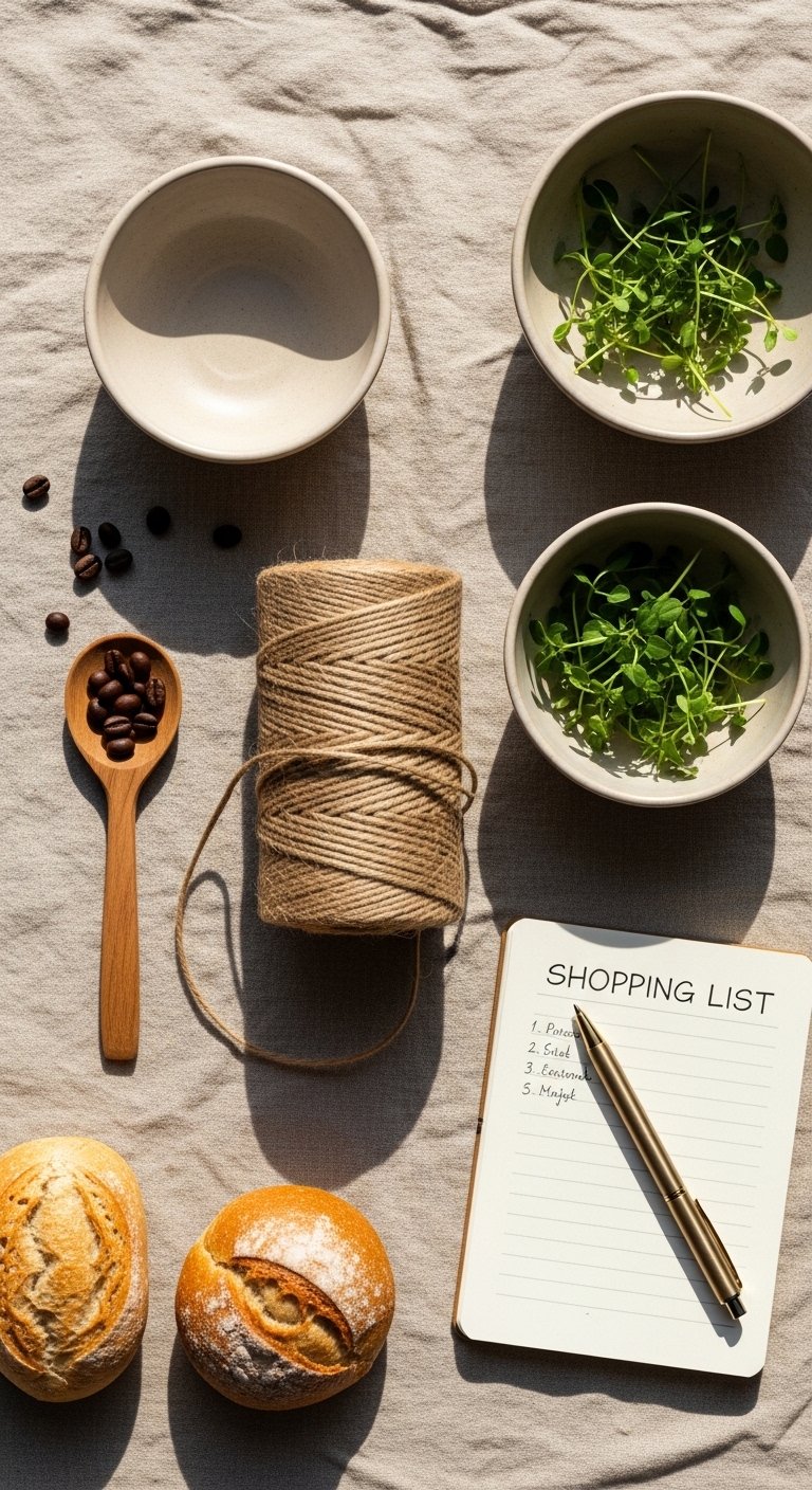
- Chunky linen tea towels in oat, set of 2 ($18-30). Used in Step 3 to add texture and a soft drape.
- Jute area rug, 8×10 ($90-160). Anchors the breakfast nook in Step 2.
- Matte ceramic vase, 14-inch white ($25-40). For Step 3, gives physical weight and a quiet focal point.
- Sage cabinet paint sample, 8-ounce ($6-12). Handy for testing color in Step 1.
- Wool seat cushion, 16-inch round ($30-55). Adds comfort and texture mentioned in Step 3.
- Brass hook set, 4-pack ($12-22). For hanging towels and adding subtle warmth in Step 4.
- Warm white LED bulbs, 2700K, 6-pack ($15-30). Ensures colors read calm as in Step 5.
- Small wooden cutting board, 18×10-inch ($20-45). For scale and two-thirds placement in Step 4.
Why Your Color Choices Look Different at Night
Light temperature changes how paint reads. A cool-grey green can look soft and sage in daylight but shift toward gray under cool bulbs. I once loved a sample at noon and hated it by eight pm. To avoid surprises, tape your sample in the morning and check it again in the evening under the bulbs you plan to use. If you have low light, pick colors with a warm base and add tactile elements like linen or wood. Those textures keep a palette feeling human even when the color shifts.
Making This Work in a Small Kitchen
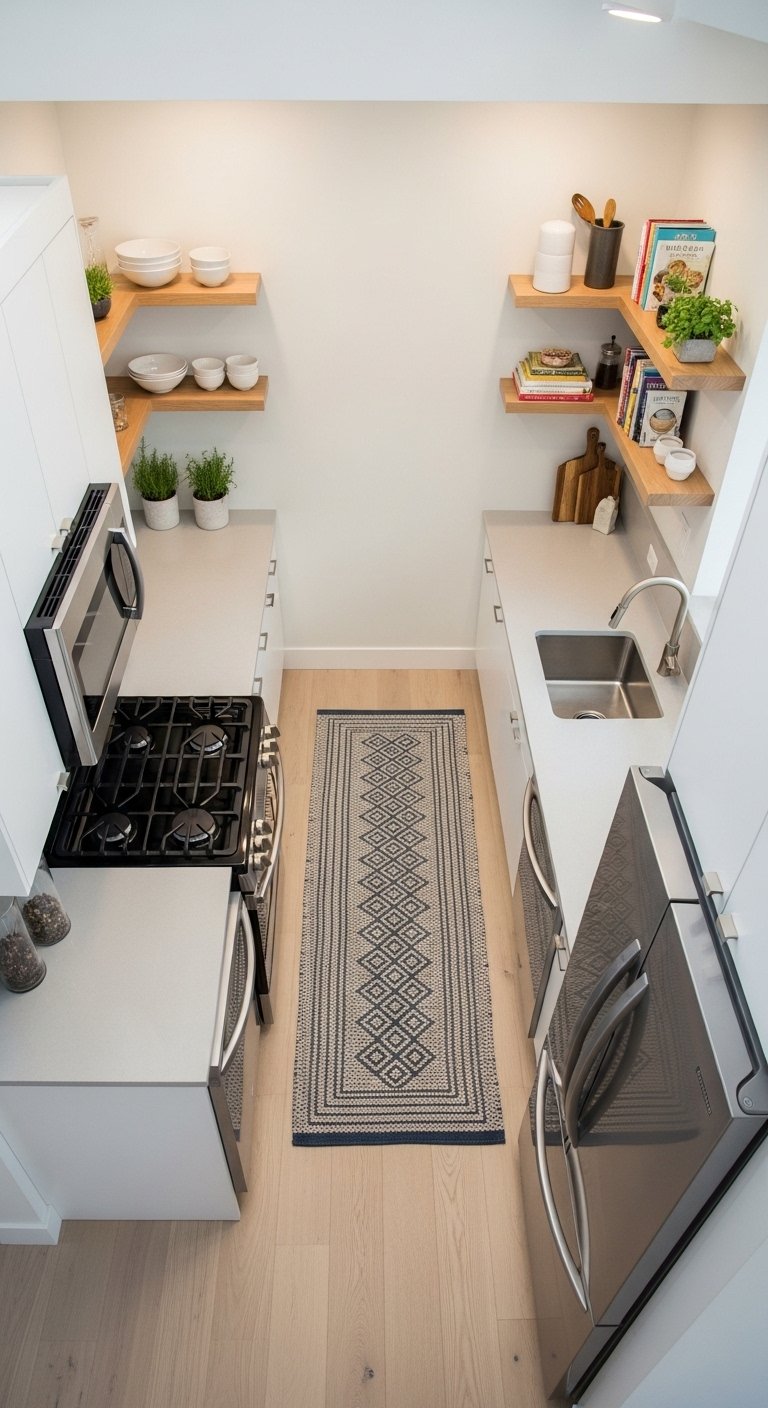
A small kitchen needs the same calm rules but scaled down. Choose a single secondary color for cabinets or just an island. Keep counters clear by using vertical storage and limit decorative items to three per visible zone. Use a runner about 6 feet long in front of the sink and leave one open shelf zone empty to prevent visual clutter. I used a 2-foot wide runner and one empty shelf above the toaster, and the space instantly felt larger and more breathable.
What Week One Looks Like with Kids and Pets
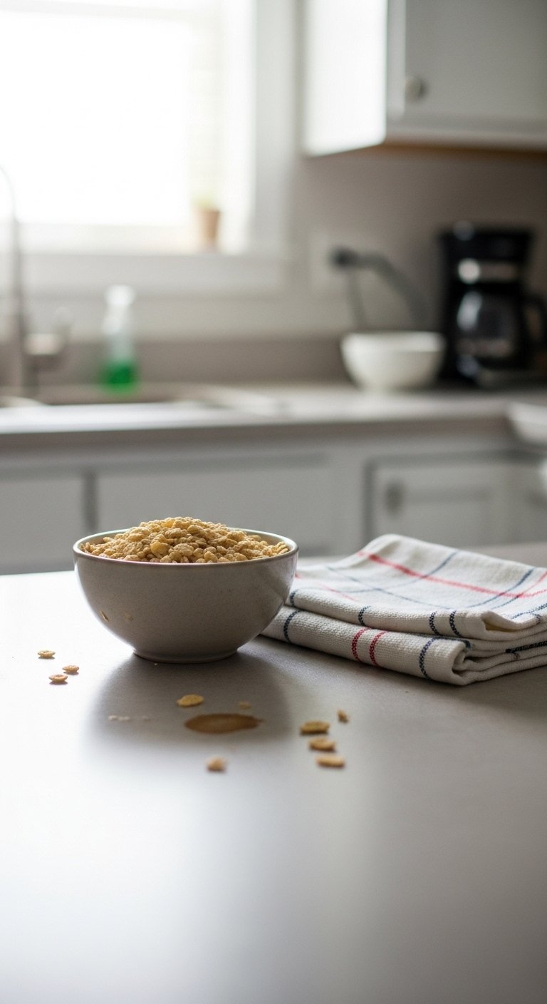
Reality test is important. Expect crumbs and a towel tossed on a chair. That is normal. To keep the calm look with kids and pets, store breakable accents on higher shelves, use washable textiles that feel soft but hold up, and choose rounded edges where accidents are common. After one week I moved fragile ceramics up and swapped a delicate linen for a heavier, washable cotton-linen blend. It still looks calm and now survives real life.
Start with One Counter
Pick one counter or one shelf to practice on. Keep your 60 percent, 30 percent, 10 percent in mind, add one textile, one weighted object, and one functional item. My first successful version was just a single breakfast nook counter with a jute runner and a ceramic vase. It was low effort and proved the method, which made me confident to repeat it elsewhere. Begin small, live with it for a week, then make one tiny tweak if it still feels off.