
My living room had nice furniture and decent lighting but it still felt like a waiting room. Took me embarrassingly long to figure out it was missing texture. Every surface was smooth, every color was flat, and nothing invited you to actually sit down. I started with small, cheap fixes and slowly swapped in art and layers until the space finally felt like home.
These ideas lean modern cozy with a handful of boho and vintage touches. Most projects are under $75 and many are renter-friendly, with a few splurges around $150. These tips work for living rooms, reading nooks, or any wall that looks timid and needs personality.
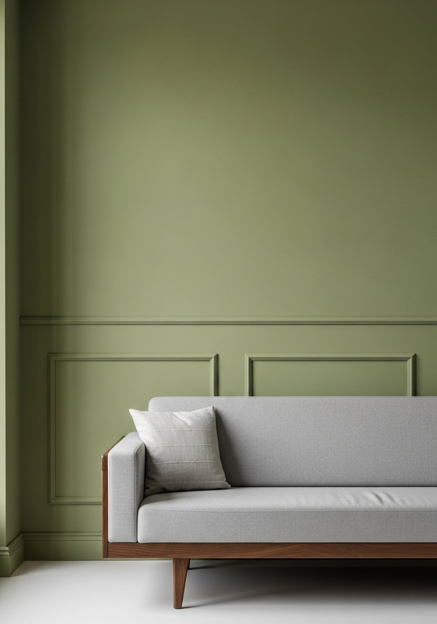
Layered Neutrals With One Warm Accent
The moment I draped a chunky knit throw over the arm of my gray sofa, the whole room stopped looking flat. Start with an 80/20 color ratio, 80 percent neutrals and 20 percent one warm color like rust or ochre. Use a chunky knit throw in cream and two 22-inch linen pillow covers in the accent color for balance. Most people buy all new cushions at once. Try swapping one pillow at a time to see how the color reads in real light. A good rule is three different textures across the sofa, the rule of three makes the setup feel intentional.
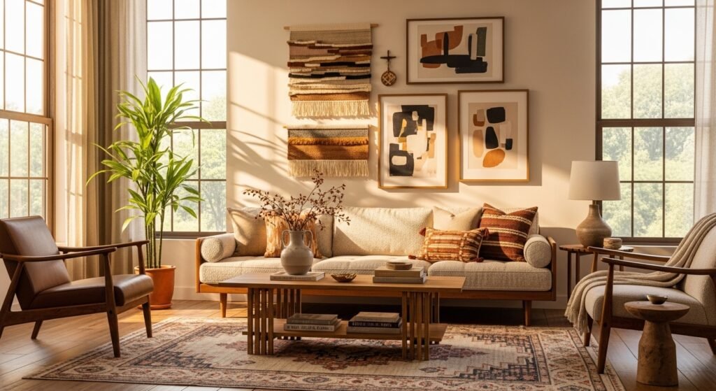
Gallery Wall With Mixed Frames Over Sofa
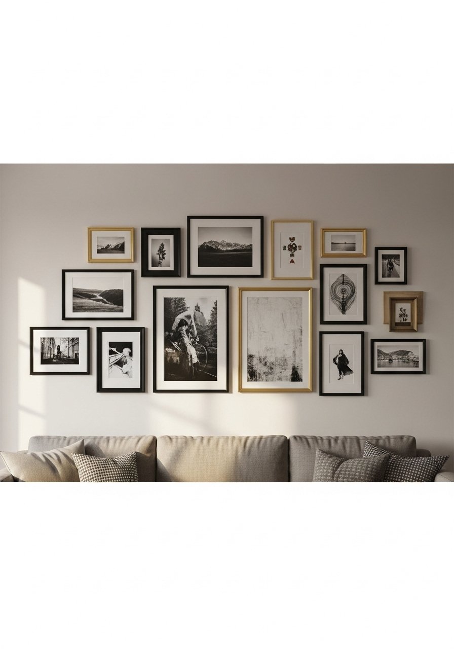
I built a gallery over my sofa using frames in three sizes and one consistent mat color. Aim for the total grouping width to be about 70 to 75 percent of the sofa length. I used mixed metal frames so the wall reads collected, not matchy. A common mistake is spacing pieces too far apart. Keep internal gaps around 2 to 3 inches. Painter's tape on the wall to map the layout first saves so many re-hangs. Pair this with the floating shelf idea later for casual swaps.
Floor-To-Ceiling Curtains To Add Height
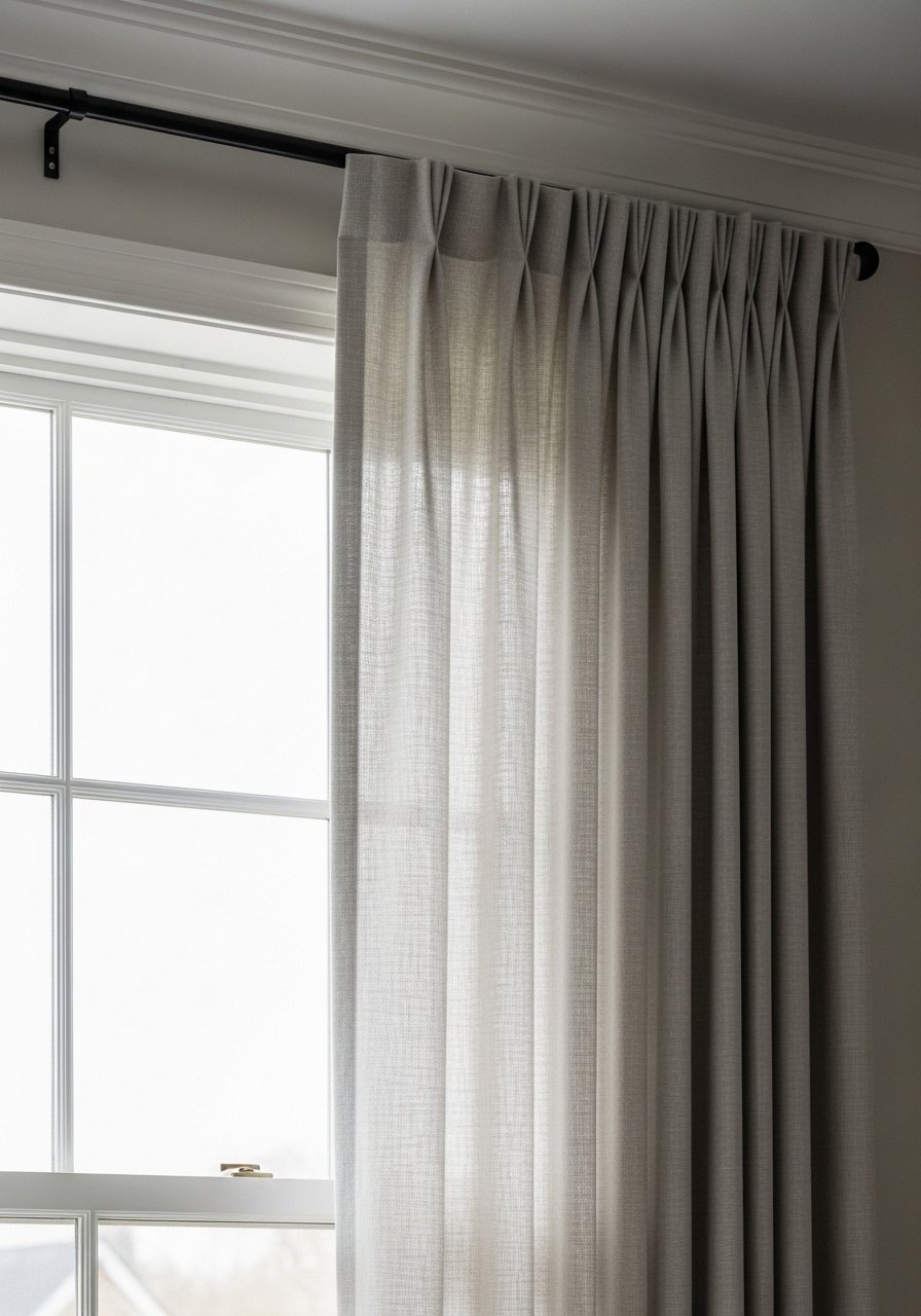
Most people hang curtains right at the window frame. That is why their rooms look shorter than they are. Hang panels 4 to 6 inches above the trim and let them either kiss the floor or puddle slightly if your ceilings are high. For 8 to 9 foot ceilings, these 96-inch linen panels are a safe bet. Budget friendly rod sets in matte black read modern, not cheap. If you have a narrow window wall, use two panels per side to get thick, full folds that frame the view without blocking light.
Oversized Mirror To Brighten Dark Corners
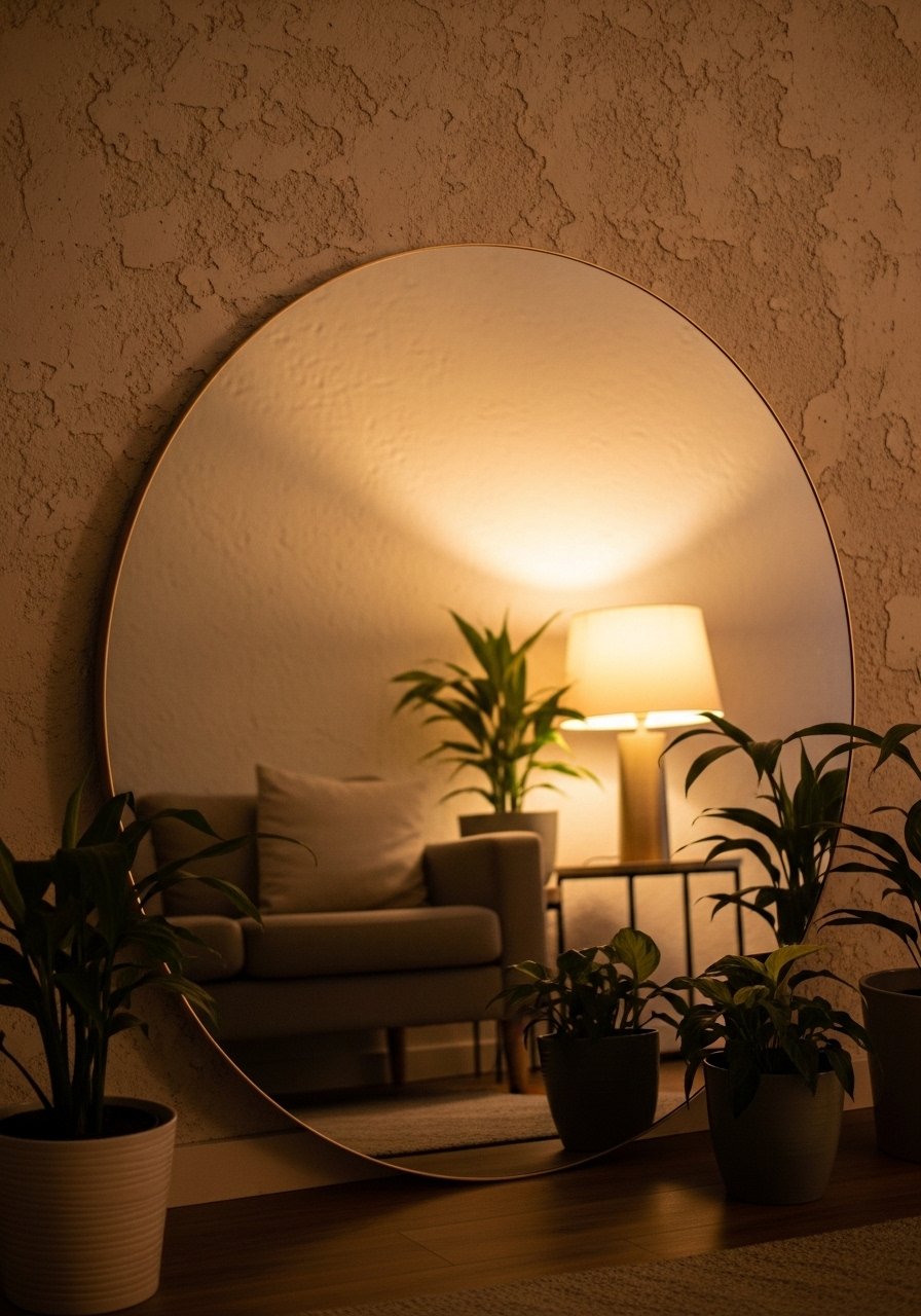
An oversized mirror made a back corner of my living room feel like it had another window. Leaning a 30 to 36 inch mirror on the floor feels more relaxed than hanging it. I used a large round mirror with thin brass frame to bounce light into the seating area. People often hang mirrors too high. The center of the mirror should sit roughly at eye level, not above it. This trick works great in narrow apartments when you need visual breathing room without repainting.
Floating Shelves Styled For A Lived-In Look
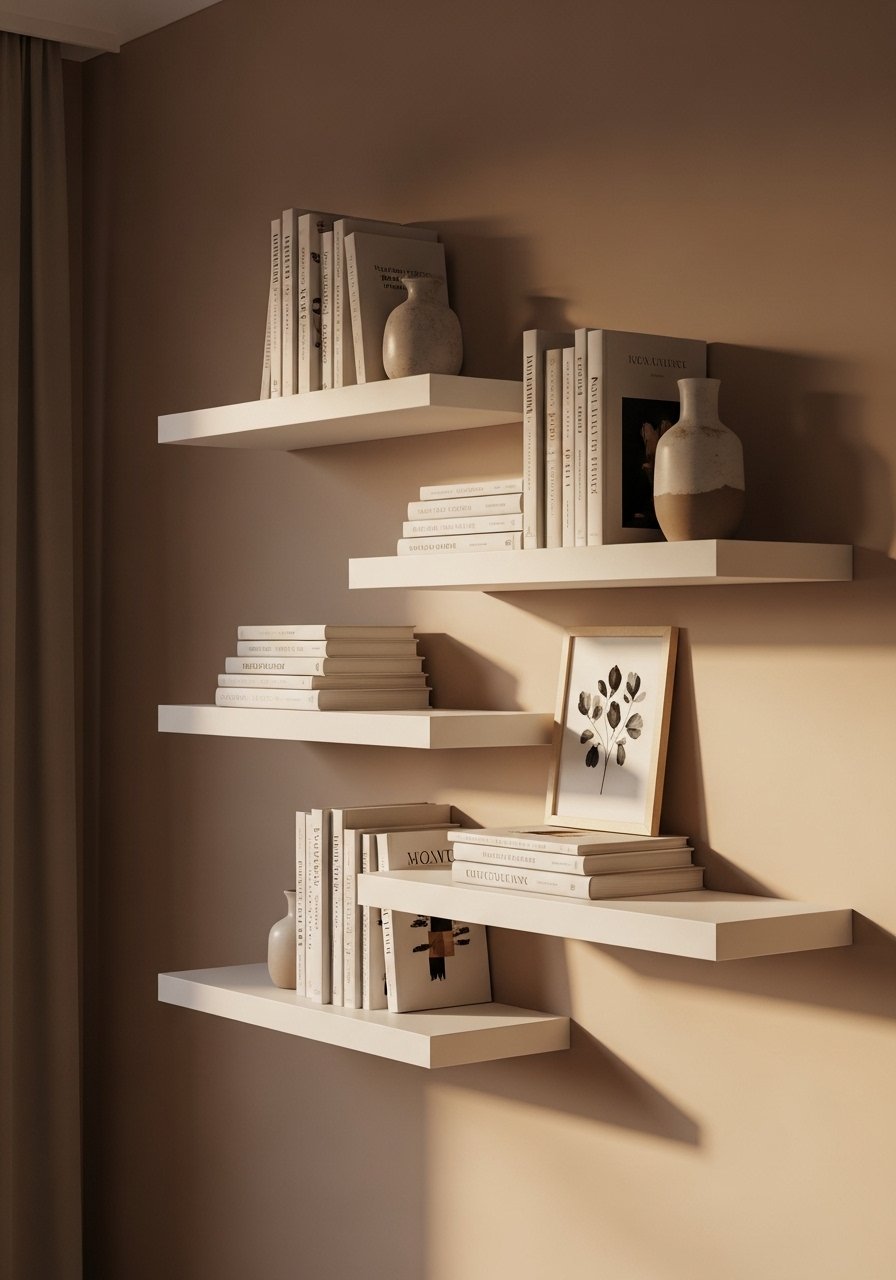
I switched from a crowded bookcase to two thin floating shelves and the wall instantly felt edited. Keep one shelf about 6 to 10 inches above the other. Use odd numbers for objects and leave breathing space. These white floating shelves are under $30 each and can be anchored with drywall anchors if you have plaster. A common mistake is lining up book spines by color only. Instead, stack one book horizontally and top it with a small plant to break the lines. Pair with the gallery wall above for a balanced focal area.
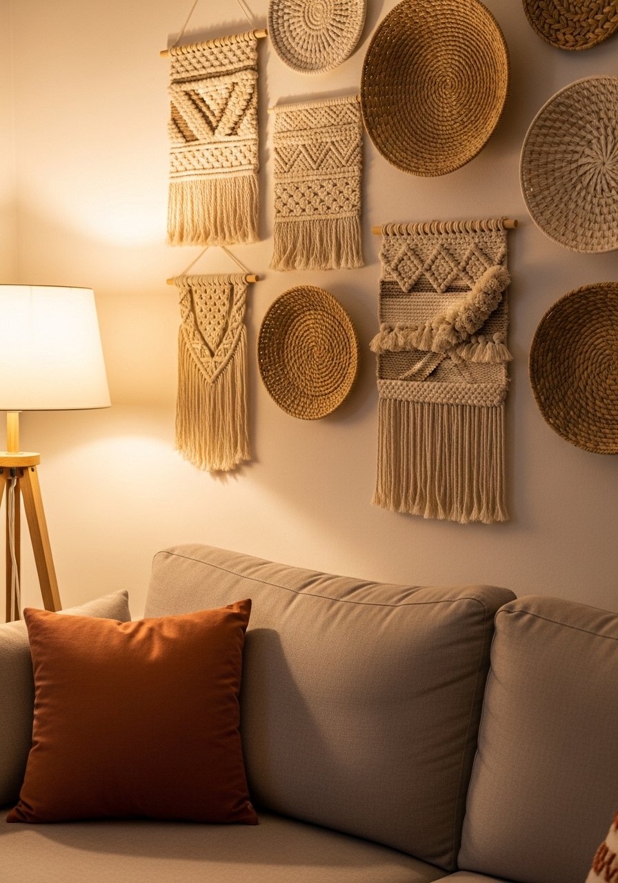
Textured Macrame For A Boho Cozy Corner
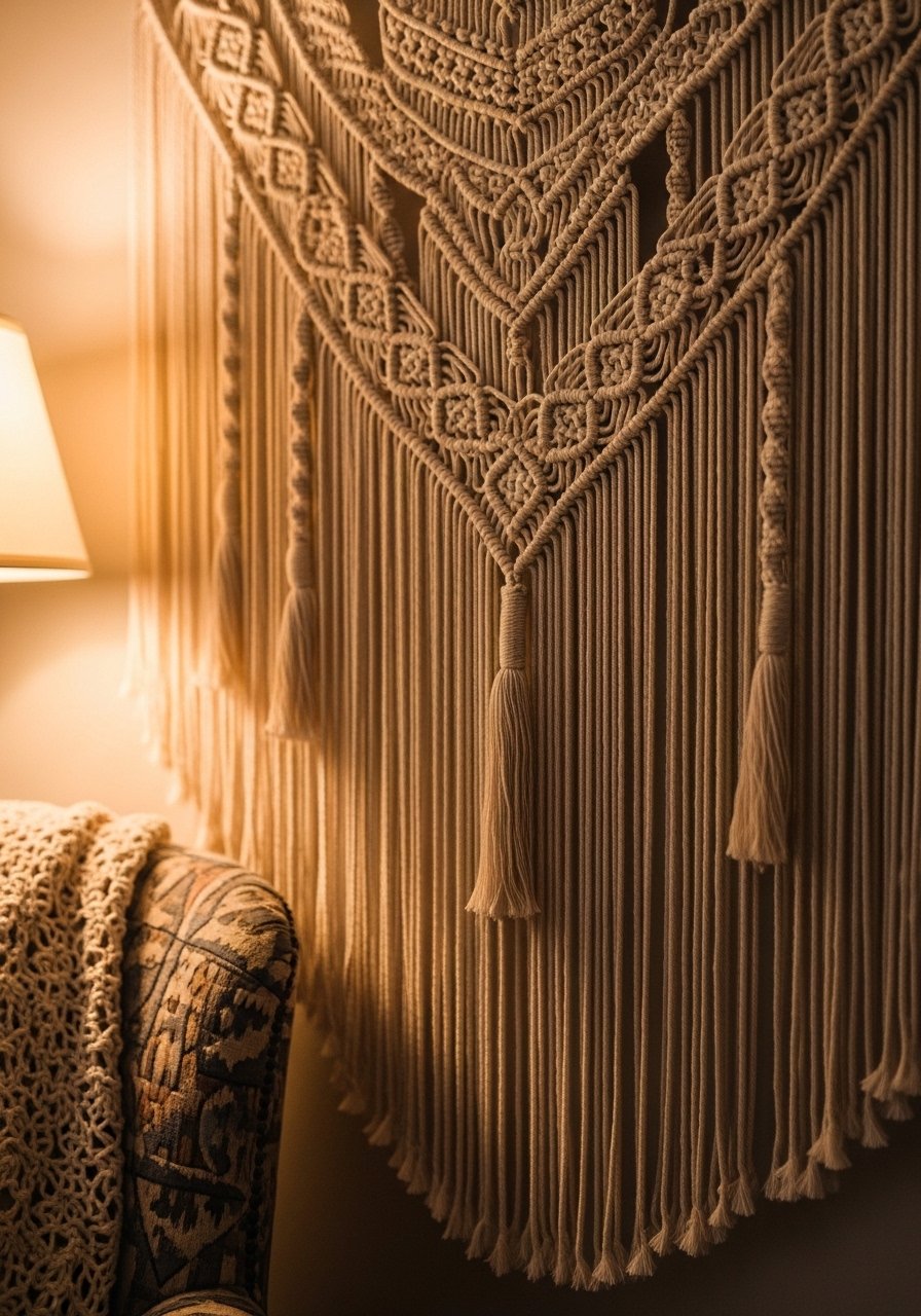
There is something about a reading nook with layered pillows that makes you want to cancel your plans. A macrame wall hanging gives instant tactile interest, especially on an otherwise blank wall. I picked a piece about 30 inches wide to sit over my armchair. For a budget pick try this handmade macrame wall hanging. The mistake I see is choosing one too small for the seating area. Match the hanging width to the chair back or side table so it reads proportional. Works well in eclectic, boho, and modern cozy rooms.
Large-Scale Abstract Canvas For Minimal Modern
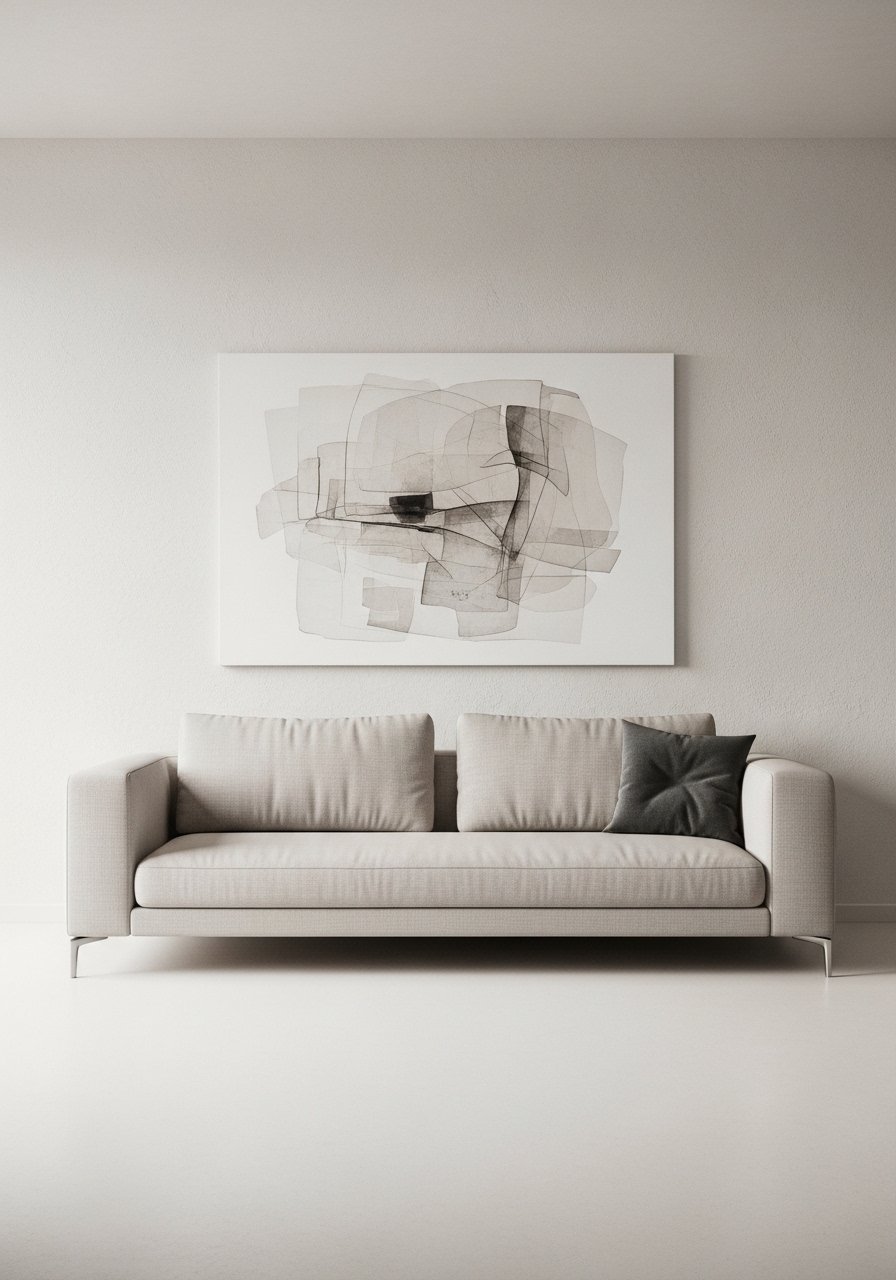
I spent weeks picking small prints before I finally bought a single 40×60 inch abstract canvas and stopped overthinking. One large piece can anchor a low-profile modern sofa where smaller frames would get lost. Try this large abstract canvas print if you want modern flair without mixing frames. A pitfall is hanging art too high. For seating walls, the bottom of the frame should sit 6 to 8 inches above the sofa back so the art feels connected to the furniture. Big scale makes rooms feel considered.
Framed Fabric Panels For Color Without Paint
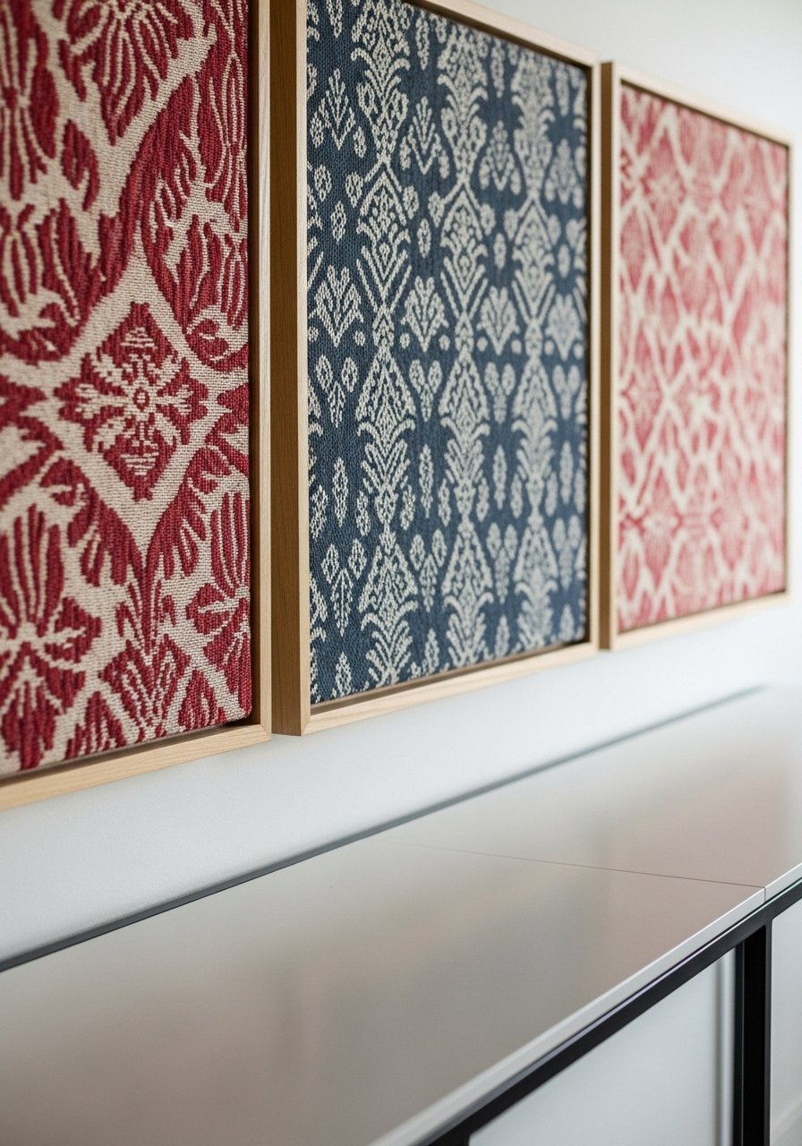
Painting a feature wall felt heavy in my rental, so I framed bold fabric instead. Use deep wooden frames and staple the fabric to foam board so the piece is lightweight. I used three 18×24 inch frames with different but related patterns to stick to the rule of three. These wood picture frames are easy to assemble. The trick is picking fabrics that read well from six feet away. Avoid small ditsy prints unless you want a vintage feel. This is renter-friendly and reversible in minutes.
Brass Ledge Shelves For Easy Rotating Art
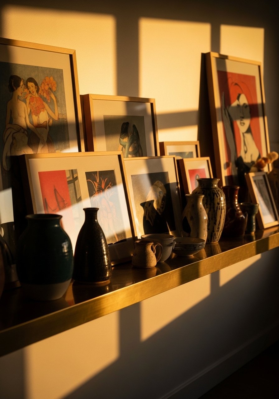
I found these brass picture ledges and stopped patching new holes every time I changed my mind. Ledges let you layer small frames, tilt canvases, and add a sculpture like you would on a mantel. I used two 24-inch ledges above my console. These brass picture ledges are under $25 and make swapping seasonal art painless. A common error is cramming them with items. Leave one or two empty inches so each object has breathing space. Pair with the gallery wall to mix permanent and temporary displays.
DIY Neon Script Art For A Fun Focal
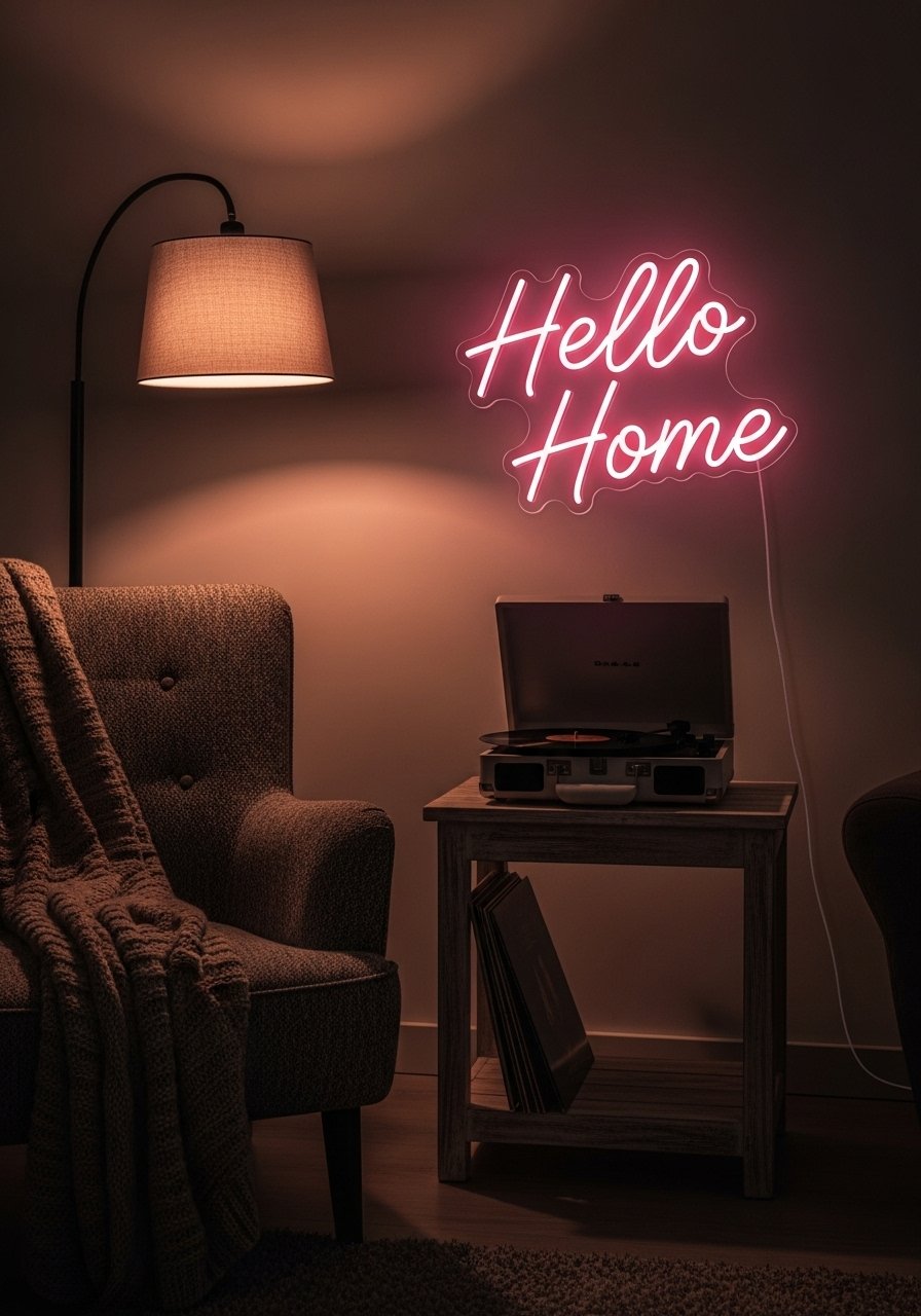
I wanted a playful wink over the bar cart so I made a neon script on a thin plywood back. You can buy pre-made LED neon signs for under $70 that look surprisingly polished. I used a small LED neon sign in script and mounted it with two hidden screws. The bad move is picking a long phrase that overwhelms the wall. Stick to one to three words. This works best in casual, youthful living rooms or media walls where you want energy without bright overhead light.
Painted Trim Molding For Subtle Interest
I added simple rectangular trim to my blank living room wall and painted it the same color as the wall for a subtle architectural lift. Use quarter-round and picture rail to keep costs low. A 1:1 ratio of frame height to wall height looks balanced when the top of the molding sits about two-thirds up the wall. If you rent, use adhesive trim that can peel off later. For supplies try this paintable trim molding set. People often make the frames too ornate for casual rooms. Simple lines feel more current.
Layered Rugs For Warmth And Pattern
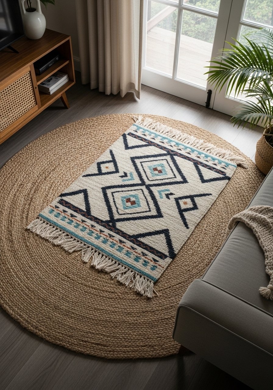
Layering rugs stopped my floor from feeling like a hallway. Start with a large neutral base rug and add a smaller patterned rug that covers the front two-thirds of the sofa legs. I used an 8×10 jute underlay and a 5×7 patterned wool runner. This 8×10 jute rug holds up to traffic and keeps the layered rug from sliding. The mistake is trying to center both rugs perfectly. Offsetting by a few inches often reads more curated. This is a great way to introduce pattern without changing upholstery.
Wall-Mounted Planters For Vertical Greenery
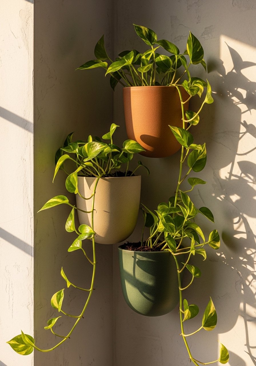
Plants add life but I kept killing them until I put them on the wall where they got light and were out of reach from the cat. Wall planters free floor space and draw the eye upward. Use one large planter 12 to 14 inches across as an anchor, then two smaller ones around it. I used these ceramic wall planters and a low-water succulent mix. A common error is choosing plants that need bright direct light for a north-facing wall. Pick trailing, low-light tolerant varieties or faux greenery if you travel a lot.
Photo Ledge With Mixed Media For Family Walls
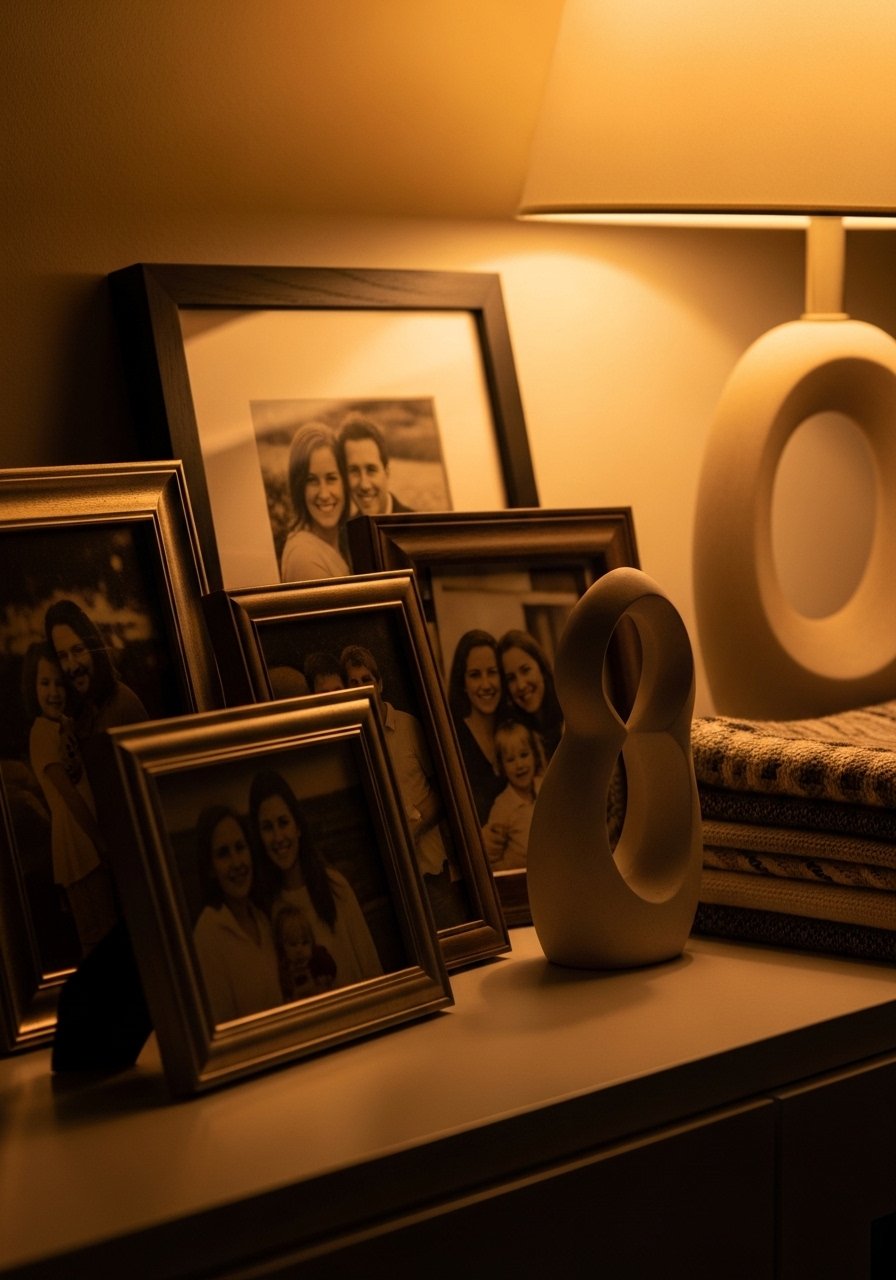
My family wall used to be a cluttered collage of mismatched frames. Switching to a single photo ledge made everything look curated. Mix photos with a ceramic vessel, a small lamp, and one textile to add softness. I keep most frames in two sizes so the ledge reads tidy. Try this picture ledge set for an instant upgrade. A mistake is over-clustering. Leave negative space so the eye rests. This approach works in living rooms that double as hallways where you want photos but also flow.
Statement Clock Wall For Functional Style
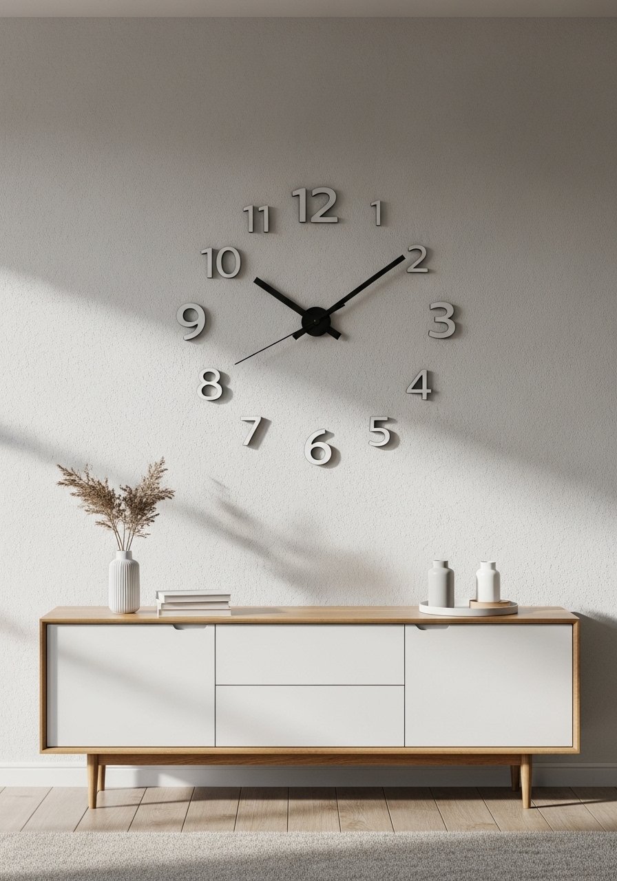
I used to ignore clocks, then I realized a large wall clock is both practical and a strong graphic element. Pick a clock around 24 to 30 inches for a main wall. I went with a black metal face that contrasts with pale walls. This oversized wall clock keeps the room readable and adds scale. Avoid tiny clock faces that get lost against patterned wallpaper. A clock pairs especially well with a console and the mirror trick from earlier for a layered vignette.
Your Decor Shopping List
Textiles
- Honestly the best $40 I have spent, Chunky knit throw in cream (50×60 inches). Drape over the sofa arm for instant warmth.
- Velvet pillow covers, set of 2 22-inch in rust and charcoal (~$30). Swap one at a time for experiments.
Wall Decor
- Mixed metal picture frames set, various sizes (~$35). Good for the gallery wall.
- Large abstract canvas 40×60 inch ($$$). Splurge piece for minimal modern rooms.
- Wood picture frames 18×24 inch for framed fabric panels.
Shelving And Hardware
- White floating shelves 24-inch (~$28 each).
- Brass picture ledges 24-inch (~$22).
Lighting And Mirrors
- Large round mirror 36-inch thin frame (~$120).
- LED neon sign script small (~$70).
Plants And Planters
- Ceramic wall planters 12-inch set of 3 (~$40). Similar at HomeGoods for in-person color matches.
Shopping Tips
White oak beats dark wood in 2026. Design feeds have shifted completely. These white oak floating shelves look current, not dated.
Grab velvet pillow covers for $15 each. Swap them seasonally and the whole room feels different.
Curtains should puddle or kiss the floor, never hang halfway up. These 96-inch linen panels are right for standard 9-foot ceilings.
One large plant beats five tiny ones. If you need height without maintenance get this faux fiddle leaf fig 6-foot.
Measure twice, mark with painter's tape once. Use picture hanging template strips to map gallery walls before you drill.
Frequently Asked Questions
Q: What size art should I hang above my sofa?
A: The grouping should be about 70 to 75 percent of the sofa width. For a single piece pick something 40 inches or wider for a standard three-seat sofa. Keep the bottom of the art 6 to 8 inches above the sofa back so it reads connected.
Q: Can I mix boho textiles with modern furniture without it looking messy?
A: Yes, if you stick to a limited color palette and three textures max on the sofa. Use the rule of three and keep one dominant neutral, one accent color, and one metallic or wood tone to unify the mix.
Q: How do I avoid a gallery wall that looks cluttered?
A: Map it on the floor or use painter's tape on the wall to test spacing. Keep internal gaps to 2 to 3 inches and aim for visual balance by alternating small and medium frames. Use a consistent mat color so pieces read as a set.
Q: What size rug do I actually need for the layered rug look?
A: Start with an 8×10 base in a neutral fiber like jute, then layer a 5×7 patterned rug so the front legs of the sofa sit on the top rug. The smaller rug should cover roughly the front two-thirds area of the seating grouping.
Q: Real plants or faux plants for wall planters?
A: Both have a place. If your wall gets bright indirect light go real and pick pothos or snake plant. For north-facing walls or travel-heavy homes go faux. A single 12-inch wall planter with trailing greenery has more impact than three small tabletop pots.