
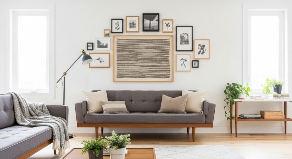
My living room had nice furniture and decent lighting but it still felt like a waiting room. Took me embarrassingly long to figure out it was missing texture. Every surface was smooth, every color was flat, and nothing invited you to actually sit down.
A friend walked into my apartment last month and said "this looks like a real adult lives here." Highest compliment I have ever received. Here is every change I made to earn it, from cheap swaps to layout tricks that mask mistakes.
Layered Neutrals with One Bold Accent Color for Living Rooms
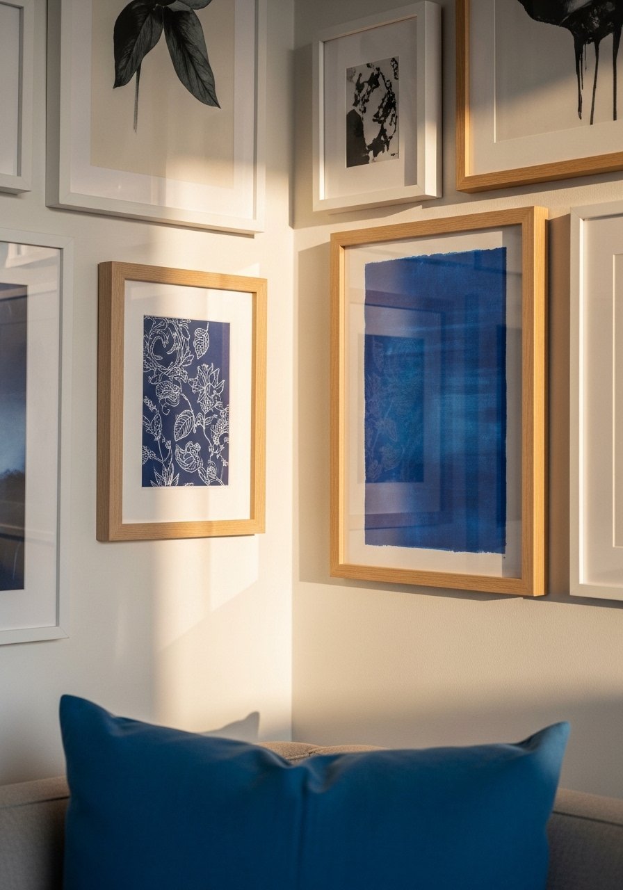
Start with an 80/20 color ratio, 80 percent calm neutrals, 20 percent one strong accent. I used 22-inch linen pillows to echo an indigo print and suddenly the wall stopped reading as a jumble. This works for living rooms and guest rooms and costs under $150 if you shop smart. A common mistake is making every frame the same weight. Mix a 24×36 print, a few 8x10s, and a textile piece for variety. For quick swaps use brass picture ledges so you can move pieces without new holes. In my layout I left 2.5 to 3 inches between frames for balance.
Gallery Wall Using Only Black Frames for Minimalist Bedrooms
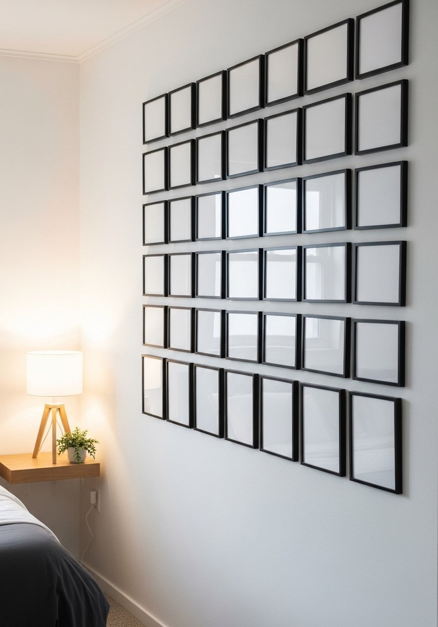
If you like less fuss, a uniform black frame grid reads clean and modern. Pick one size, like 11×14, and hang eight frames in a 2×4 grid centered above a headboard. The rule I follow is center the whole arrangement at 57 inches from the floor to the center of the grid. Budget is low, usually under $100 with thrifted frames or a set of matching frames. People often hang grids too high. Also avoid mixing mats of wildly different widths. For a soft edge try black frames with white mats so photos pop.
Mix Prints and Plants for Cozy Reading Nooks
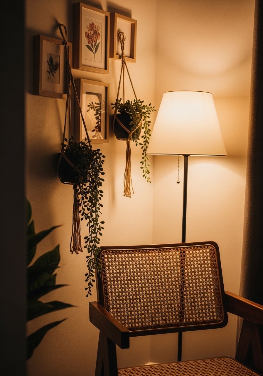
There is something about a reading nook with layered pillows that makes you want to cancel your plans. My trick was to add two trailing plants inside shallow frames and anchor them with a framed quote. This combo makes the space feel lived-in and costs about $50 to $120 depending on plant choice. Common mistake is crowding plants right into frames that block artwork. Leave 1.5 inches clear around a plant pot. Use a mix of faux and real where maintenance is an issue. I swap the tiny pots seasonally to keep the vignette fresh.
Asymmetric Gallery for Entryways with One Large Anchor Piece
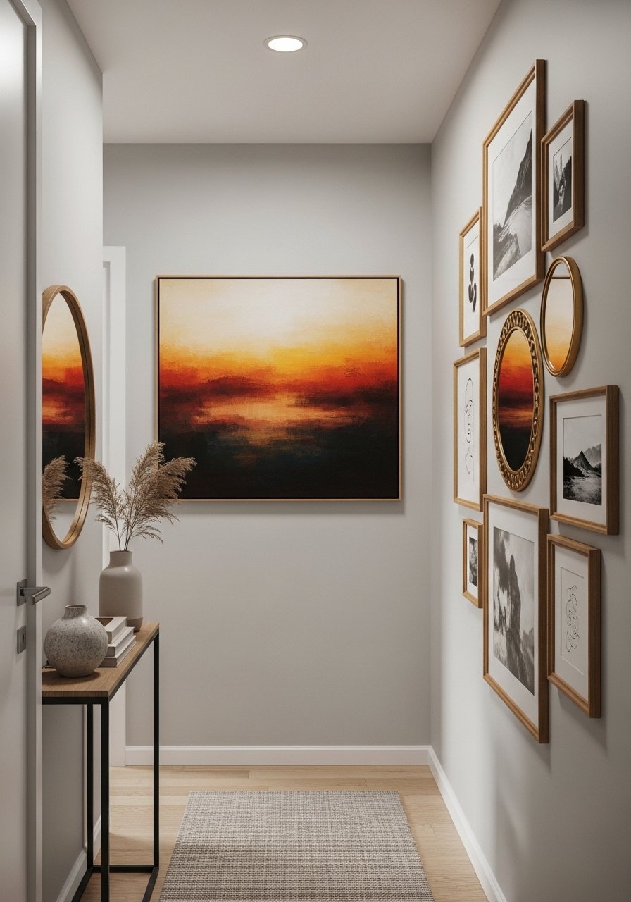
My entryway used to feel like a no-man zone. Putting one 30×40 anchor art piece and clustering smaller frames to one side fixed that. The anchor should take roughly 40 percent of the wall space in the cluster. Expect to spend $60 to $200 depending on the anchor. People make the mistake of centering a cluster on the console instead of on eye line. Center the anchor at 57 inches and let the rest fall off it. For easy swaps try gallery hanging kit with level to avoid crooked frames.
Vintage Mix for Eclectic Dining Areas
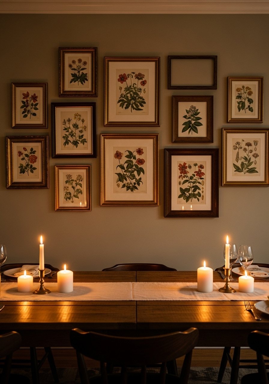
I collect thrifted finds and pair them for dining room galleries. Mixing ornate golds with worn wood looks intentional when you repeat one color across pieces, like faded green. Budget varies but you can do a strong wall for under $100 if you hunt weekend markets. A common mistake is grabbing random pieces without a unifying thread. Choose one repeat element, such as color or subject, and stick to it. I also recommend spacing larger pieces 3 to 4 inches from smaller ones to avoid visual jostling.
Built-In-Look Frames for Rental-Friendly Living Rooms
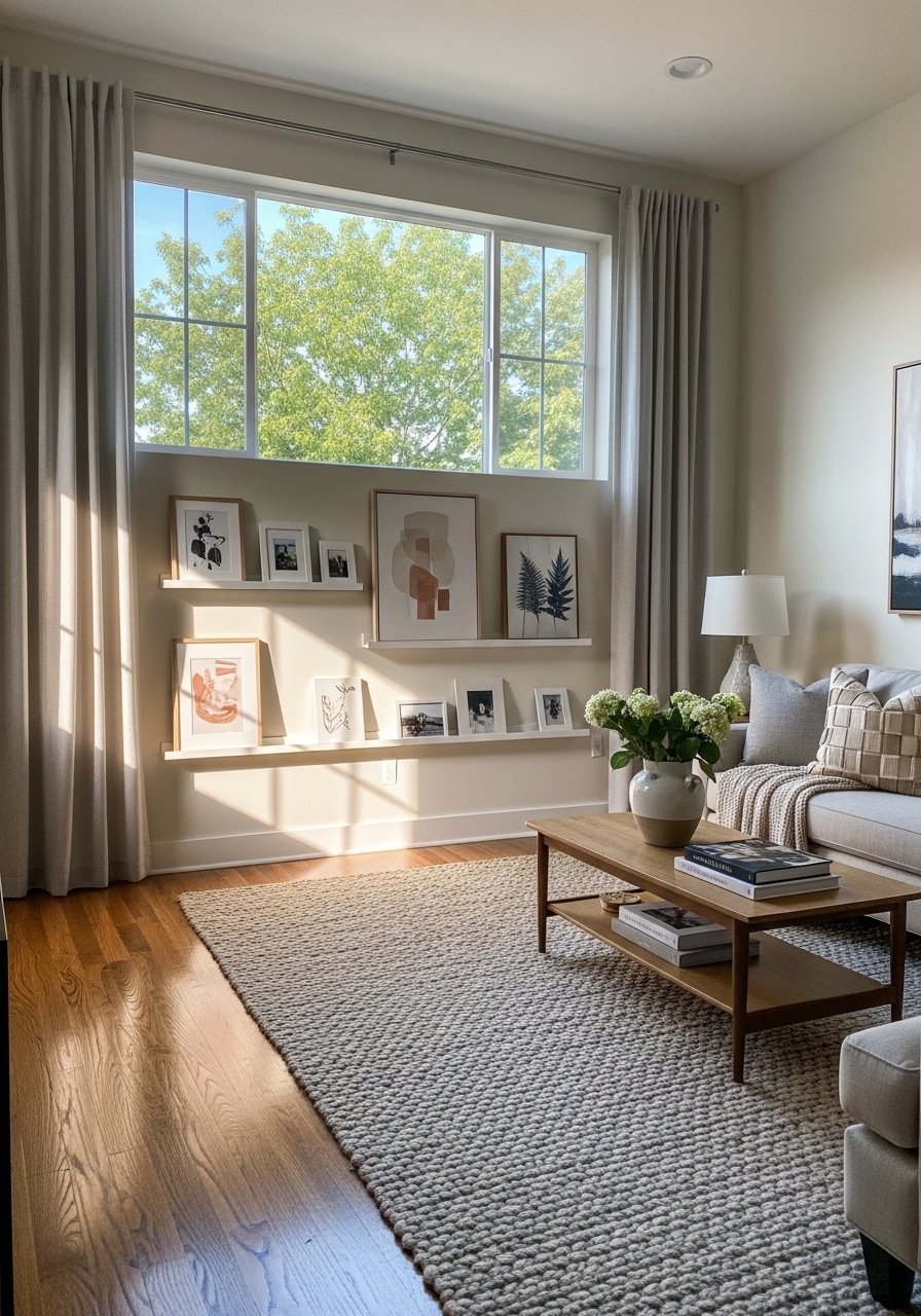
If you are renting, picture ledges create a built-in vibe with no wall damage. I installed two staggered shelves and leaned framed prints, postcards, and a small lamp. It costs about $30 to $80 per shelf. Most people forget to stagger heights on the ledges and everything looks flat. Use the rule of three: stack three object heights and repeat that group across the ledge. For quick buys try floating picture ledges in natural wood so swapping art is painless.
Black-and-White Photo Collage for Hallways
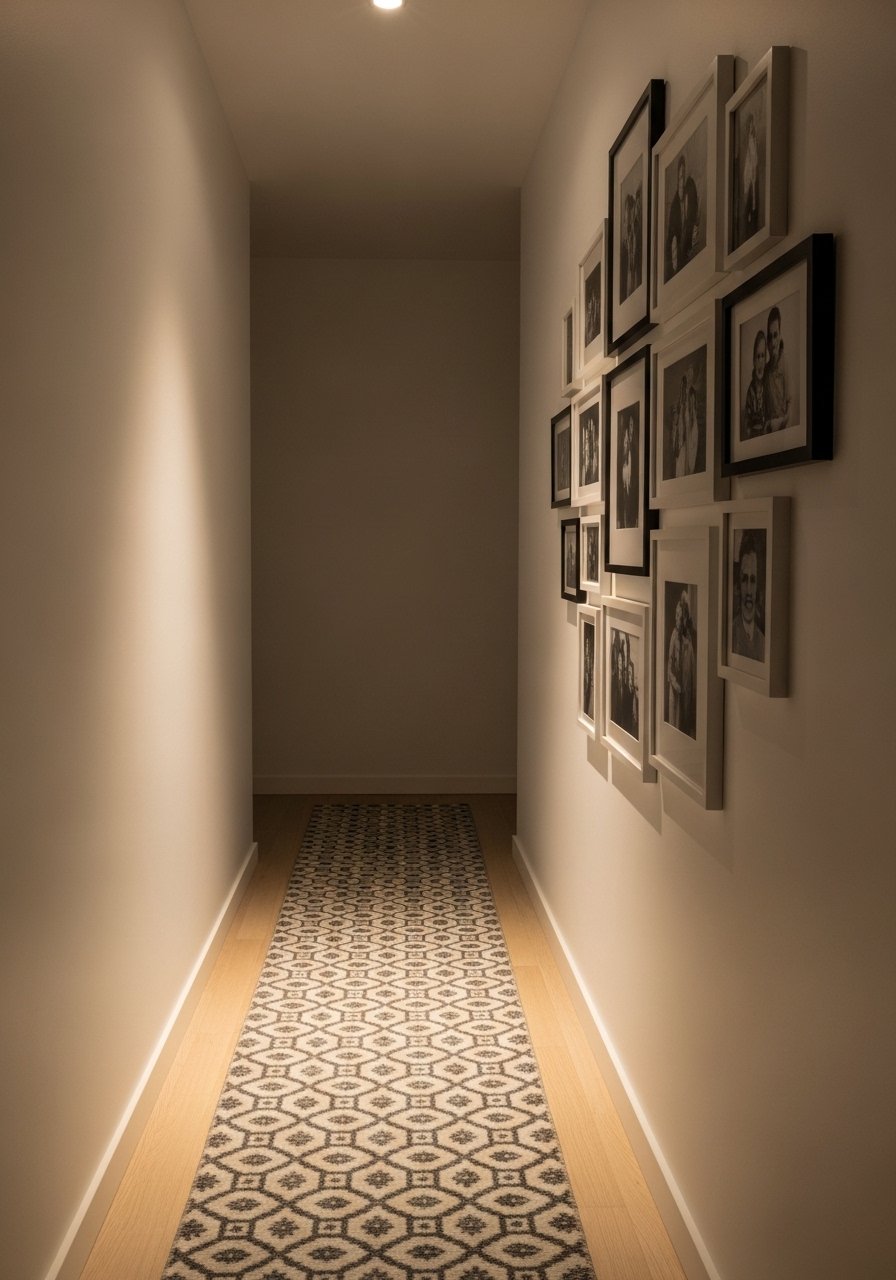
I laid out my family photos in a deliberate collage down our hallway and suddenly the corridor told a story. Stick to black-and-white to reduce visual noise. Keep top and bottom margins equal and use about 2.5 inches between frames. A frequent mistake is making the collage too wide for the hallway which makes it feel cramped. For framing, choose identical mats for cohesion. These frames and prints can be done for under $120 with print services. I used matted photo frames set to speed things up.
Textile-Centered Gallery for Cozy Bedrooms
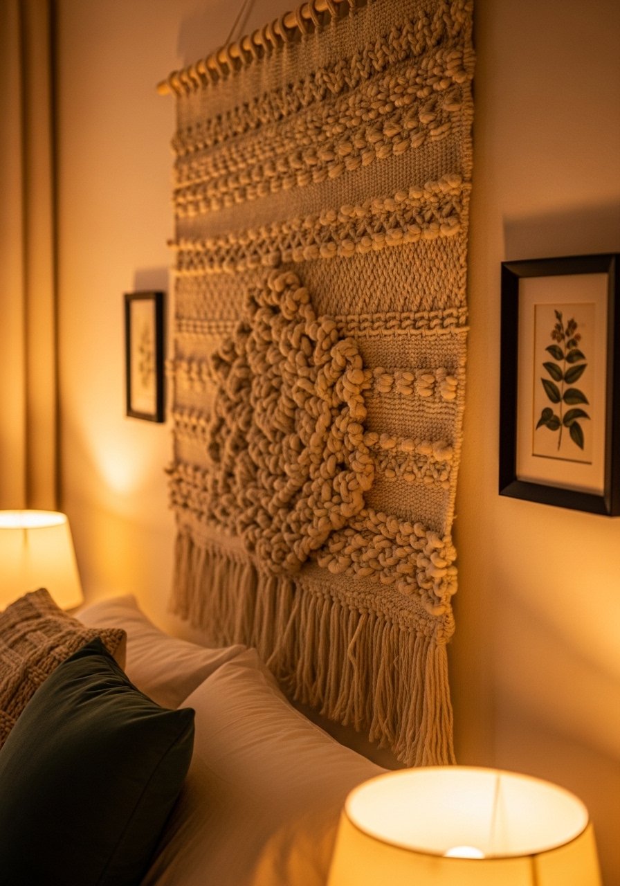
Textiles add real texture in a bedroom where flat art can feel cold. A 36×48 woven or macrame piece anchors the wall and the smaller frames read as accents. Expect to spend $40 to $200 depending on the textile. The mistake I see most is hanging textiles too close to other frames; give them breathing room equal to roughly half the textile width. Also try pairing with a 22-inch pillow in a matching yarn for cohesion. If you need a budget find, handwoven wall hangings are surprisingly affordable.
Mix Metallics for Modern Glam in Living Rooms
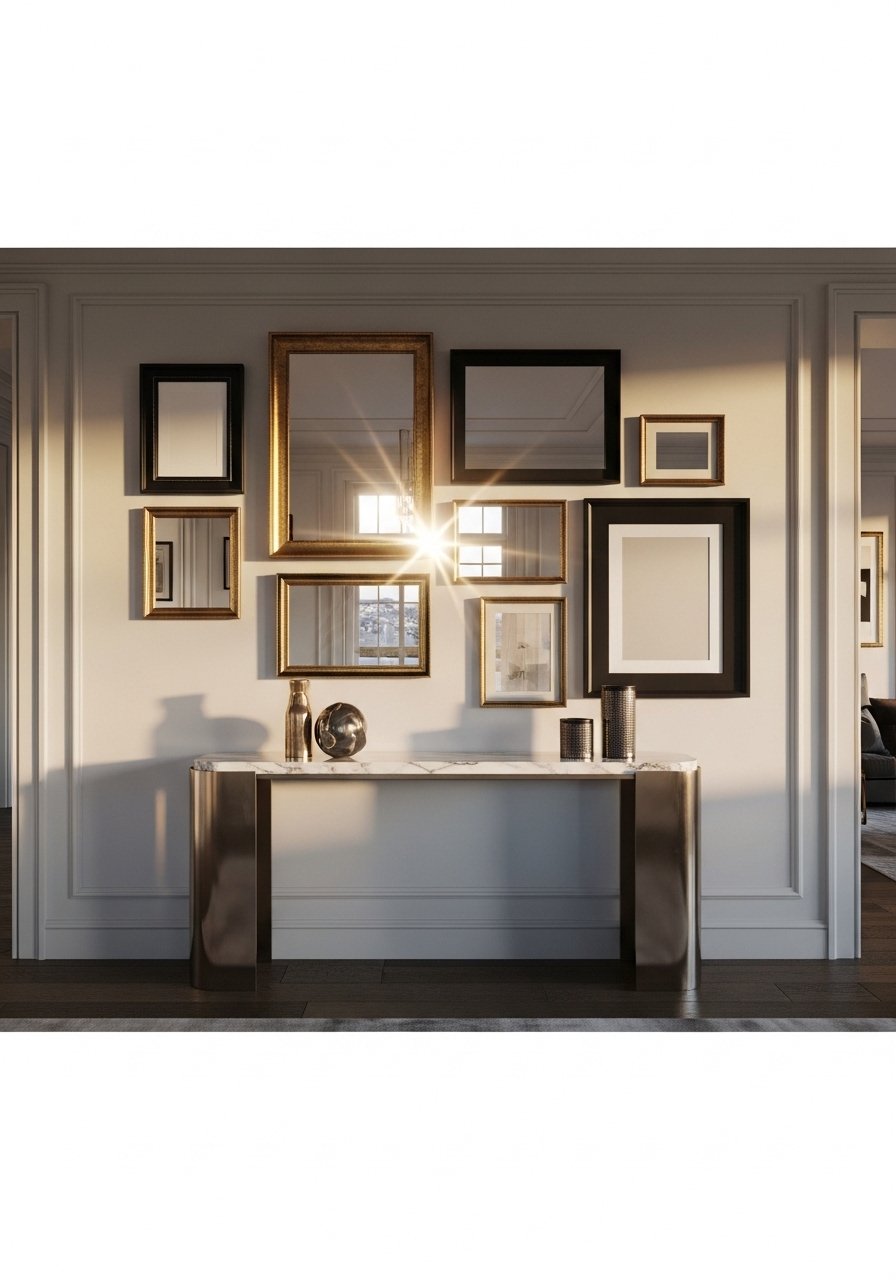
Mixed metallics read intentional if you treat them like neutrals. I balanced brass, brushed nickel, and black by repeating each metal at least twice. This approach works well above a TV or console. Typical budget is $100 to $300. People often try to match every metal and it looks sterile. Instead, let one metal be dominant and use the others sparingly. For frames try mixed metal frames set so you are safe to mix right out of the box.
Oversized Mirror and Gallery Combo for Dark Corners
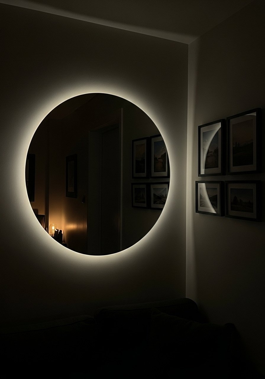
An oversized mirror bounces light and makes a gallery feel intentional instead of cluttered. Place the mirror to reflect a window or lamp. I left 6 to 8 inches between the mirror and the nearest frame to keep the focus. Budget is flexible, $75 to $300. A common error is choosing a mirror without a frame that ties into the rest of the wall. Match at least one frame metal or wood tone to the mirror rim. For an easy pick, large round framed mirrors come in several finishes.
Layered Mats and Tiny Frames for Staircase Runs
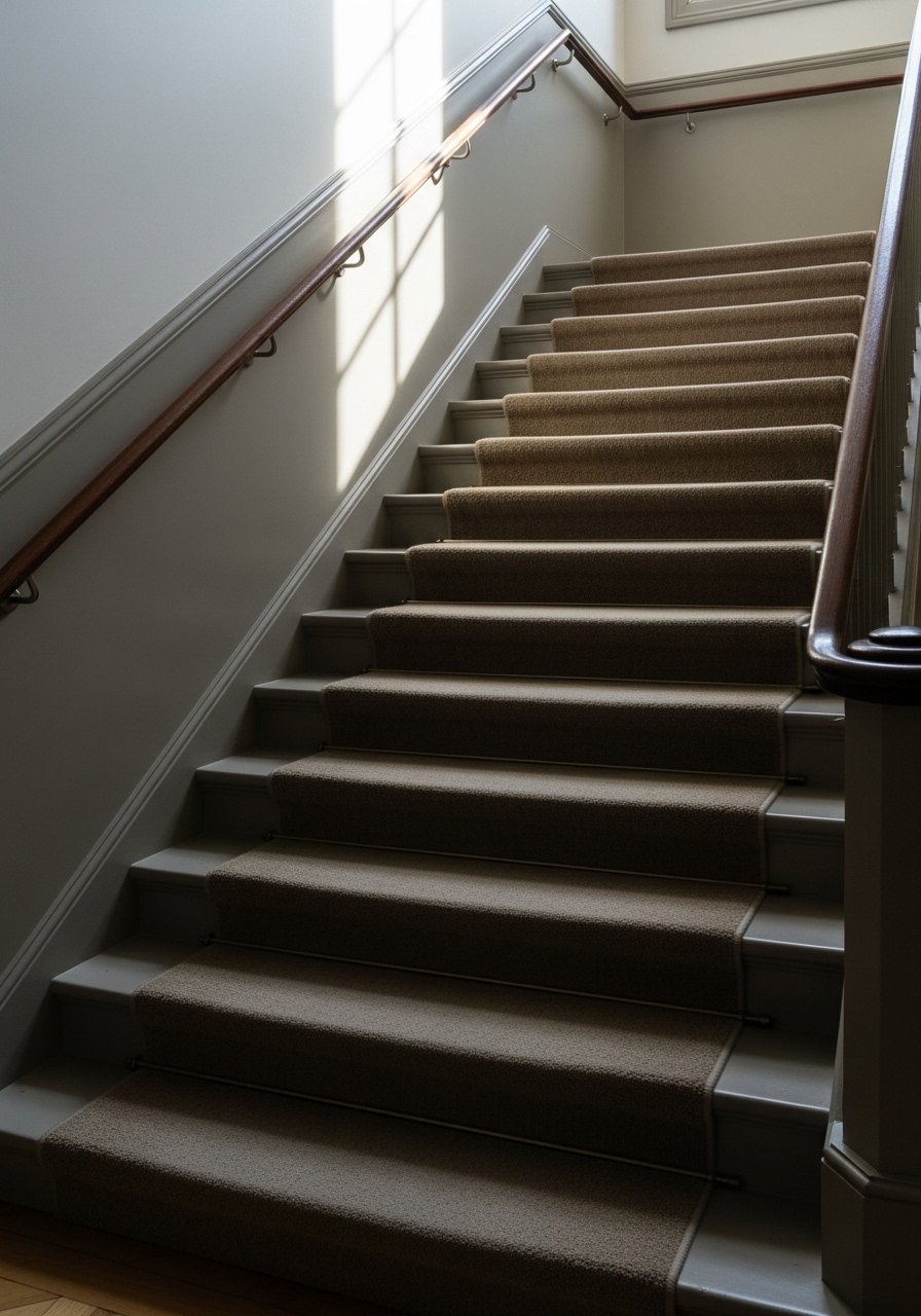
Staircase galleries feel custom when you layer a larger matted print with a smaller frame below it, following the stairs’ rise. Keep the spacing consistent with the stair riser height, roughly 6 to 9 inches between centers. People tend to hang pieces level to the stairs instead of aligned to the viewer, which makes them read messy. I recommend placing the dominant pieces at eye level for the landing then cascading smaller works. For neat mats, use white matted frames set to keep everything looking crisp.
Mixed Media Gallery for Home Offices
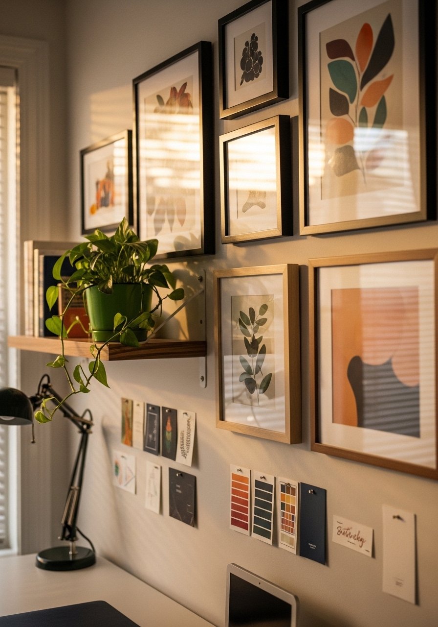
My office felt uninspired until I added a mix of a calendar, art, and a clipboard with rotating notes. This gallery is practical and pretty. Use a 60/40 work-to-decor ratio so function is first. Common misstep is neglecting scale; a tiny frame above a desk disappears. Aim for at least one 16×20 or a 20×20 square to anchor the area. For quick office upgrades try display clipboards set so you can change prints without rehanging.
Patterned Mats for Kid-Friendly Playroom Walls
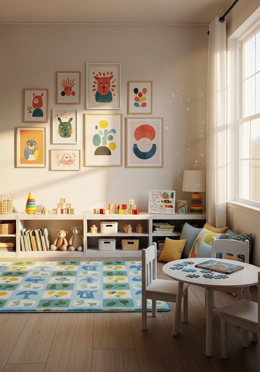
Kids’ rooms can be fun without being chaotic. I switched plain mats to patterned mats that pick up a play rug color and the whole room looked considered. Budget is low, around $40 to $120 depending on prints. People make the mistake of hanging art at adult eye level; for kids, include pieces lower so they can interact with them. Also keep frames shatterproof. I use simple acrylic frames and colorful patterned mats to keep things safe and bright.
Blackboard or Chalk Art as a Rotating Gallery in Kitchens
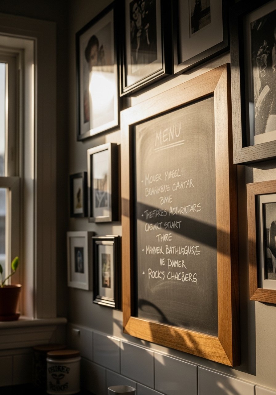
Kitchens beg for rotating content. Install a framed chalkboard and surround it with recipe prints and small herb prints. It makes the wall useful and homey. A typical spend is $30 to $100. Mistakes include using a glossy frame that reflects light and hides handwriting. Choose a matte finish and place the board at counter height. For tools, framed chalkboards work well and let you swap recipes without new holes.
Budget-Ledger Gallery for First Apartments
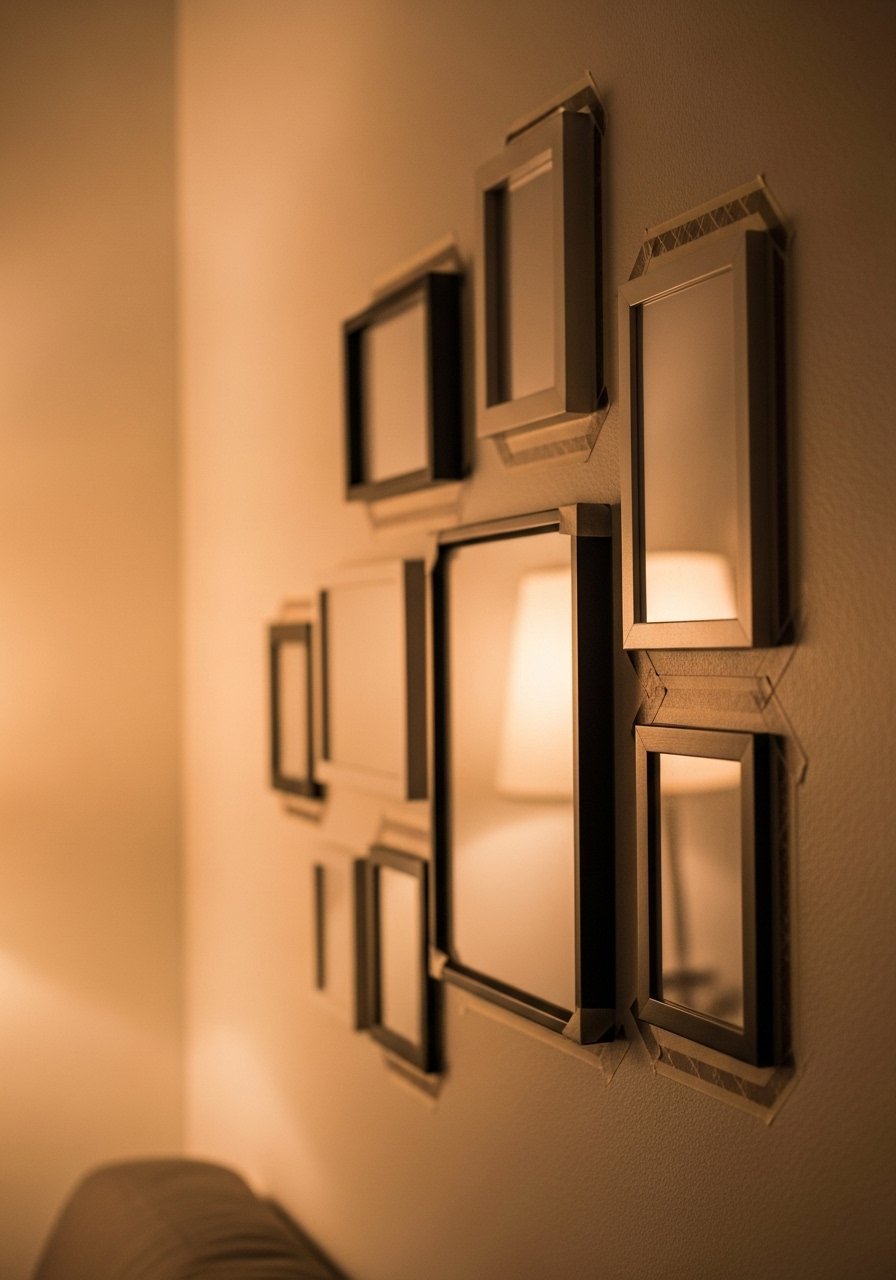
When I moved into my first place I could not commit to nails. I used washi tape to map layouts and bought a set of mix-and-match frames that gave a curated look for under $100. The washi mapping trick saves you from multiple holes. A common mistake is eyeballing spacing. Instead, trace frames on kraft paper and tape them up. If you want ready frames, try affordable frame set with mats that look pricier than they are.
Your Decor Shopping List
Textiles
- Honestly the best $40 I have spent. Chunky knit throw in cream (~$35-55). Drape over a sofa arm for instant warmth.
- 22-inch linen pillow covers, set of 2 in neutral gray and indigo, down-fill recommended.
Wall Decor
- Brass picture ledges (~$18-30) for renter-friendly rotating displays.
- Black frames with white mat, set of 6 (11×14) for cohesive grids.
Lighting and Mirrors
- Large round framed mirror, 30-inch to brighten dark corners.
- Framed chalkboard for a kitchen rotating gallery.
Plants and Planters
- Faux fiddle leaf fig, 6-foot for height without maintenance.
- Hanging planters, set of 2 for integrating greenery into small galleries.
Budget Finds
- Affordable frame set with mats (~$40-80) for first apartments.
- Gallery hanging kit with level to avoid crooked frames.
Shopping Tips
White oak beats dark wood in 2026. Design feeds have shifted completely. These white oak floating shelves look current, not dated.
Grab these velvet pillow covers for $12 each. Swap them every season and the room feels different without a major expense.
Curtains should puddle or kiss the floor, never hang halfway up. These 96-inch linen panels are right for standard 9-foot ceilings.
Everyone buys five small succulents. One single 6-foot fiddle leaf fig has ten times the visual impact.
Use kraft-paper templates taped to the wall before committing. Painter's tape and kraft paper roll will save you from holes and awkward rehangs.
Frequently Asked Questions
Q: What size should I make my gallery above a sofa?
A: Aim for the gallery to be about two-thirds the width of the sofa. Leave 6 to 8 inches between the top of the sofa and the bottom of the lowest frame. If in doubt, create a kraft paper template first so you can see the scale.
Q: Can I mix boho textiles with modern furniture without it looking messy?
A: Yes. Repeat one color across the textiles and frames to tie things together. I often use a single accent color on a throw pillow and a small print to make the mix feel intentional.
Q: How far apart should frames be hung for a curated look?
A: For a curated but airy look leave 2 to 3 inches between frames in clusters, and 3 to 4 inches when mixing large and small pieces. Consistent spacing reads cleaner than random gaps.
Q: What do I do if I do not want lots of nail holes?
A: Use picture ledges or large frames on the floor for rotation. A washi tape layout helps plan before you punch holes. Also consider adhesive-friendly hanging strips for lightweight frames.
Q: Should I match my frames or mix them?
A: Mix them. It looks intentional when you repeat at least one frame finish or one color across the wall. For a quick start get a mixed metal frames set.
Q: Which is better for galleries, real plants or faux plants?
A: Both. Real plants like pothos survive neglect and add scent and life. Use a faux fiddle leaf fig where you need height without the care.