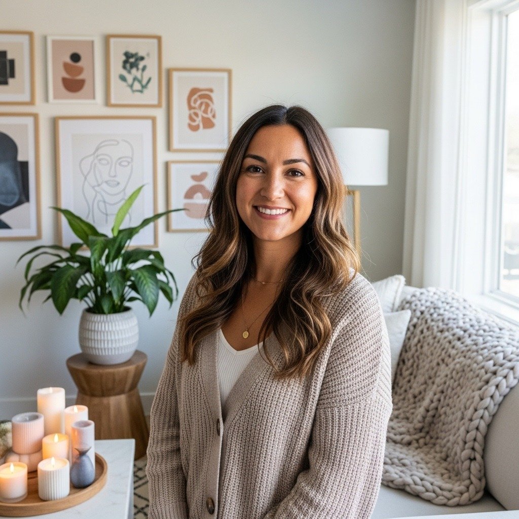
I always decorate my own rooms first, and then fix what I broke. There’s a difference between a Pinterest photo and a space you live in — and I’ve learned the messy, useful route.
These are the trends I actually used, returned, reworked, and kept. Practical, small wins you can bring into a real home.
29 Must-See Home Decor Trends Taking Over Pinterest
These 29 ideas are things I’ve tried in real rooms — the good, the awkward, and the worth-keeping. Each idea is practical, budget-aware, and written so you can picture the exact pieces to buy and what to watch for.
1. Layered Patterned Textiles That Read Cohesive, Not Busy
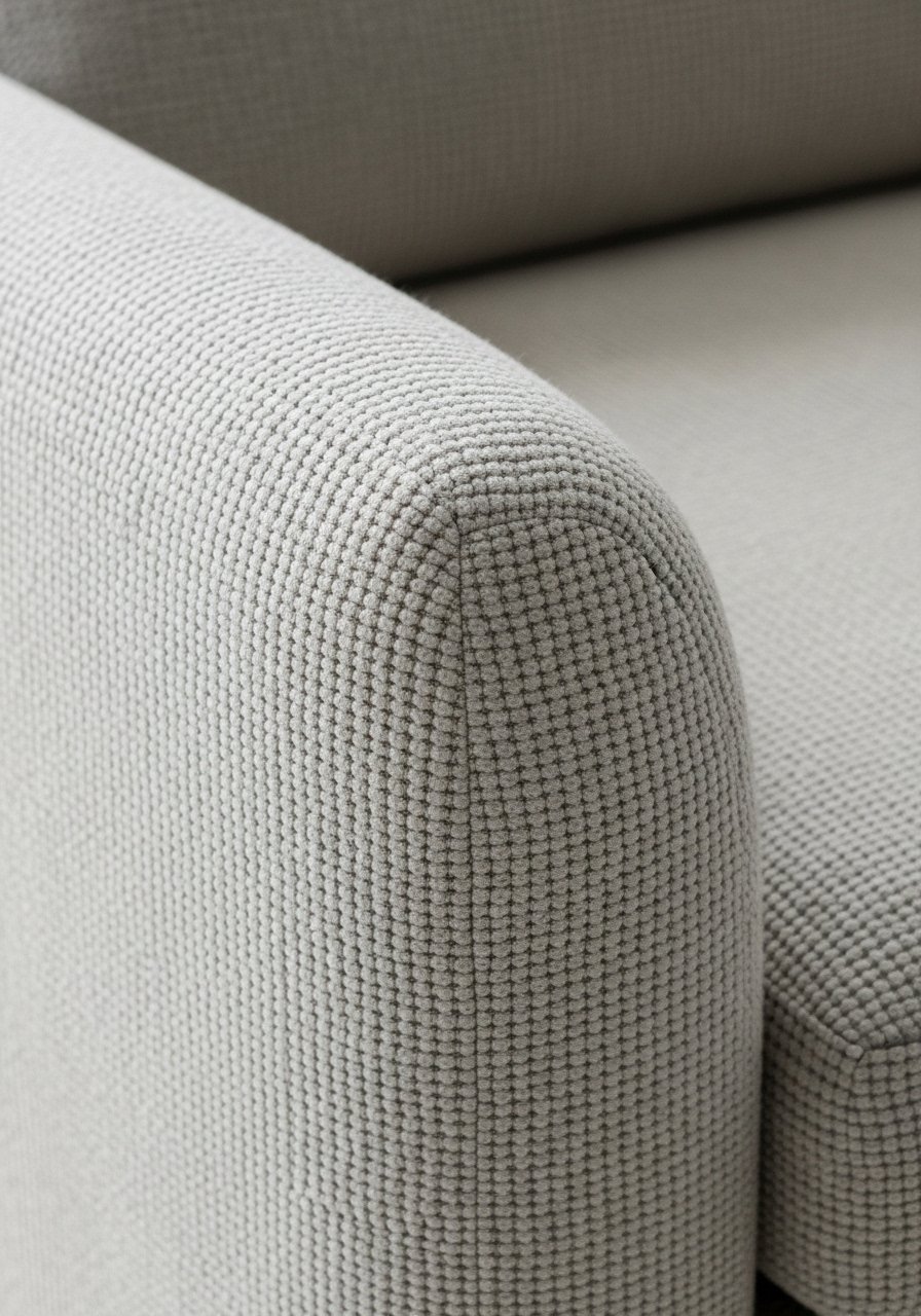
I started layering patterned pillows because my room felt flat. Mixing scale — small geometrics, medium florals, and a large lattice wallpaper — brought depth without chaos. I once put three bold prints in the same hue and it read loud instead of cozy; I swapped one pillow for a solid and it settled.
Pay attention to one unifying color across patterns. Keep texture varied: linen, velvet, woven. It makes the look feel curated, not staged. Small tip: buy removable pillow covers first so you can test mixes.
What You'll Need for This Look
- Velvet patterned throw pillow covers (18×18)
- Peel-and-stick lattice wallpaper sample (small)
- Linen throw pillow covers (20×20, warm beige)
2. Warm Neutral Living Room with Jewel Tone Pops
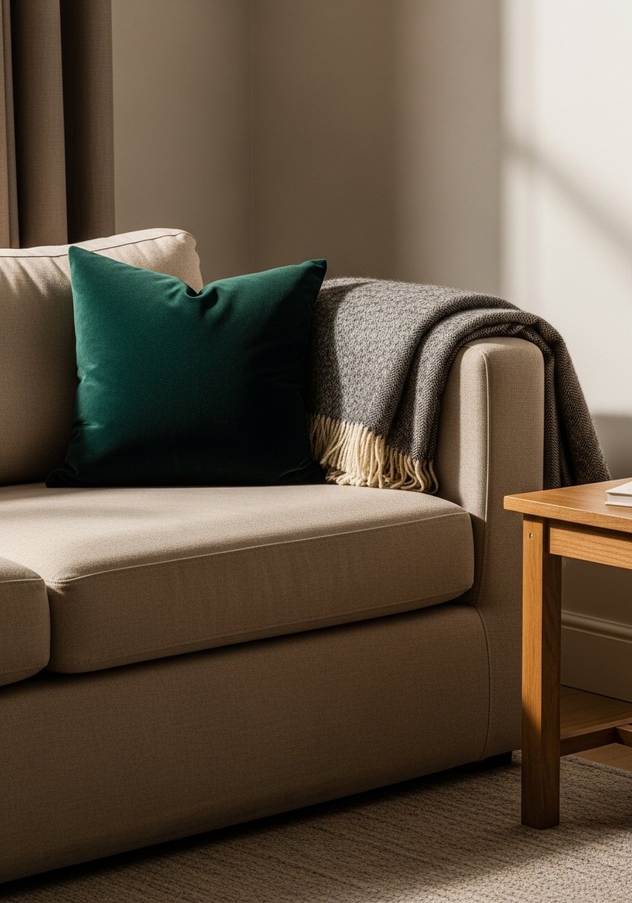
I switched from gray to warm beige and everything softened. Adding a single jewel-tone cushion — emerald or deep sapphire — made the room feel intentional, not sterile. I once bought a bright blue accent that clashed with my wood tones; darker jewel tones read richer and sit better with warm neutrals.
Focus on one jewel accent per seating area. It keeps the palette calm but interesting. The result is cozy and flexible for seasons. My honest tip: test the jewel next to wood before committing.
What You'll Need for This Look
- Warm beige linen throw blanket (50×60)
- Emerald velvet throw pillow (18×18)
- Light oak side table, small
3. Raw Wood Accent Wall for Collected Warmth
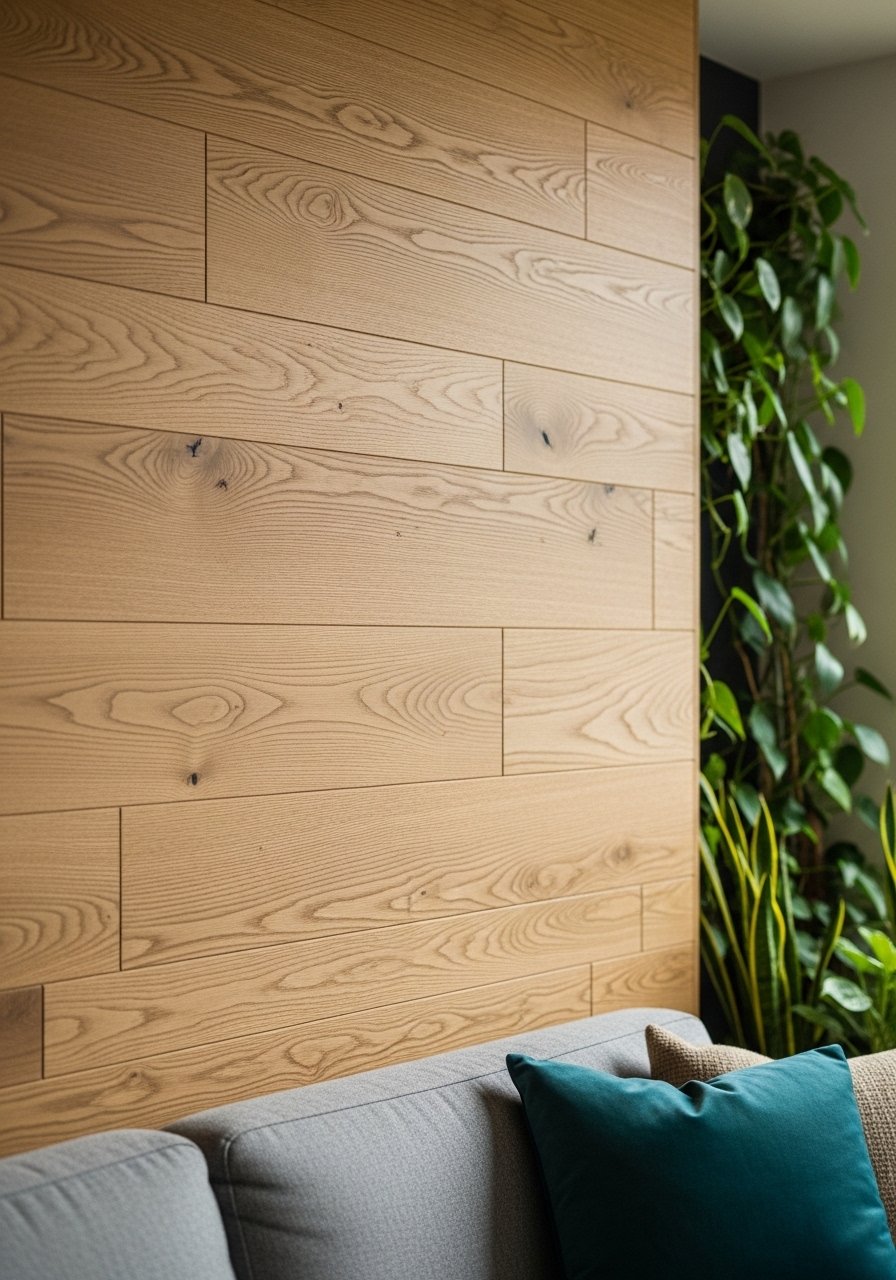
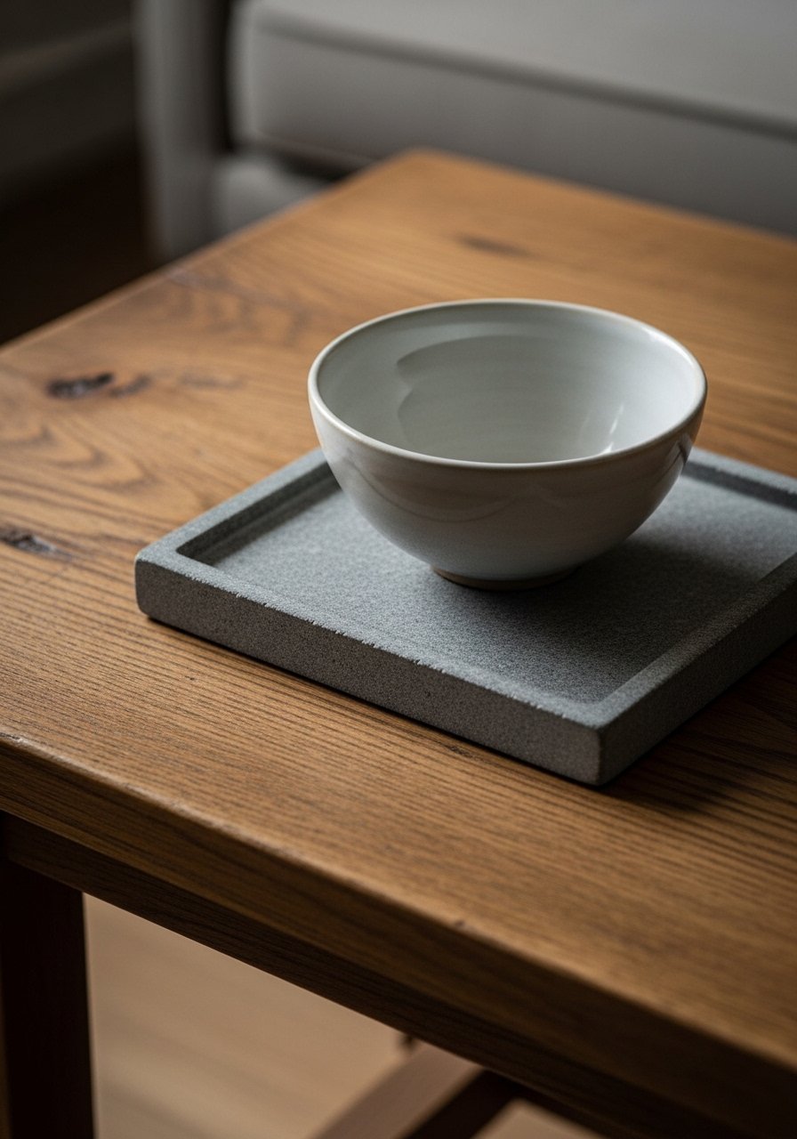
I added raw wood planks behind my sofa to stop the room from feeling staged. The texture reads like something loved, not brand-new. My first attempt used a stain that was too orange; I sanded and re-finished to a lighter tone and it finally felt right.
Mixed wood tones nearby keep it collected. Don’t overdo glossy finishes. The wall should look like it aged in place. Tip: try a removable wood-look panel if you rent.
What You'll Need for This Look
- Reclaimed wood plank wall panels (light oak look)
- Matte wood finish sealer
- Small potted indoor plant
4. Mauve Color Drenching for Soft, Emotional Rooms
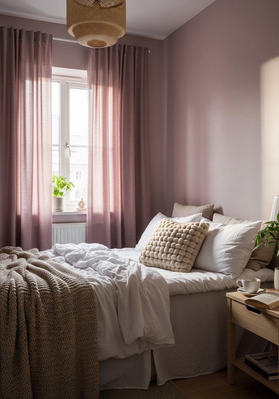
I painted a guest room mauve and it calmed the whole space. Using the same family — walls, curtains, a throw — creates an enveloping, emotional backdrop without feeling purple-heavy. My mistake was choosing a mauve with too much pink; switching to a dustier tone made it adult and comfortable.
Keep finishes warm: brushed brass or aged silver work well. This is about feeling rooted. Start with a swatch on a big wall before you commit.
What You'll Need for This Look
5. Seagrass Rugs Under Slipcover Sofas for Cottage Airiness
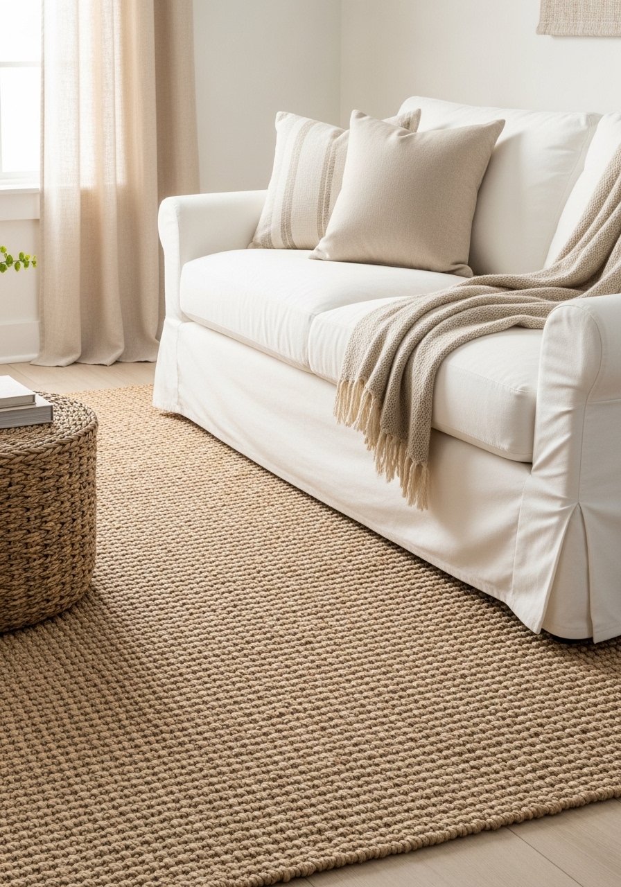
Seagrass rugs make rooms breathe, especially with lighter slipcovered sofas. I used one in my family room and noticed dust tracked less — the texture hides life. I once bought too-thin seagrass and it rode up; invest in a dense weave.
Pair with linen slipcovers for a casual, coastal-cottage vibe. The look feels lived-in and light. My tip: a rug pad prevents slipping and makes the texture feel more luxurious.
What You'll Need for This Look
6. Mix Wood Tones to Create an Evolved, Collected Look
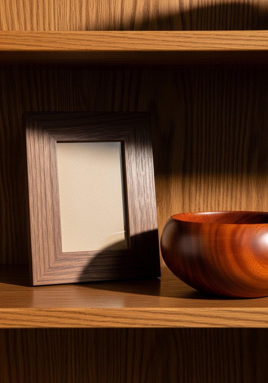
I stopped buying matching sets and mixed oak, walnut, and a dark vintage piece. The room felt layered and honest. My early error was matching grain too closely; contrast between tones gives more depth.
Start small: a walnut frame next to an oak table. Over time add pieces that share scale or finish, not exact color. It reads like a collected life, not a showroom. Practical note: test wood samples together in different light.
What You'll Need for This Look
7. Silver Accents with Lattice Frames for Traditional Freshness
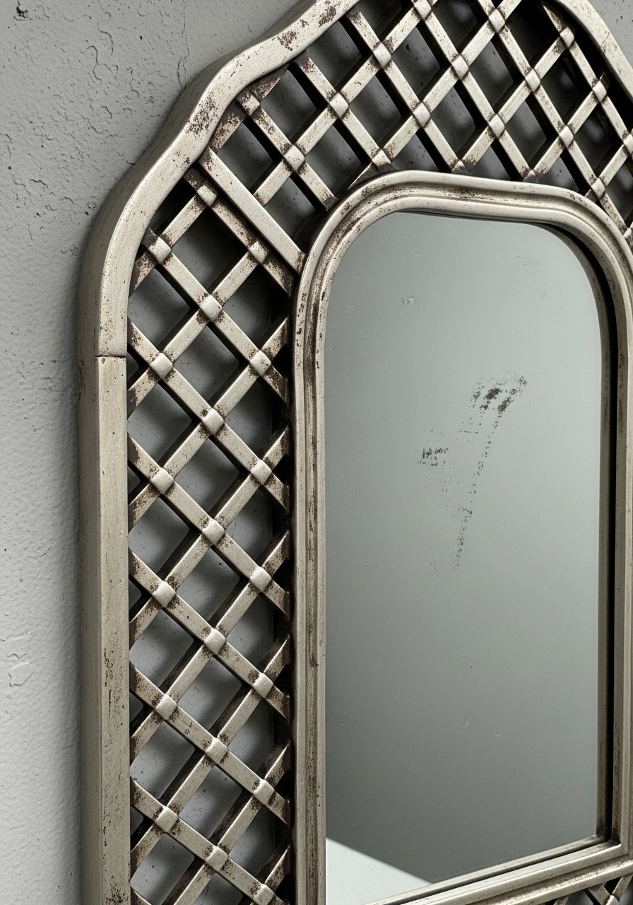
I added a silver lattice mirror above my console to lift a corner. The silver brought light without feeling cold. I tried a super-polished mirror at first and it looked precious; the slightly aged silver read more relaxed.
Lattice details echo patterns elsewhere for cohesion. Use trays, small frames, or mirrors to scatter that finish. Tip: a quick polish evens patina if it’s too dull, but keep some age for warmth.
What You'll Need for This Look
8. Botanical Woven Rugs to Bring Garden Texture Indoors
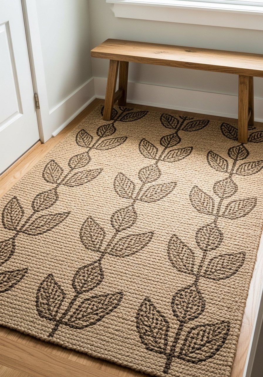
I swapped a flat rug for a botanical jute piece in my entry. It immediately felt grounded and forgiving of traffic. My first rug was too fine and showed dirt; a coarser weave hides life better.
Pair with potted plants and simple benches for an indoor-outdoor rhythm. These rugs age nicely and soften hard floors. Tip: vacuum and rotate seasonally to keep the weave even.
What You'll Need for This Look
9. Terra-Cotta Tiles and Rustic Cabinets for European Patina

I swapped a piece of laminate for a terracotta tile sample in the kitchen and loved the warmth it added. The tiles give a lived, European feel. My mistake was choosing very dark grout; a lighter grout blended more naturally.
Pair with raw wood lower cabinets and simple hardware. It ages beautifully, so don’t fear imperfections. Practical tip: pick a tile with a slightly irregular surface for authenticity.
What You'll Need for This Look
- Terra-cotta tile sample (small)
- Raw wood cabinet door sample (light oak)
- Matte cabinet hardware (aged brass)
10. Solid Tone Area Rug Under Pattern for Grounded Layers
I used a solid wool rug under a patterned braided runner to anchor a busy seating area. The solid base calmed the top layer and kept the pattern from competing with furniture. I initially skipped the base and the room felt visually heavy.
Choose a solid that picks up a subtle hue from the pattern. It makes layers readable, not messy. Tip: keep the top rug smaller so the solid frames it like an artwork.
What You'll Need for This Look
11. Hand-Painted Tiles with Soft Curves in Cottage Kitchens
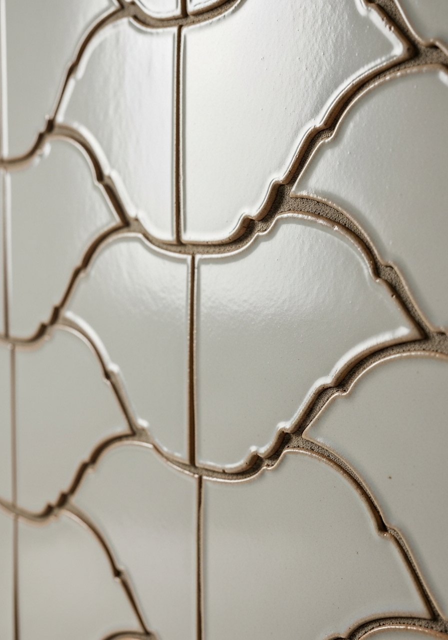
I installed a small hand-painted tile backsplash behind the stove and it changed the whole kitchen personality. The organic curves feel personal and slightly imperfect, which I like. My first batch had inconsistent glaze colors; returning and choosing a consistent artisan fixed that.
Use tiles sparingly if you rent: a small backsplash or shelf riser goes a long way. Keep grout simple so the curves pop. Tip: sample a tile against your cabinet color first.
What You'll Need for This Look
- Hand-painted ceramic tile sample (curved scallop)
- Neutral tile grout sample
- Adhesive tile backer (small)
12. Blue-and-White Pairings for Casual Coastal Calm
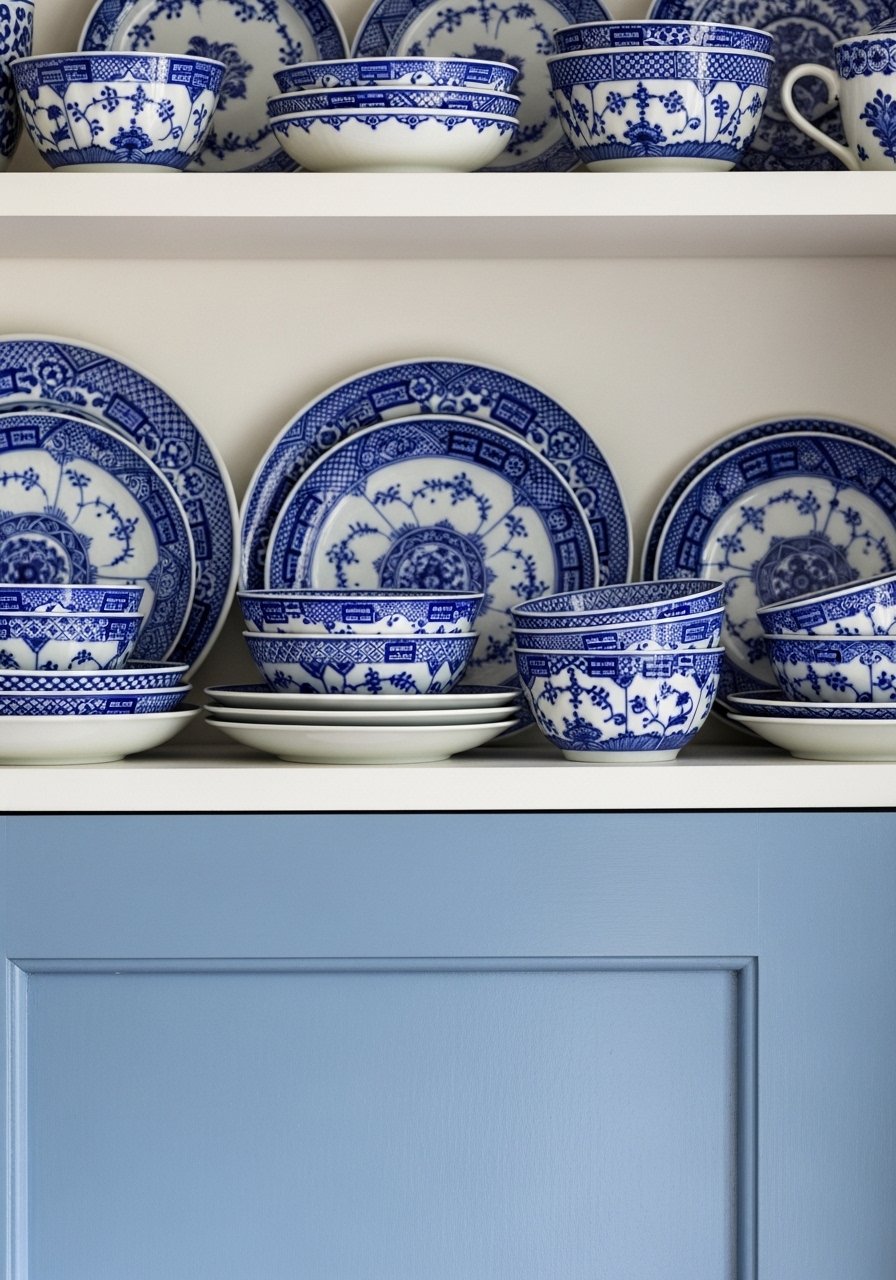
I painted a lower cabinet powder blue and grouped blue-and-white porcelain on open shelves. The pairing feels classic but relaxed. I once overdid the blue and it read childish; choosing a muted powder blue solved that instantly.
Balance with warm neutrals and wood to avoid coldness. Blue-and-white anchors a kitchen or bathroom without being literal coastal. Tip: use one strong blue area and repeat small accents elsewhere.
What You'll Need for This Look
- Powder blue cabinet paint sample
- Blue-and-white porcelain vase (small)
- Open wooden shelf (light oak)
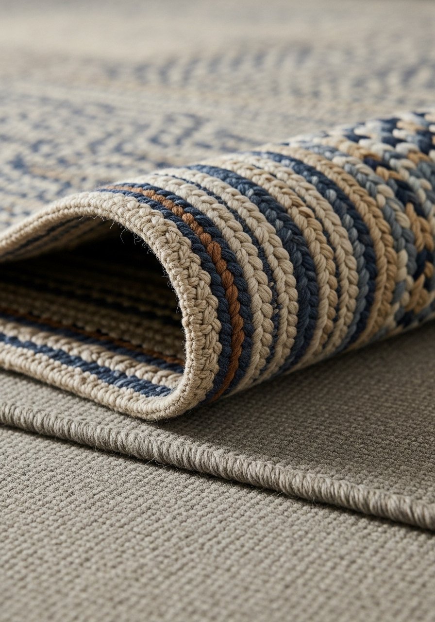
13. Braided Rugs with Quilt Motifs for Subtle Americana
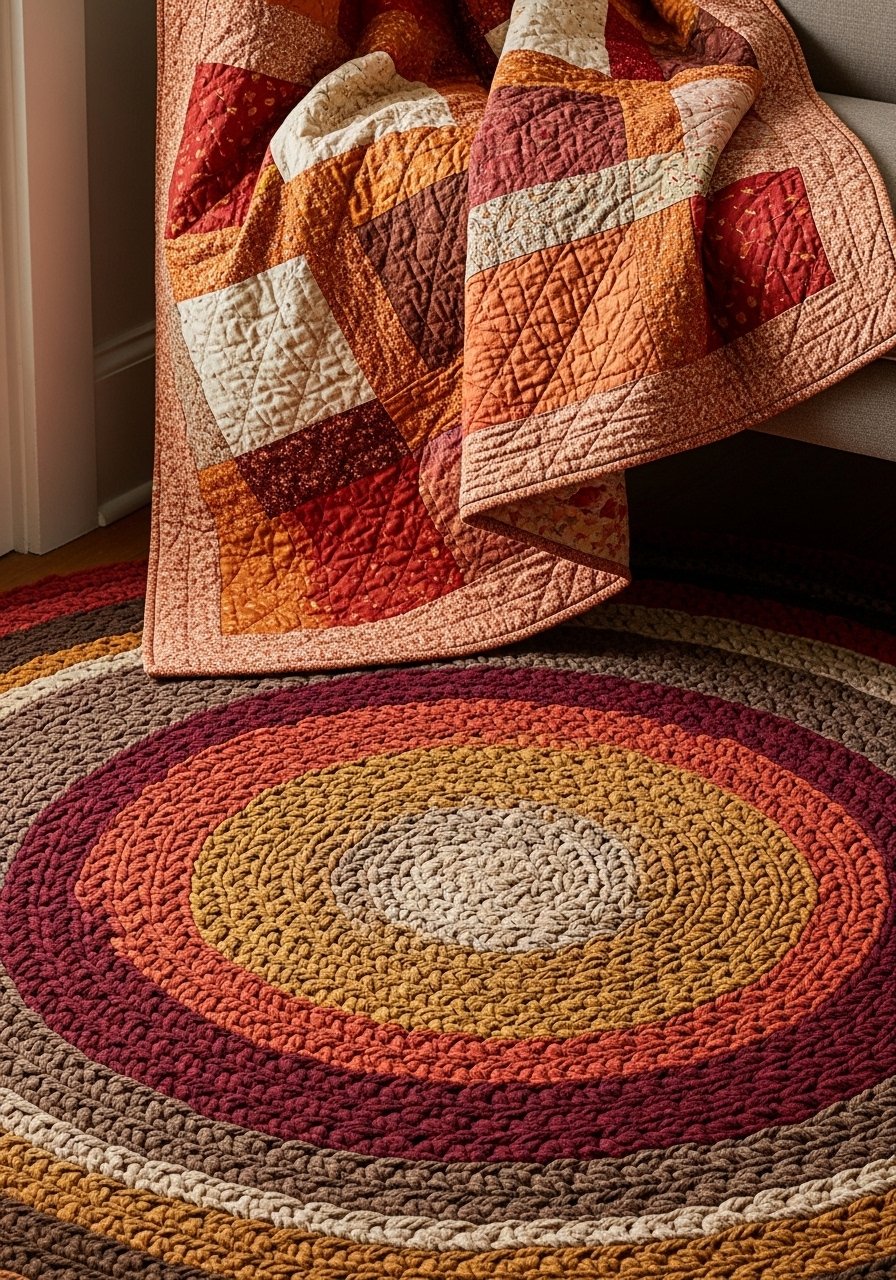
I brought a braided rug into a reading nook and layered a family quilt on the chair. The combination felt like a home that evolved. My first braided rug was too small; scaling up made all the difference.
These pieces are forgiving and family-friendly. Mix with simple modern furniture so the vintage motifs stand out. Tip: rotate the rug to even wear and keep the color balanced.
What You'll Need for This Look
- Braided rug (6×9, quilt motif)
- Quilted throw blanket (50×60)
- Small wood reading chair, casual finish
14. Statement Oven or Appliance as Kitchen Focal Point
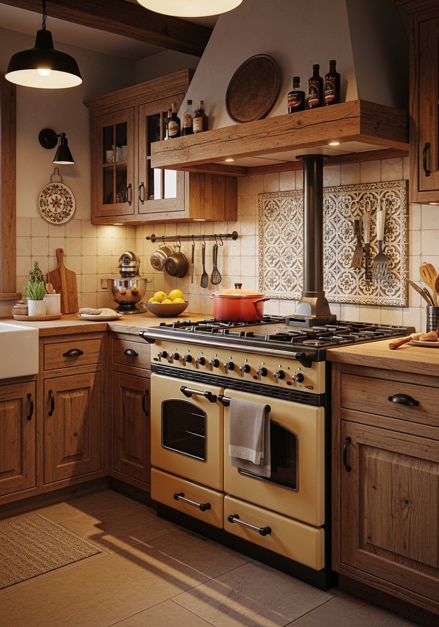
I finally swapped my plain range for a colored enamel model and the kitchen stopped being anonymous. It anchors cabinetry and makes everything else feel chosen. I initially thought a bright red would be fun; I traded it for a deep blue that felt calmer.
Treat a statement oven like art — keep surrounding finishes simple. It’s a larger investment but it makes the kitchen sing. Practical note: check dimensions and venting before you fall in love.
What You'll Need for This Look
- Colored range appliance (small, enamel finish)
- Matte range hood, simple design
- Heat-resistant backsplash panel
15. Decorative Toe Kicks on Cabinets for Subtle Personality
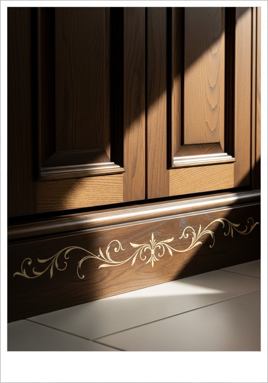
I added a painted toe kick detail to my laundry cabinets and it changed the visual weight. It’s a tiny detail that reads intentional. My first paint color was too dark and created a line; a softer tone blended and felt deliberate.
This is an affordable way to add personality without committing to new cabinetry. It’s renter-friendly if you use removable trim or adhesive paint films. Tip: test with a small sample strip first.
What You'll Need for This Look
16. Inframe Doors with Metal Grills for Textured Cabinetry
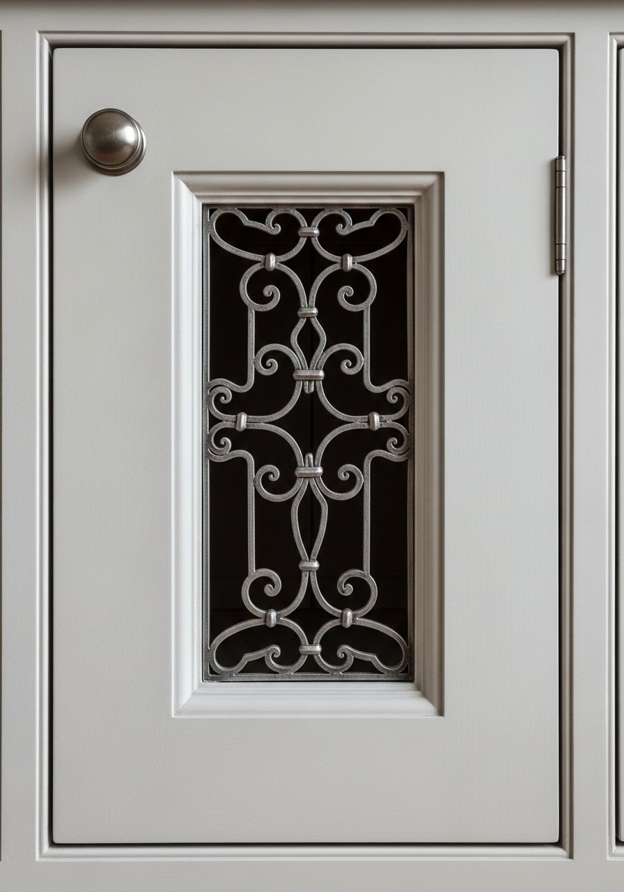
I swapped one cabinet door for an inframe version with a metal grill to add texture. It breaks up solid fronts and lets the kitchen breathe. I once used too-large grills and it looked busy; scale matters.
This detail reads custom in a small step. Use on pantry doors or a glass-front cabinet replacement. Tip: choose a grill color that complements other metal finishes.
What You'll Need for This Look
- Inframe cabinet door with metal grill (sample)
- Cabinet paint sample (satin finish)
- Small cabinet hinges (matte)
17. Layered Rugs in Entryways for Warm First Impressions

I started layering rugs in the entry to soften a hard floor and disguise dirt. A neutral woven rug with a patterned runner feels intentional and handles foot traffic. I once used two slick rugs and they slipped; a good pad fixed that.
Layering also lets you change the top rug seasonally. Keep colors cohesive and scale staggered. Tip: choose durable fibers near the door.
What You'll Need for This Look
18. Statement Mirrors to Bounce Light and Add Grace
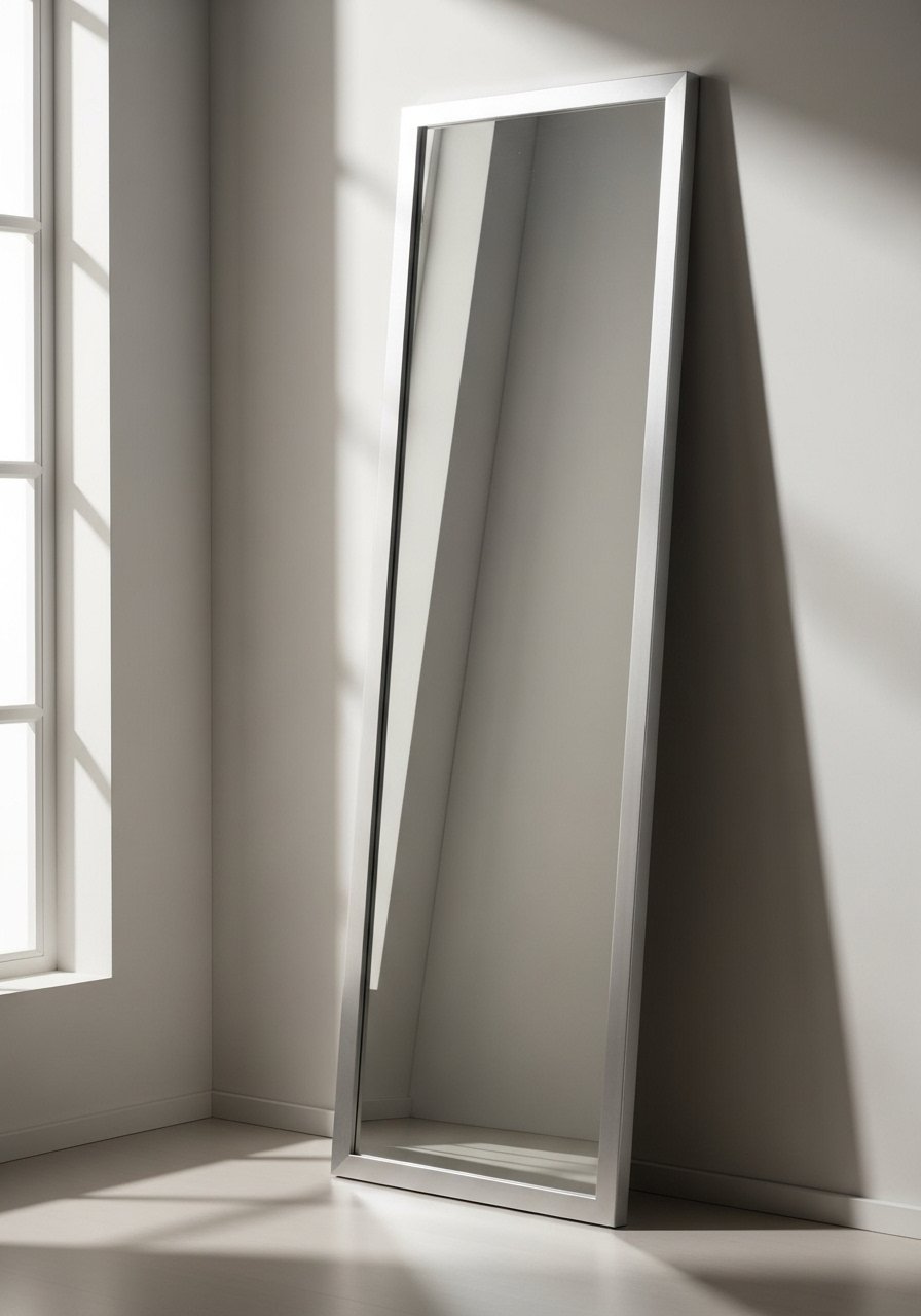
I leaned a large silver-framed mirror in a narrow hallway and it doubled the light. Mirrors feel expensive without costing a fortune. My first choice was an ornate frame that competed with art; swapping to a simpler lattice frame kept focus.
Use mirrors to enlarge small spaces or reflect greenery. Place them opposite windows when possible. Tip: secure leaning mirrors in households with kids or pets.
What You'll Need for This Look
- Large leaning mirror (silver frame)
- Wall mirror mounting kit (safety straps)
- Small vase with greenery
19. Organic Stone Accents for Patina That Ages Well
I added a small travertine tray to my coffee table and it absorbed small stains gracefully. Natural stone brings patina and a quiet weight. I once tried a high-gloss marble look and it felt showy; a honed finish looks lived-in.
Use stone for trays, coaster, and lamp bases. They require little fuss and reward gentle wear. Tip: seal porous stone on flat surfaces to protect from spills.
What You'll Need for This Look
20. Curved Furniture Accents for Timeless Flow
I added a round-backed chair to soften a room of straight furniture. Curves change how a room moves. I once bought a deeply curved sofa and found it dominated the layout; smaller curved pieces read timeless without overpowering.
Mix curves with straight lines for balance. Curved pieces invite sitting and slow the eye. Tip: measure thoroughly to keep circulation clear.
What You'll Need for This Look
21. Small-Scale Pendant Clusters Over Tables for Intimacy
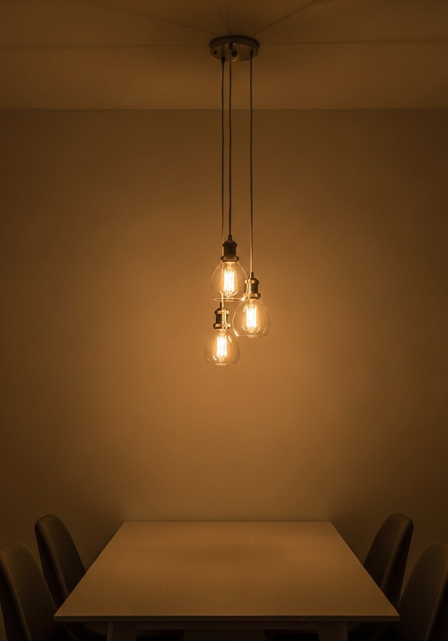
I replaced one large chandelier with three small pendants over my table. The scale felt more intimate and adjustable. My initial pendants were too high; lowering them to eye level improved conversation and light.
Clusters let you layer brightness and create rhythm. Use dimmable bulbs for dinner and chores. Tip: stagger heights slightly to avoid a rigid line.
What You'll Need for This Look
22. Quilted Throws as Layered Texture and Color
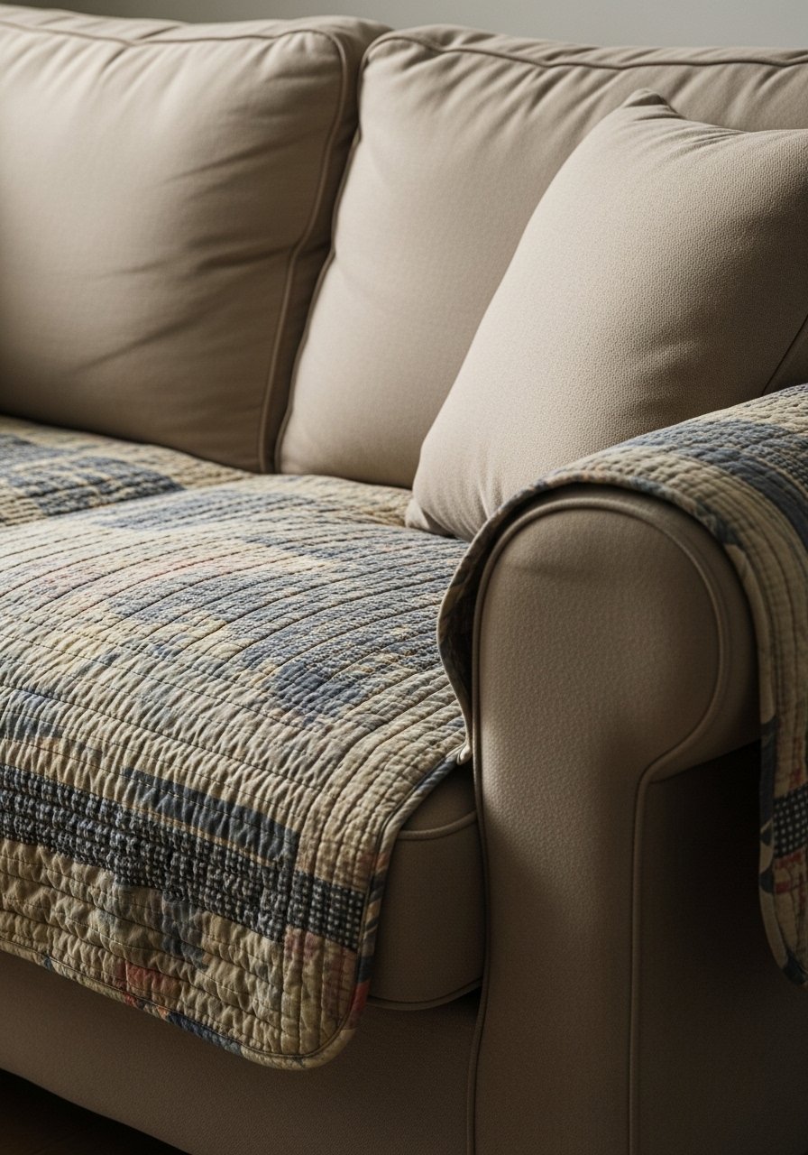
I keep a quilted throw over my sofa arm for texture and quick warmth. Quilts add pattern without overwhelming. I once treated a colorful vintage quilt as an everyday piece and it faded quickly; I rotate and wash sparingly now.
They’re great for layering over neutral sofas or on the end of a bed. Quilts feel personal and easy to live with. Tip: use color pick-ups from cushions when choosing a quilt.
What You'll Need for This Look
23. Small Space Wood Tones to Open Up Apartments
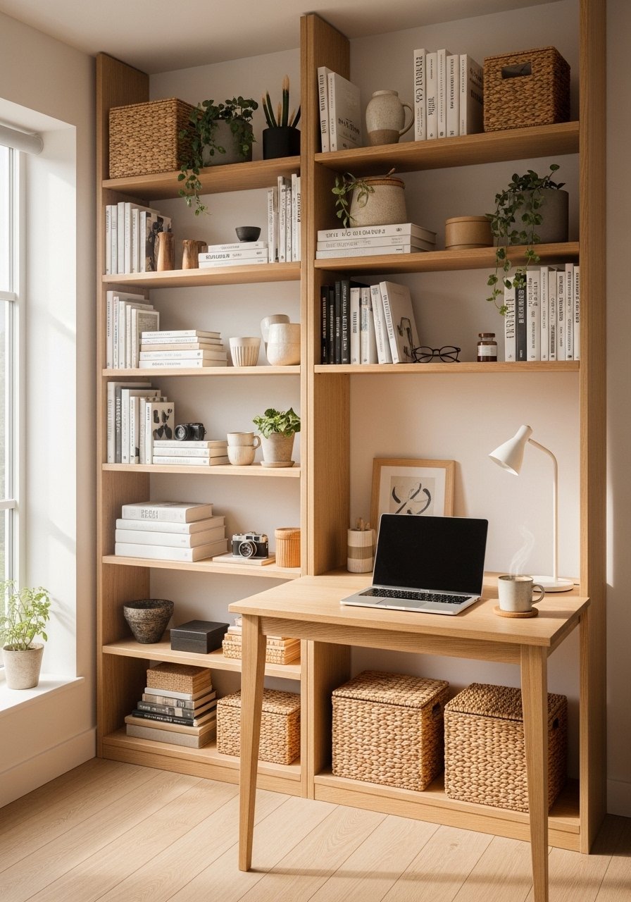
In my apartment I used light oak shelving to keep things airy. Small-scale wood furniture with open legs prevents crowding. I once bought heavy, dark pieces and regret it — the room instantly shrank.
Pick lighter tones and slimmer profiles. They feel intentional and scale-appropriate. A few warm wood accents make a small space feel curated rather than rented. Tip: mirrors opposite shelves double perceived space.
What You'll Need for This Look
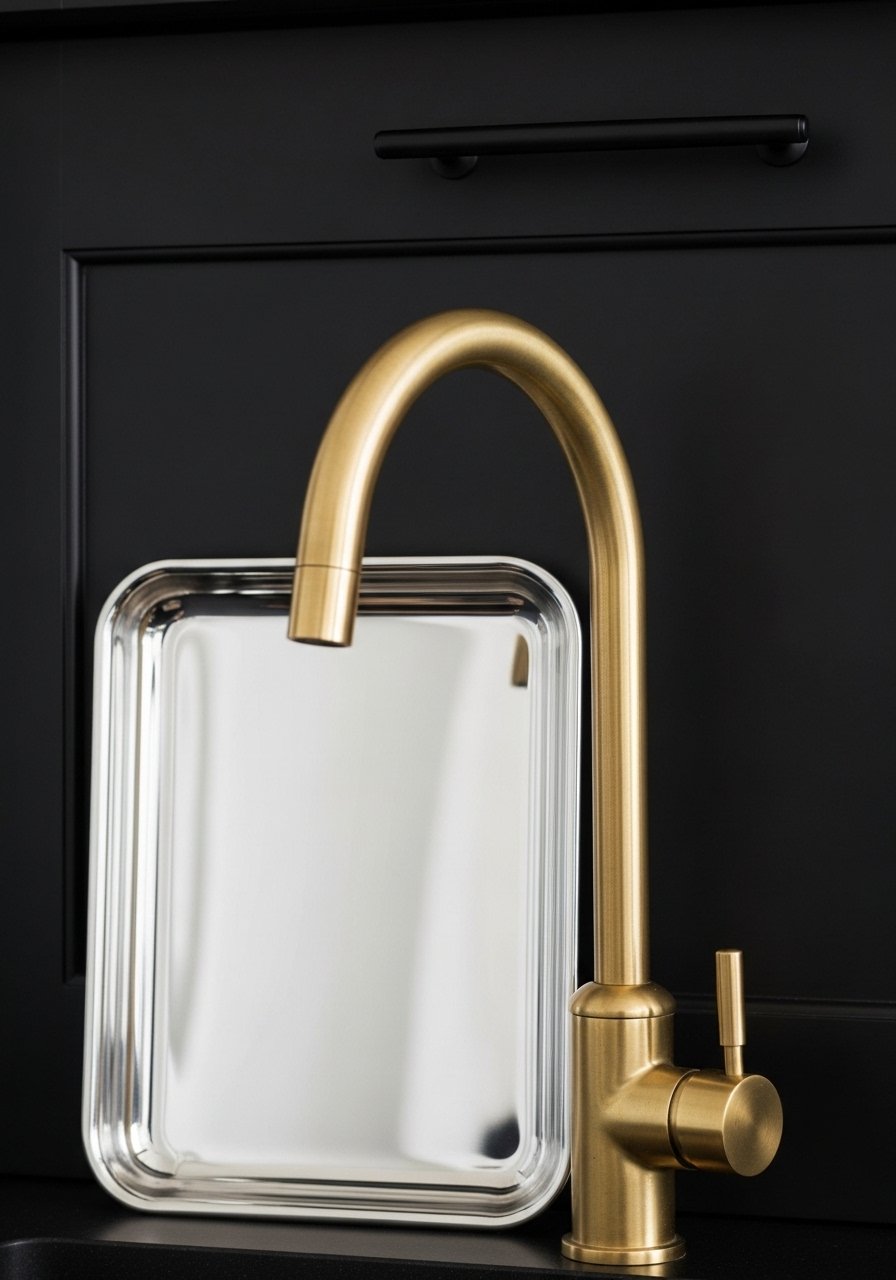
24. Silver Hardware in Unexpected Spots (Not Just Kitchens)
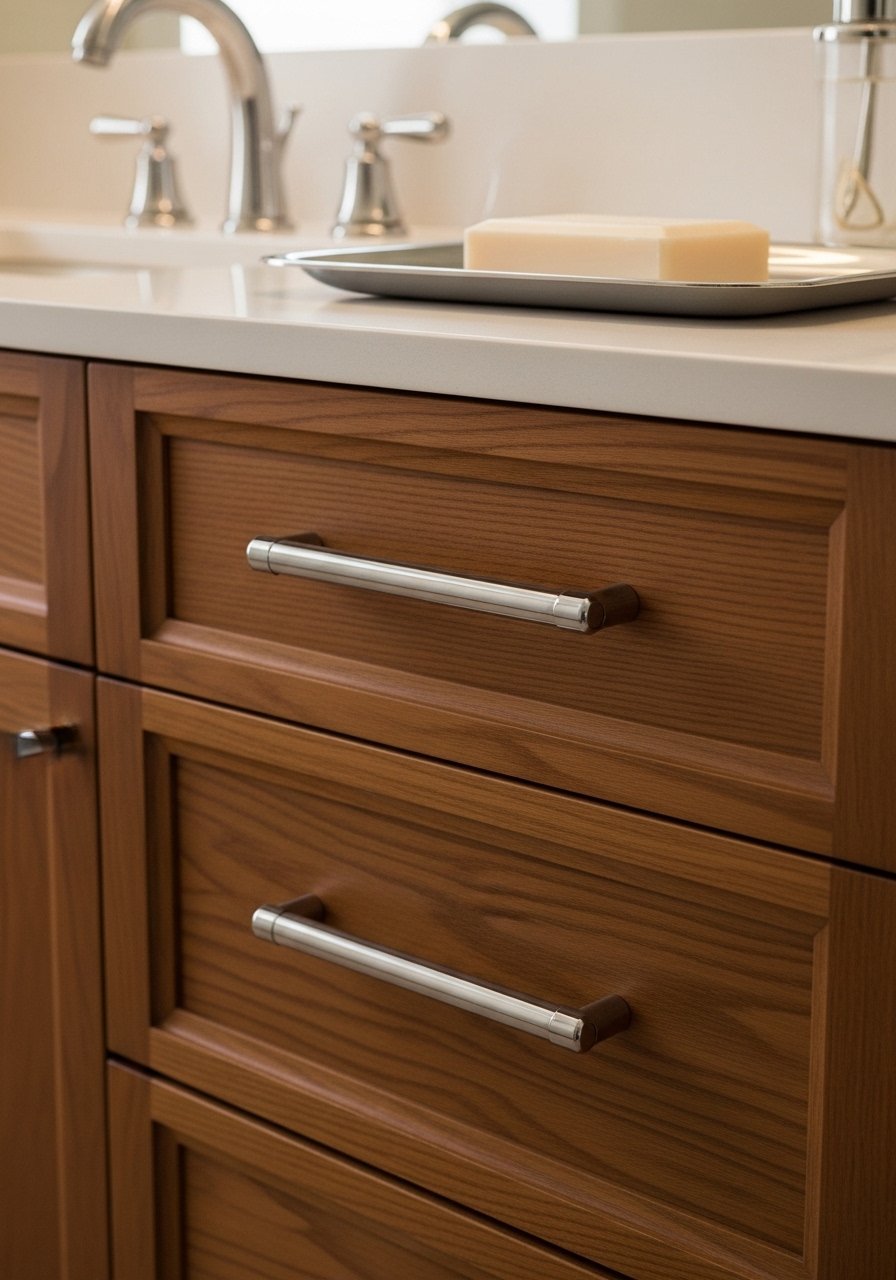
I added silver pulls to a bathroom vanity and it brightened the space more than new paint. Silver works outside kitchens — on nightstands, built-ins, even open shelving hooks. I once mixed gold and silver without a plan; pick a dominant tone and pepper in the other.
Silver reads classic when paired with warm woods and natural textures. Tip: bring a small silver sample to the store to compare finishes.
What You'll Need for This Look
25. Botanical Wallpaper on a Single Wall for Soft Focus
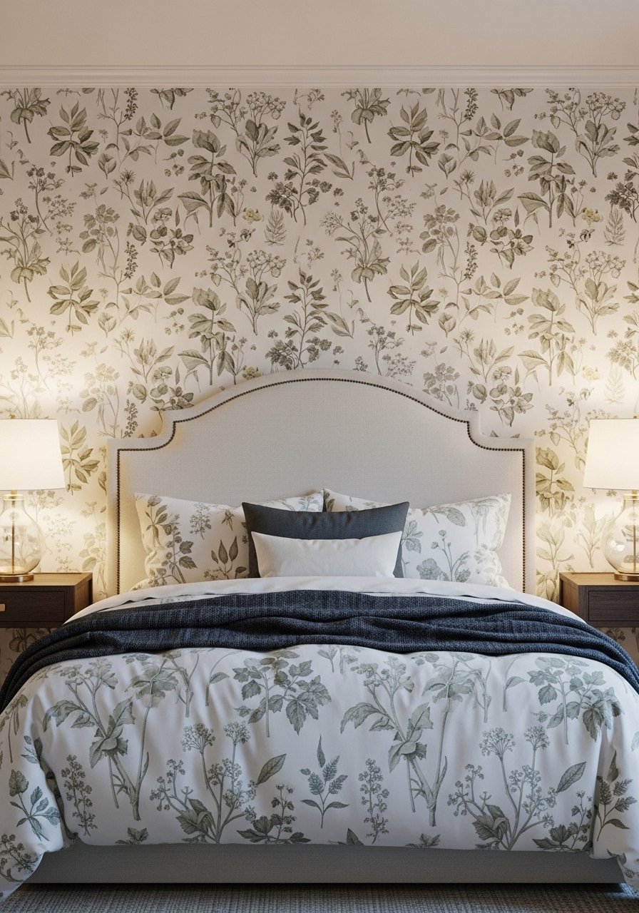
I papered one wall with botanical wallpaper in a bedroom and the bed suddenly had a backdrop worth keeping. Single-wall application keeps pattern from overwhelming and is renter-friendly if you choose removable paper. My early papering attempt had bubbles; a professional smoother fixed it.
This creates a focal point without redecorating the whole room. Keep bedding simple to let the paper breathe. Tip: match one color from the paper to pillows.
What You'll Need for This Look
- Botanical peel-and-stick wallpaper (single roll)
- Wallpaper smoother tool
- Neutral pillow covers (queen)
26. Handwoven Storage Baskets as Functional Decor
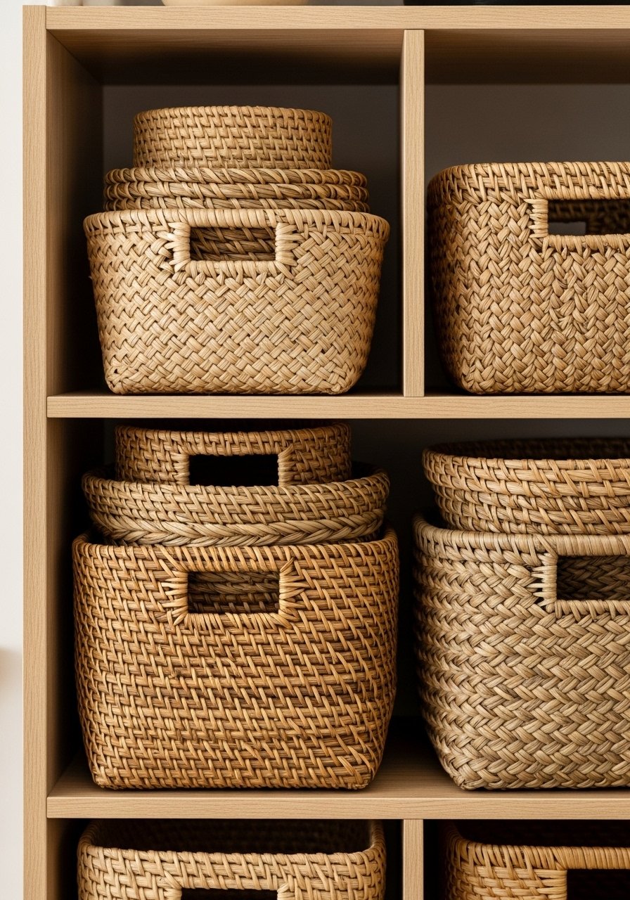
I replaced plastic bins with handwoven baskets in my pantry and everything felt calmer. Baskets hide clutter while adding texture. I learned the hard way that too-small baskets just create more bins; pick sizes that fit shelf depths.
They’re inexpensive and upgrade open shelving quickly. Use similar tones for cohesion. Tip: label baskets discreetly inside for family use.
What You'll Need for This Look
27. Single Bold Art Piece Over a Minimal Couch
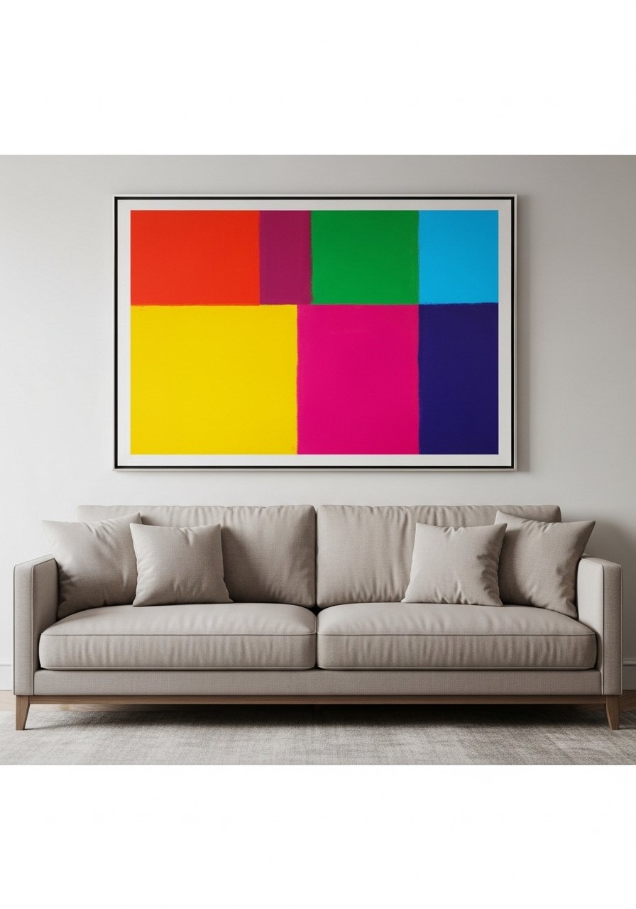
I replaced a gallery wall with one bold painting above my couch and the room instantly read more confident. A single statement art piece can calm a cluttered spot and anchor the sofa. I tried too-small art before and it got lost.
Choose scale that fills the space and complements cushion colors. It’s an easy way to refresh without repainting. Tip: ensure the art’s lower edge sits about 8-12 inches above the sofa back.
What You'll Need for This Look
28. Mix of Metals (But One Dominant Finish) for Curated Cohesion
I mix metals in my kitchen but keep brass as the dominant finish so it feels intentional. Random mixing can look scattered; choosing one primary metal and a secondary accent keeps it collected. I once added three competing metals and it read messy.
Introduce a secondary metal in small items like trays or frames. This keeps the look rich without chaos. Tip: carry the dominant finish in hardware and a fixture.
What You'll Need for This Look
29. Small Gallery with Personal Objects and Negative Space
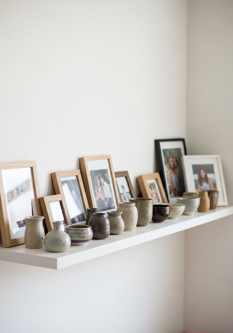
I created a small gallery mixing family photos, a thrifted plate, and a tiny shelf. Leaving negative space between pieces made it feel designed, not crowded. My first gallery crammed frames wall-to-wall; removing half the pieces changed everything.
Pair different scales and materials for interest. The goal is personal depth, not perfection. Tip: start with three pieces and build slowly, stepping back between additions.
What You'll Need for This Look
Final Thoughts
You don’t need every trend. Pick a few that solve a problem in your home and try them slowly. I learned that small edits — a rug, a pillow, a cabinet pull — add up to a collected, lived-in place.
Start with one room and one purchase. Live with it, then adjust. Decorating should feel like a long conversation with your home, not a checklist.