
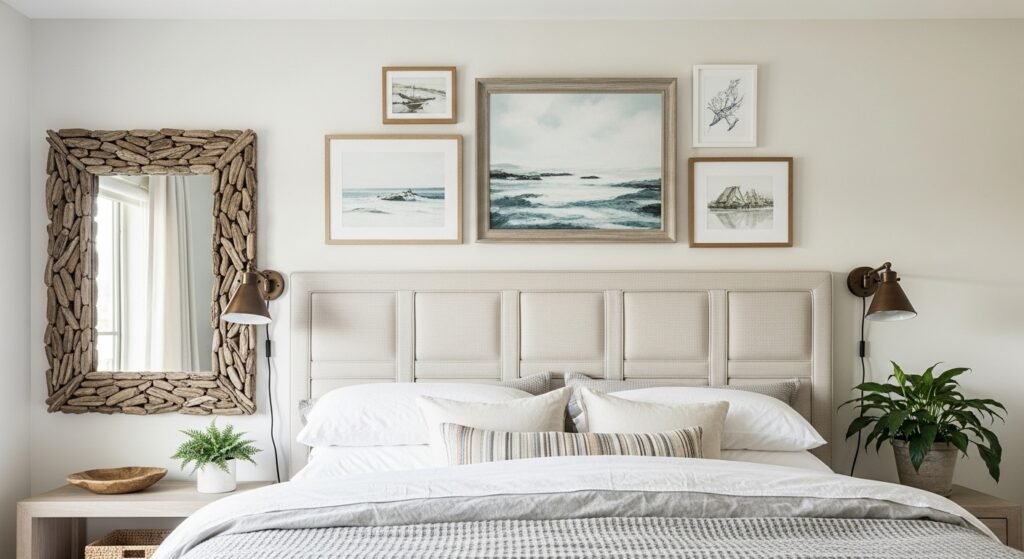
My bedroom used to feel like a hotel room with perfect bedding and zero personality. I finally hung a small cluster of beach photos over the headboard and suddenly the room felt lived in. That tiny change made me notice scale, texture, and how a single frame can anchor a whole wall.
These ideas lean relaxed coastal with plenty of linen, wood, and soft blues. Most looks can be done for under $150, with a few splurges around $200. Works for master bedrooms, guest rooms, or any cozy nook where you want that ocean-breezy feeling.
Soft Coastal Neutrals With Driftwood Frames
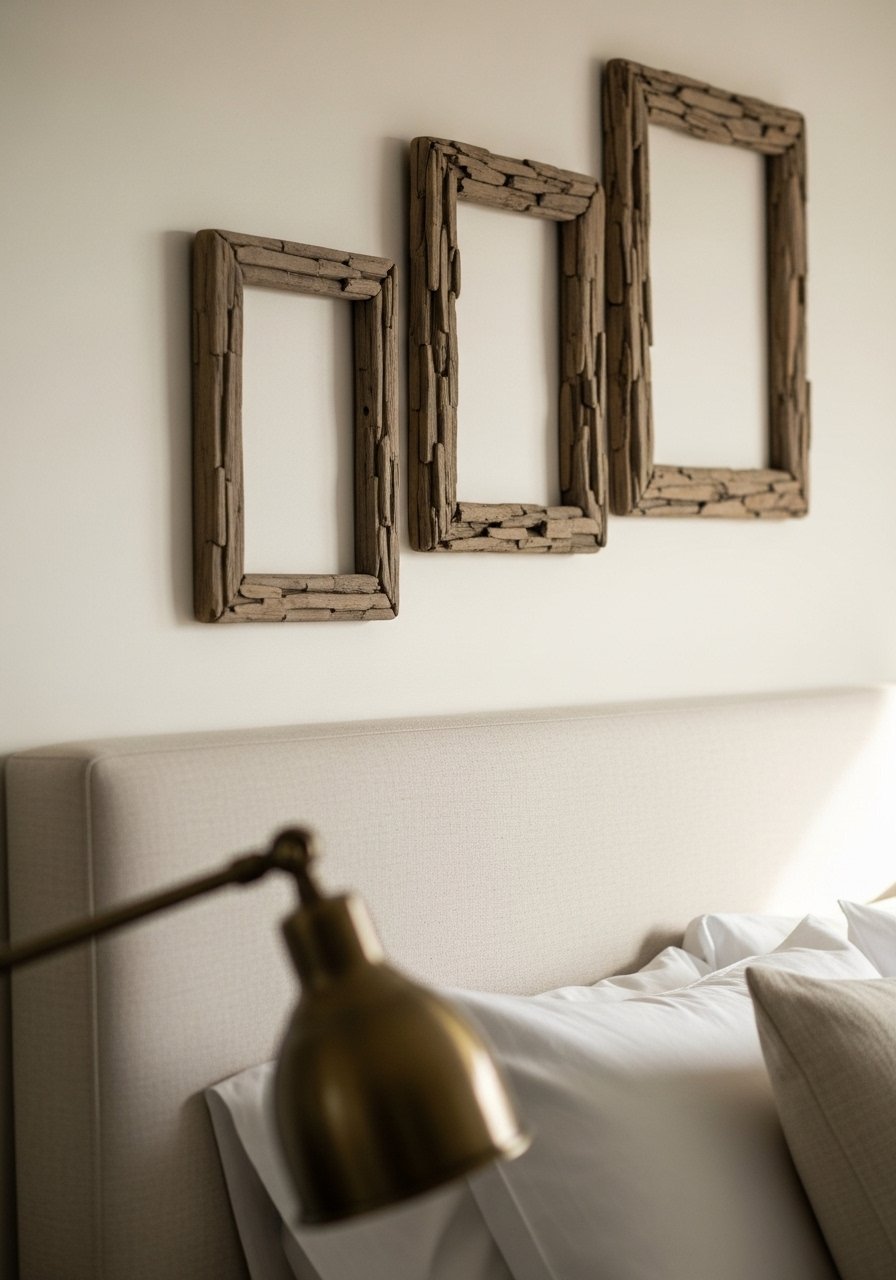
The easiest way to get a coastal feel is to stick to a neutral palette and let texture carry the look. I used 60/20/20 color balance, 60 percent neutrals, 20 percent soft blue, 20 percent weathered wood. It reads calm and collected from across the room. For frames, I like driftwood picture frames that are slightly different widths so the cluster looks curated, not matched. Common mistake, hang everything too high. Aim to keep the center of the cluster around 60 inches off the floor so it reads at eye level from the bed. Note, narrow frames read less coastal than chunky ones so pick the heavier grain for real seaside vibes.
Beach Print Mix With Linen Textures
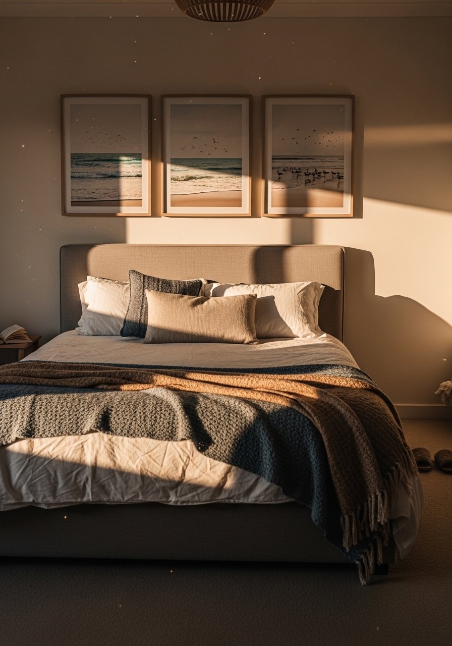
When I layered three different beach prints with linen pillows, the room stopped feeling staged. Prints bring place and memory. Use a consistent mat color to unify mixed-scale art, about a 2-inch mat on medium prints and 3-inch for larger ones. I bought a set of coastal art prints and had them framed in linen mats for under $120 total. Mistake people make is matching all frames. That becomes boring quickly. Instead, mix one natural wood, one white, and one thin black frame for contrast. It’s a small edit that reads professional.
Vintage Maps And Nautical Finds For A Collected Look
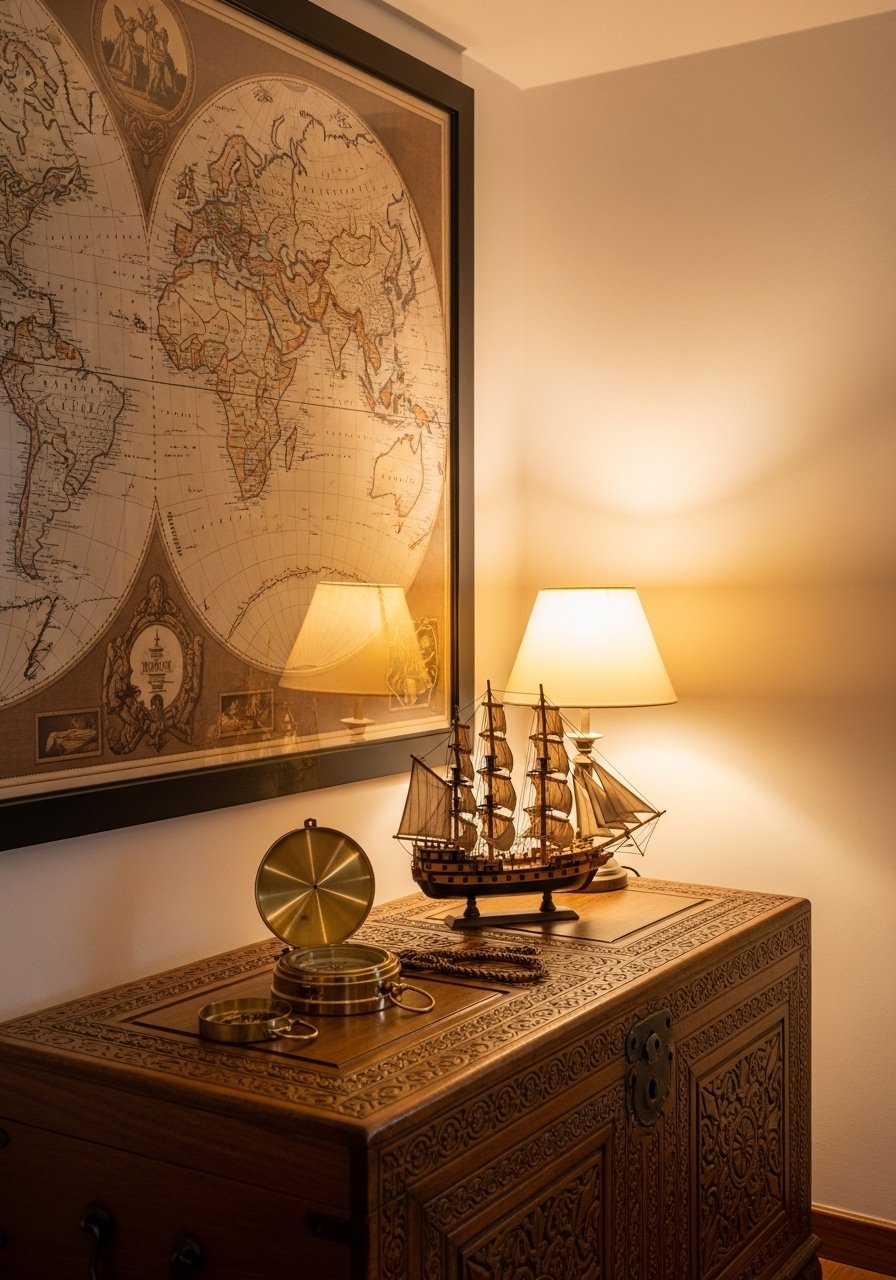
I once framed an old nautical map I found at a flea market and the wall suddenly had a story. Vintage maps give scale and a hint of history. If you are on a budget, scan and print a high-resolution map and use a textured paper stock. For authenticity, add one brass nautical piece like a small compass on the bedside table. I used antique-style map prints that came in three sizes so I could stagger them. A common slip is clustering too many small pieces. Use one large anchor piece and two supporting items in a 3:1 size ratio.
Monochrome Coastal Minimalist Bedroom
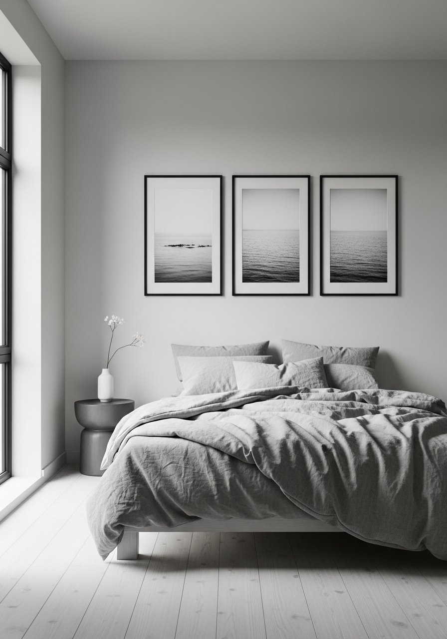
If you prefer calm order, try monochrome seascapes. I swapped my colorful prints for black-and-white photos and the whole bedroom felt more restful. The trick is variety in texture rather than color. Mix matte prints with a single glossy photo for a subtle highlight. I bought black-and-white seascape prints and used uniform frames. Mistake, people choose too many identical sizes. Break the grid with one large print and three smaller companions. It keeps the minimalist vibe but avoids monotony.
Oversized Statement Seascape Above Bed
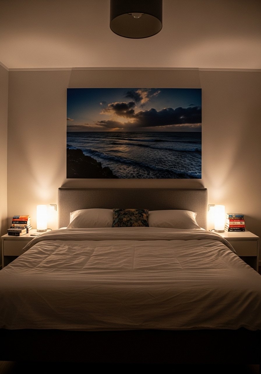
One large piece can make a small room read bigger. I hung a 36×48-inch canvas above my headboard and it solved a months-long "something is missing" problem. Pick a canvas that fills roughly two-thirds the headboard width. Too big and it overwhelms, too small and it disappears. I grabbed this large seascape canvas for under $200. Common mistake is centering art on the wall instead of the bed. Always center large art on the bed for balance. Bonus detail, it reduced how many nails I needed.
Floor-To-Ceiling Curtain Frame For Art
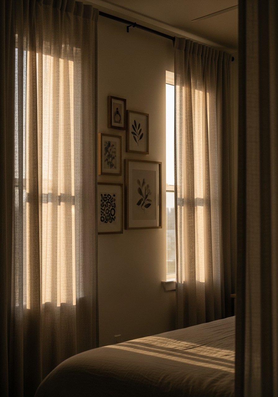
Hanging curtains all the way to the ceiling makes the wall feel taller and gives your gallery wall room to breathe. I moved my curtain rod up six inches above the window frame and the whole wall gained height. Use lightweight linen panels in natural tones to echo beach sand. For long panels, try 96-inch linen curtains. Mistake, people hang short curtains and then wonder why the artwork looks cramped. If your ceiling is over 9 feet, go 108 inches instead.
Mixed Media Shell Shadow Boxes For Depth
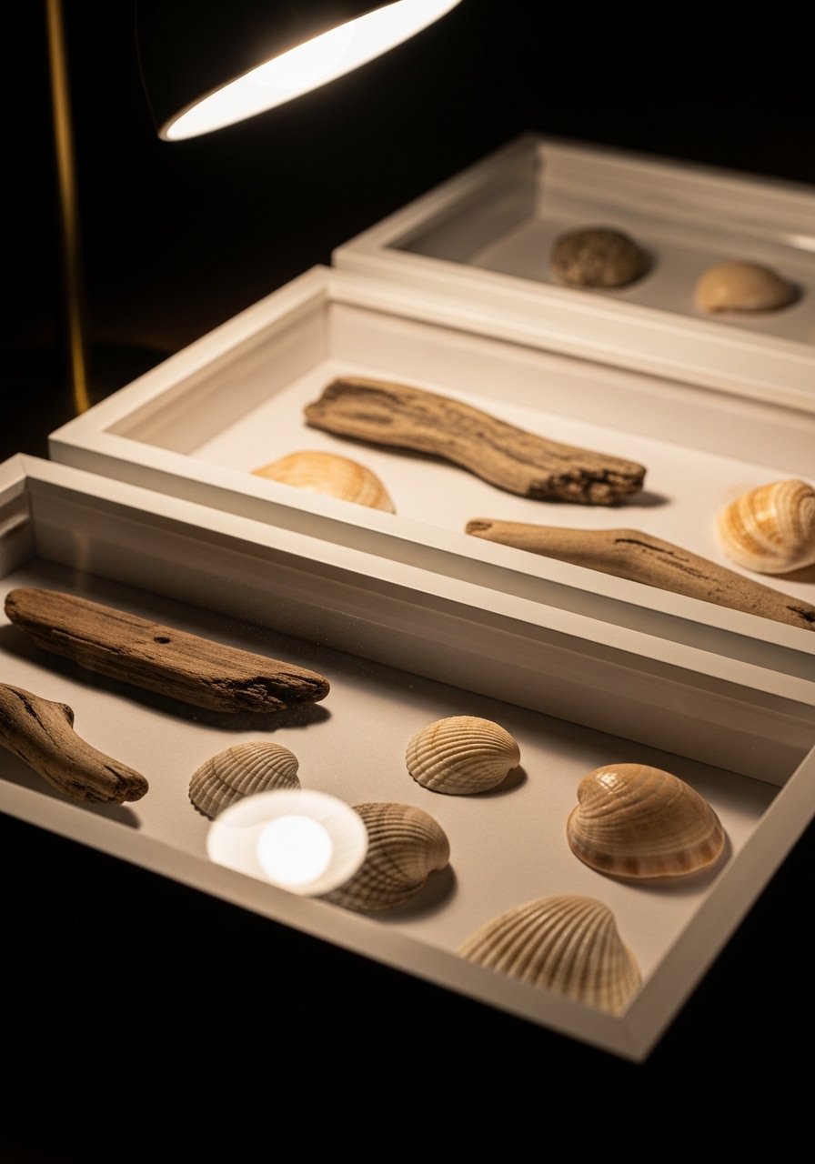
Shell shadow boxes add real depth to a gallery wall. I mounted three boxes with collected shells, spacing them about 3 inches apart to avoid a cluttered look. Use shallow boxes, 2-3 inches deep, so they don't cast heavy shadows. I sourced small shadow boxes and labeled one with the beach name on the mat for a personal touch. Beginner mistake, placing them too low. Keep shadow boxes at the same visual plane as framed prints to read cohesive. A little personal story on the mat goes a long way.
Kid-Friendly Coastal Gallery With Personal Photos
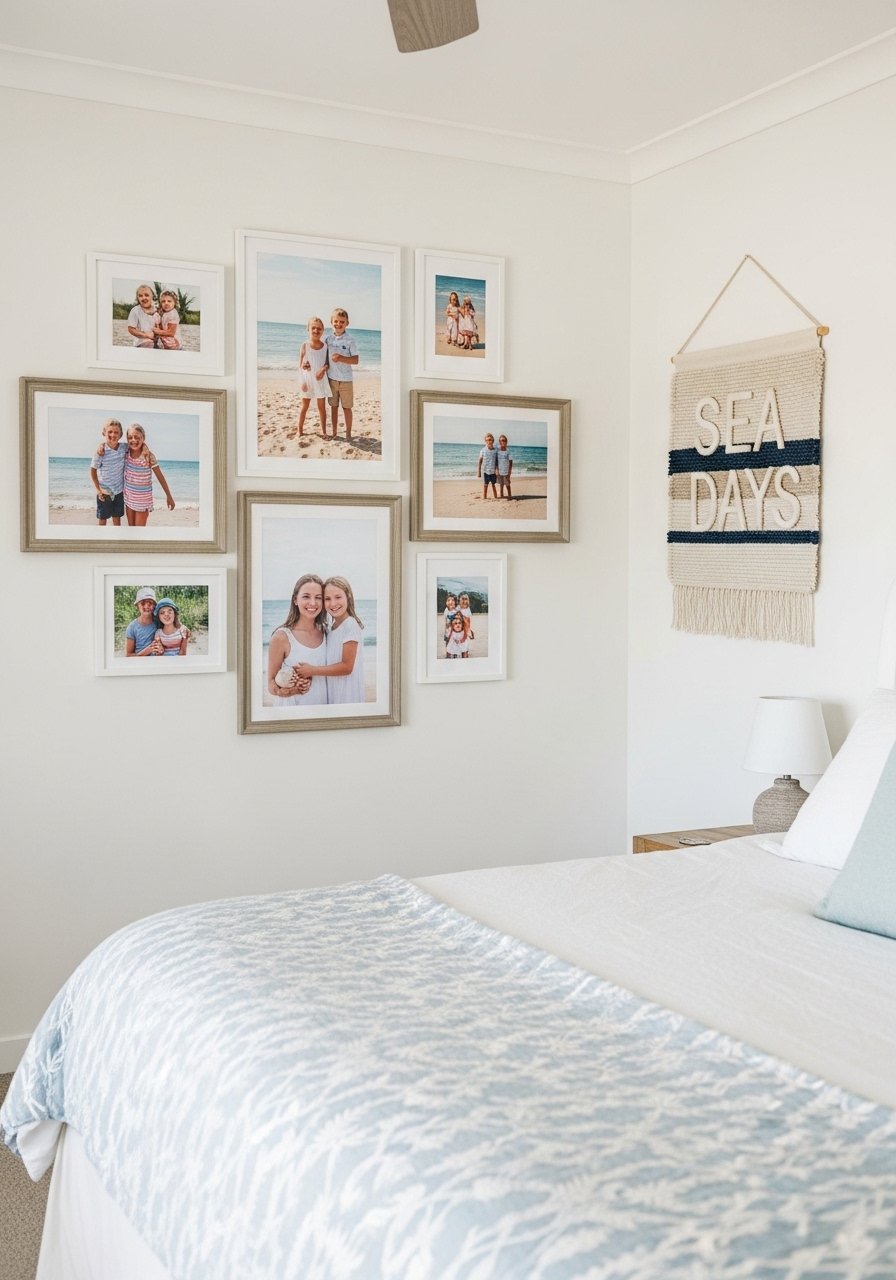
A gallery wall that includes family beach photos makes a bedroom feel like home. I printed three favorite phone shots and mounted them in 5×7 mats. Use inexpensive frames so you won’t stress about fingerprints. I used mixed photo frames and swapped images seasonally. Common worry is the wall looking messy. Give each photo a consistent mat color or spacing of 2.5 inches to keep it tidy. Tip, laminate one photo for kids to touch without leaving marks.
Layered Frames On Picture Ledges For Easy Updates
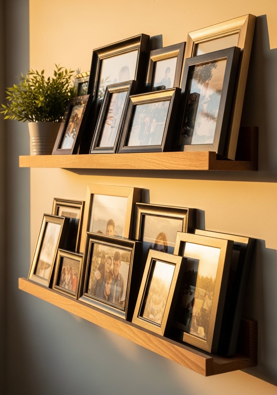
Picture ledges are a lifesaver if you change your mind a lot. I installed two 6-foot ledges and now I swap prints every few months without new holes. Ledges let you layer a small mirror in front of a print and tuck a book behind a frame. I use white wood picture ledges that are sturdy and easy to level. Mistake, placing frames flush together. Leave 2 to 3 inches between layered pieces for breathing room. Also, use one taller object for scale, like a 12-inch ceramic vase.
Rotating Seasonal Mini Galleries
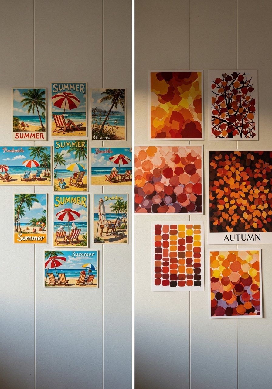
I swap small prints with the seasons. Summer gets beach postcards and a shell; fall gets muted sepia prints. Keep a consistent frame color so seasonality reads intentional, not messy. I store off-season prints in archival sleeves in a flat bin. For quick swaps, keep 5×7 archival sleeves on hand. A common error is changing everything at once. Swap 20 to 30 percent of the wall and the room feels refreshed without losing cohesion. I usually rotate three pieces per season.
Gallery Wall With Mirrors To Brighten Dark Corners
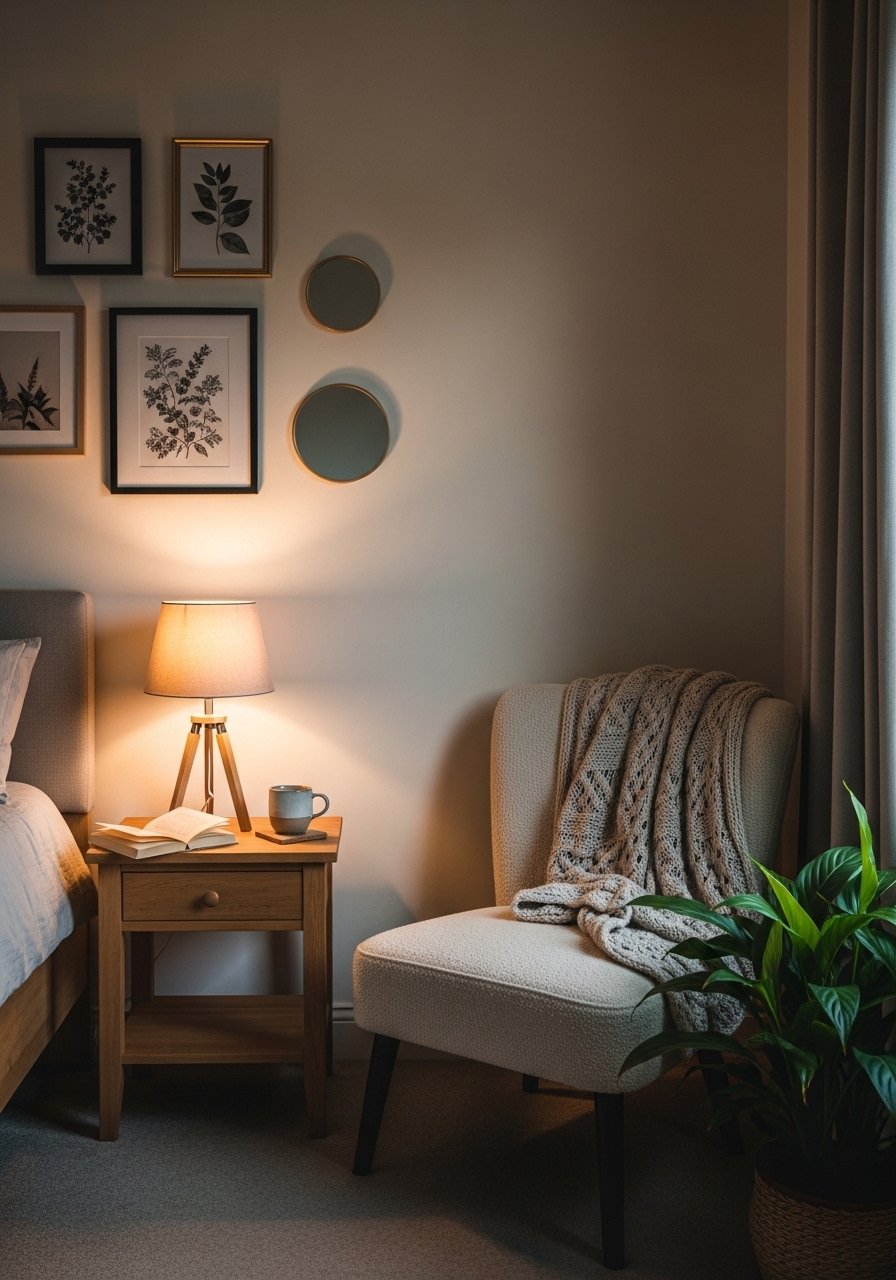
Mirrors multiply light and make a small bedroom feel airier. I mixed two round mirrors, one 20-inch and one 14-inch, with framed prints to reflect the window light. Place mirrors opposite or adjacent to natural light sources for best effect. I use small round wall mirrors with thin frames so they read modern coastal. Mistake is using too many reflective surfaces. Balance mirrors with matte photographs to avoid glare. One small mirror reduces a dark corner dramatically.
Balancing Large Art With Small Prints For Rhythm
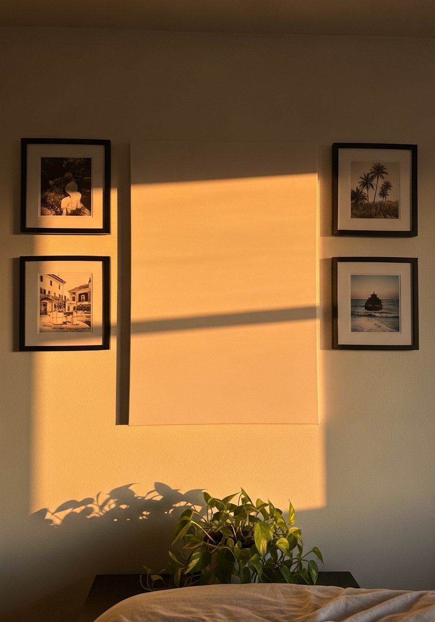
Rhythm on a wall comes from mixing scales. My rule of thumb is one large piece for every three or four small pieces. The large piece anchors and the small ones add detail. I measured the headboard and chose a large 30×40-inch canvas that covered about 65 percent of the headboard width. Use small 8×10 coastal prints to fill gaps. People often space prints too tightly. Aim for 2.5 to 3.5 inches between pieces for a balanced rhythm.
Textile Art And Macrame For Texture
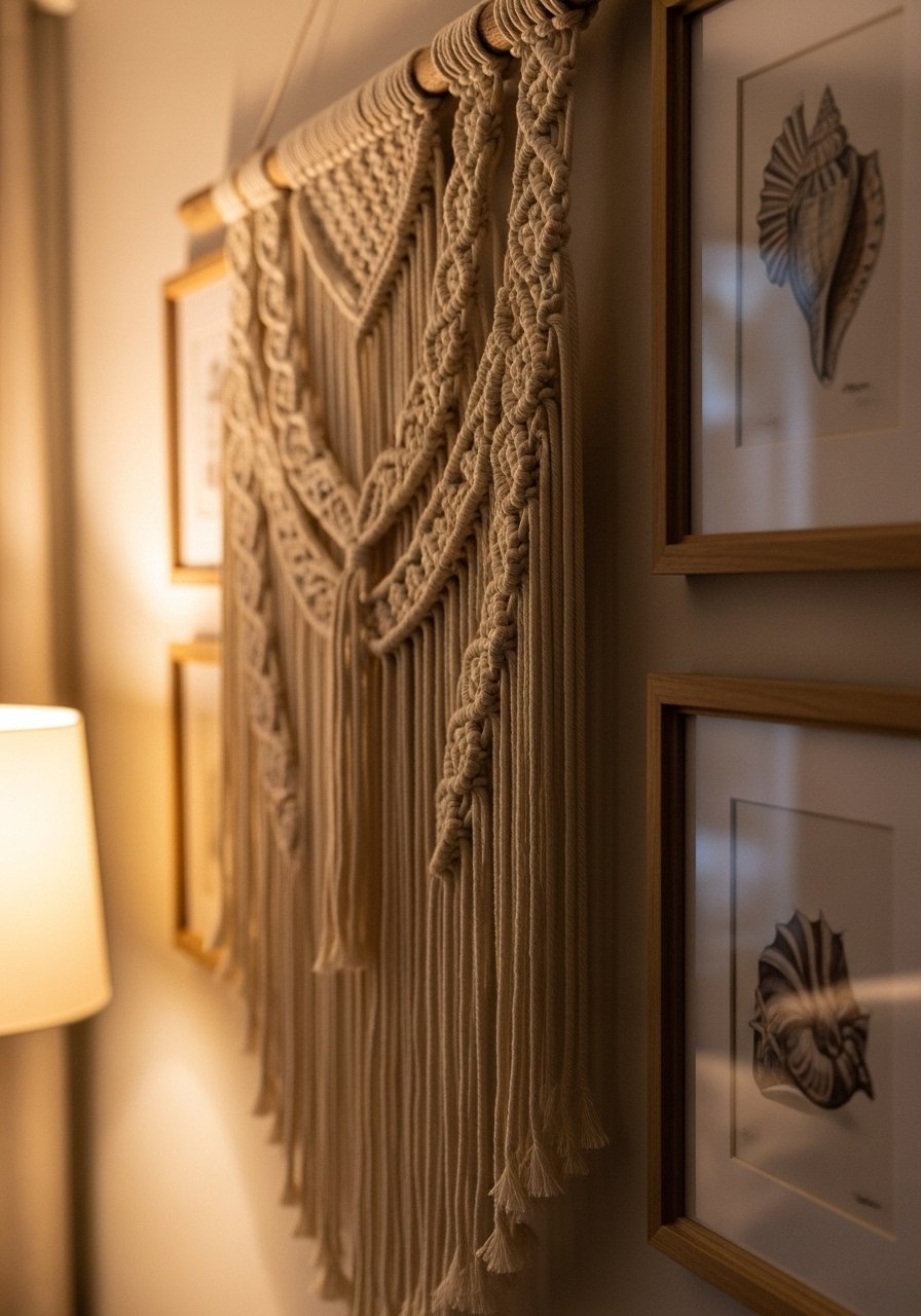
A macrame piece adds instant texture, especially in coastal bedrooms where wood and linen dominate. I hung a 24-inch macrame panel offset from two prints and it read artisanal. Choose natural cotton fibers so the piece softens the wall visually and acoustically. I picked a small macrame wall hanging that was under $45. Mistake, thinking macrame only fits boho styles. It pairs beautifully with clean-lined frames when you keep colors neutral.
Black Frame Anchored Coastal Contrast
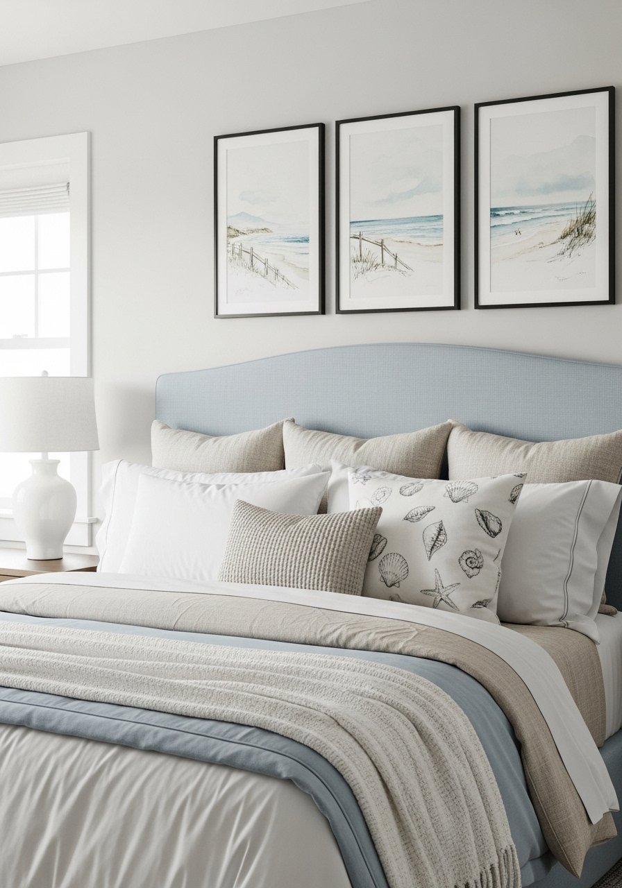
Black frames can ground a coastal palette and provide modern contrast. I swapped two white frames for thin black ones and the gallery suddenly had sharper focus. Use black sparingly, maybe two or three frames, to avoid a heavy look. I ordered thin black frames that are under $25 each. A frequent mistake is overdoing black and losing the relaxed vibe. Pair black frames with softer textiles to keep things inviting.
Minimal Labeling With Handwritten Titles For Personality
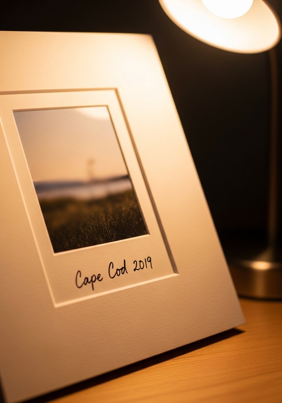
Adding a handwritten title on a mat makes gallery pieces feel personal. I write the place and year in pencil on the mat edge for three prints and it reads like a small curated exhibit. Use a soft H pencil and keep handwriting consistent. If you want identical looks, make photocopies of your handwriting. For quick framing, pick pre-cut mats 5×7 with 2-inch border. Mistake, using stickers or printed labels that look too commercial. A simple pencil note is low-cost and soulful.
Your Decor Shopping List
Textiles
- Honestly the best $40 I have spent. Chunky knit throw in cream (~$35-55). Drape it over the bed footboard for instant warmth
- 22-inch linen pillow covers, set of 2 in natural and soft blue, down-fill recommended
Wall Decor - Driftwood picture frames pack 8×10 and 11×14 sizes, good mix for clusters
- Large seascape canvas 36×48 for statement placement
Shelving & Display - Found these on a whim. 6-foot picture ledges set are perfect for layered looks
Lighting - Brass bedside lamp with soft white bulb, 14-inch height is a good scale
Plants & Greenery - Faux fiddle leaf fig 6-foot for height without maintenance
Budget Finds - Mixed photo frames set under $30 for rotating family photos
Specialty - Small macrame wall hanging 24-inch for texture
Similar at Target or HomeGoods for pillows and throws if you prefer to touch fabric before buying.
Shopping Tips
White oak beats dark wood in current feeds. Design feels fresher with lighter grains. White oak floating shelves look current and pair easily with coastal pieces
Grab velvet pillow covers for $12 each. Swap them seasonally and the room feels different without changing everything
Curtains should puddle or kiss the floor, never hang halfway up. 96-inch linen curtain panels are right for standard 9-foot ceilings
One tall plant beats five small succulents. Try a faux fiddle leaf fig 6-foot where you need scale and zero upkeep
Frequently Asked Questions
Q: What height should I hang a gallery above the bed?
A: Aim for the center of the cluster to sit about 60 to 65 inches from the floor, which usually centers the art at eye level when standing. If your bed has a tall headboard, lower the cluster by 4 to 6 inches so it reads connected to the bed.
Q: Can I mix modern frames with coastal art without it looking odd?
A: Yes. Mix thin black or metal frames with natural wood and keep mat colors consistent. I mix one thin black frame for contrast and three natural frames to keep the vibe soft.
Q: How do I make a gallery wall feel personal on a budget?
A: Use phone photos printed on matte paper, add one flea market find, and handwrite small notes on mats. I rotate three phone prints every season for a fresh look without spending much.
Q: Should I use real plants or faux in a bedroom gallery vignette?
A: Both work. Real plants like a snake plant survive low light and add life. Faux plants, like a 6-foot fiddle leaf, give scale without maintenance so you can place them exactly where the composition needs height
Q: My gallery looks cluttered. How do I fix it without rehanging everything?
A: Remove about 20 to 30 percent of the pieces and add negative space. Step back three times during editing and keep odd-numbered groupings for better rhythm. Sometimes one large print replaces three small ones and you are done.
Q: What frame sizes work best for a mixed gallery?
A: Mix a large anchor, about 30×40 or 36×48, with medium 11×14 and small 8×10 prints. A practical ratio is one large, two medium, three small. I use that ratio and it usually reads balanced in most bedrooms