
My living room once had good furniture and zero personality. I spent months swapping big pieces before realizing small, intentional touches made the space feel finished. One evening I folded a throw differently and the whole room finally felt like someone lived there. These are the changes I used to make the room read polished without a complete remodel.
These ideas tilt toward modern, warm, and slightly eclectic styling. Budgets range from low-cost swaps under $40 to splurges around $300 for lighting or a statement rug. They work in living rooms, open-plan family rooms, and even larger dens. Lately I keep seeing warm neutrals and organic textures everywhere, and that soft, natural approach is what ties these looks together.
What You'll Need to Get This Look
Textiles and Soft Goods.
- Chunky knit throw in cream. I toss mine over the sofa arm for instant texture.
- Linen blend curtains, 84-inch. These filter light while keeping the room airy.
- Velvet pillow covers, set of 4. Swap two colors for a layered feel. Similar at Target.
Wall Decor and Art.
- Set of 3 floating shelves, white oak. Stagger them for a curated look.
- 36-inch round mirror. Mirrors open up small spaces. Also available at HomeGoods.
Lighting.
- Rattan pendant shade. Switching a shade updates the whole room.
- LED warm white bulbs, Edison style. Warm light reads better at night.
Plants and Greenery.
- Artificial fiddle leaf fig, 6ft. Tall plants create vertical interest.
Budget-Friendly Finds.
- Peel and stick wallpaper panels in neutral tones. Great for one accent wall. Similar at Target and Wayfair.
- Rattan storage baskets, set of 2. Hide clutter but keep the look intentional.
- 8×10 jute area rug. Natural fiber grounds the seating area.
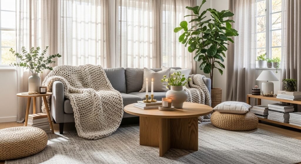
Layered Textiles for a Cozy Reading Nook
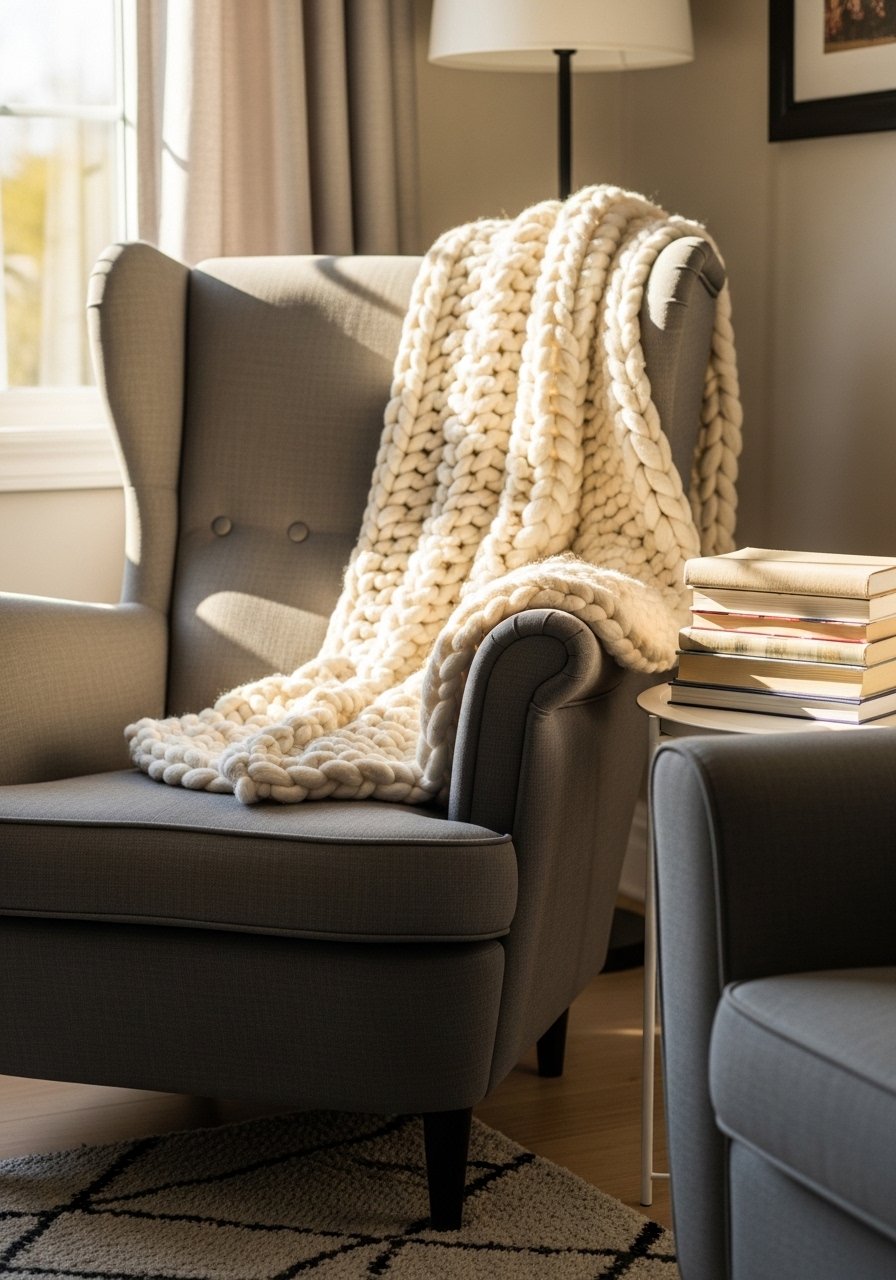
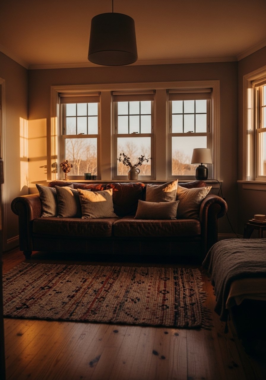
The moment I draped a chunky knit throw over my gray sofa, the room stopped feeling flat. For a reading nook aim for a 60-30-10 color rule, where 60 percent is neutral, 30 percent is a mid-tone, and 10 percent is a pop. Budget $50 to $200 depending on chair choice. Use odd numbers of pillows, three works well. Avoid slick polyester that looks shiny in photos. I use a cream chunky throw and a small reading lamp with warm bulbs. In small rooms pick a narrow chair to keep circulation clear.
Floor-to-Ceiling Curtains to Add Height
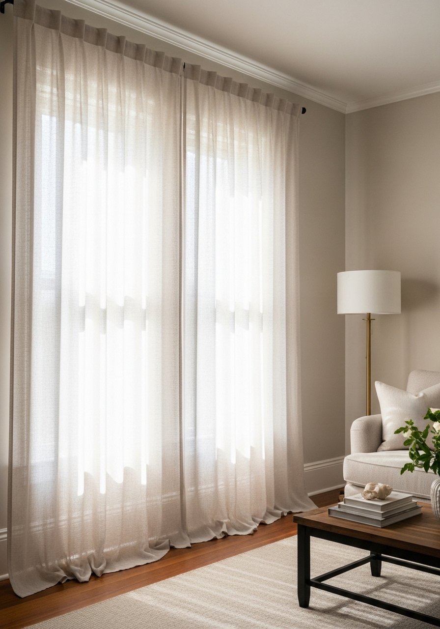
Most people hang curtains too low. I learned to mount the rod 4 to 6 inches above the trim and extend it past the window edges. The result reads taller and more intentional. Works in modern and transitional rooms and fits any budget. For 9-foot ceilings pick 96-inch or 108-inch panels. Avoid curtains that stop mid-wall. I use linen blend 96-inch panels when I want height on a budget. In large rooms, wider rods and multiple panels keep proportions balanced.
Gallery Wall with Mismatched Vintage Frames
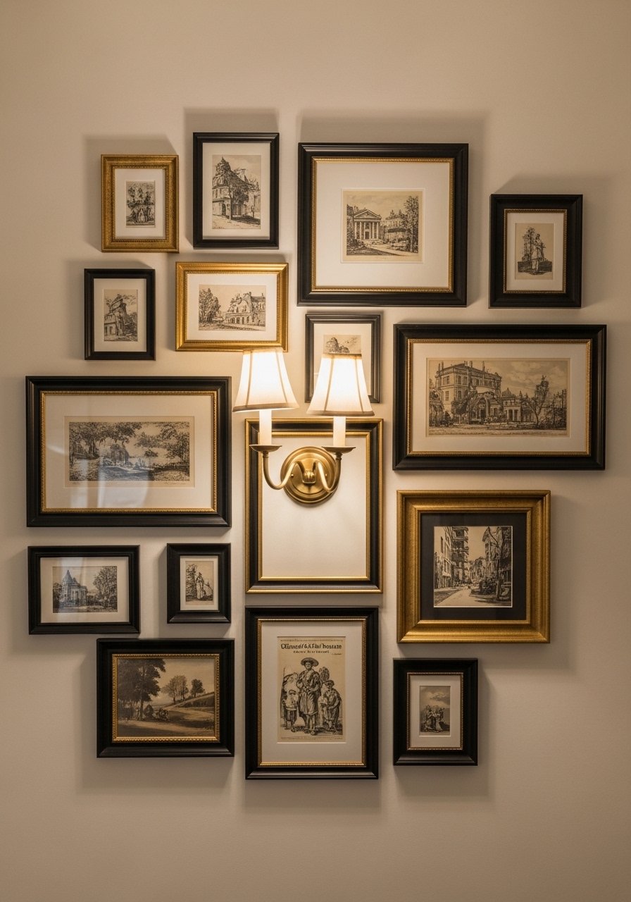
A gallery wall feels curated when you mix frame finishes and repeat one color in the art to unify it. I lay pieces on the floor first, following an odd-number rule for groupings. For true-life vs photo styling, small frames look great in images but can get lost in person. If your wall is large, scale up the art or add an oversized mirror. Avoid frames that are all the same cheap plastic. Grab a set of vintage-style frames and some white mats to make thrifted finds sing.
Statement Rug to Anchor the Seating Area
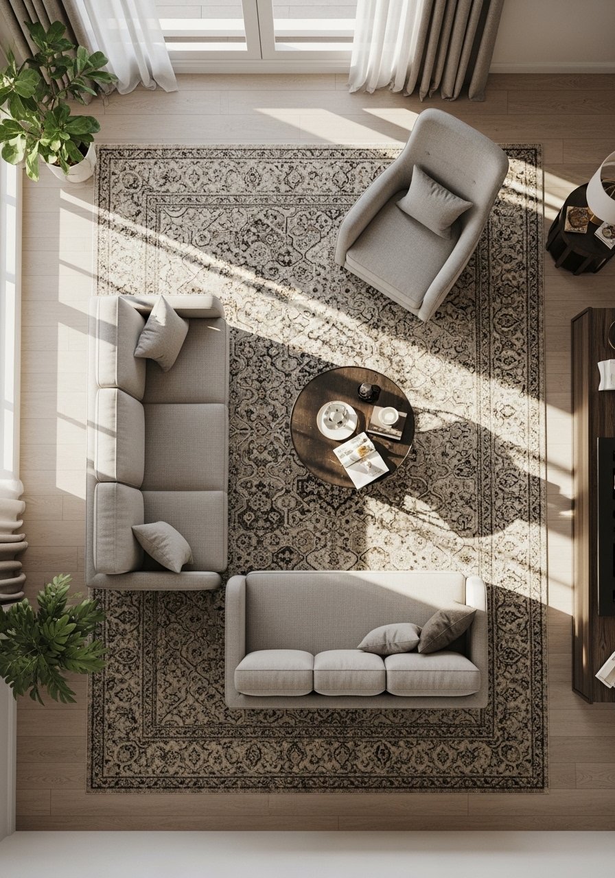
A rug sets the room's mood and scale. I went from a too-small rug to an 8×10 and the seating finally read connected. Rule of thumb, all front legs on the rug in medium rooms. Pattern works even in neutral palettes if you repeat a color from pillows or art. Avoid shag rugs in high-traffic family rooms. For durability I recommend an 8×10 jute rug. In small rooms, choose a light rug to keep the feeling open.
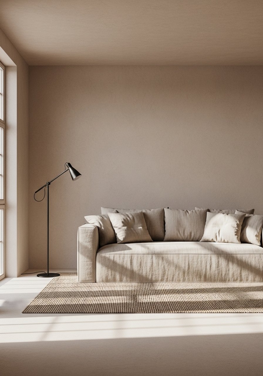
Oversized Mirror to Brighten Dark Corners
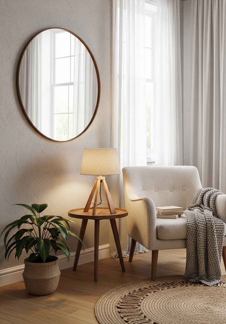
I leaned a large round mirror behind a console table and the room felt instantly brighter. Mirrors double perceived space when angled toward windows. Round mirrors soften rectilinear furniture. Budget $80 to $300 depending on frame. Avoid mirrors with heavy ornate frames in modern rooms. This 36-inch round mirror is the size I use. In narrow rooms, a tall vertical mirror works better than a wide one.
Mixed Metallics for Modern Glam
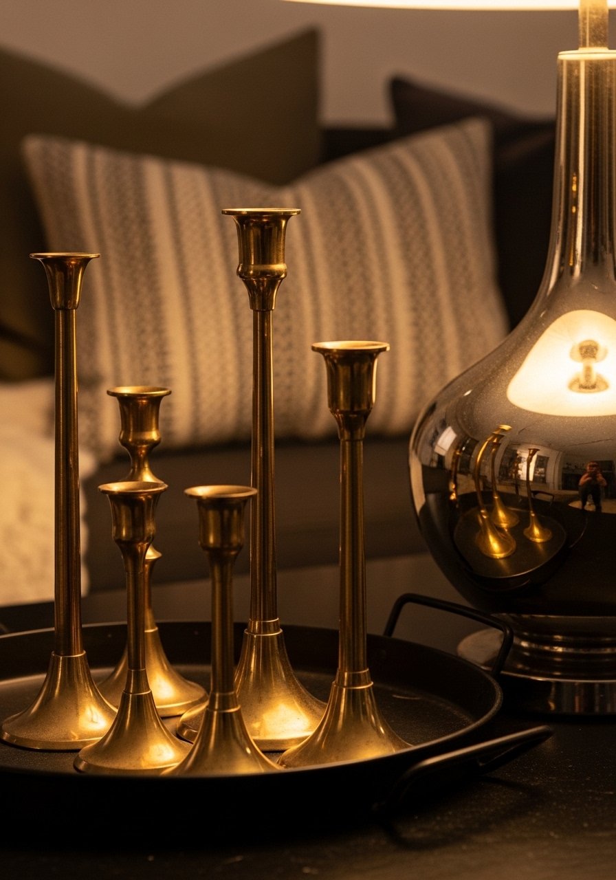
I used to match every metal. Then I mixed warm brass with cool chrome and the space looked more intentional. The trick is to repeat one metal at least three times and let a secondary metal act as accent. Works well in modern glam and transitional rooms. A common mistake is adding shiny finishes in every corner. Start with brass picture frames and a nickel lamp. In small rooms limit metallic surfaces to avoid glare.
Floating Shelves with Curated Greenery
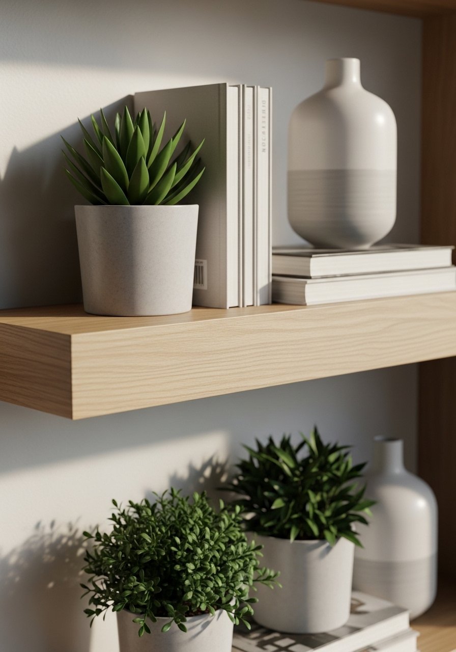
I keep seeing white oak shelves in every showroom. Floating shelves give a built-in look without construction. Stagger three shelves and style them with odd-numbered objects for balance. A common mistake is overstuffing. Leave breathing room. For product specifics, go 12 inches deep for books and 24 inches wide per shelf for good proportion. I use white oak floating shelves and a mix of real and faux plants. In tall rooms line up shelves vertically to draw the eye upward.
Sculptural Lighting as a Focal Point
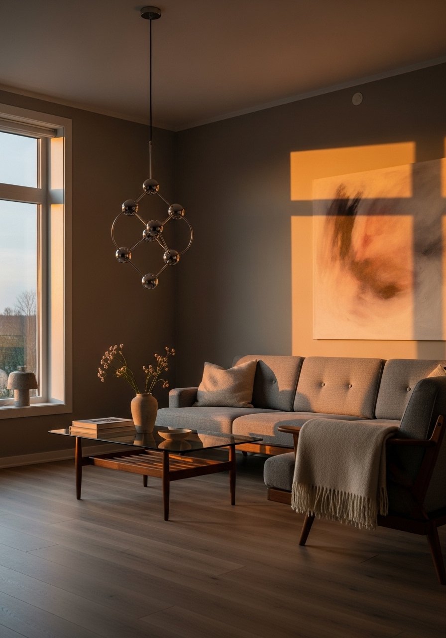
Lighting defines mood. I switched a generic fixture for a sculptural pendant and guests asked about it every time. Budget varies widely. For scale pick a fixture that is one-third the width of your table for overhead placement. Avoid tiny fixtures over large seating groups. I recommend a rattan pendant shade for softer light. In open plans use multiple light sources to avoid shadows.
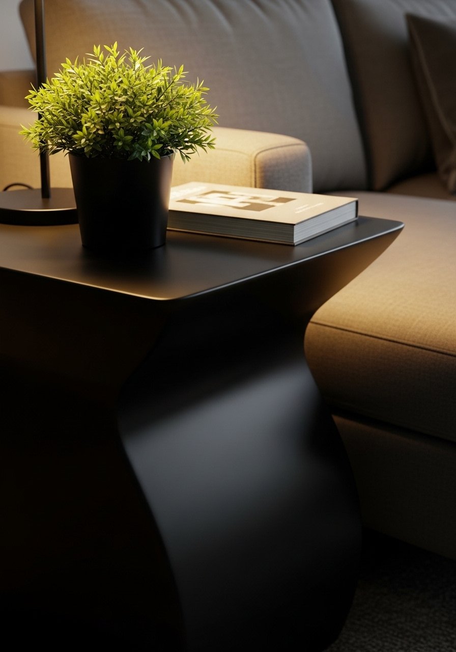
Minimalist Coffee Table Styling with Purpose
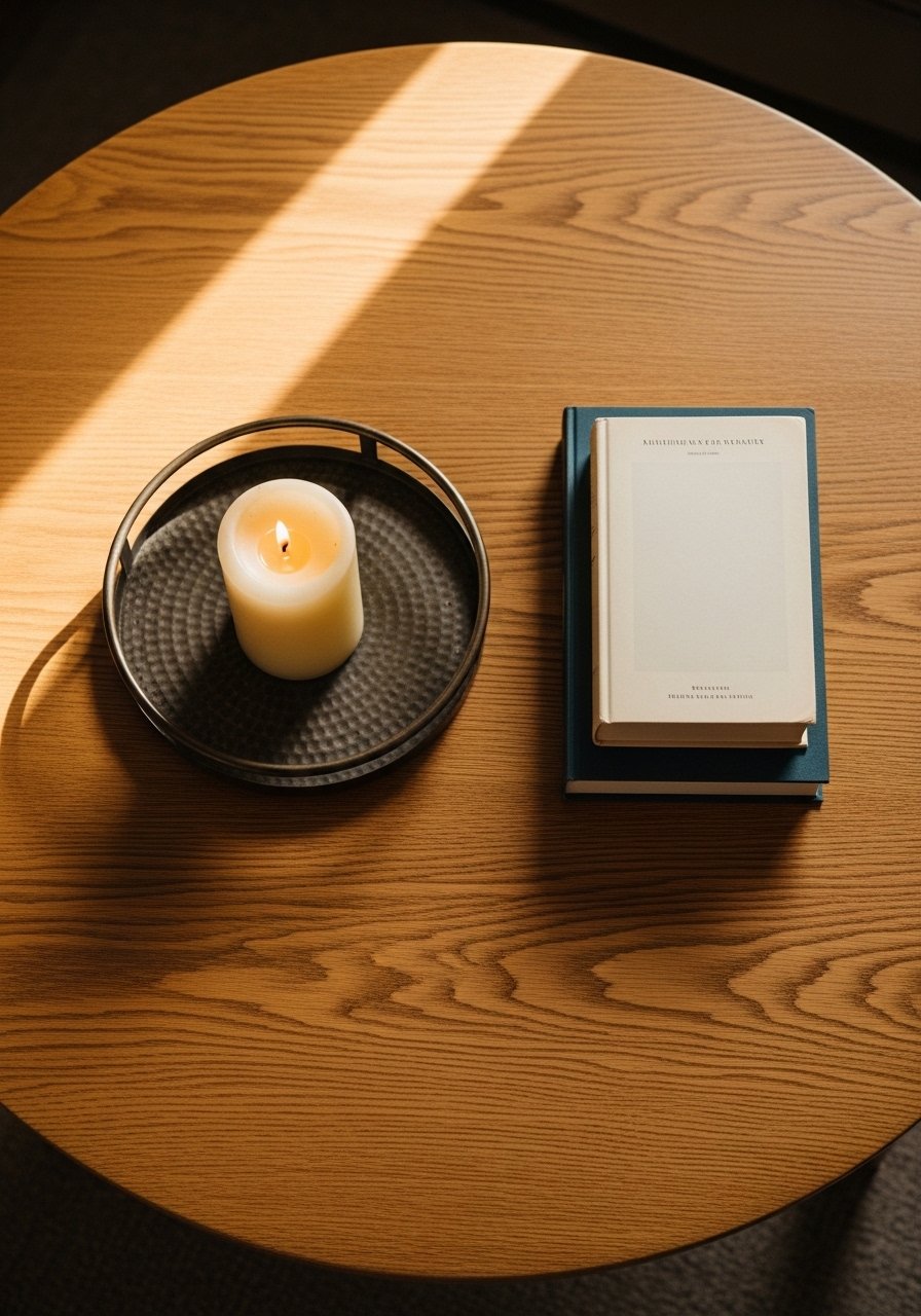
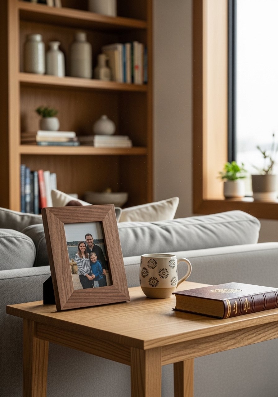
Coffee tables often get cluttered. I edit to three purposeful items, following an odd-number rule. One tray, one plant, and one stack of books reads curated in person and in photos. For functionality, choose a table height within 1 to 2 inches of your sofa seat. Avoid tall centerpieces that block sightlines. My go-to is a round oak table paired with a small decorative tray. In homes with kids keep breakables off the main surface.
Curated Coffee Table Books and Objects
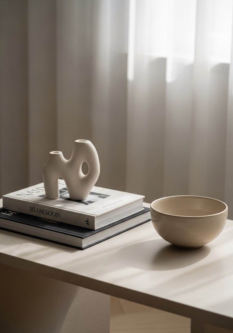
Books should be more than props. I pick titles I actually read and stack them in groups of two or three. Use one object on top to add height variation. A cheap mistake is mixing glossy covers with random paperback colors. Pick neutral jackets or slipcovers. Design books with neutral covers make styling easier. In small rooms keep stacks low so sightlines are open.
Monochrome Living Room with Contrast Texture
I used to think monochrome meant boring. In practice texture creates interest. Pair linen, wool, and leather in the same hue to avoid flatness. Budget can be modest if you shop pillow covers and throws. For contrast add one black or dark accent under the 60-30-10 rule. Avoid fabrics with sheen that read cheap. Neutral linen pillow covers are my go-to. In large rooms use varied textures at different heights to prevent the look from feeling monolithic.
Warm Wood Accents for an Organic Feel
Warm wood tones are trending hard this year. I introduced a white oak side table and the space felt more grounded. Mixing wood tones works if you repeat at least one finish across the room. The mistake I see is random mismatched pieces with no shared undertone. For product choice, prioritize real wood or high-quality veneer. White oak side tables hold up better than cheap laminates. In small rooms choose slimmer profiles to keep pathways open.
Wet-Lacquer Console for High-Contrast Entry
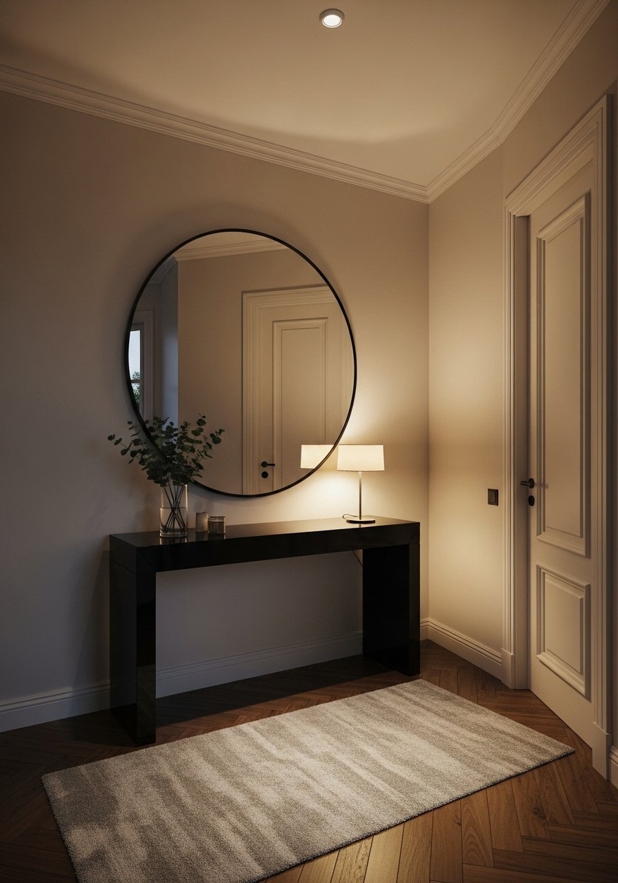
High-contrast pieces anchor transitional spaces. I added a wet-lacquer console and the entry read intentional immediately. Gloss reflects light and hides fingerprints on darker finishes less than you expect, so pick a finish you can maintain. Avoid cheap lacquer that chips. For size, a 36 to 48-inch console fits most apartment entries. A black lacquer console added drama in my hallway. In open-plan spaces use console styling to define circulation lines.
Boho Layering with Kilim Rugs and Textiles
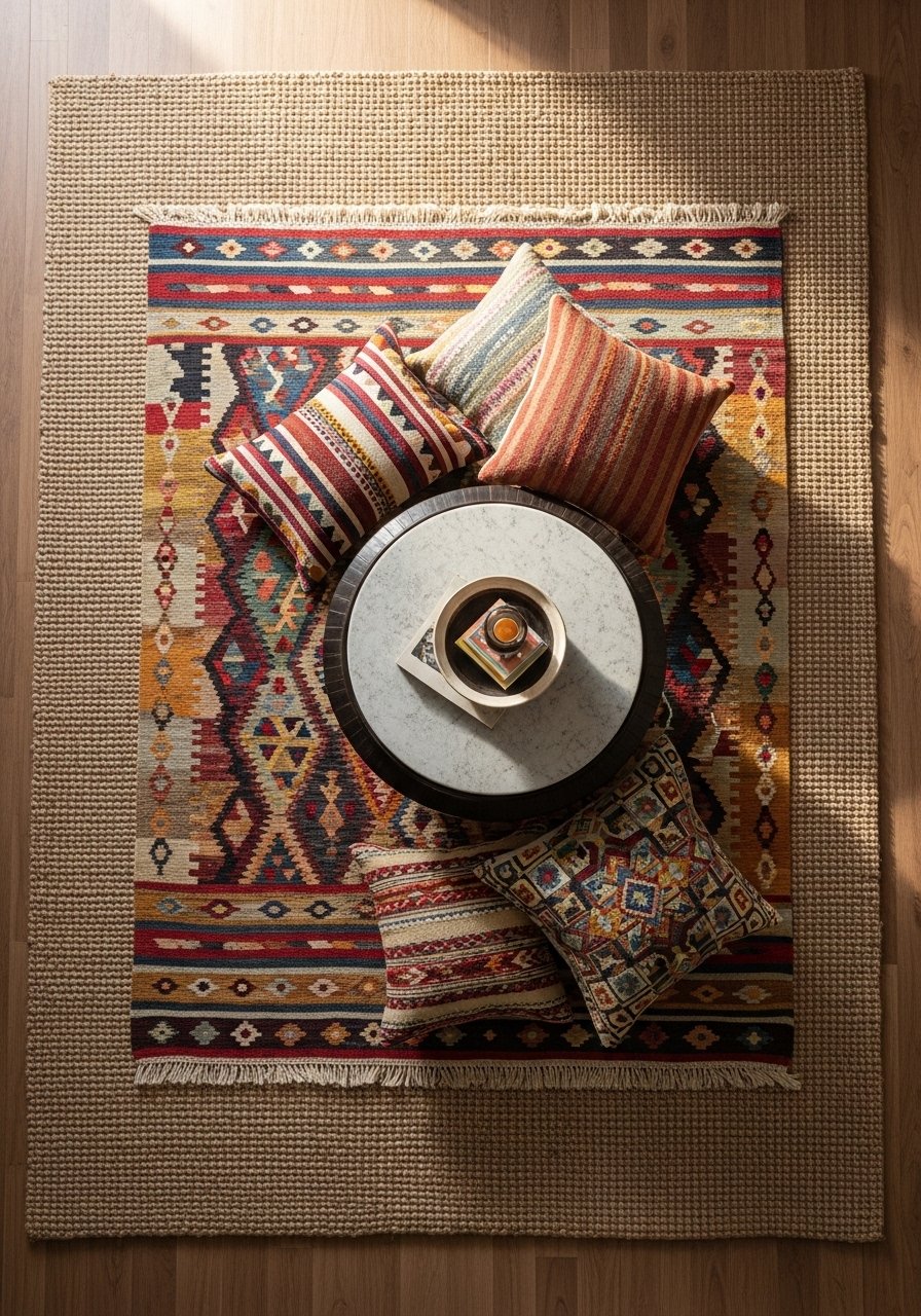
Boho works by mixing scale and pattern. I layered a small kilim on top of a neutral jute rug to add color without overwhelming the room. The rule that saved my styling was balancing one bold pattern with two subdued elements. A common cheap look is clashing patterns of similar scales. For product picks, get a natural fiber base rug and an accent kilim under 6×9. Kilim rugs are great accents. In compact rooms limit layering so the floor doesn't feel busy.
Low-Profile Modular Seating for Small Rooms
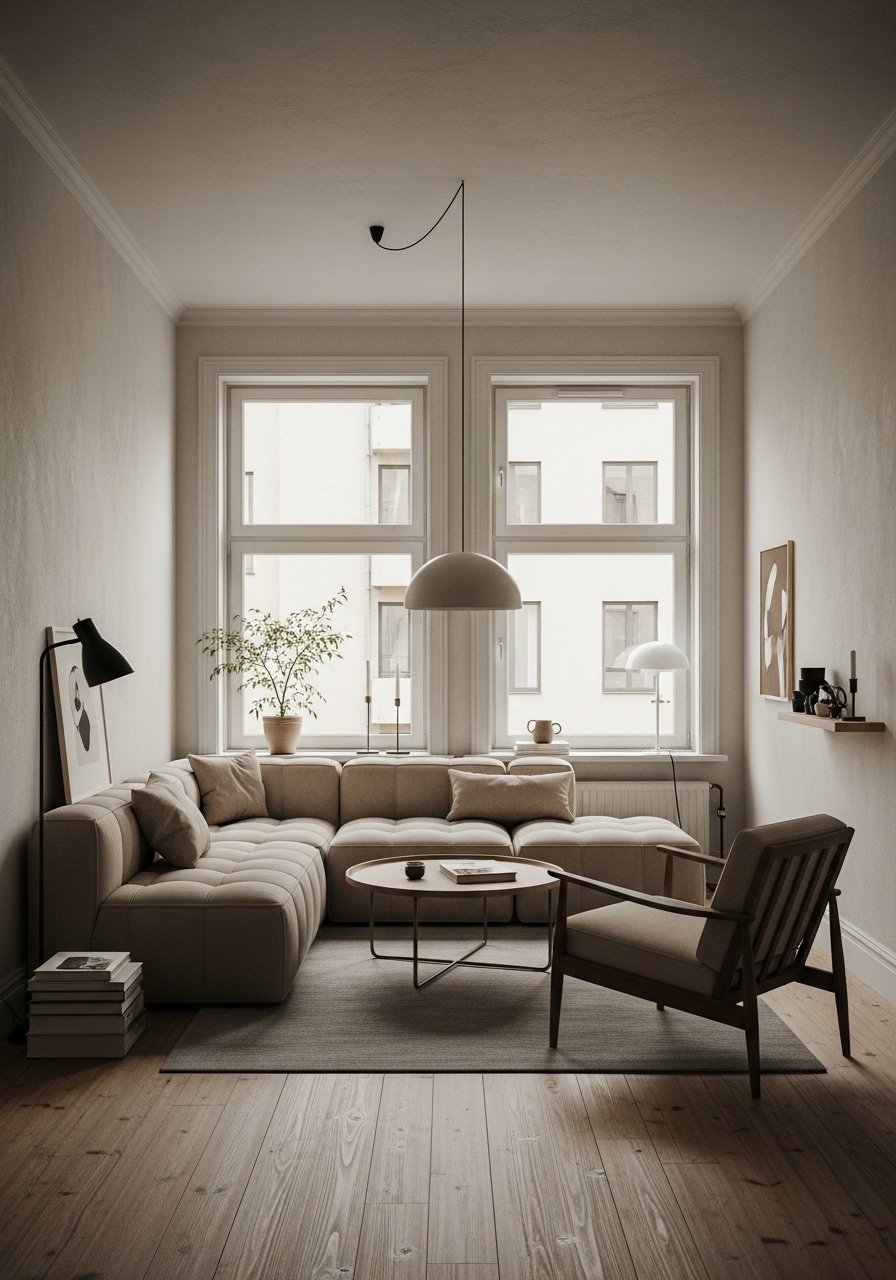
In tiny spaces modular seating changes everything. I swapped a bulky sofa for a low-profile sectional and the room gained visual breathing room. Low profiles help sightlines feel open and make small rooms feel larger. A mistake is choosing a modular unit that is too deep for circulation. Pick seat depths near 36 inches for compact plans. A low-profile modular sofa fit my narrow living room. In larger rooms modular pieces can be combined for flexible configurations.
Accent Chair with Pattern for Instant Interest
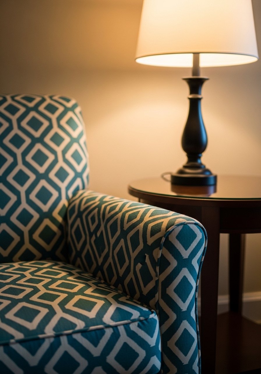
An accent chair is an easy way to inject personality. I added a patterned chair and suddenly the whole seating grouping felt edited. Choose a chair with a strong silhouette and fabric that complements your rug or pillows. Avoid tiny accent chairs that disappear in scale. For durability pick a performance fabric if pets are present. I like a patterned upholstered accent chair with 28 to 32-inch width in small rooms. Place it at a 15-degree angle to the sofa for better conversation flow.
Built-In Planter or Green Corner for Vertical Interest
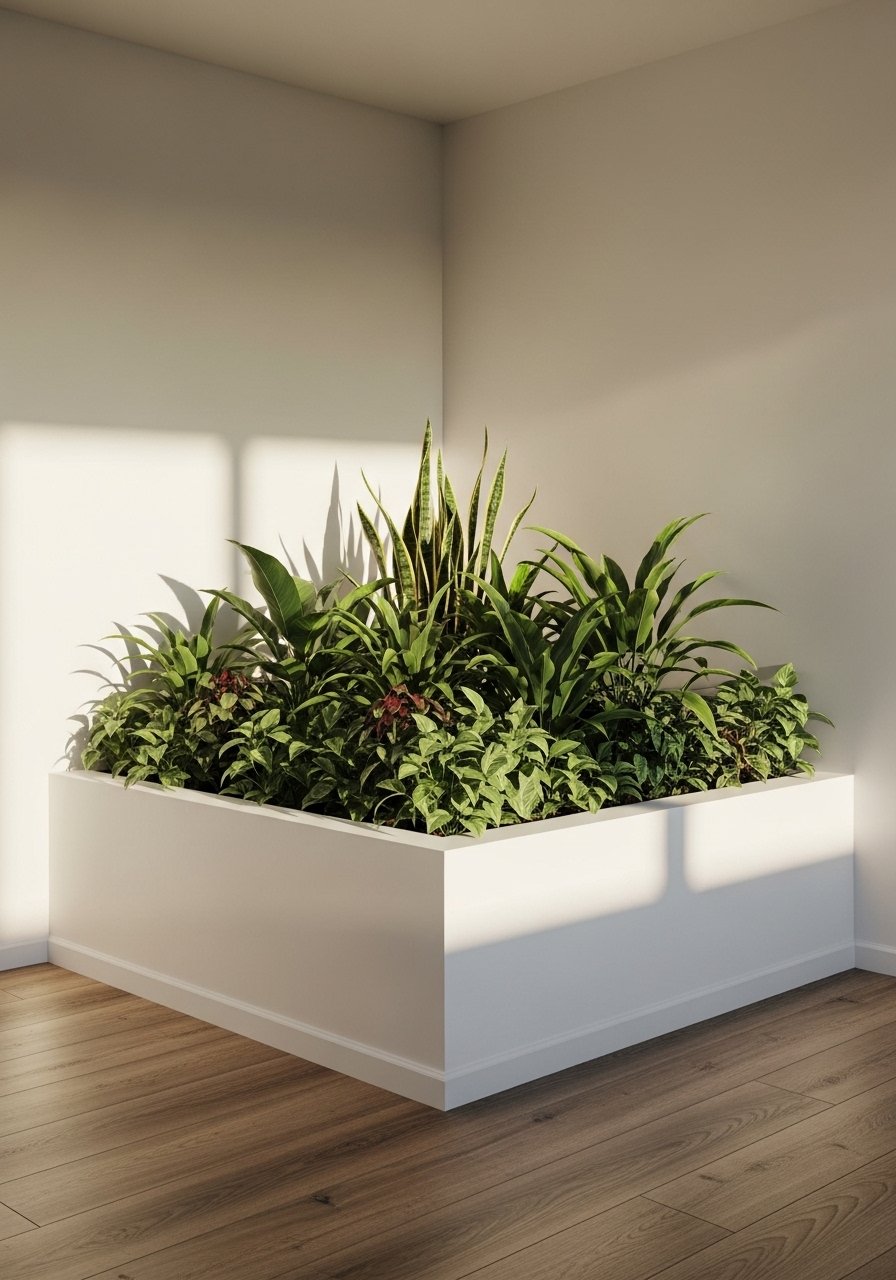
Plants add life but scale matters. I created a green corner with a 6-foot fiddle leaf fig and a few smaller pothos. A single tall plant reads much stronger than five little ones scattered. Use one large planter at eye level and a smaller one below for depth. Avoid overwatering faux alternatives. A realistic faux fiddle leaf fig gives height with low maintenance. In bright rooms choose sun-loving species. In low light pick realistic faux or hard-to-kill varieties.
Hidden Storage with Stylish Baskets
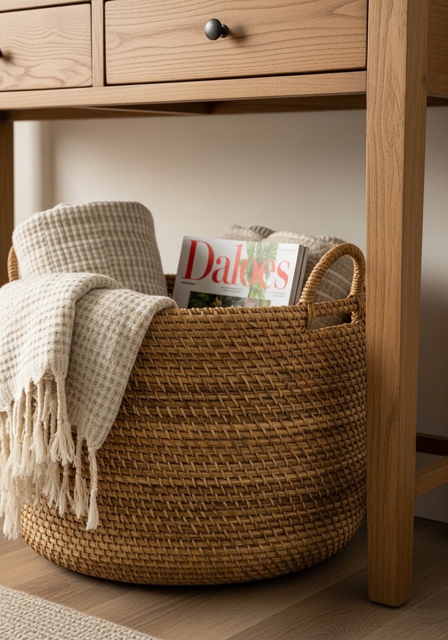
Clutter ruins a polished look. I hid remotes and blankets in rattan baskets and the room felt instantly neat. Baskets should be sized to the shelf or console, and labeled if you share space. Avoid flimsy woven options that sag. Rattan storage baskets set are sturdy and photo-friendly. In family rooms choose baskets with lids to hide toys. For the living room display one basket and keep the rest behind cabinet doors.
Layered Lighting for Even Glow

Lighting should be layered. I stopped relying on one overhead fixture and added a floor lamp and two table lamps. The most common mistake is using bulbs that are too cool. Pick warm white bulbs of 2700K to 3000K. A lampshade material matters. Linen shades diffuse light more softly than plastic. LED warm white bulbs are what I use. In open-concept areas place lamps near seating zones to create separate moods.
Tone-on-Tone Artwork Grouping for Calm Walls
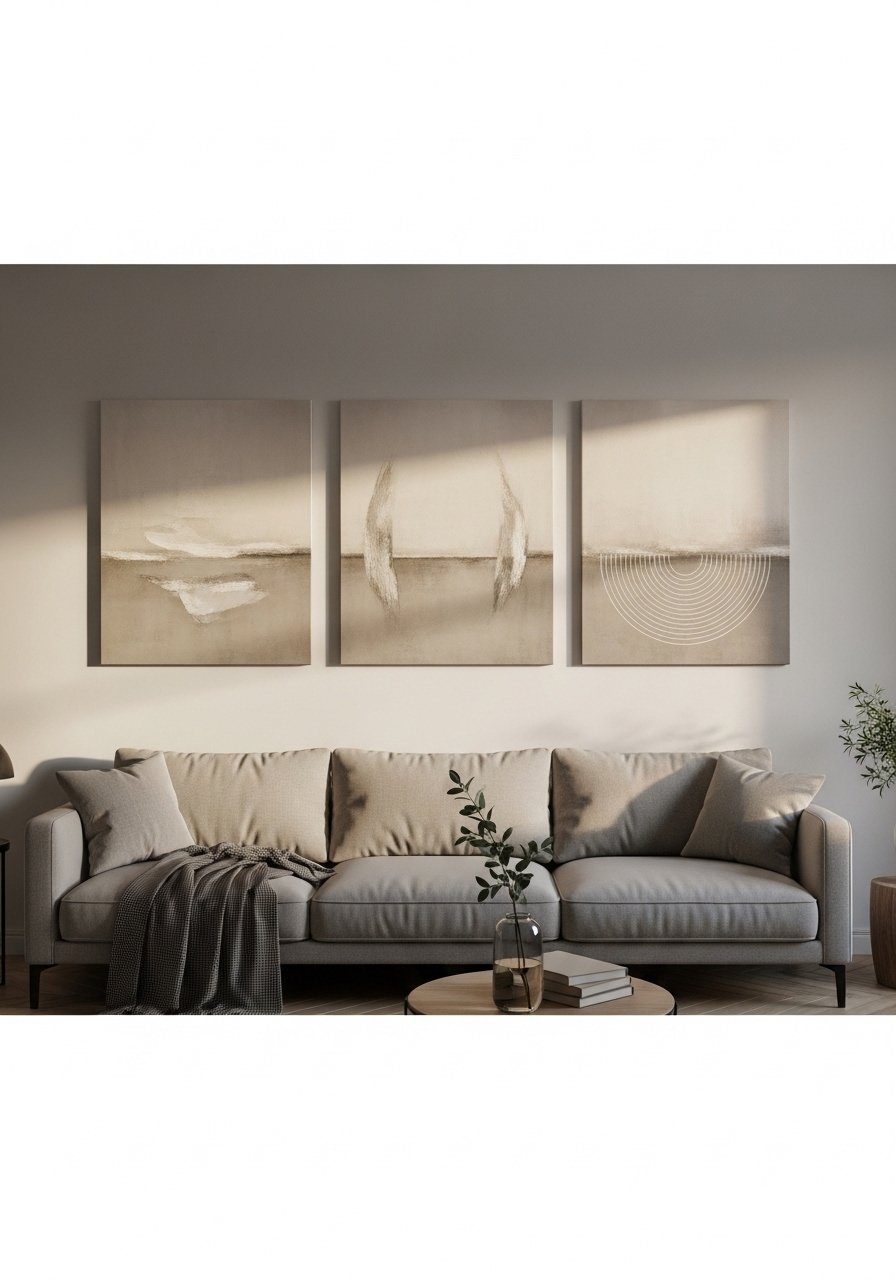
I grouped similar-toned artwork over my sofa and the effect was calm and sophisticated. Tone-on-tone works for modern and minimalist spaces. Use pieces that vary in scale by at least 30 percent to keep visual movement. A mistake is hanging art too high; the center should be about 57 inches from the floor. I ordered neutral abstract prints in assorted sizes. In tall rooms stack vertical pieces to emphasize height.
Textured Wallpaper Accent Wall for Subtle Drama
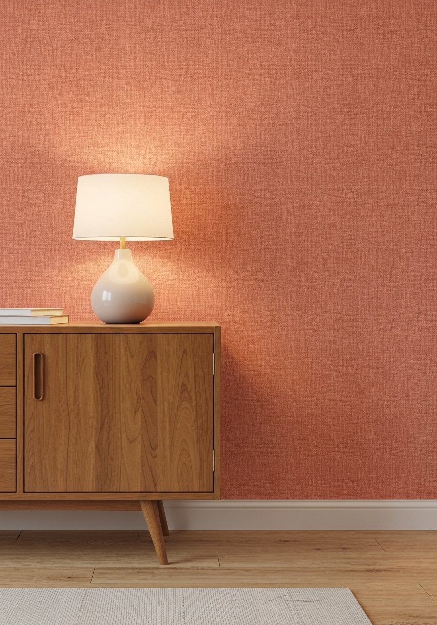
Peel and stick wallpaper adds pattern without commitment. I used textured neutral wallpaper behind my media console and it reads expensive. For a modern look pick a large-scale pattern or a subtle grasscloth texture. Avoid small busy prints that make the wall feel dated. Peel and stick wallpaper in neutral terracotta worked for my rental. In narrow rooms use wallpaper on a single wall to avoid feeling boxed in.
Leather and Linen Mix for Sophisticated Casual
Mixing leather with linen balances elegance and approachability. I paired a warm brown leather sofa with cool linen pillows and the contrast felt intentional. A rule I use is to balance one heavy material with two soft ones. Avoid pairing shiny faux leather with delicate linens. For durability choose full-grain or top-grain leather when you can. A leather sofa in warm brown held up better than budget faux options in my household. In humid climates pick performance fabrics for the pillows.
Symmetrical Seating for a Formal Living Room
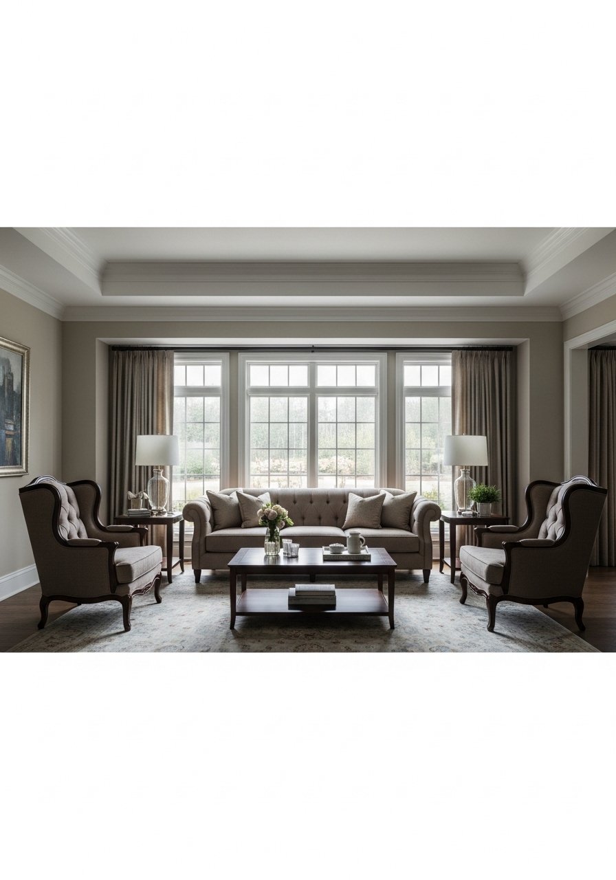
Symmetry reads composed. I arranged two matching chairs opposite a sofa for a formal sitting area. The mistake people make is forcing symmetry into an odd-shaped room. In that case use visual symmetry with matching lamps and unmatched chairs. For scale pick chairs that visually balance the sofa, usually 24 to 30 inches wide. Matching accent chairs simplified my arrangement. In family rooms, soften strict symmetry with a textured throw or different pillows.
Vintage Finds Mixed with New for Personality
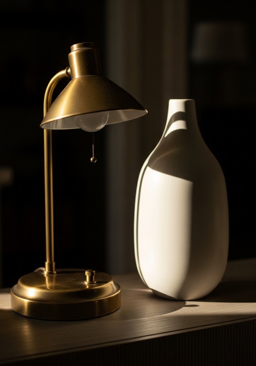
A mix of old and new keeps spaces personal. I found a vintage brass lamp at a flea market and paired it with a modern ceramic vase to anchor a console. The risk is a mismatched look that feels random. Tie old and new together by repeating one color or material. I recommend shopping thrift stores for unique pieces and supplementing with modern ceramic vases to create balance. In rentals this approach feels layered and lived in.
Neutral Palette with One Bold Accent
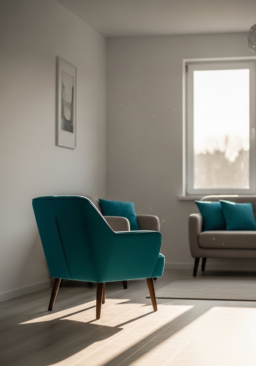
I used a single teal chair as a focal point and the neutral room finally felt curated. The rule I follow is keep 80 percent neutral, 15 percent mid-tone, and 5 percent accent. One bold piece reads thoughtfully in photos and real life. Avoid adding multiple small accents of competing colors. A durable way to test a bold color is with removable covers or a removable accent rug. A teal accent chair made the difference in my space. In large rooms repeat the accent in two to three spots.
Open-Plan Zoning with Rugs and Shelves
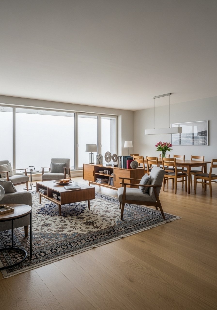
Open plans need visual anchors. I used an 8×10 rug and a low bookshelf to zone my living area from the dining space. The best mistake to avoid is tiny rugs that break up sightlines. For clear zoning keep at least 24 inches of walk space between zones. A low bookshelf creates separation without closing the plan. In small apartments use color or lighting to reinforce zones.
Patterned Throw Swap for Seasonal Refresh
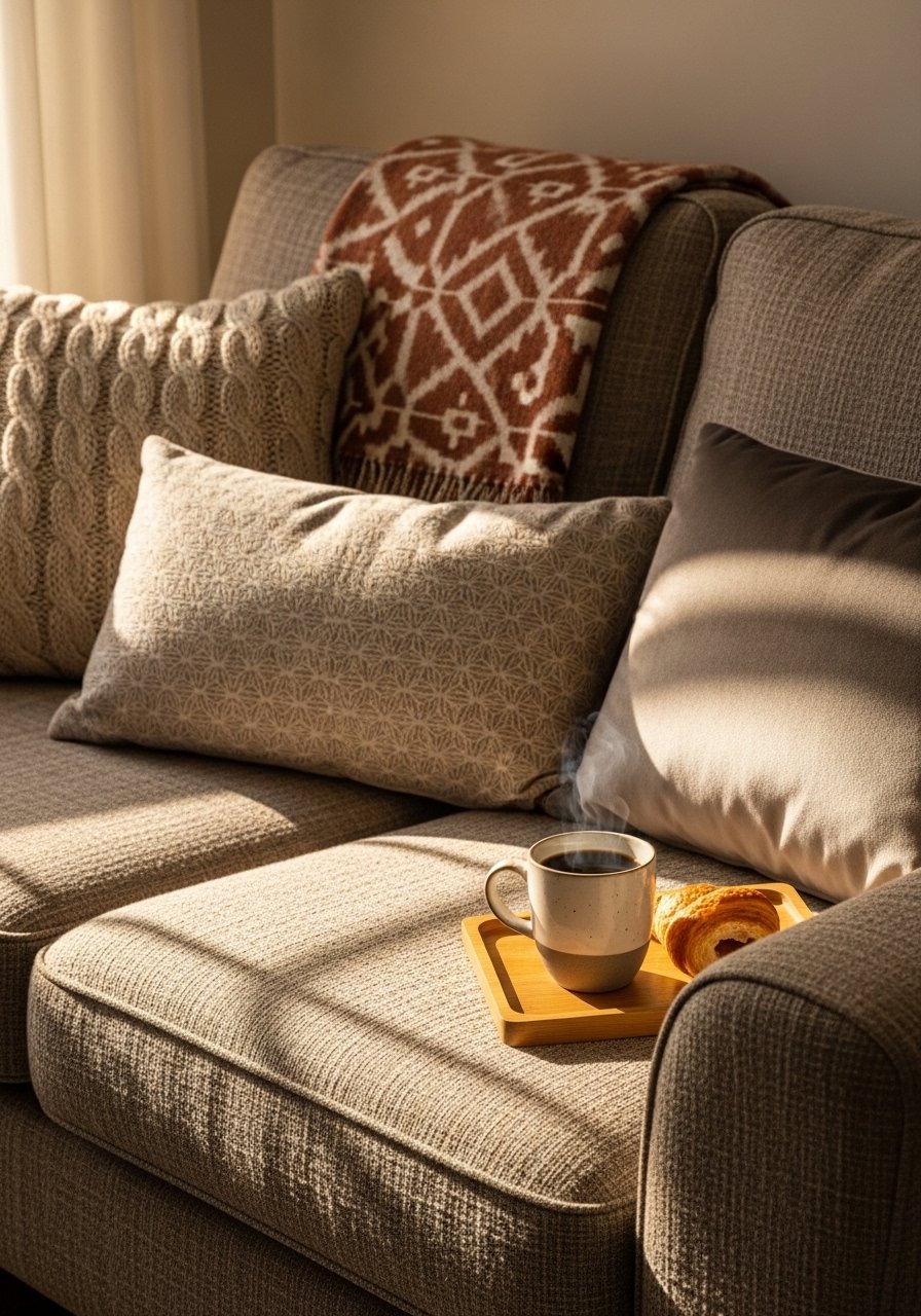
I swap throw blankets seasonally to refresh the room. A patterned throw can reset the palette with minimal cost. Pick patterns that repeat a main color from the room for cohesion. Avoid mixing more than two dominant patterns at once. A rust-and-cream patterned throw gave my fall living room new life. In households with pets pick machine-washable fabrics.
Sculptural Side Table for Functional Art
A sculptural side table doubles as art and function. I swapped a plain table for one with an interesting silhouette and it's a conversation starter. Choose a height within 2 inches of your sofa arm. Avoid overly intricate bases that catch dust. For durability pick solid wood or metal. A sculptural side table added personality without clutter. In tight layouts pick nesting tables for flexibility.
Shopping Tips for These Looks
- Grab velvet pillow covers. They are easy to swap and change the room's mood for about $12 each.
- Curtains should kiss the floor, not hover. I use linen blend 96-inch panels for 9-foot ceilings.
- White oak beats dark wood in the current feeds. Try white oak floating shelves for a modern built-in look.
- One tall plant is better than five small ones. Get a 6-foot faux fiddle leaf fig if maintenance is an issue.
- Buy a neutral base rug and layer an accent rug on top. An 8×10 jute rug is versatile and durable.
- Look for mixed-metal accents for depth. A set of mixed metal frames makes styling simple.
- Replace one light fixture before any furniture. A rattan pendant shade updates the mood quickly.
Frequently Asked Questions
Q: Can I mix boho textiles with modern furniture or will it look messy?
A: Mix them. I pair a clean-lined mid-century sofa with a patterned kilim and it reads curated. Keep one unifying color and limit patterned scales to two sizes. Add a neutral jute layer to tie both styles together. Kilim rugs help blend the look.
Q: What size area rug should I buy for my living room?
A: Bigger than you think. For most seating areas go 8×10 so all front legs sit on the rug. Too-small rugs make the furniture feel disconnected. This 8×10 jute rug worked well in my room.
Q: Should I hang art centered over the sofa or aligned with the cushions?
A: Center art over the sofa at about 57 inches from the floor to the center of the piece. If you want alignment with cushions, keep the bottom of the frame 6 to 8 inches above the sofa back. I follow the 57-inch rule for consistent results.
Q: How do I prevent a gallery wall from looking cluttered?
A: Lay pieces on the floor and photograph the arrangement before hanging. Use odd-number groupings and repeat one frame color to unify. White mats help vintage prints read modern. I used white mats to make thrifted frames look intentional.
Q: Real plants or realistic faux for styling?
A: Both. I use real snake plants and pothos where light is good. In dim corners a realistic faux fiddle leaf fig gives scale with no maintenance. A realistic faux fiddle leaf fig saved me time.
Q: Can I mix metallic finishes in one room?
A: Yes. Mix warm brass with cool nickel but repeat each finish two or three times so it reads deliberate. Start with brass picture frames and add a lamp in a second finish for balance.