
My living room felt flat for months until I swapped one blank wall for art that gave the space personality. I did not need a big budget. A single oversized piece, a small gallery, and better lighting made the room feel intentional. After that, every guest noticed the walls first.
These looks lean modern with warm, tactile pieces and a few boho touches. Most items run $20 to $200, with occasional splurges for large originals. These ideas work in living rooms, bedrooms, hallways, and small home offices. I keep seeing warm wood tones and textured art all over design feeds this year.
What You'll Need to Get This Look
Textiles and Soft Goods:
- Chunky knit throw blanket in cream. Around $40. I toss mine over the sofa arm for instant texture
- Velvet pillow covers, set of 4. About $35. Mix jewel tones for depth
Wall Decor and Art:
- Set of 3 floating shelves, white oak. $50 to $70. Stagger heights for interest, similar at Target
- 36-inch round brass mirror. $90 to $140. Mirrors open up small rooms
Lighting:
- Rattan pendant light shade. $30 to $60. Swapping the shade modernizes a fixture
- LED warm white Edison bulbs, pack of 4. $15. Warm bulbs matter at night
Plants and Greenery:
- Artificial fiddle leaf fig tree, 6ft. $65 to $95. One tall plant beats five small ones
Budget-Friendly Finds:
- Peel and stick wallpaper panels neutral linen. $25 to $40 per pack. Great for a renter accent wall
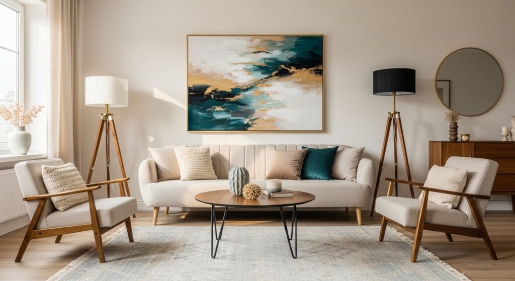
Oversized Abstract Canvas to Anchor a Modern Living Room
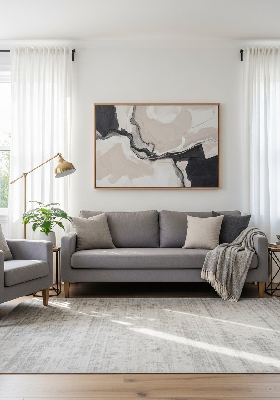
A single 48 by 36-inch abstract canvas can ground a seating area and set the palette. I bought a large print from an independent artist for $120 and it made my sofa feel curated. In photos, abstracts look perfectly balanced. In person, texture and varnish show up more. Pick a size so the art fills two-thirds of the sofa width. Avoid tiny pieces that get lost above furniture. Try a textured abstract print if you want texture without the splurge.
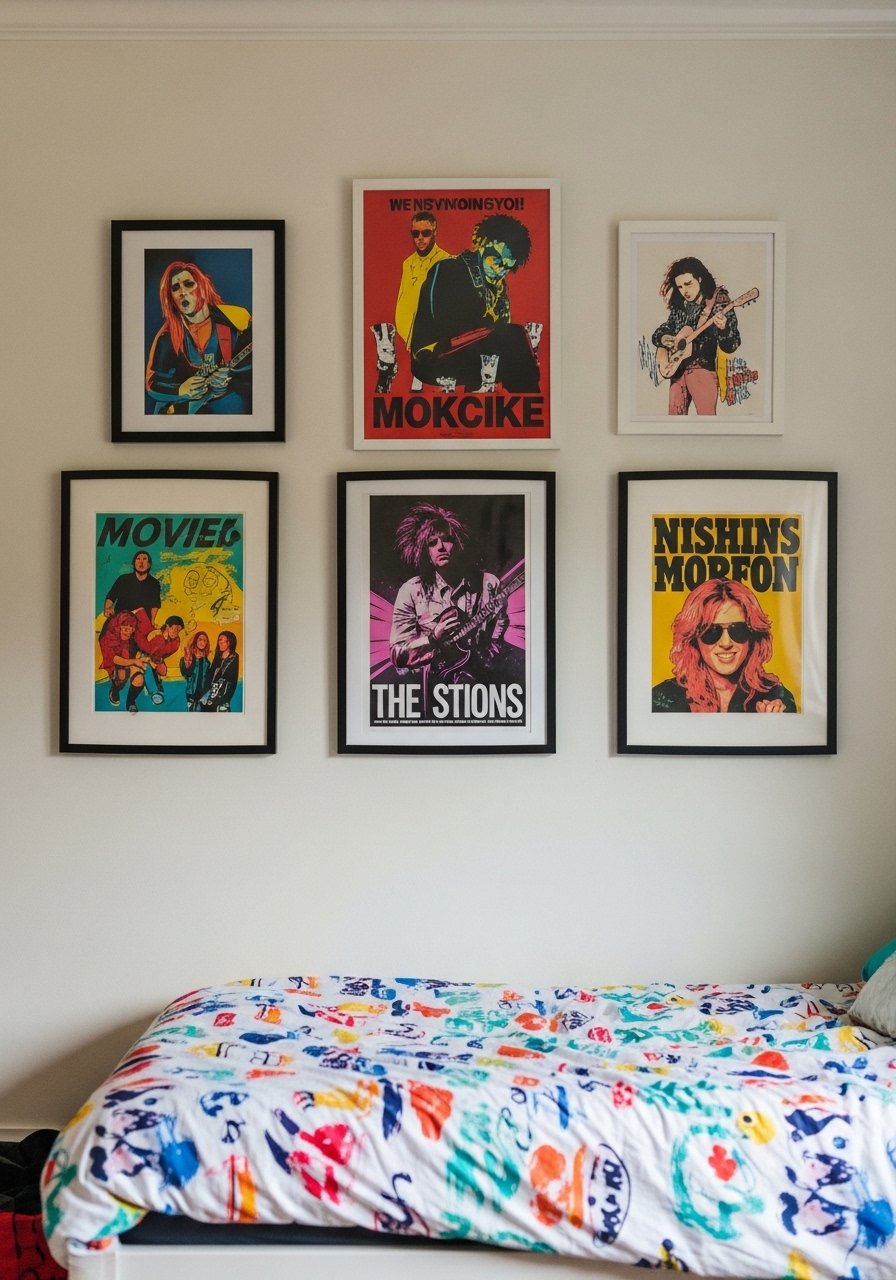
Gallery Wall with Mixed Frame Finishes for a Cozy Dining Area
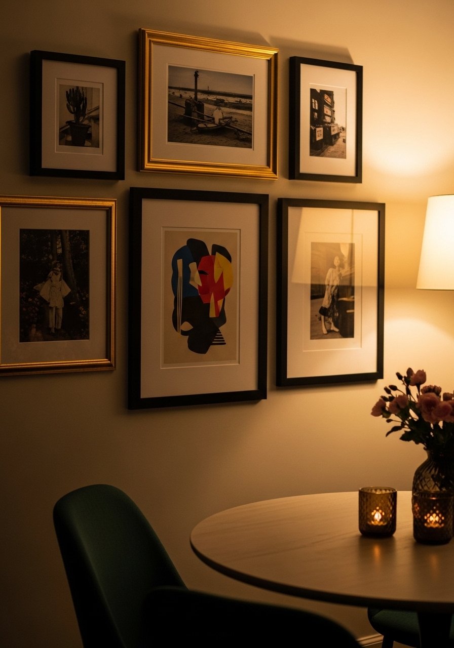
My dining nook felt sparse until I built a gallery wall using odd numbers of frames, mostly black with two brass accents. I keep seeing mixed metals in frames across showrooms this year. The rule I use is odd grouping and a dominant anchor piece. In a small room, keep frames within a 36-48 inch square to avoid visual clutter. The cheap mistake is using mismatched mats that look sloppy. I recommend a pack of white picture mats and mixed-metal frames.
Minimalist Line Art in a Bedroom for Calm and Focus
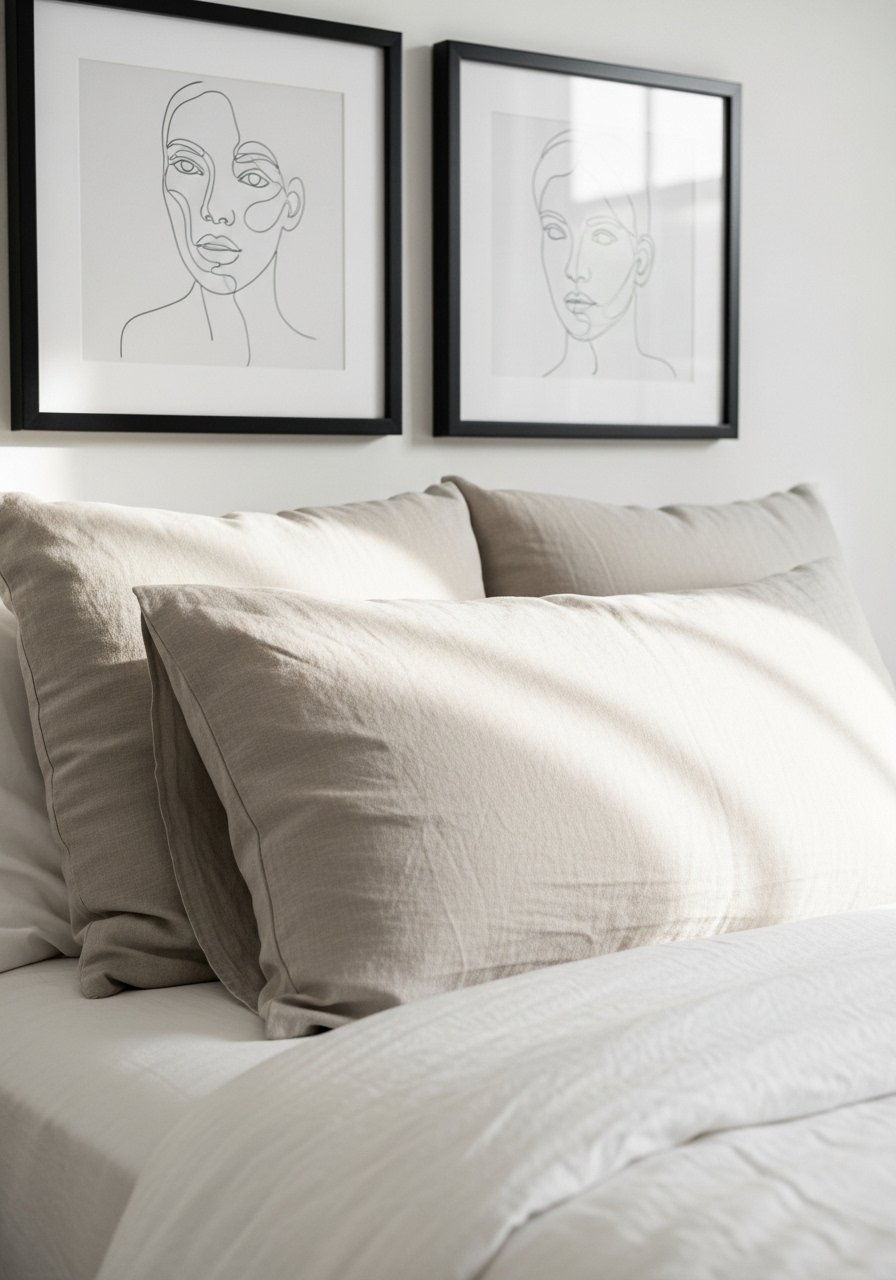
I swapped busy prints for two matching line drawings over my bed and the room felt instantly calmer. My feed is full of this pared-back look for 2026. In person, thin frames and real glass read higher end than matte paper in cheap frames. For small bedrooms, choose vertical prints to add perceived height. A common mistake is buying frames that are too wide for the mattress width. I used 11×14 black frames and mounted the pair 6 inches apart for balance.
Textured Wall Hangings for a Boho Modern Entryway
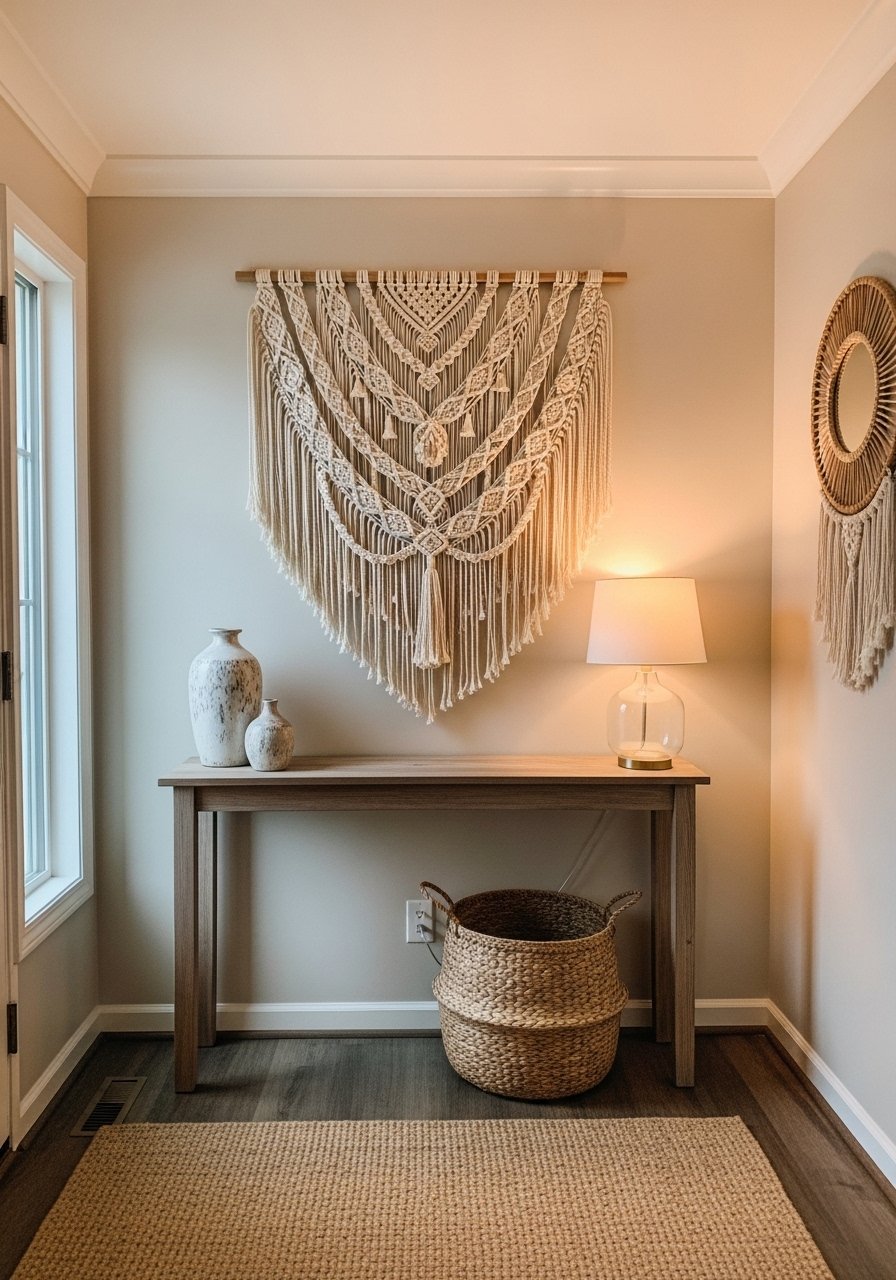
There is a softness to a woven wall hanging that photos do not capture fully. I bought a handwoven piece for $85 and it hid drywall imperfections while adding pattern. In narrow hallways stick to one vertical piece so the space still breathes. Avoid overly long fringe that drags dust and looks tired in photos. Pair with wood tones and a brass mirror. Try a boho macrame wall hanging in a small entry for under $100.
Floating Shelves Styled with Art and Greenery in a Home Office
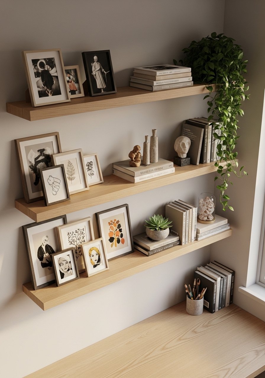
I keep a rotating set of small prints and found that floating shelves let me change the wall art without patching holes. Shelf spacing follows a 60-30-10 visual rule for decor: 60 percent books, 30 percent art, 10 percent greenery. For small offices, shallow shelves of 8 to 10 inches work best. The cheap version is overloading shelves with tiny items that look cluttered. I use white oak floating shelves and ceramic planters.
Oversized Mirror to Brighten a Dark Corner in a Hallway
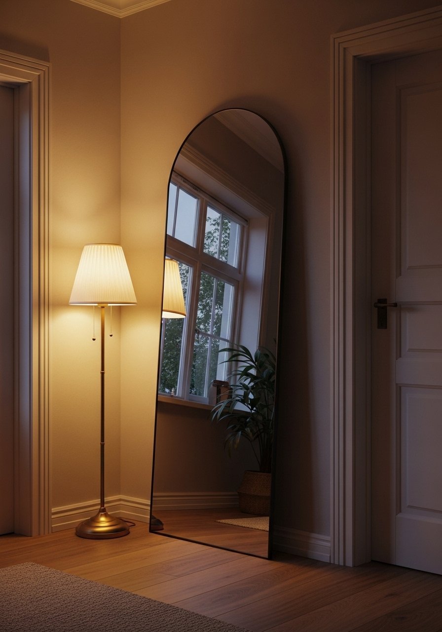
Adding a large mirror made my dim hallway feel like it had double the light. Every showroom I walk into has at least one oversized mirror right now. For narrow spaces, lean a mirror instead of hanging it. Mirrors should be proportionally large enough to reflect light without overwhelming the wall. A common mistake is choosing a mirror with a frame that matches the furniture too closely. I prefer a subtle contrast, like a brass frame against cool gray walls. Consider a 36×72 arched mirror.
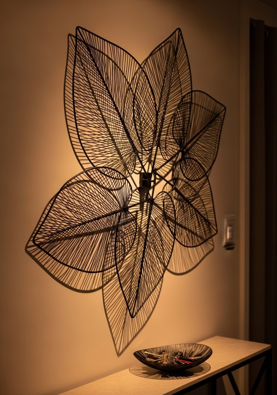
Geometric Metal Wall Sculptures for Modern Glam in a Living Room
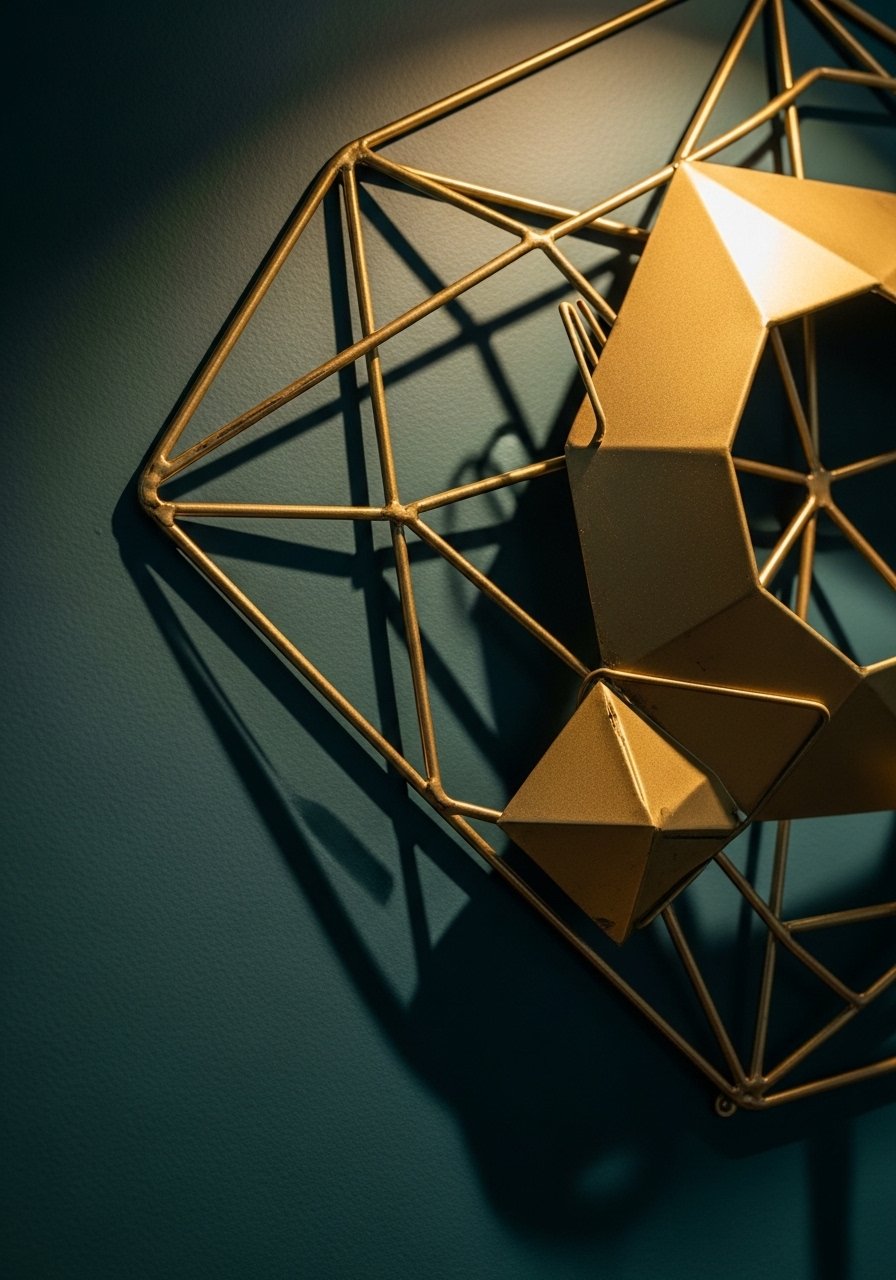
I added a metal sculpture above my console and the shadow it cast made the wall feel dynamic. I keep seeing geometric metal pieces used in modern glam rooms this year. Metal art works differently in photos and real life because the shadows shift with lighting. For larger rooms choose pieces at least 24 inches wide. The mistake people make is buying thin metal that bends easily. Look for solid brass or powder-coated steel. I linked a 26-inch gold metal wall sculpture.
Black and White Photography Gallery for a Minimalist Staircase
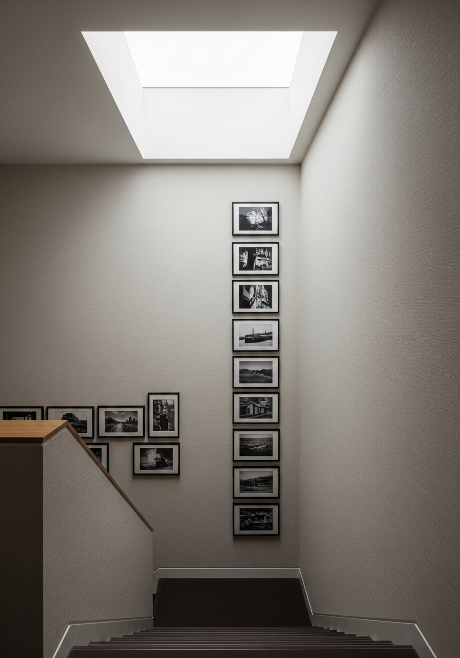
I curated a vertical strip of black and white photos for my stairwell and it reads timeless. My feed is full of stair galleries like this in 2026. The rule I follow is matching frames and alternating horizontal and vertical prints for rhythm. In small staircases keep the scale consistent so it does not feel chaotic. A cheap version uses low-resolution prints that pixelate up close. Order high-res prints and use matte black frames.
Mixed-Media Collage Over a Bedroom Dresser for Textural Interest
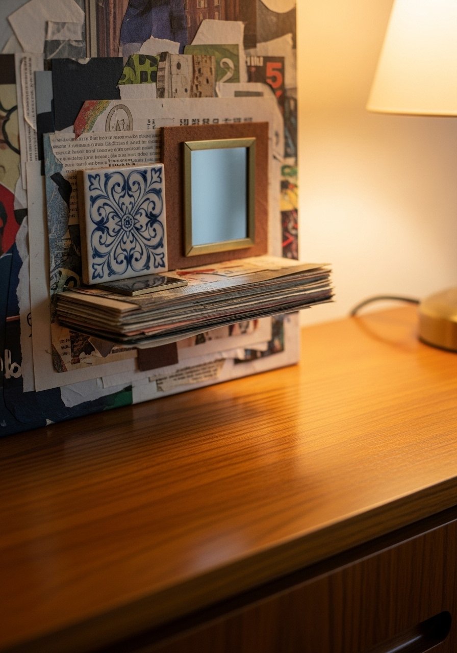
Layering paper, fabric, and found objects created depth above my dresser. I switched to mixed-media after getting bored with flat prints. In photos collages can look busy, but in person the texture is what sells it. For small bedrooms keep the collage within tabletop width to feel intentional. Avoid combining too many materials that fight for attention. I like framed fabric swatches paired with a small ceramic accent.
Sculptural Floating Frame for a Modern Nursery Accent Wall
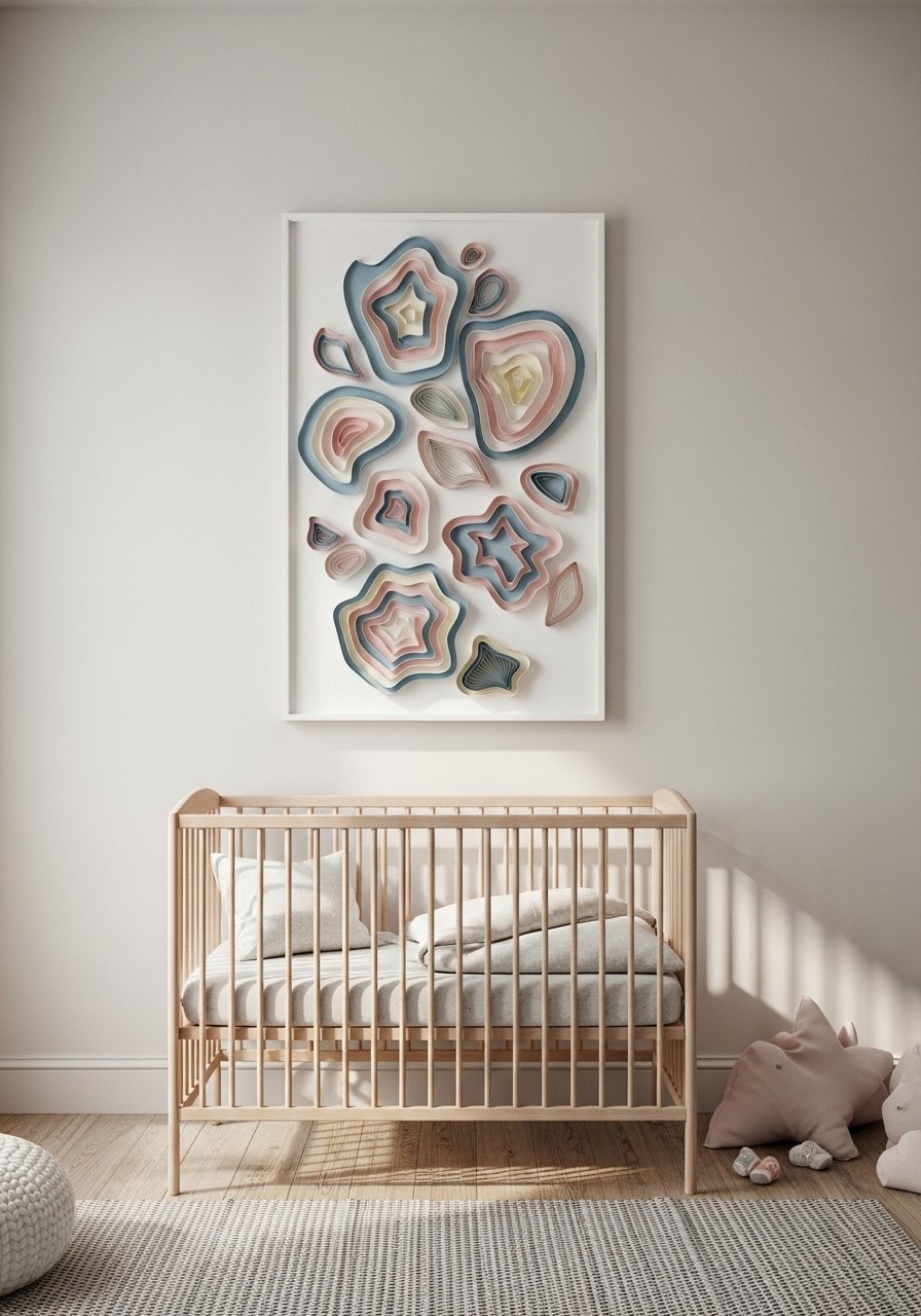
I used a lightweight sculptural frame above a changing table and it made the wall playful without being juvenile. A friend asked me about mixing boho textiles with modern furniture and this is a safe way to bridge the two. For nurseries choose materials that are easy to dust. The mistake is hanging too many soft elements that collect lint. Try a small 18-inch sculptural wall piece to introduce shape.
Ceramic Wall Planters to Bring Organic Texture to a Kitchen
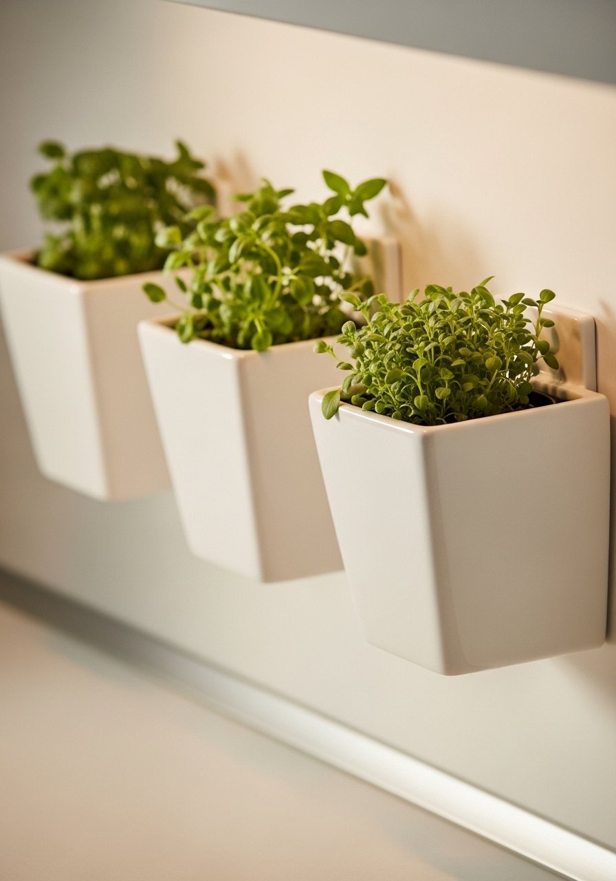
I mounted ceramic planters on a small kitchen wall and suddenly meals felt friendlier. I keep seeing herb planters used in kitchens across feeds. For small kitchens choose planters under 8 inches wide so they do not overpower the backsplash. The wrong choice is plastic pots that look cheap in photos. Ceramic with a matte glaze reads better. I used white ceramic wall planters.
Framed Textile Art for a Cozy Reading Nook
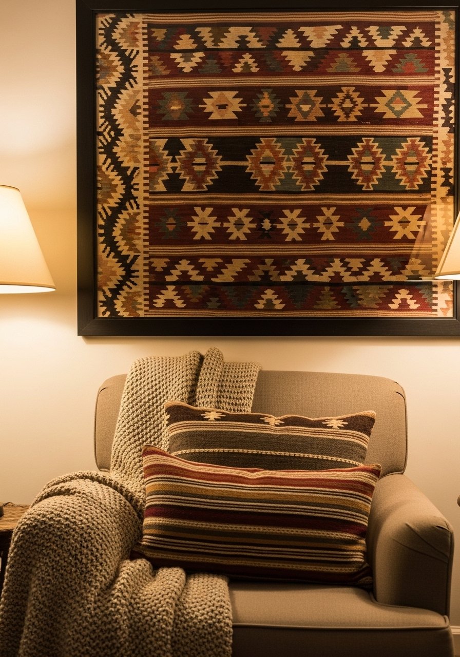
A framed vintage kilim transformed my reading nook into a tactile retreat. I used to think framed textiles were fussy, but they add scale and color effortlessly. In pictures the textile pattern appears flat, but up close the weave adds warmth. For small nooks choose a single horizontal piece to echo the chair width. The typical mistake is failing to stretch the textile before framing so it sags. I recommend a ready-stretched textile frame kit.
Neon or LED Word Art for a Modern Entry That Pops
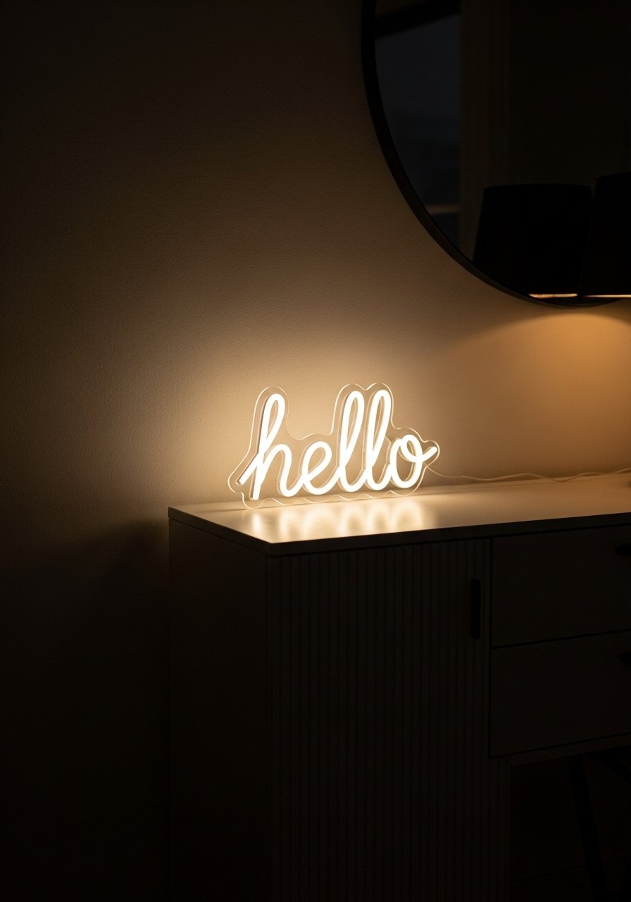
I added a small LED "hello" sign to my entry and guests actually smiled. I switched to LED words six months ago and they are great for adding a casual, modern feel. In photos neon can look too saturated, so pick one with dimming or warm white LED. For tiny entryways pick a sign under 24 inches. Avoid tacky fonts that read cheap on camera. Consider an LED script sign reading "hello".
Layered Mirrors for a Bedroom to Create Artful Reflection
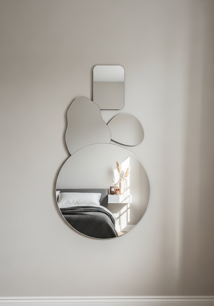
I layered three mirrors above a dresser and the arrangement doubled the visual interest without buying art. My feed is full of mixed-shape mirror groupings this year. The rule I use is a dominant mirror plus two smaller companions for a 3:1 visual weight ratio. In small bedrooms it adds depth. The cheap look comes from mismatched finishes that fight each other. Match tones or intentionally contrast warm and cool metals. Try a set of varied-shape mirrors.
Ceramic Plate Display on a Kitchen Wall for Vintage Modern Charm
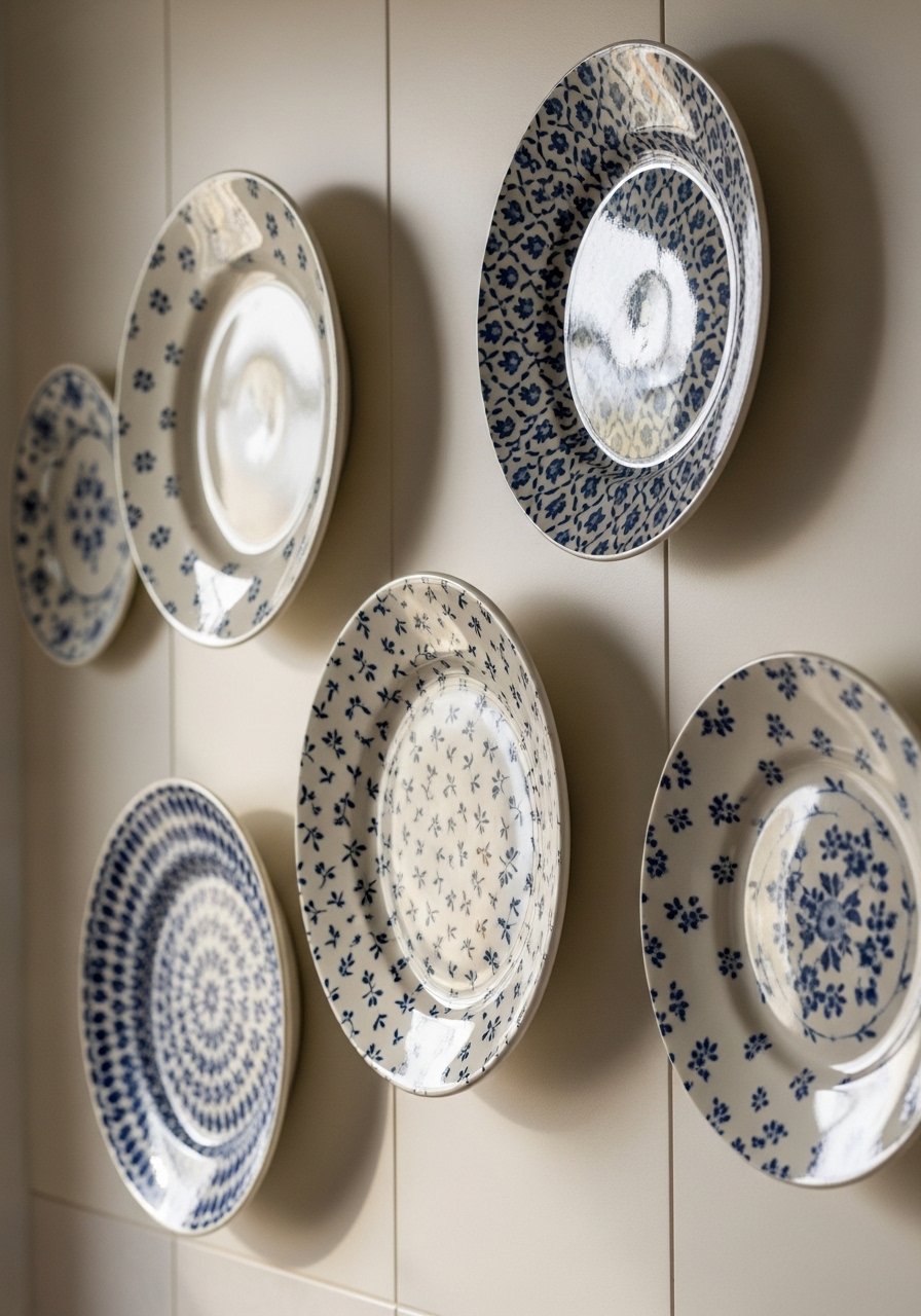
Plates on the wall added a collected feel to my kitchen faster than any backsplash. I keep seeing plate displays in modern farmhouse kitchens this year. Use odd numbers and vary scale for a balanced look. In photos plates can look flat so pick patterns with contrast. The mistake is shallow spacing that makes plates overlap awkwardly. Use secure plate hangers and start with a 60-inch wide arrangement for a kitchen wall. Decorative plate hangers are inexpensive and sturdy.
Photo Ledge with Rotating Art for a Small Rental Living Room
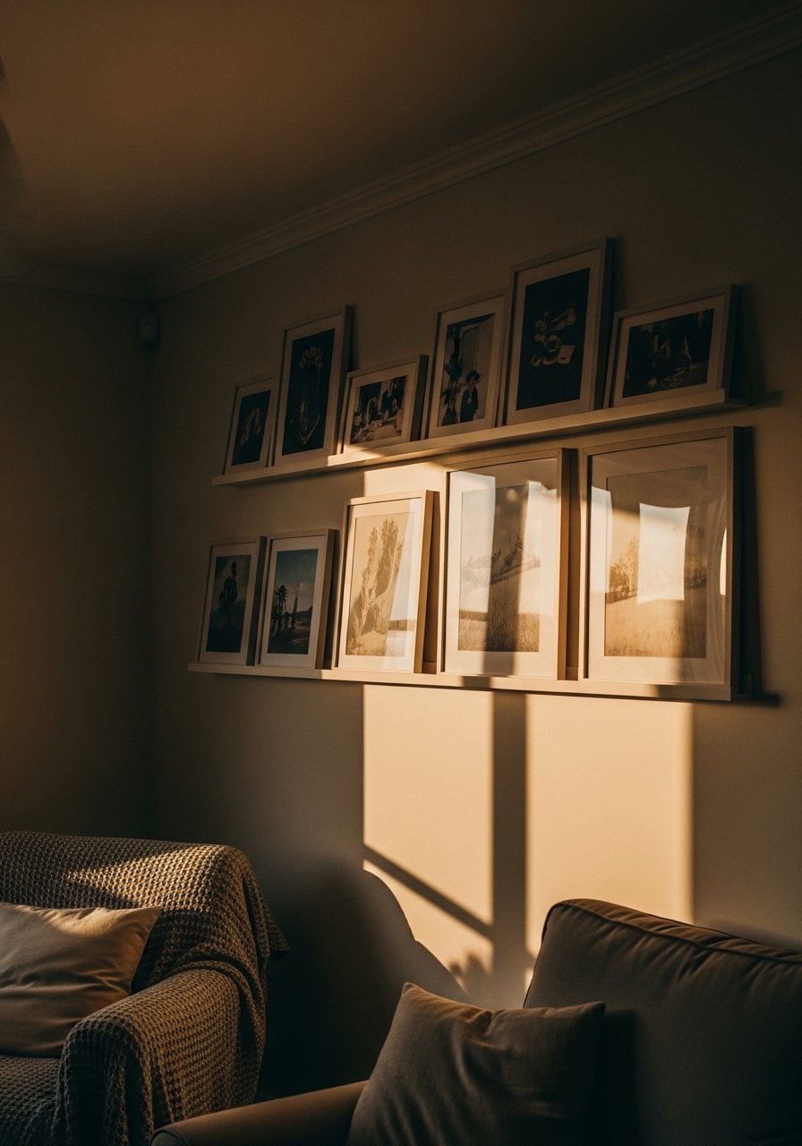
A photo ledge allowed me to rotate prints seasonally without extra holes in plaster. A friend asked me if this works in rentals and it does. In small rooms use a single 36-inch ledge to keep things tidy. Photos look curated when prints overlap slightly. Avoid overstuffing the ledge which reads messy. I recommend a 36-inch picture ledge in white oak finish.
Large-Scale Typography Print for a Home Office with Personality

I hung a typographic print that reads "Make It Happen" above my desk and it nudged productivity without yelling. I keep seeing bold typography in home offices this year. For small spaces pick one large print rather than several small ones. The common error is using overly ornate fonts that distract. Choose a clean sans-serif and a frame that coordinates with your desk. Try a large 24×36 typography print.
Reclaimed Wood Frame Collage for a Rustic Modern Entry
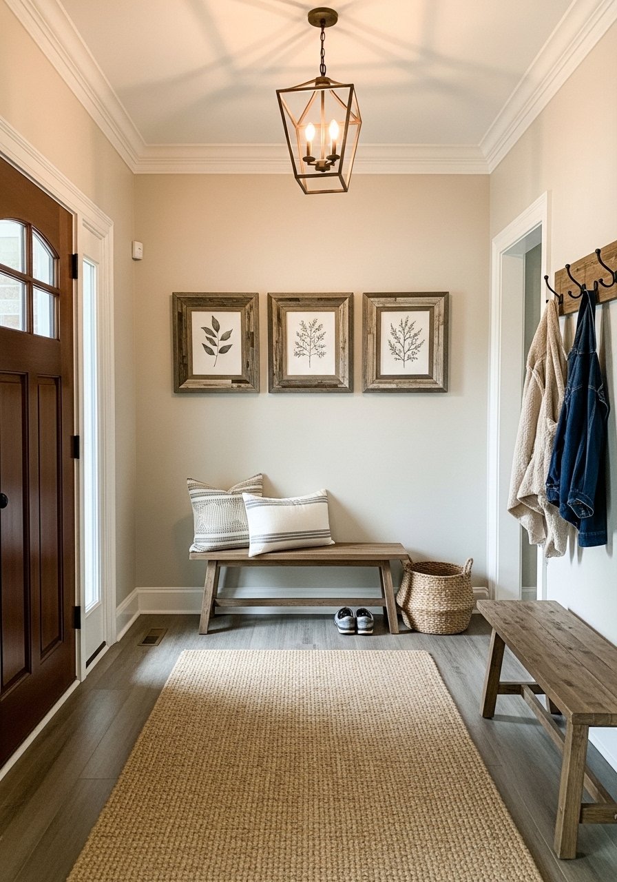
I built a small horizontal collage in reclaimed wood frames and it anchored my entry with warmth. I keep seeing reclaimed wood frames paired with modern art in showrooms. For longer walls use a horizontal composition that mirrors benches or consoles. The cheap mistake is using thin softwood that chips easily. Choose kiln-dried hardwood frames or pre-made reclaimed frame kits. I used reclaimed wood frames 16×20.
Metallic Leaf Accent Panels for a Dining Room Focal Point
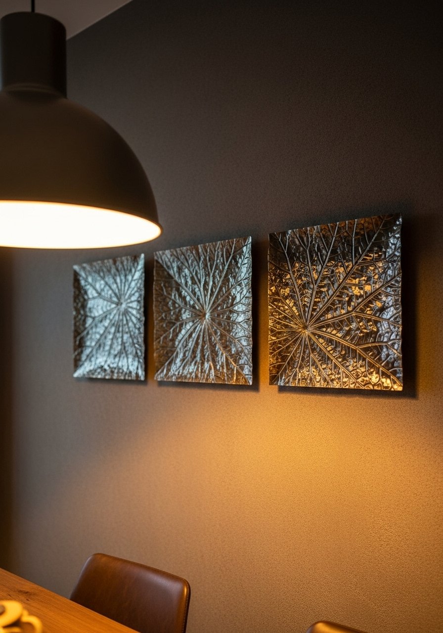
Adding three small metallic leaf panels introduced subtle sheen to my dining wall without glam overload. Every showroom I walk into shows metallic accents used sparingly this year. In photos metallics can look harsh, so choose warm-toned metals and soft lighting. For mid-size dining rooms panels around 18 inches each work. Avoid high-shine finishes that show fingerprints. I used 18-inch metallic leaf panels.
Layered Poster Art in Frames for an Affordable Teen Room Update
Framed posters instantly updated my teenager's room without breaking the bank. My feed is full of poster walls paired with modest frames. Use consistent frames and white mats to make inexpensive posters look curated. For small rooms keep posters to one wall so they do not overwhelm. The mistake is skipping mats, which makes posters look cheap. I recommend 11×17 poster frames with white mats.
Sculptural Wire Wall Art for an Entry Nook with Minimal Floor Space
I replaced a bulky console lamp with a sculptural wire art piece and the entry felt less crowded. I keep seeing wire sculptures used where floor space is tight. In small nooks choose pieces under 30 inches and mount them slightly off-center for tension. The cheap look comes from flimsy thin wire. Look for powder-coated steel that holds shape. Try a 28-inch black wire wall sculpture.
Shopping Tips for These Looks
Buy a statement piece first. Choose one large canvas and let smaller items follow. I rearrange everything around the big piece.
Grab white oak floating shelves and style them with 60-30-10 for balance. I shop West Elm for shelf styling props and Target for affordable frames.
Curtains should puddle or kiss the floor, never hang halfway. These 96-inch linen blend panels work for 9-foot ceilings.
Vintage frames are $2 to $10 at thrift shops. Pair them with fresh white mats from Amazon to look intentional.
Buy dimmable LED art lights for large canvases. LED picture lights warm white save glare and show texture.
Swap pillows seasonally so your wall art keeps feeling new. Velvet pillow covers set are cheap and high impact.
Frequently Asked Questions
Q: Can I mix boho textiles with modern furniture, or does it look messy?
A: Yes. I mix a framed kilim with a streamlined sofa and it reads collected instead of messy. Keep scale balanced and stick to two dominant textures. Framed textile kits make it easier.
Q: What size mirror should I use in a narrow hallway?
A: Go big enough to reflect light but not block walk space. I recommend at least 24 inches wide and preferably leaning rather than hung. 36×72 arched mirrors work if you have room to lean.
Q: How do I avoid my gallery wall looking cluttered?
A: Use one anchor piece and build around it in odd numbers. Keep consistent mat colors and vary frame finishes sparingly. I like a dominant print plus five supporting pieces for a balanced look. Mixed-metal frames set is a good starter.
Q: Are faux plants acceptable for styling large wall arrangements?
A: Absolutely. I used an artificial fiddle leaf fig where light was limited. Real plants are great, but a realistic faux gives scale without maintenance. Try a realistic faux fiddle leaf fig 6ft.
Q: Should I match frame finishes across my house?
A: No. Mixing finishes adds depth. I pair warm brass with matte black and it feels intentional. Keep one finish dominant in each room to avoid chaos. Mixed metal frames help you experiment.
Q: What is the easiest affordable way to update blank walls in a rental?
A: Use peel and stick wallpaper on one accent wall and a photo ledge for rotating art. Both are renter-friendly and reversible. Neutral peel and stick panels are a quick fix.