
My living room had good bones and expensive furniture but it still felt like a hotel lobby. A few small swaps fixed that. Soft textures, a single bold accent, and lighting that actually flatters skin did the trick. I can generally tell which rooms will feel lived in within five minutes. Those are the changes listed here. They all feel designer without needing a full renovation.
These looks aim for elevated transitional style with a modern edge. Budgets run from $30 for small accessories to $900 for a real statement sofa. Most ideas work in living rooms, family rooms, and larger open-plan spaces. Everywhere I look this year, people are choosing tactile, natural materials over slick finishes.
What You'll Need to Get This Look
Textiles and Soft Goods
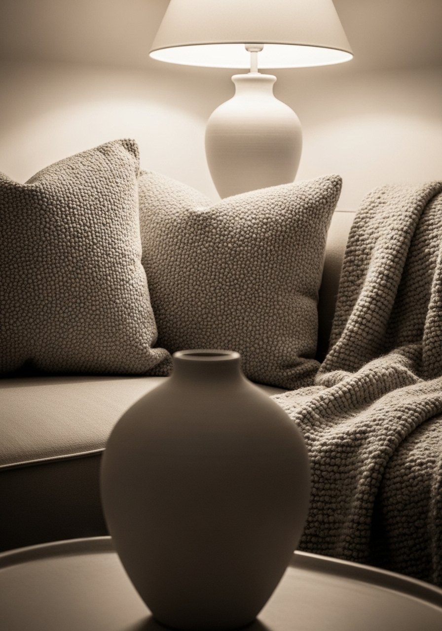
- Chunky knit throw blanket in cream. I drape mine over the sofa arm and it instantly softened the room
- Linen blend curtains, 96-inch. Great for 9-foot ceilings. Similar at West Elm
Wall Decor and Art
- 36-inch round statement mirror. Hang it opposite a window to double the light
- Set of 3 floating shelves in white oak. Stagger them for a curated shelf look
Lighting
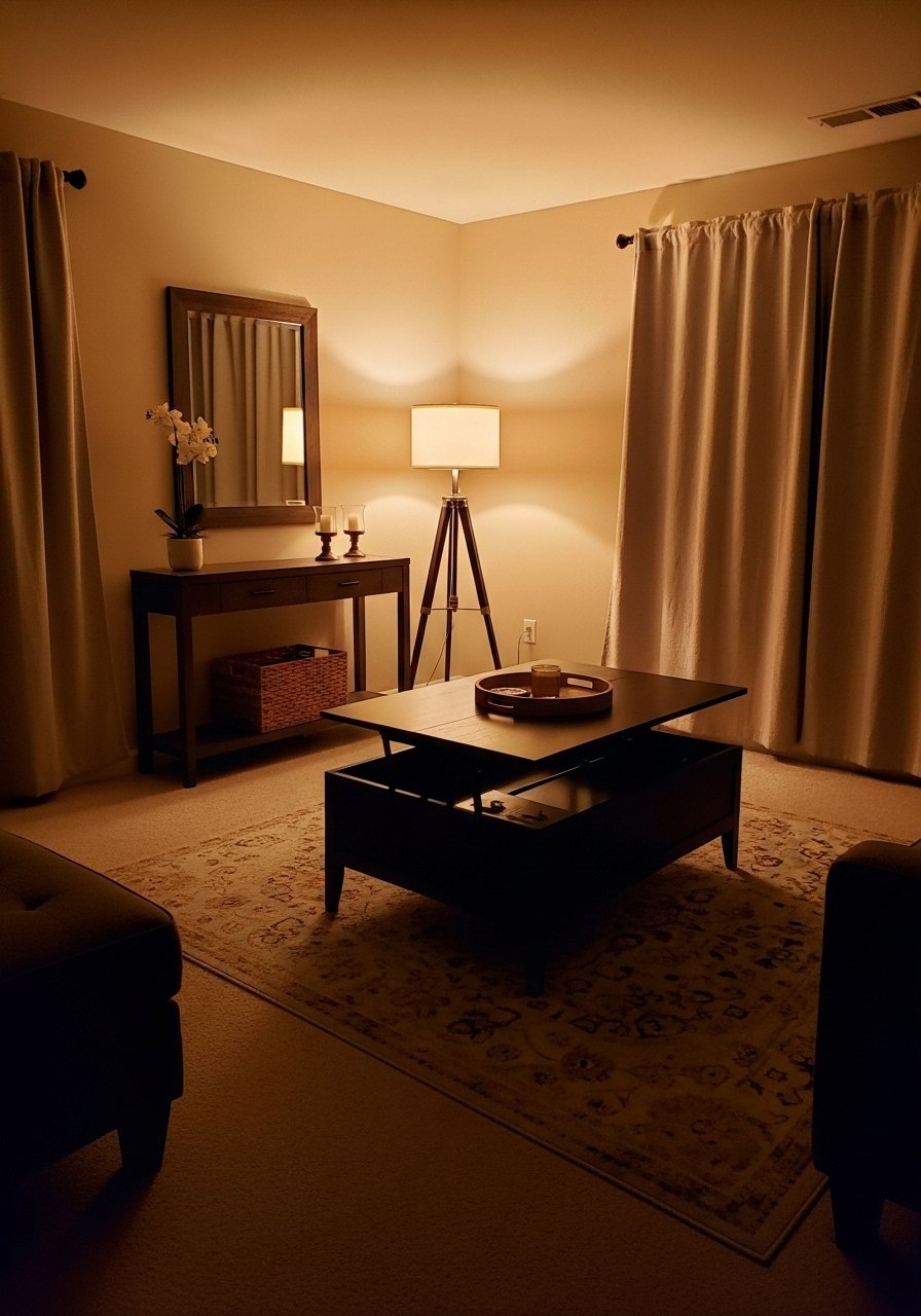
- Brass floor lamp with dimmer. A dimmer makes evening scenes cinematic
- LED warm white bulbs, soft white. Swap existing bulbs and you will notice the difference
Plants and Greenery
- Realistic faux fiddle leaf fig, 6ft. Great for renters. I tucked one behind an armchair
Accent Furniture
- Small sculptural side table, marble top. Use as art and functional surface
Budget Finds
- Velvet pillow covers, set of 4. I swap colors seasonally and it changes the mood
- Peel-and-stick neutral wallpaper panels. Pick one accent wall only
- Jute 8×10 area rug. Tough for real life and layers well. Similar at HomeGoods
Layered Neutrals With One Bold Accent Color
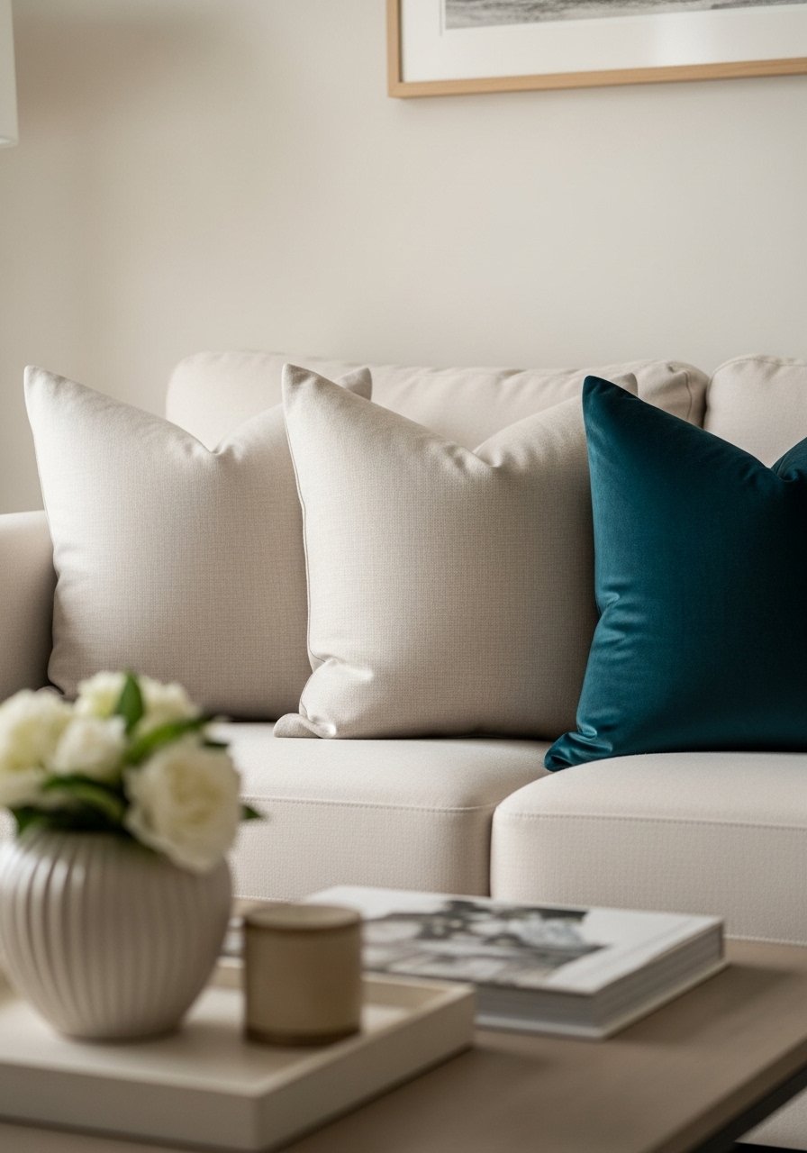
The moment I added a single deep teal pillow to my beige sofa, the whole palette felt intentional. I use the 60-30-10 rule. Sixty percent neutrals, thirty percent mid-tones like wood and leather, and ten percent the bold color. In photos the teal pops cleanly. In person it grounds the room if you pick a saturated fabric, not a cheap polyester. For small rooms, keep the accent on accessories so it does not overwhelm. Try teal velvet pillow covers for $18 each. Avoid too many competing accents. One bold color needs breathing room.
Floor-to-Ceiling Curtains to Add Height
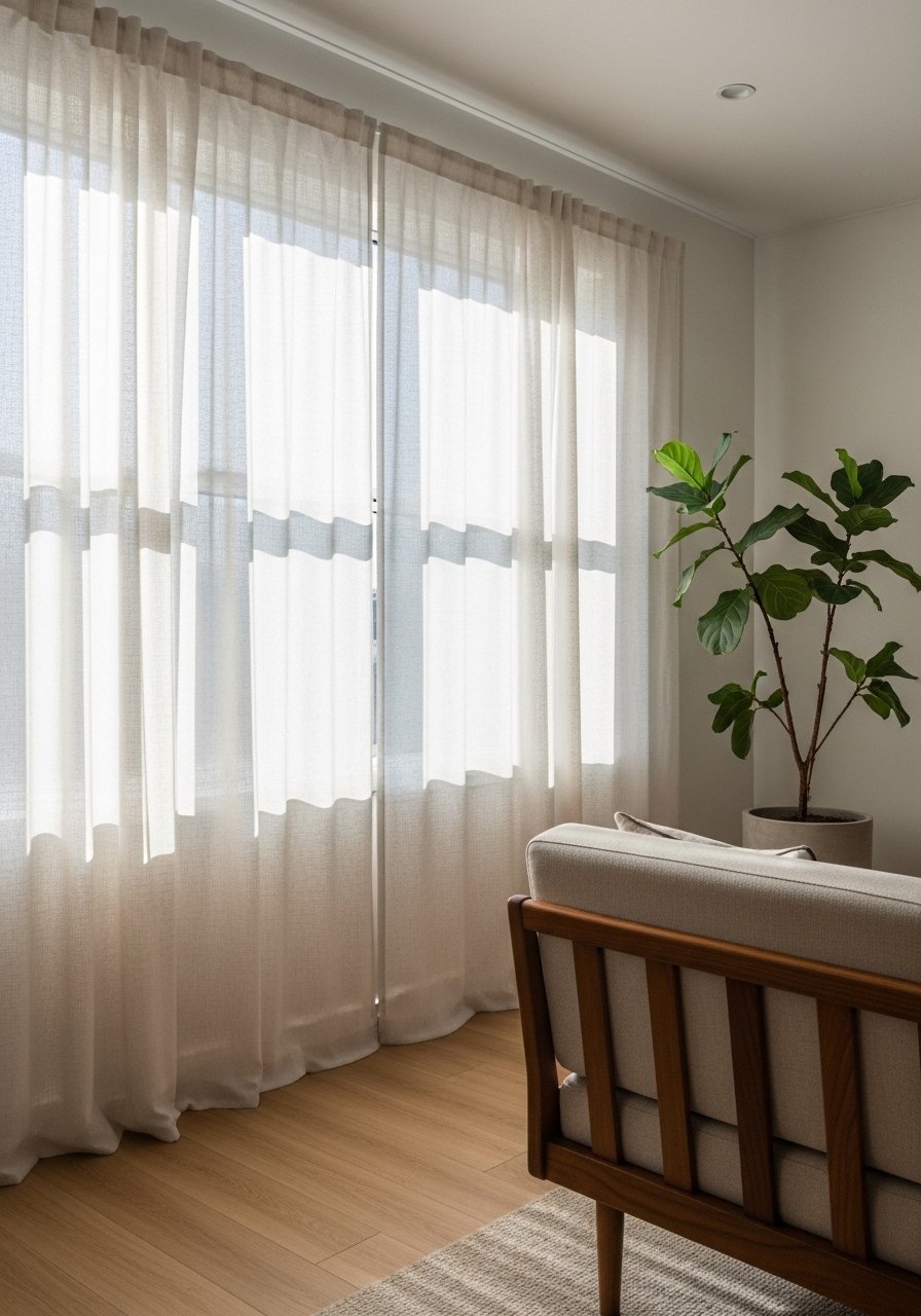
Most people hang curtains at the window frame. That makes rooms feel shorter. I hang mine four to six inches above the molding and let them puddle slightly. The visual trick works in both 8-foot and 10-foot ceilings. For narrow rooms, choose lighter fabrics so the panels do not read heavy. I use linen blend 96-inch panels. A common mistake is buying panels too short. Also avoid curtains that are too patterned when your rug is patterned. Mix textures instead.
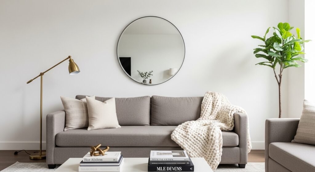
Oversized Mirror to Brighten Dark Corners
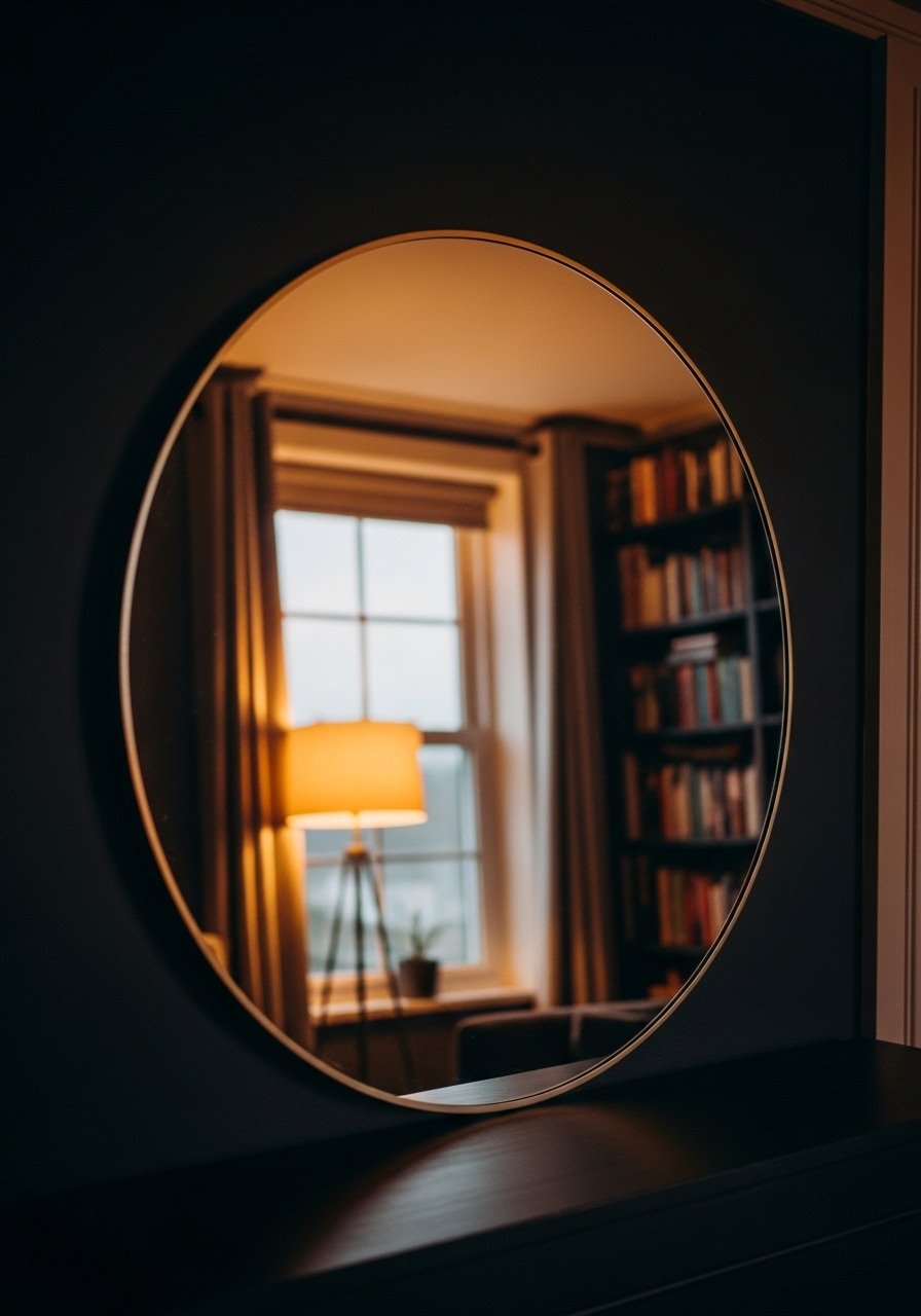
A 36-inch round mirror made my dim corner read like a window. Mirrors double light and create depth. In photos an oversized mirror reads dramatic. In real life, placement matters. Leaning a mirror slightly forward catches lamps and balances glare. For large rooms use two mirrors for symmetry. I recommend a 36-inch round mirror. Avoid cheap plastic frames. Metal or wood frames give weight and last longer.
Mixed Metallics for Modern Glam
I used to match every metal. Then I tried brass, chrome, and black together. It reads curated now. The key is to repeat a primary metal twice and the secondary once. Odd numbers work. For instance two brass lamps and a chrome side table. In photos the mix reads intentional. In person, mismatched finishes can look random if sizes are the same. Pick different scales. I love brass picture frames as an easy way to start. Avoid mixing three overly shiny metals. Matte finishes pair better with polished ones.
Curated Coffee Table Vignettes
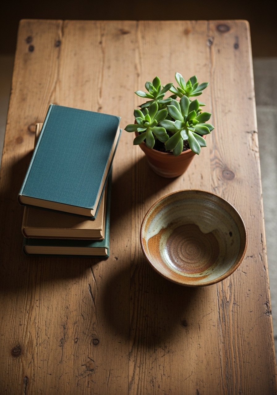
My coffee table used to carry clutter. Editing it down to three items improved the whole room. I follow the odd-number rule when grouping objects. Use one tall item, one medium, and one low. Books add weight and scale. In photos a cluttered table can look styled. In real life, proportional pieces are easier to keep tidy. Grab this ceramic bowl for a grounded centerpiece. A mistake is choosing items that are all the same height. Vary the levels for movement.
Statement Light Fixture Over the Seating Area
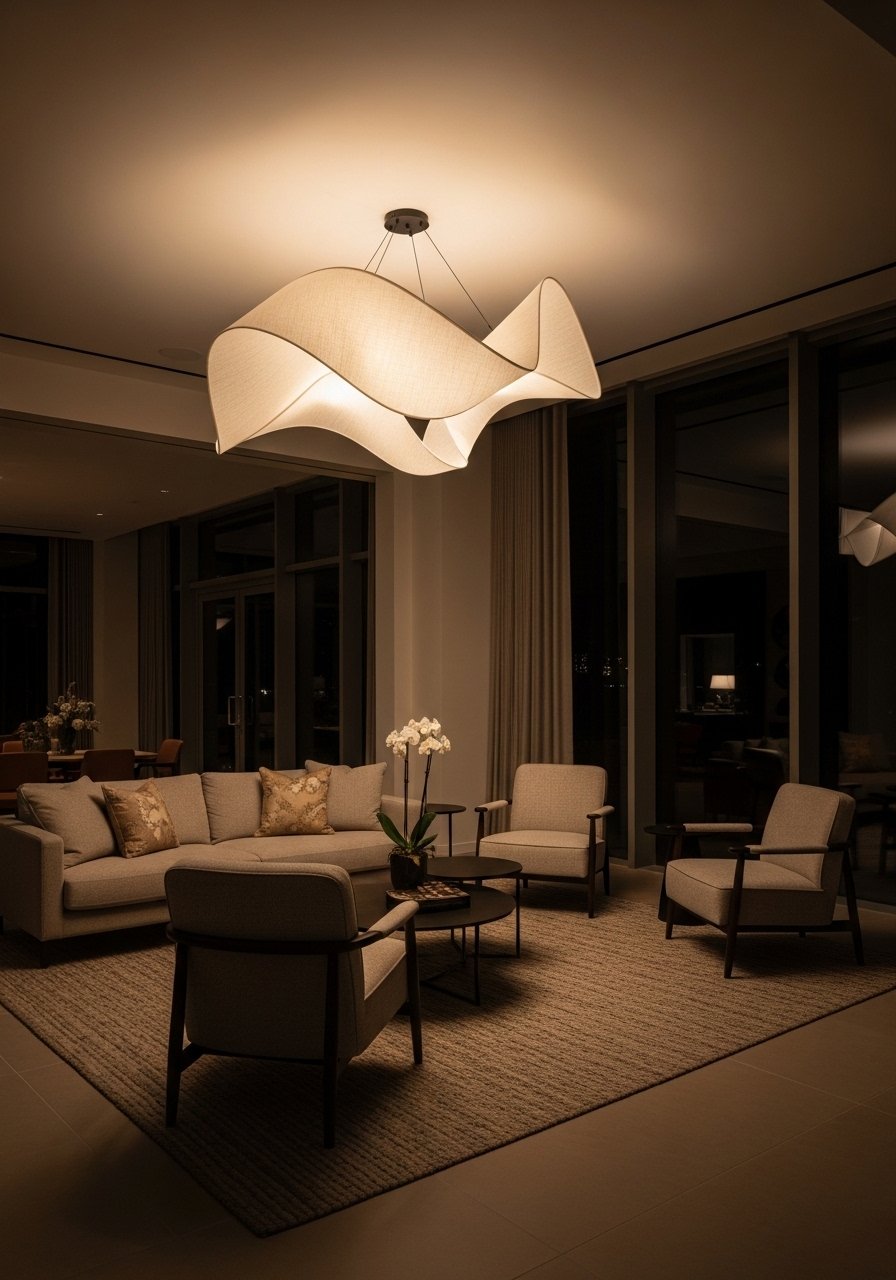
I swapped a basic ceiling fixture for a sculptural pendant and the room finally read intentional. A single large fixture can define the seating area in an open plan. In photographs it becomes the hero. In person, make sure the fixture is scaled to the seating group. For a standard sofa and two chairs aim for 24 to 36 inches in diameter. Consider a rattan pendant shade for a softer look. Too small a fixture disappears. Too large one overwhelms.
Built-In Shelving Styled Like a Boutique
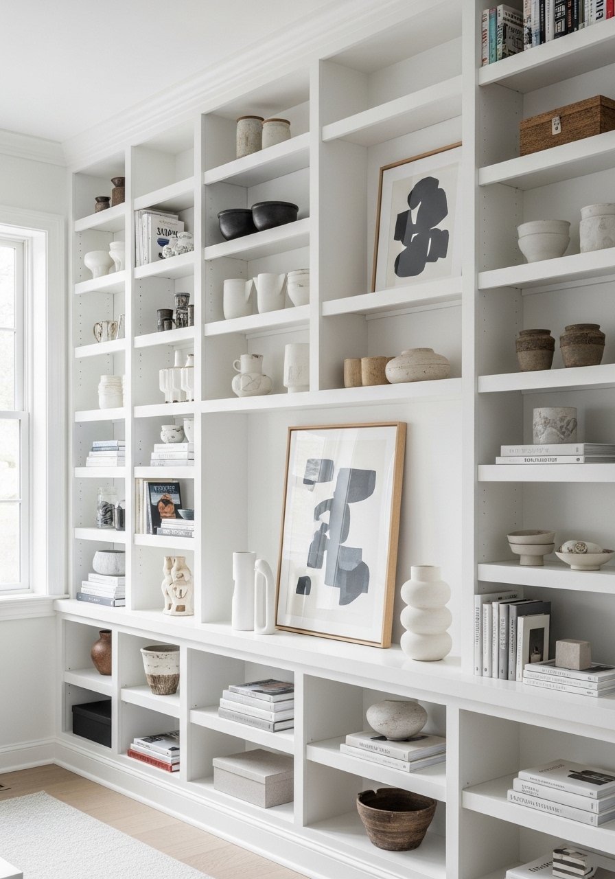
When I styled built-ins like a boutique shelf, guests lingered longer. Design rule: leave one in three shelves partially empty. That negative space keeps shelving from reading busy in photos and real life. Mix in a couple of vintage finds for personality. For tall rooms, stagger objects in odd groups and vary heights by at least four inches. I used white oak floating shelves for a lighter look. The common cheap version is to cram every shelf edge to edge. Edit ruthlessly.
Plush Reading Nook With a Daybed
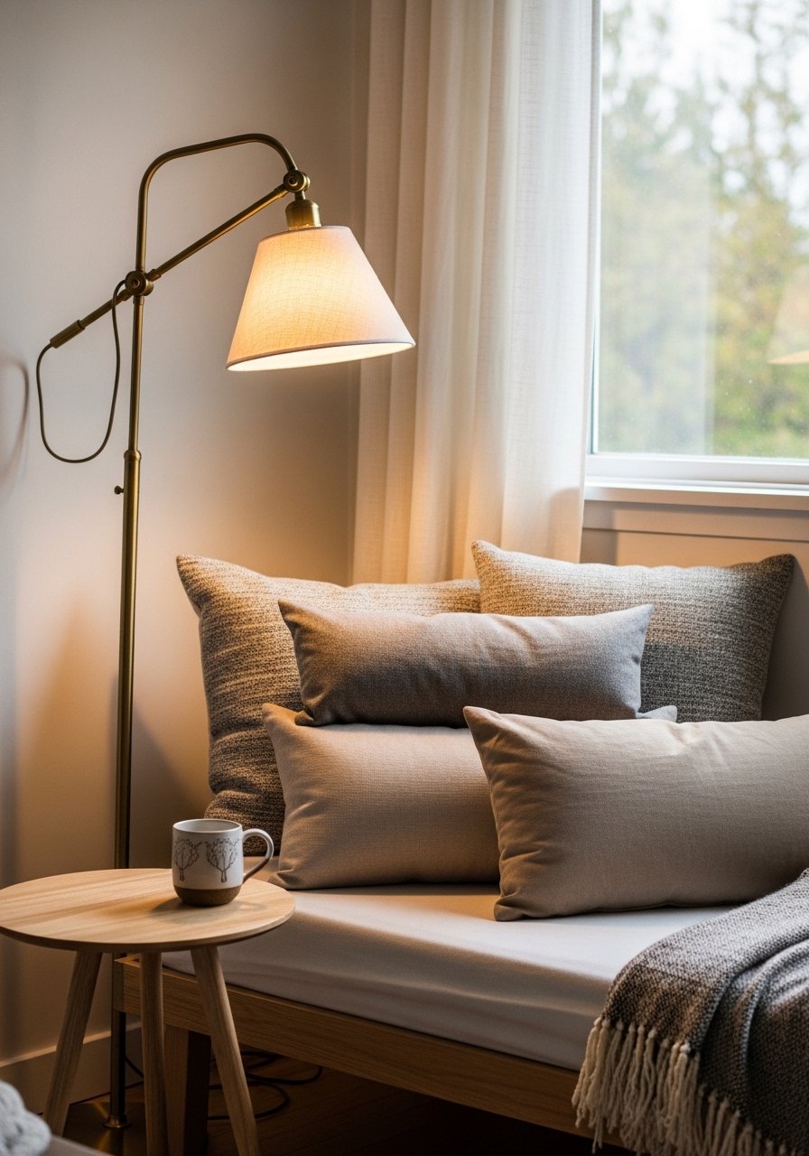
There is a different energy when a room has a dedicated reading corner. I carved out a corner with a daybed and layered pillows. Use three pillows and one lumbar for balance. For small apartments, pick a narrow daybed, 30 to 36 inches wide, so it does not swallow the space. In photos the nook looks inviting. In real life you need a lamp with a dimmer for evening use. Try a slim daybed. The mistake is using too many cushions that flop and look messy.
Rug Layering for Depth and Warmth
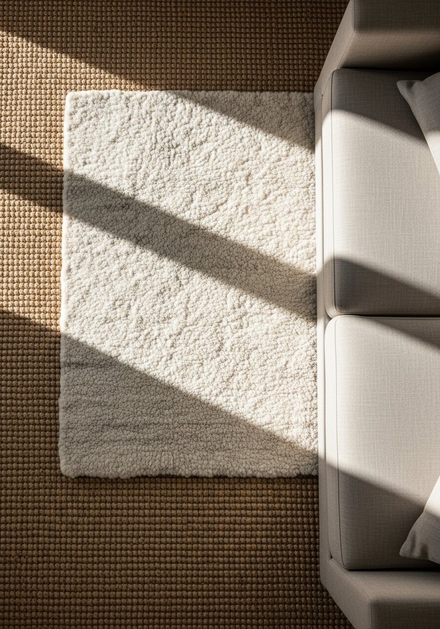
I layered a jute rug under a softer wool rug and the room suddenly had texture and anchor. Use a larger, neutral rug underneath and a smaller patterned one on top. For living rooms, the bottom rug should be big enough for front legs of furniture to sit on it. In photos layering adds pattern without clutter. In real life, choose rug pads to prevent slipping. I recommend an 8×10 jute rug as the base. Avoid tiny rugs that float in the center of the room.
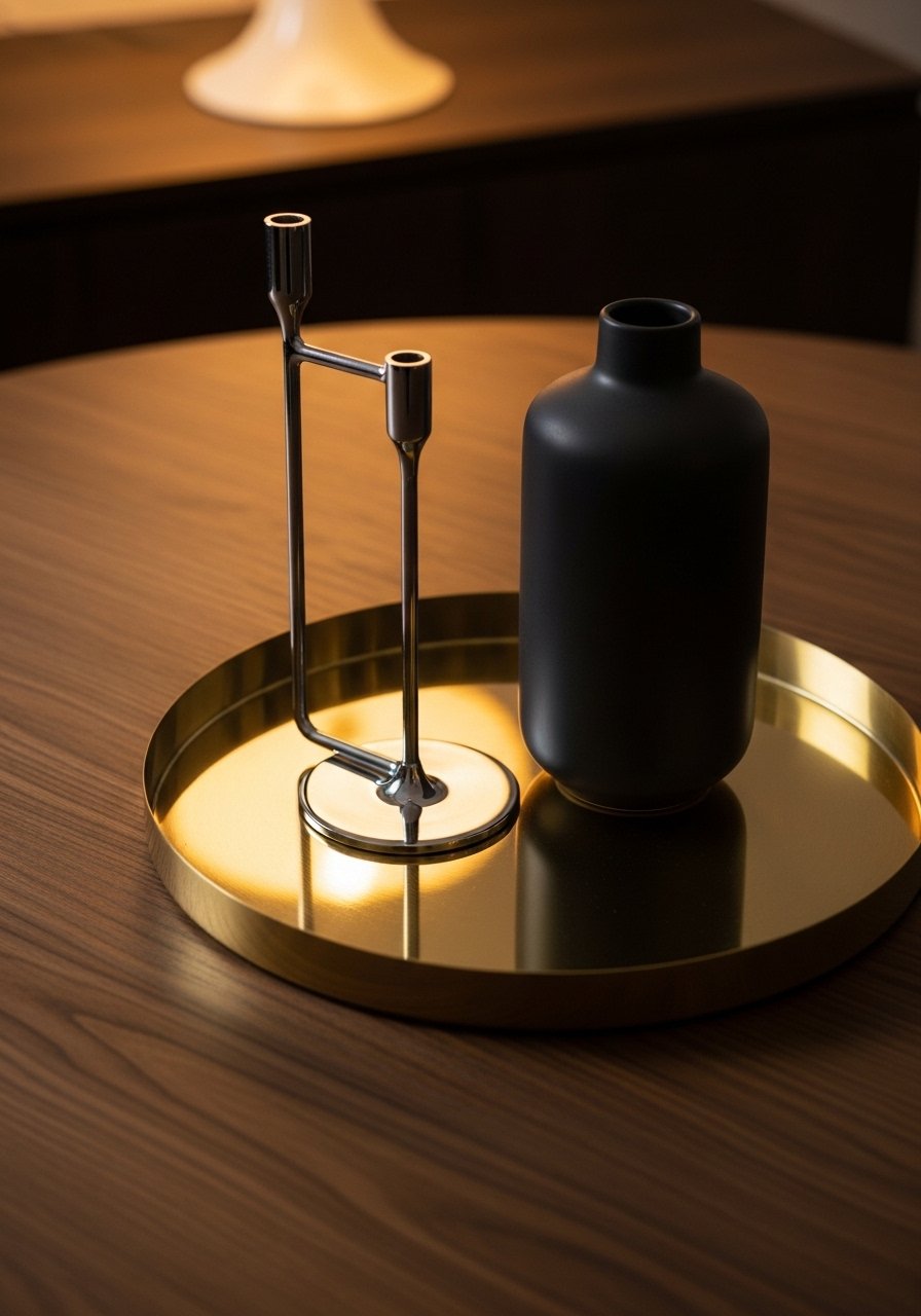
Sculptural Side Tables as Functional Art
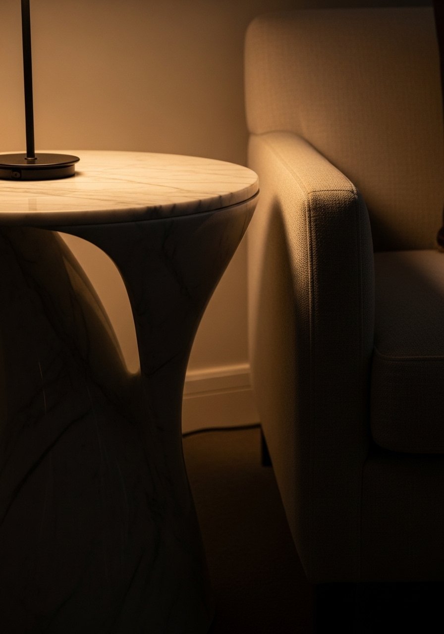
A sculptural side table reads like art. I swapped a plain end table for a curved marble-top piece and it felt like a mini upgrade. For small rooms, pick an asymmetric table that can tuck into corners. Photos love reflective surfaces. In person, marble shows rings and needs coasters. I use a marble-top side table. The common mistake is choosing a round table that is too low. Match the table height to the arm of your chair for real-life comfort.
Gallery Wall With Unified Color Story
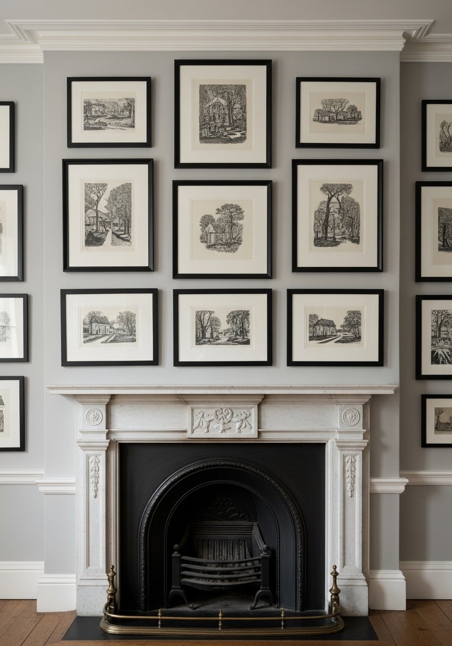
I built a gallery wall by picking two frame finishes and a repeating ink color in the art. Keeping a unified color story makes multiple pieces read as one large artwork. In photos a random mix can look eclectic. In person, inconsistent matting and cheap frames read unpolished. Lay frames on the floor first and use the odd-number spacing rule, about 2 to 3 inches between frames. I used black frames with white mats. Avoid mixing too many frame styles at once.
Velvet Sofa as a Luxe Anchor
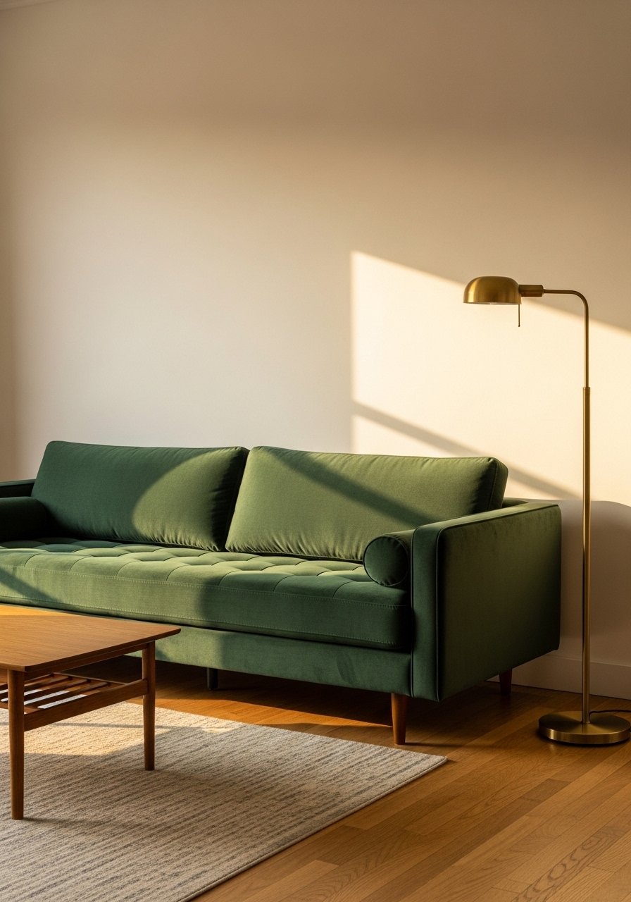
I chose a velvet sofa to anchor my main seating area. Velvet reads luxe in photos and feels cozy in real life. For families, pick performance velvet with stain resistance. Seat depth matters. I recommend 20 to 22 inches for comfortable lounging. A deep color like navy or emerald hides wear better than pale pink. Try a deep green velvet sofa if you want a focal piece. The mistake is buying a sofa that is too small for your space and then crowding it with tiny chairs.
Natural Wood and Rattan for Soft Modern
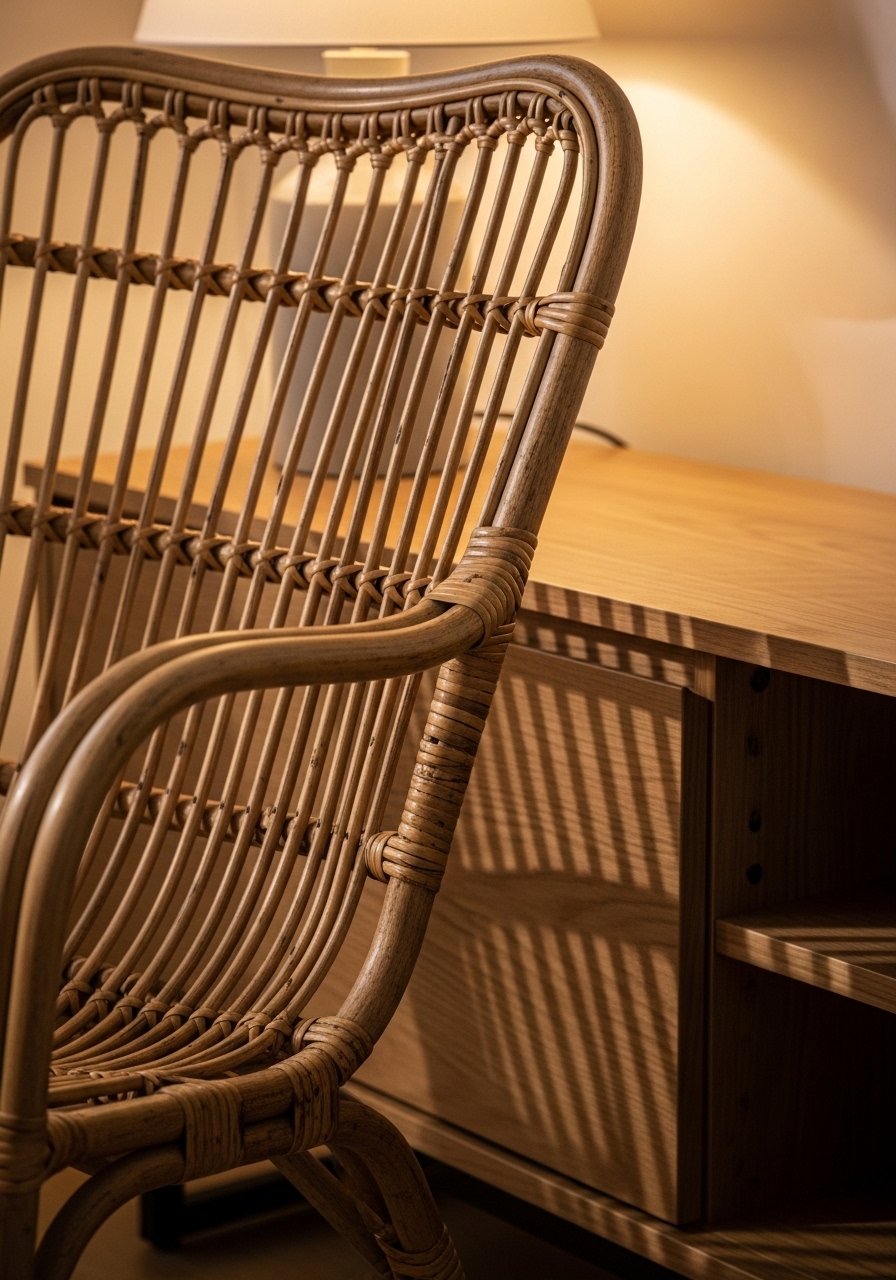
I swapped black lacquer pieces for white oak and rattan accents and the room felt less sterile. My feed is full of warm wood tones this year. Natural materials add weight without heaviness. In large rooms, scale wood pieces up. In small rooms, pick one wooden anchor piece and add rattan in smaller doses. Pair rattan with matte metals, not shiny ones. A woven rattan chair is an easy swap. Avoid mixing light woods with heavy dark woods in one sightline.
Bold Wallpaper on an Accent Wall
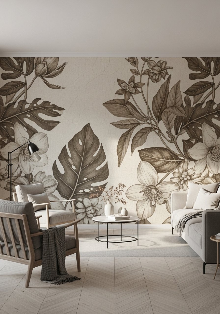
I used peel-and-stick botanical wallpaper on one wall behind the sofa and the space felt designed. Bold wallpaper acts like large-scale art. For small rooms pick a wallpaper with negative space so it does not shrink the room. In photos wallpaper gives instant drama. In real life, pattern scale matters. Choose larger motifs for tall ceilings, smaller ones for low ceilings. I used peel-and-stick neutral wallpaper panels. The common error is wallpapering all four walls in busy prints.
Monochrome Scheme With Texture Play
A monochrome palette can feel flat without texture. I layered boucle, linen, and matte ceramic to keep interest. In photos the monochrome look feels calming. In real life, balance matters. Use three types of texture at minimum. For small rooms use lighter shades so the space does not feel closed. I grabbed boucle pillow covers to add tactile contrast. Avoid flat, identical fabrics across all seating. That reads staged.
Hidden Storage That Still Looks Chic
Clutter ruins a luxe look fast. I added a lift-top coffee table and woven baskets to hide remotes and toys. In photos storage can be invisible. In person make sure doors close flush and baskets are sturdy. For small rooms, choose storage that doubles as a surface. I recommend a lift-top coffee table for real life. Avoid open cube shelves if you cannot commit to neat styling.
Mix of Vintage Finds and New Pieces

I hunt thrift stores for one vintage statement per room. My last three finds were a sideboard, a lamp, and a mirror. Mixing old and new prevents a room from feeling showroom. In photos vintage items add character. In real life, beware of scale mismatch. Restore hardware if needed. Pair a vintage piece with modern lines to keep it current. A good starting point is vintage brass table lamps. The mistake is keeping too many thrifted items that do not share a common tone.
Greenery in Varying Heights for Scale
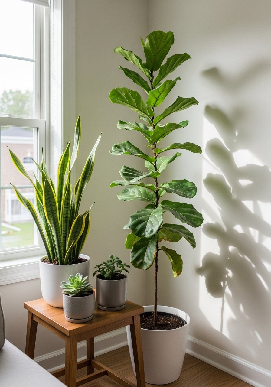
One tall plant is good. Three plants at varying heights are better. I use a 6-foot fiddle leaf fig for height, a mid-sized snake plant for texture, and a low succulent for detail. In photos layered greenery reads lush. In real life, choose plants suitable for your light levels. For low-light rooms pick realistic faux options. I use a realistic faux fiddle leaf fig where light is limited. Avoid placing plants where they block sightlines.
Metallic Trim on Furniture for Detail
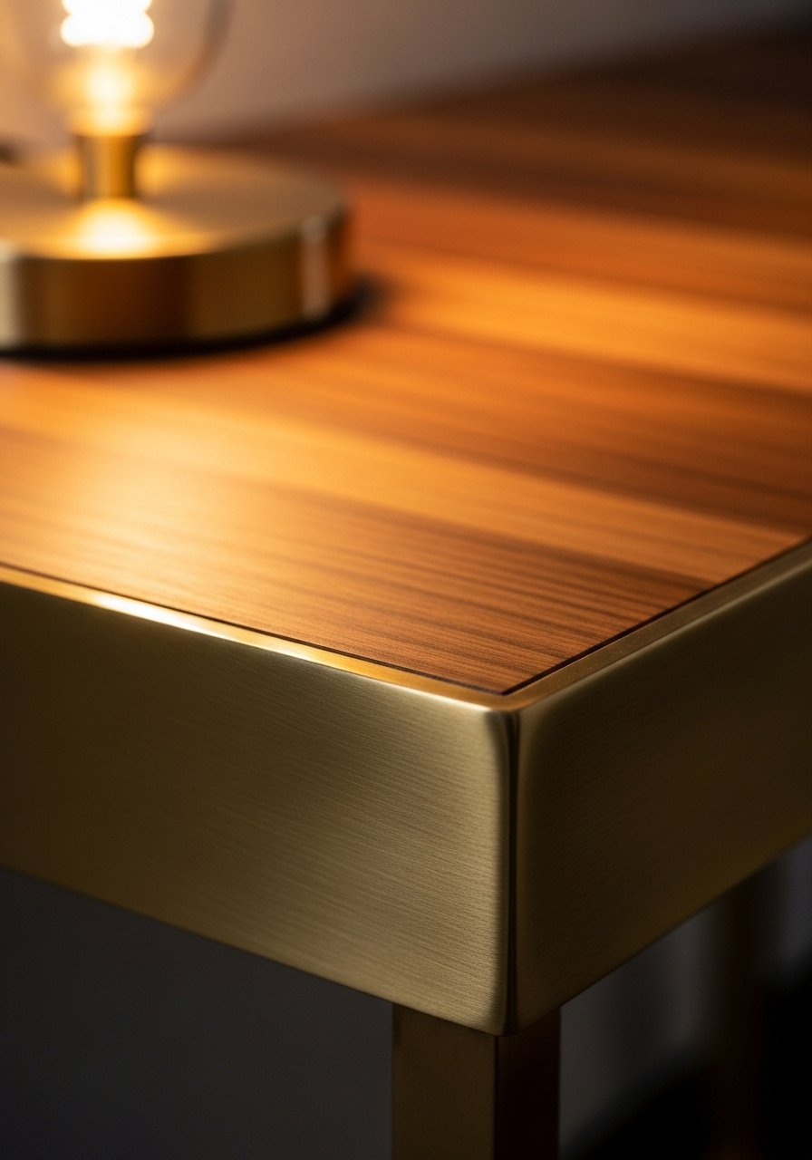
Small metal trim elevates a simple console. I added brass edge pulls and the piece looked custom. In photos trim reads expensive. In person, the finish quality matters. Cheap plated trim peels and looks worse than none. For mid-century or modern styles pick brushed finishes. Try brass edge console tables. The mistake is overusing trim on every piece which can read kitschy.
Minimalist Mantel Styling for Focus
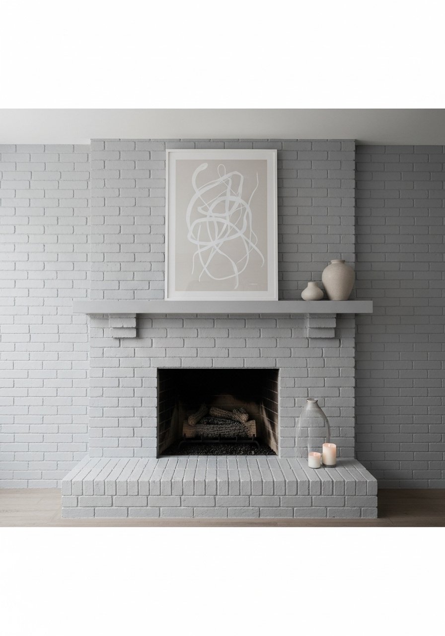
I stopped overcrowding my mantel and kept one oversized print, a low vase, and a candle. Negative space drew attention to the art. For tall rooms, keep mantel decor low so it does not fight the chimney breast. In photos a crowded mantel reads chaotic. In real life, pick items that vary in height by at least five inches. I recommend an oversized art print. Avoid a line of tiny objects that read as clutter.
Oversized Art Leaning for Casual Luxury
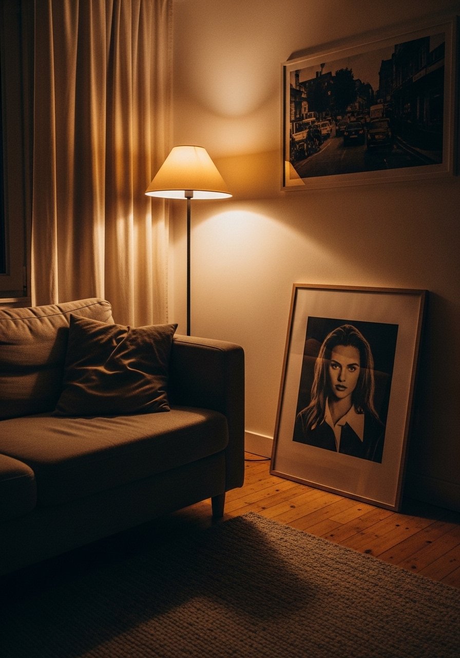
I started leaning a 30×40 framed print instead of hanging it. It felt relaxed and intentional. Leaning art is great for renters and allows easy swapping. For small rooms, choose an art scale that is about two-thirds the width of the furniture beneath. In photos leaning art looks editorial. In real life secure the frame if you have kids or pets. I use a 30×40 framed print. Avoid tiny pieces above large furniture.
Textured Throws and Odd-Number Pillow Groups
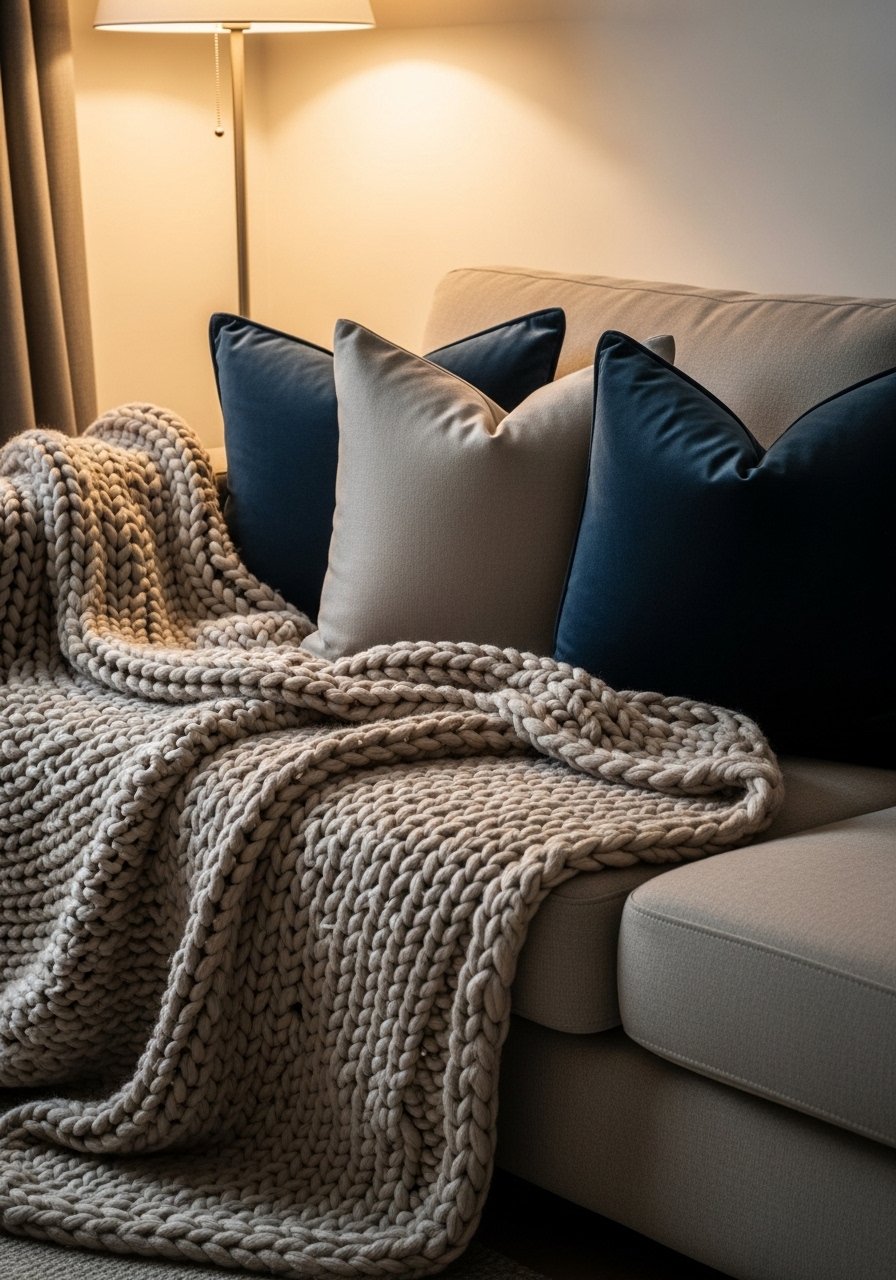
Throws are cheap mood changers. I keep one chunky knit and one woven throw in rotation. Pillows look best in odd numbers. For a three-seat sofa use three pillows plus one lumbar. In photos texture reads tactile. In real life, pick pillow insert fill that holds shape. I linked chunky knit throws that hold up after washes. The mistake is using too many cushions that collapse into lumps.
A Neutral Palette With Warm Wood Tones
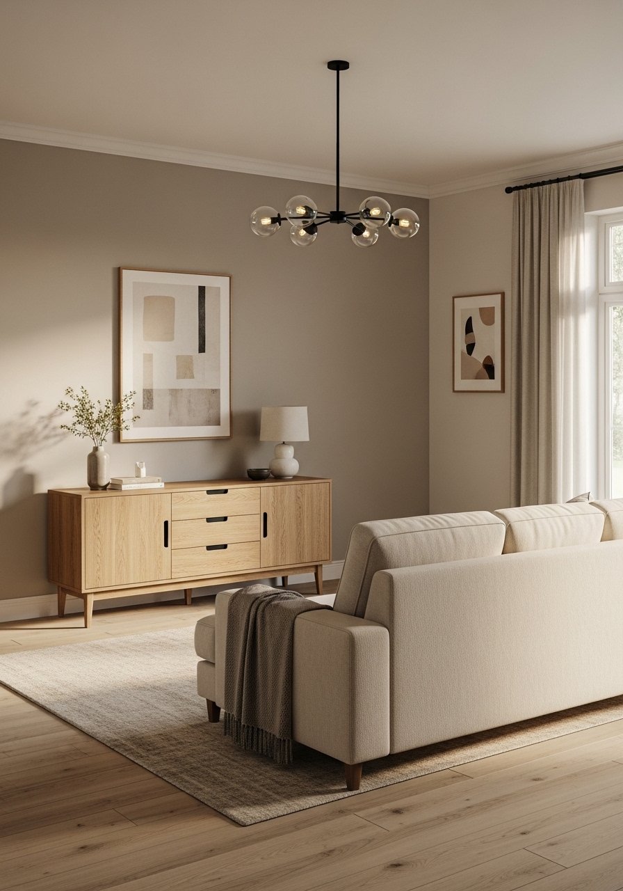
I swapped an espresso console for white oak and the room felt fresher. Warm woods balance cool neutrals. My showroom visits this year confirmed oak is dominating. For modern transitional spaces, pair oak with warm brass hardware. In photos the combo reads cohesive. In real life, keep wood saturation consistent across sightlines. A mismatched set of dark and light woods looks accidental. Try a white oak media console. Avoid mixing stains aggressively.
Open Plan Zoning With Rugs and Lighting
I used rugs to define zones and a pendant to mark the dining area. Rugs visually anchor seating groups. For open plans pick rugs that are different but complementary. In photos distinct rugs help the camera read separate areas. In real life keep at least 18 inches of bare flooring between rugs to avoid tripping. I used two complementary rugs. Avoid rugs that are too similar in pattern, which confuses the eye.
Layered Lighting for Ambience and Tasking
I stopped relying on overhead lights. Now I mix ambient, task, and accent lighting. Use a floor lamp for reading, a table lamp for conversation, and dimmable overheads for ambience. In photos layered light adds depth. In real life, buy bulbs that match in color temperature. I replaced bulbs with warm white LED bulbs. The common mistake is using all the same brightness. Dimmer switches help.
Curved Furniture to Soften Rectilinear Rooms
I introduced a curved sofa into a room full of right angles and it instantly softened the feel. Curved furniture invites conversation and reads luxe in photos. For small rooms pick a shallow radius so it does not dominate the floor plan. In large rooms a curved sectional helps define a seating area. Try a curved loveseat for a focal piece. The mistake is forcing a curve into a cramped layout. Measure first.
Shopping Tips for These Looks
Measure Before You Buy: I always measure twice. Grab a laser tape measure for accuracy and peace of mind.
Grab velvet pillow covers to swap seasonally. I change mine every three months and it refreshes the room.
Curtains should puddle or kiss the floor. These 96-inch linen panels work for 9-foot ceilings.
White oak beats dark wood in current feeds. White oak floating shelves look updated and layer well.
Buy a faux fiddle leaf fig if your room is low light. A realistic 6-foot faux ficus gives scale without maintenance.
Try mixing a vintage find with a new sofa. Look for brass lamps at thrift stores and pair them with a modern piece.
Frequently Asked Questions
Q: Can I mix boho textiles with modern furniture without it looking messy?
A: Yes. Stick to a common color thread and three textures. I pair a modern sofa with a woven rattan chair and a kilim pillow. A woven rattan chair is an easy bridging piece. Avoid clashing patterns at equal scale.
Q: What size art should I hang above a sofa?
A: Aim for artwork that is roughly two-thirds the width of the sofa. If your sofa is 84 inches wide, choose art about 56 inches wide or group pieces to reach that span. I often lean a 30×40 piece for a relaxed feel. A 30×40 framed print fits many sofas.
Q: How do I keep a neutral room from feeling flat?
A: Add at least three different textures and one warm wood tone. Layer throws, pillows, and rugs. I added a white oak console and a boucle pillow. Boucle pillow covers make a big tactile difference.
Q: Is faux greenery okay or does it date the room?
A: Good faux plants are fine and last longer. Use realistic fauxs for scale and place one real easy-care plant nearby if you can. I use a faux fiddle leaf fig in low light and a real snake plant by a window. A realistic faux fiddle leaf fig is a practical choice.
Q: How do I make a small living room feel luxe without crowding it?
A: Opt for a large rug that brings furniture onto it, choose one statement piece like a velvet chair, and keep walls light. In small rooms, scale down chair depth to 20 inches and keep negative space around the main pathway. An 8×10 jute rug works wonders.
Q: Should I mix metals or match them?
A: Mixing metals looks thoughtful when repeated in odd numbers. Pick a dominant metal and repeat it twice, then add a contrasting metal as an accent. I use brass lamps and a chrome side table for balance. Brass picture frames are my go-to starter.