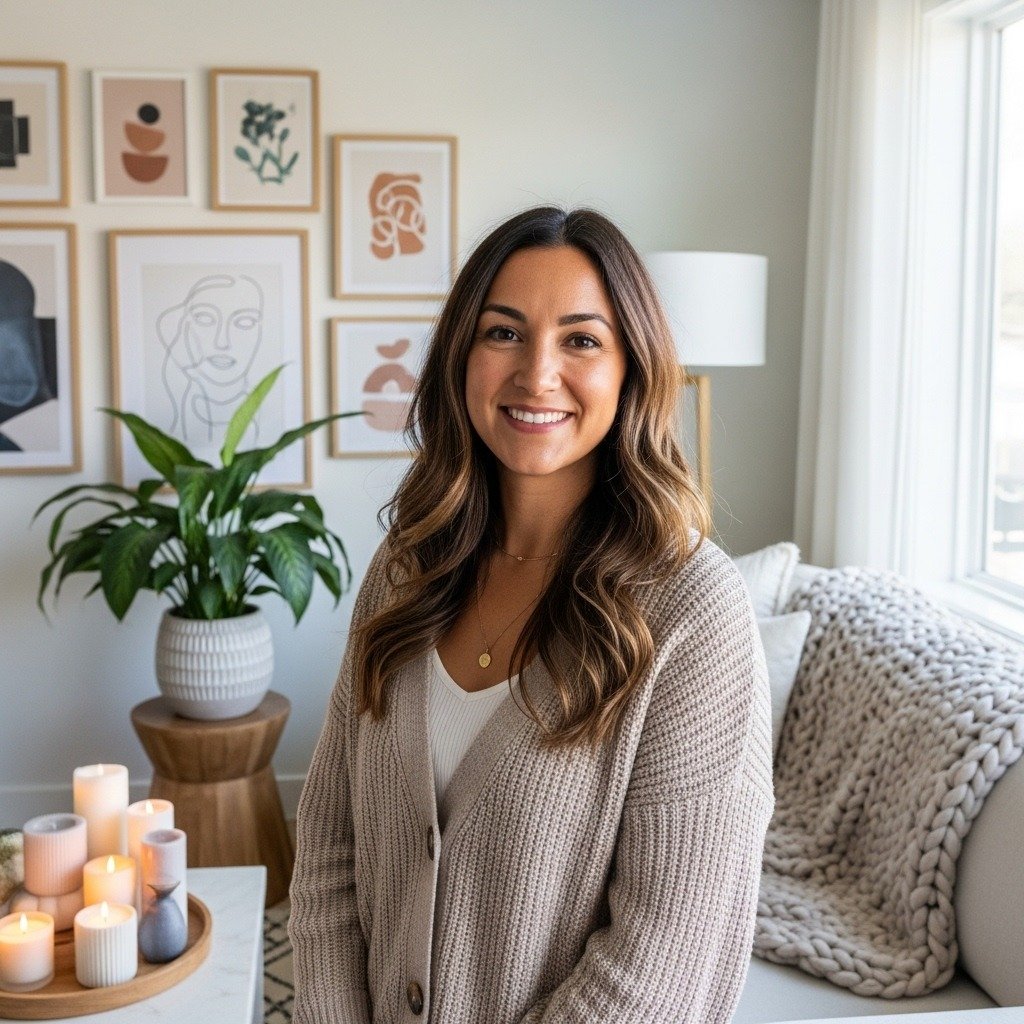

My living room had good bones and nothing felt personal. I started collecting small handmade pieces and suddenly the space told stories, not just showed furniture. The difference was immediate. Little handmade choices add character in a way mass-produced items never do.
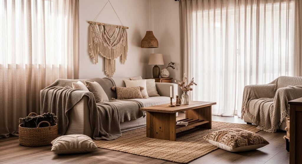
These looks lean modern-boho with warm neutrals and natural materials. Most ideas are under $150, with a few splurges around $200. Perfect for living rooms, entryways, bedrooms, or corners that need personality. My feed is full of woven textures this year, so I focused on tactile pieces you can touch.
What You'll Need to Get This Look
Textiles and Soft Goods.
- Chunky knit throw blanket in cream. I drape mine over the sofa arm and it instantly softens the silhouette.
- Linen blend curtains, 84-inch. Filter light while keeping a breezy look.
- Velvet pillow covers, set of 4. Swap two colors for depth.
Wall Decor and Art.
- Set of 3 floating shelves, white oak. Stagger heights for rhythm. Similar at Target.
- 36-inch round mirror, natural wood frame. Mirrors open up a small room.
Lighting.
- Rattan pendant light shade. Swapping a shade refreshes a fixture.
- LED Edison bulbs, warm white. Warm light reads better at night.
Plants and Greenery.
- Artificial fiddle leaf fig tree, 6ft. One tall plant beats five small ones.
Budget Finds.
- Peel and stick wallpaper panels in neutral tones. Great for renters, try one accent wall.
Layered Textiles for a Cozy Reading Nook
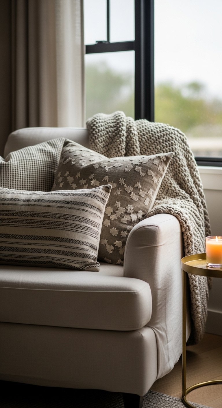
The moment I added layered pillows and a throw my reading corner became irresistible. I used the 60-30-10 rule for color, 60 percent neutral linen, 30 percent warm terracotta, 10 percent deep navy. In photos the layers read flat. In real life you want different textures, not just different colors. Avoid buying identical pillows in different shades. Go for varied fills, like down and polyester, and pick 20×20 and 16×16 sizes to create odd-number groupings. I used velvet pillow covers in the mix. A common mistake is overstuffing the chair. Leave room to tuck your legs under.
Handmade Ceramic Vase Grouping for a Minimalist Mantel
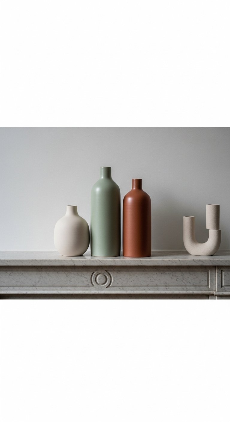
I keep seeing single-vase looks, but a trio of handmade ceramics gives sculptural rhythm. Use odd numbers and vary height by at least 4 inches. For a mantel aim for a 1:3 height ratio, one tall piece and two shorter ones. In photos ceramics can look glossy and perfect. In real rooms small glaze variations add charm. Avoid mixing glossy porcelain with matte stoneware. I recommend hand-thrown ceramic vase set for a cohesive look. On large mantels add a low runner of greenery. On small mantels skip the runner to keep it airy.
Macrame Wall Hanging for Boho Bedroom Vibe

A macrame hanging changes the room without color. I keep seeing boho textures in 2026 catalogs. For a king bed pick one 36-40 inch piece. The common mistake is too-small macrame above a wide headboard. In photos macrame looks delicate. In person it anchors the bed. Pair it with linen bedding in warm neutrals. I bought a large macrame wall hanging and it made the room feel finished. If your room is small choose a narrower hanging and balance with a slim shelf.
Hand-Painted Ceramic Knobs on Kitchen Cabinets for Subtle Charm
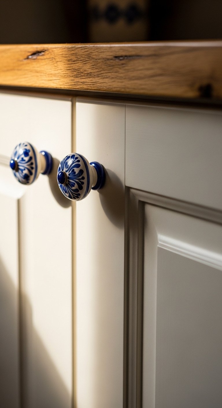
A friend asked me about this last week, and I told them knobs change the personality of a kitchen. Choose knobs that are 1.25 to 1.5 inches for drawers and 1 inch for cabinets. The wrong size throws off handle height and feel. In photos painted knobs look boutique. In real cooking life you want durable glaze and metal bases. I swapped in hand-painted ceramic cabinet knobs for under $8 each. Avoid cheap hollow backs that loosen quickly.
Woven Paper Basket for Entryway Catchall

I switched to a woven paper basket six months ago and shoes, umbrellas, and mail finally had a home. For an entryway pick a basket 14-18 inches wide. Too small and it looks cluttered. In images these baskets read perfectly formed. At home they bend a bit, which adds character. Pair with a waterproof liner if you store damp items. Grab a woven paper basket. The mistake I see often is using multiple small baskets instead of one statement basket.
Pressed Flower Resin Tray for Coffee Table Styling
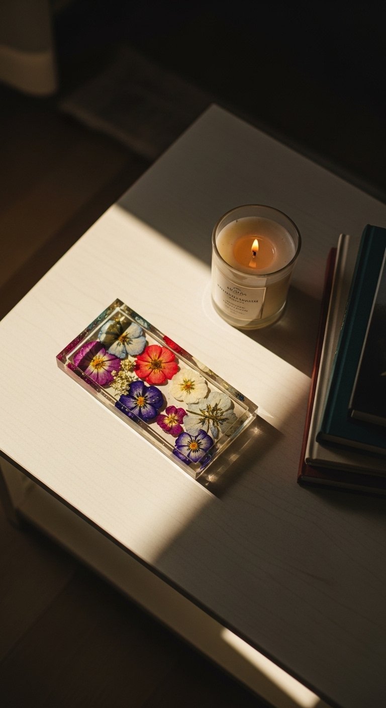
My feed is full of botanical accents, and this tray fits that trend. Use a 10×6 inch tray for coffee tables. Smaller trays look lost. In photos pressed flowers can appear perfectly flat. In real life light catches the resin and you notice depth. Avoid cheap resin that yellows. Look for UV-stable resin. I bought a pressed flower resin serving tray and it survives candle heat. Pair with brass accents for contrast.
Embroidered Lampshade for Soft Ambient Light
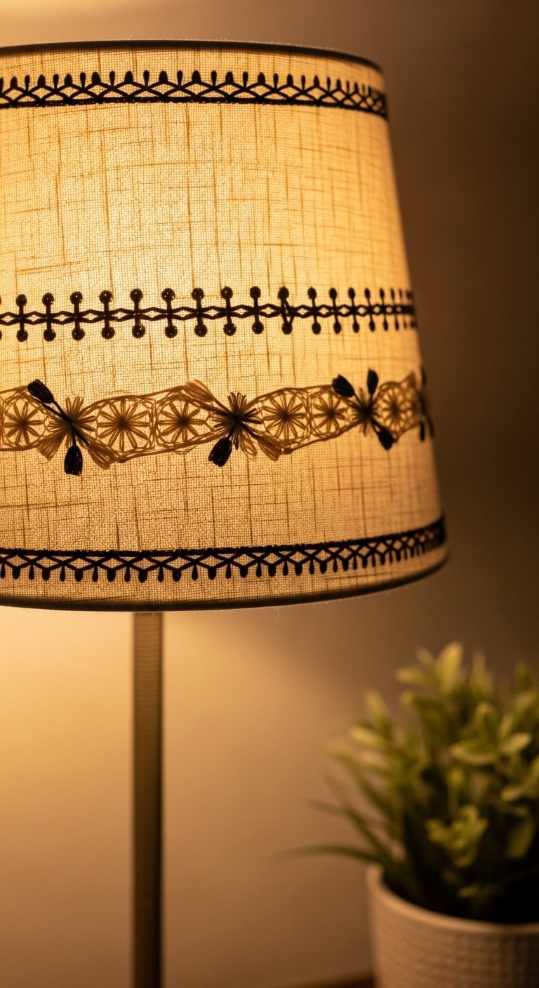
Every showroom I walk into has interesting lighting. I swapped a plain shade for an embroidered linen one and the bedside area became cozier. Choose shades compatible with your lamp harp. The wrong size shade upends balance, making the base look oversized. In photos embroidery reads delicate. In person hand-stitched textures create shadow play. I recommend embroidered linen lampshade 12-inch. Avoid shades with flimsy frames that sag.
Gallery Wall with Mismatched Vintage Frames in Living Room
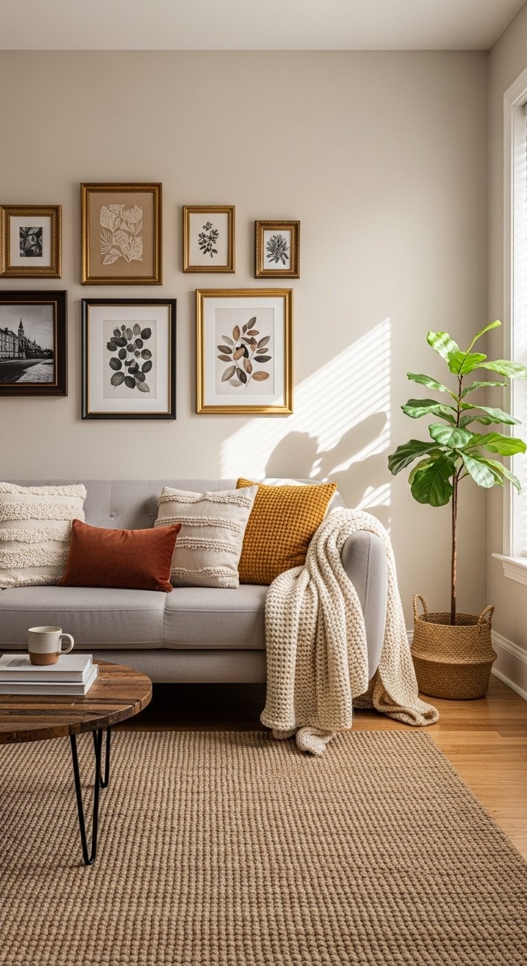
A gallery wall of thrifted frames changed my blank wall. I use the rule of thirds when planning layout, three vertical columns works for most sofas. Photos online often look perfectly spaced. At home you will need small tweaks to balance sightlines. Avoid arranging too symmetrically when you want an eclectic feel. I framed prints using white mats and budget frames to get a curated look. When in doubt, group frames in an odd number.
Handwoven Table Runner for Rustic Dining Room
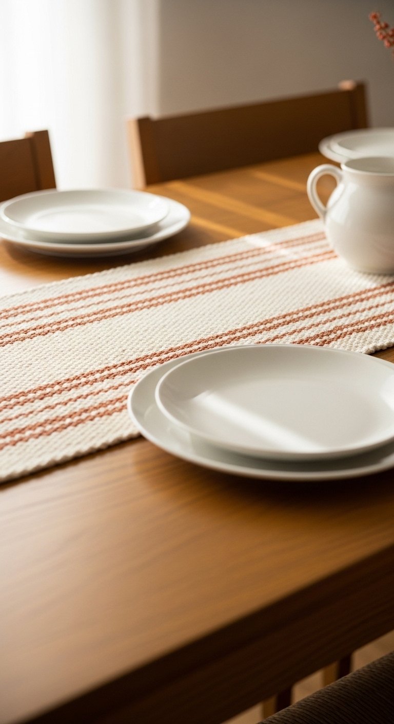
I used to buy machine-made runners and they always looked off. Handwoven runners have slight irregularities that read as intentional. On an 84-inch table go for a runner 12-14 inches wide. Too narrow looks skimped. In photos runners can look perfectly flat. At home the weave invites touch. Pair a woven runner with simple white stoneware. I found a great option, handwoven cotton table runner. A common mistake is matching runner color exactly to chairs, which flattens the palette.
Ceramic Wall Pockets for Entry Plant Display
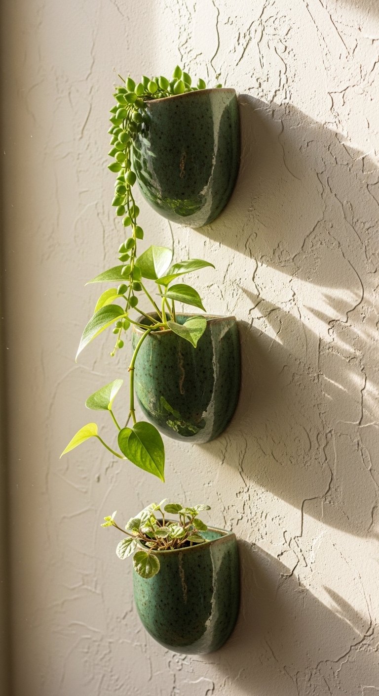
A friend gifted me ceramic wall pockets and my entry went from functional to framed. Use pockets 5-7 inches deep for real plants. Anything shallower will dry plants quickly. In photos wall pockets look neat. In real life make sure drainage is accounted for. Pair with trailing plants like pothos or string of hearts. Try ceramic wall pocket planter set. Avoid placing them where splashes from shoes hit them.
Patchwork Throw Pillow Mix for Boho Sofa
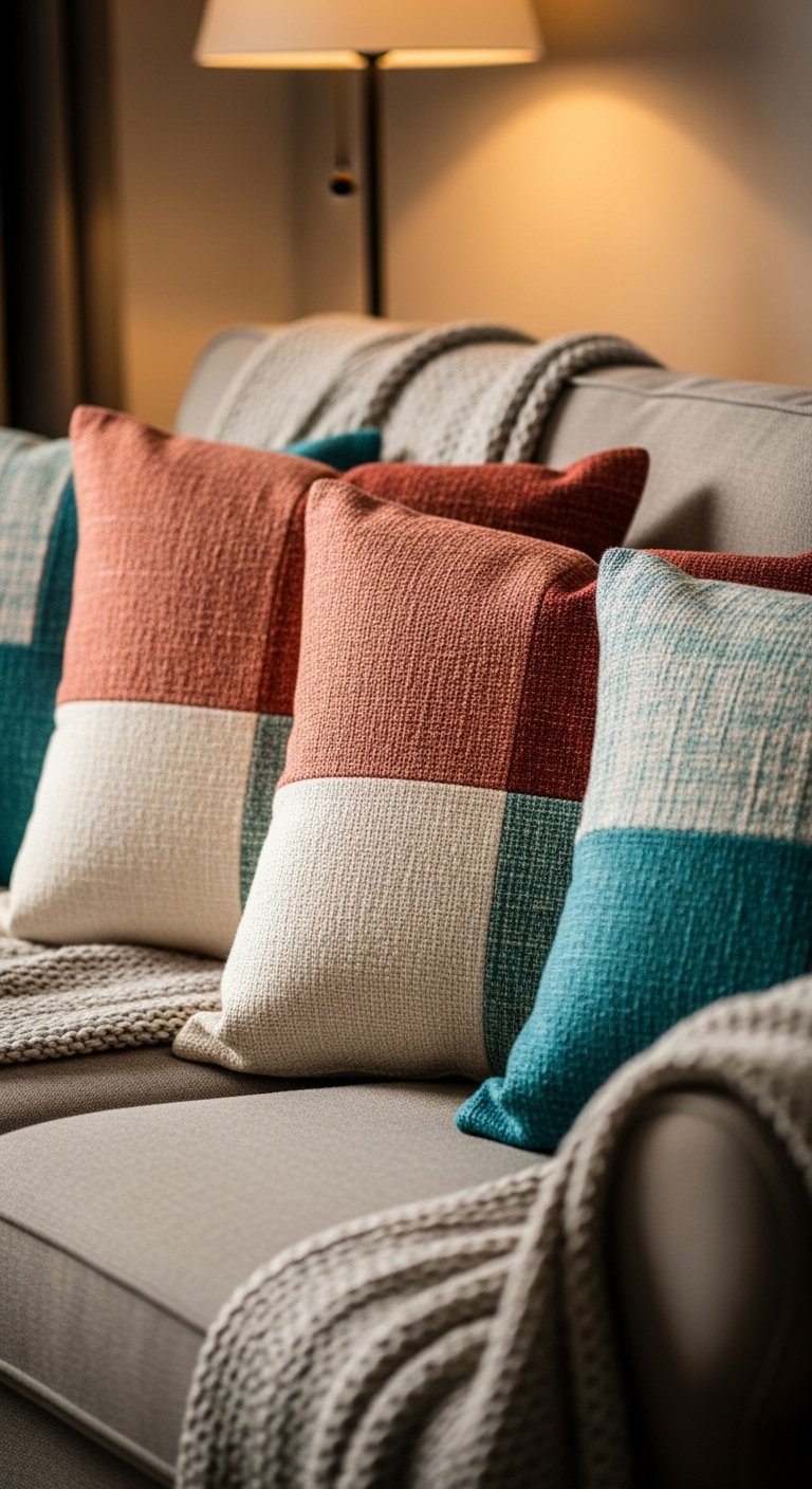
My feed is full of patchwork textiles this year. I mixed three patchwork pillows with two solid velvet ones using an odd-number rule. For a standard sofa use 5 pillows, not 8. Too many pillows means no one will sit. Photos show perfect symmetry. In real life vary sizes and push some forward for a relaxed look. I used patchwork throw pillows 20×20. A mistake is matching fabrics too closely to curtains.
Hand-Poured Soy Candle Clusters on Accent Tables
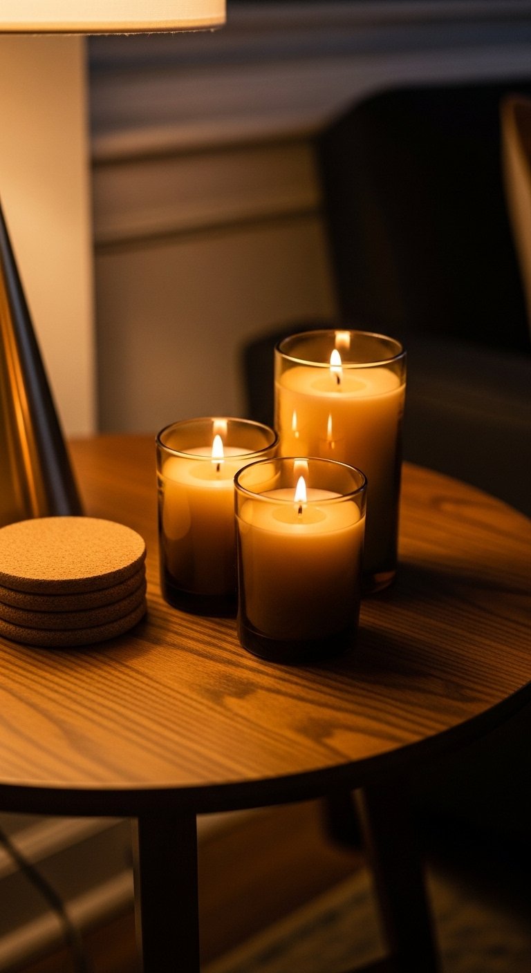
I switched to hand-poured soy candles for scent control. Group candles in odd numbers and vary heights by 1-2 inches. In photos candles look staged and static. At home smell and burn time matter. Choose vessels with stable bases. I buy small hand-poured soy candles and reuse the jars as bud vases later. Avoid candles with cheap fragrance oils that overpower a room.
Reclaimed Wood Floating Shelf with Curated Objects
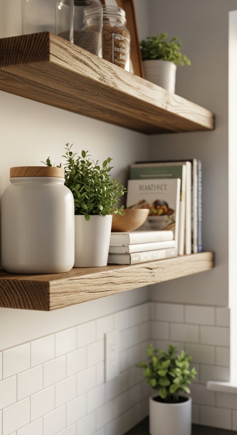
Every showroom I walk into features warm wood tones this year. I installed a reclaimed wood floating shelf and it grounded my kitchen vignette. Use one long shelf instead of two short ones for a cleaner look. If your wall is plaster anchor properly. Online photos hide the mounting hardware. In person visible hardware can ruin the handmade look. I recommend white oak floating shelf 36-inch. Avoid cluttering the shelf with too many small objects.
Stitched Map Wall Art for Travel-Lover Bedroom
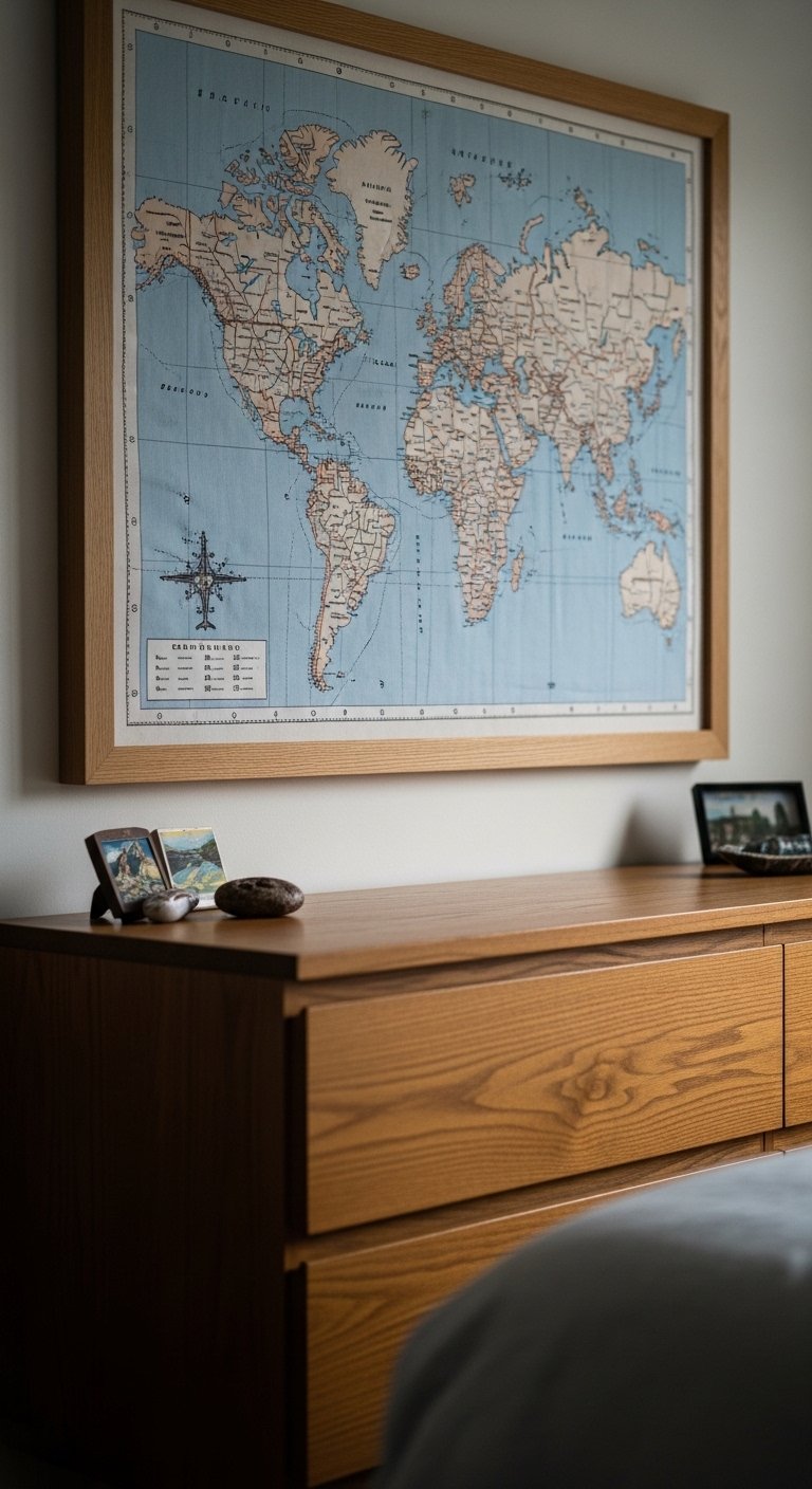
A stitched map replaced a bland print for me. I used one large framed piece rather than a grid of tiny maps. For small rooms one 18×24 inch piece works. In photos stitched art looks delicate. In real rooms texture reads more boldly. Pair with leather travel trunks for contrast. I found stitched-map-framed-art that fits my color scheme. The common mistake is using a map too colorful for your palette.
Ribbon-Wrapped Glass Bottles as Vases for Shelf Styling
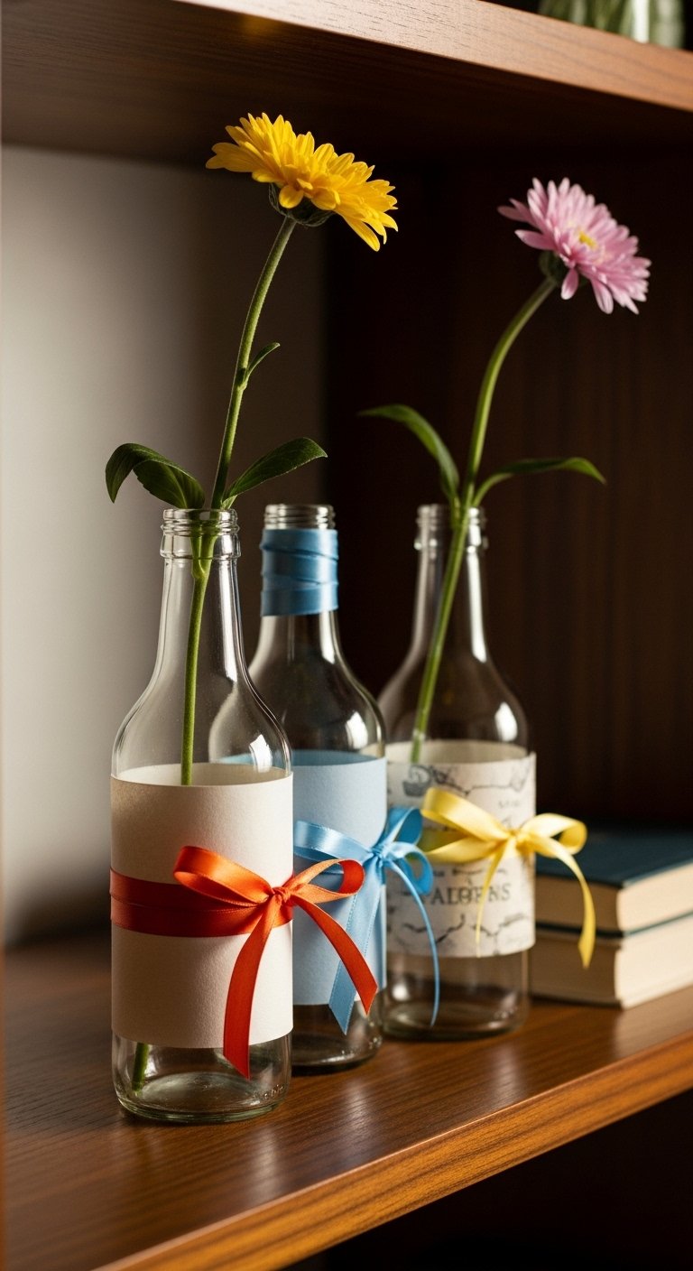
I used to toss small bottles. Wrapping ribbon around glass bottles created instant vases. Use ribbon widths of 1/4 to 3/4 inch to match bottle scale. Too wide ribbon overwhelms slender bottles. In photos this looks quaint. In real life pick ribbon with a satin finish to reflect light. I keep recycled glass bottle vase set on rotation. Avoid ribbon colors that clash with your wall paint.
Hand-Stitched Patchwork Quilt as Wall Tapestry in Guest Room
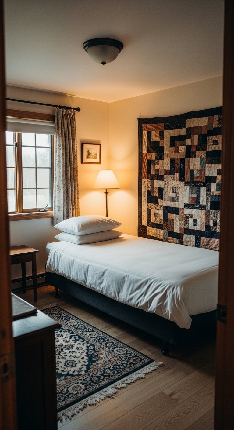
I hung a small quilt behind a twin bed and the room instantly felt curated. For a twin use a 60×80 inch quilt vertically. A mistake is cutting the quilt down to fit exactly. Let the edges drape slightly. In photos quilts appear perfectly flat. Live textiles have folds that add dimension. Pair with simple bedding. I recommend hand-stitched-patchwork-quilt. Avoid overly bright patterns that fight your throw pillows.
Leather Cord-Wrapped Handles on Cabinet Doors for Rustic Modern Look
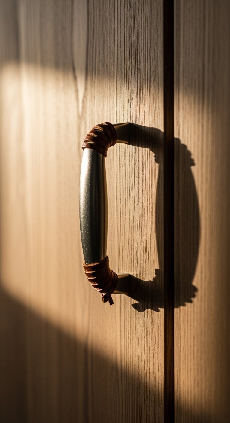
I used a leather cord to wrap a plain metal handle and the whole cabinet felt custom. For cabinet doors use cord wrapped 10-12 times for grip. Too few wraps look unfinished. In photos leather looks polished. At home consider oiling it occasionally. I bought leather-cord-wrap-kit for under $15. Avoid thin leather that frays quickly.
Handmade Soapstone Coasters for Coffee Table Functionality
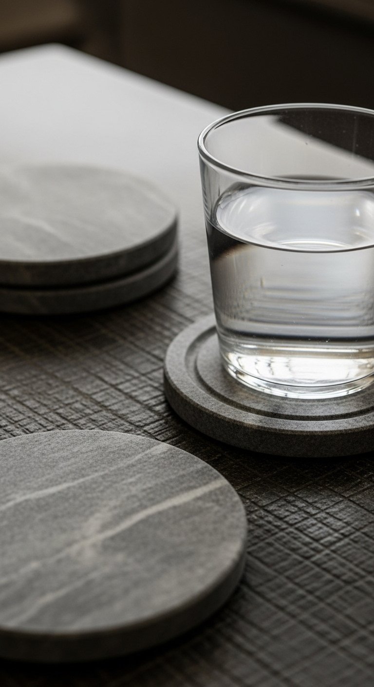
I keep seeing natural stone accents in catalogs. Soapstone coasters resist heat and develop patina. Use coasters at least 3.5 inches wide for mugs. Smaller coasters slide. In photos stone looks uniform. In real life subtle veining varies. I bought soapstone-coaster-set. Avoid cheap slate that flakes.
Miniature Textile Sampler Display for Shelf or Desk
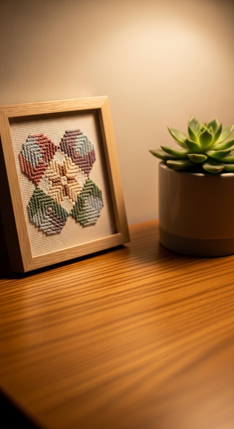
A friend brought me a small textile sampler and it made my workspace feel personal. Use a 5×7 or 8×10 frame to avoid overwhelming the desk. In pictures tiny textiles look decorative. In reality they add scale contrast to larger pieces. Pair with brass desk accessories to balance texture. I source mini-textile-sampler-frame from independent makers on Etsy. Avoid loud patterns that compete with your laptop.
Burnished Brass Trinket Dishes for Nightstand Styling
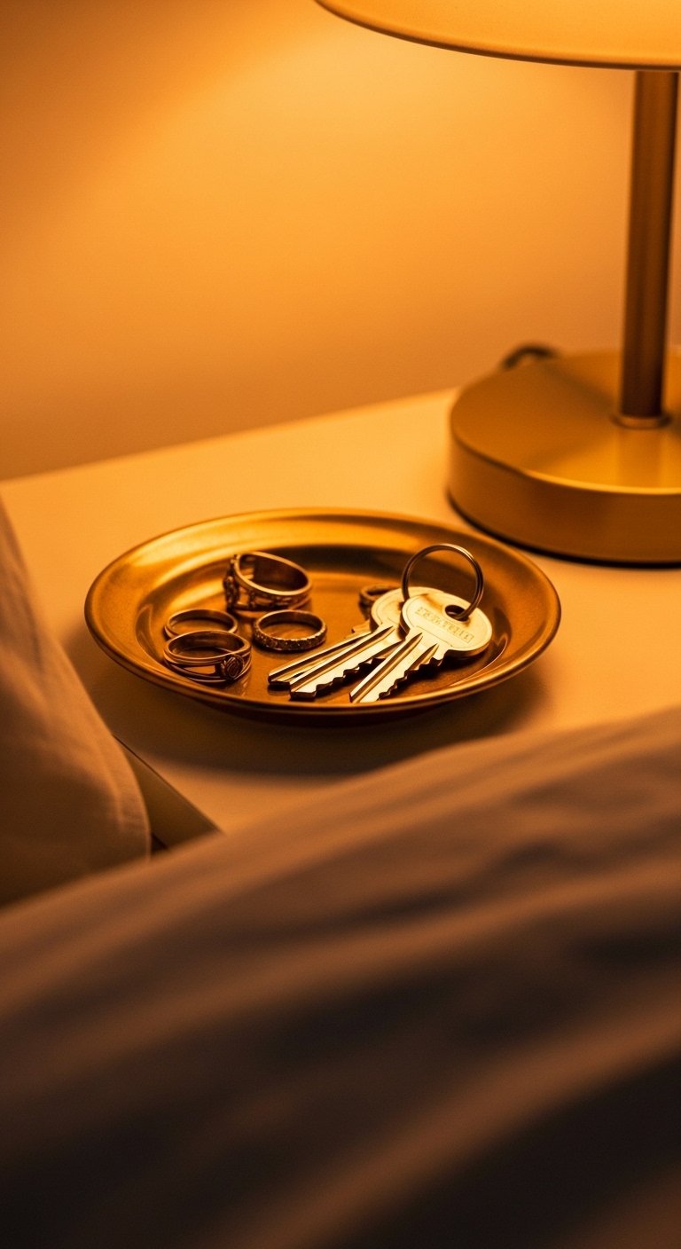
I used to have a catchall bowl that looked cheap. Swapping to burnished brass dishes made the nightstand look intentional. Aim for a dish 4-5 inches wide. Too small and items spill. In images brass reads glossy. In person a slightly oxidized finish looks richer. I like burnished-brass-trinket-dish. Avoid bright polished brass if your hardware is aged.
Wooden Bead Garland Draped Over Bookshelves for Playful Texture
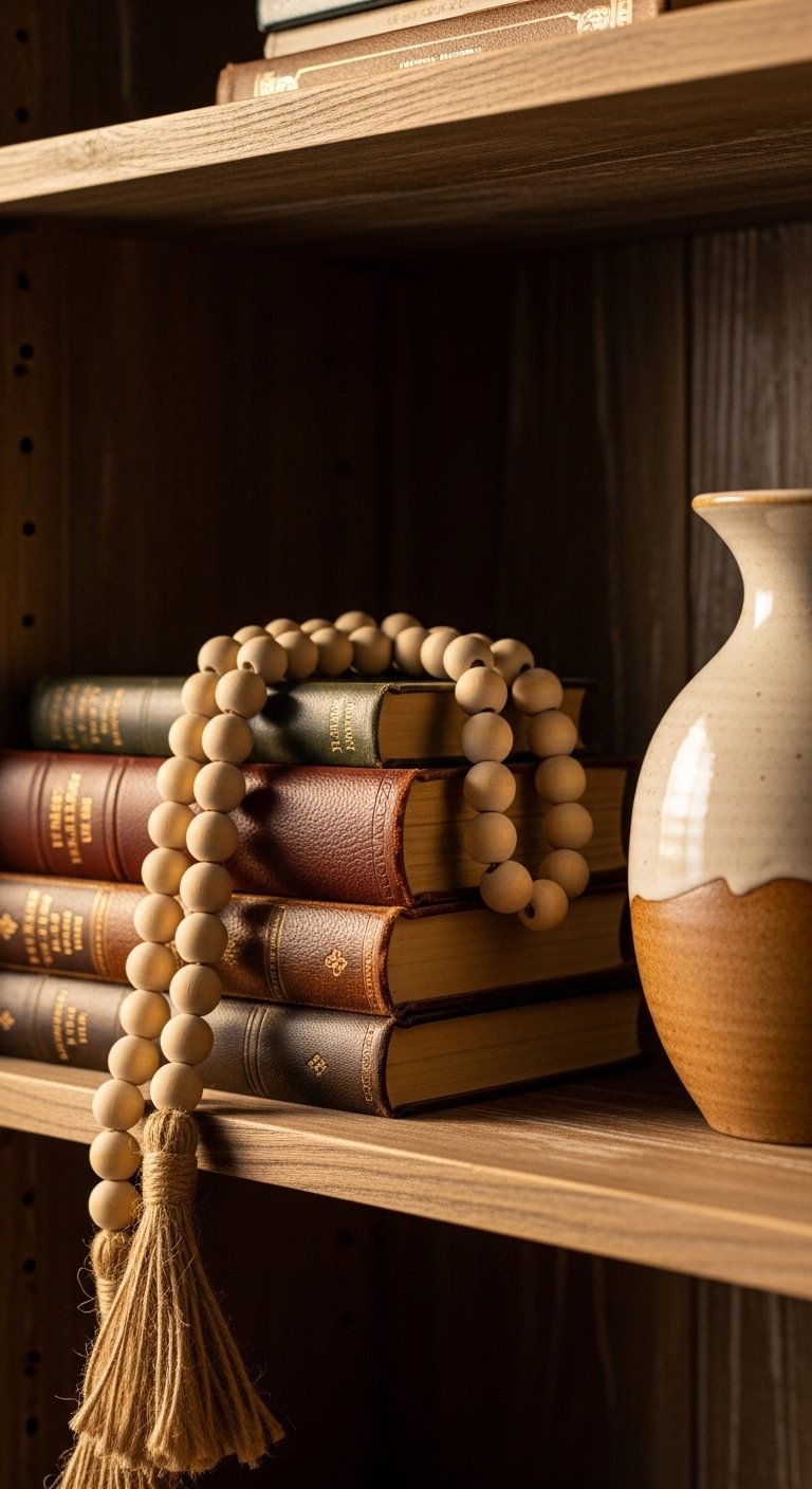
I added a wooden bead garland and it softened shelf lines. Use beads 12-20mm for a visible silhouette. Tiny beads disappear on large shelves. Photos often show perfect drape. At home loop it loosely and tuck ends behind objects. I bought wooden-bead-garland. Avoid plastic-looking beads that read cheap.
Shopping Tips for These Looks
- Buy one handmade piece at a time. Start with a handmade ceramic vase. I bought one and it set the tone for my shelf styling.
- Grab these velvet pillow covers for $12 each. I swap mine seasonally and it changes the room without replacing furniture.
- Curtains should touch or puddle the floor, never hang halfway. These 84-inch linen blend panels are right for 8-foot ceilings.
- White oak finishes are everywhere this year. These white oak floating shelves look current and pair well with rattan.
- Buy functional handmade items, not just pretty ones. I use soapstone coasters every day and they still look good.
- Mix a splurge with budget finds. Pair a handmade quilt with affordable pillow covers rather than buying everything high end.
- If you thrift frames, buy fresh white mats. These 11×14 mats make vintage frames look gallery-ready.
Frequently Asked Questions
Q: Can I mix boho textiles with modern furniture and have it look cohesive?
A: Yes. I pair a modern sofa with a single handmade macrame wall hanging and a patchwork pillow for balance. Use the 60-30-10 color rule so one palette ties the two styles together. A neutral macrame hanging helped me bridge styles.
Q: Are handmade items worth the price compared to mass-produced decor?
A: In my experience, yes. Handmade pieces have subtle imperfections that create soul. They age better too. I saved by buying one handmade vase and styling around it instead of buying three cheap accessories.
Q: How do I style handmade ceramics on an open shelf without overwhelming the space?
A: Use odd numbers and vary heights. Place one tall piece with two shorter ones and leave breathing room. A set of three hand-thrown vases works well on a 36-inch shelf. Avoid crowding with small trinkets.
Q: Can I use faux plants with handmade decor or will it look fake?
A: Both work. I use a realistic faux fiddle leaf fig where height is needed and live pothos in wall pockets. This 6-foot realistic faux fiddle leaf fig gives height without maintenance.
Q: What common mistake do people make when adding handmade textiles to a room?
A: The biggest mistake is matching everything too closely. I once used identical tones across throw, rug, and curtains and the room read flat. Mix textures and slightly different shades for depth.
Q: How do I keep handmade items from looking staged in photos but authentic in real life?
A: Leave small imperfections visible and avoid perfect spacing. Slightly angle a vase, let a throw drape rather than fold it. In my photos that messiness reads as comfort at home.