

I used to worry that adding black would make my kitchen feel heavy or cold. My counters felt cluttered, and small black pieces got lost.
I learned a simpler way: pick a few purposeful black accents to ground the room. The result is a kitchen that reads warm, balanced, and lived-in—not stark.
How to Decorate a Kitchen With Black Accents
I’ll show how to pick one anchor piece, scatter smaller touches, and edit countertops so black reads as deliberate. It’s the method I use when a kitchen feels unfinished—leaning into organic modern textures so the space stays warm and calm.
What You'll Need
- Black metal pendant light, 12" diameter (~$80–180)
- Matte black cabinet pulls, 10-pack (~$12–30)
- Matte black soap dispenser pump, 17 oz (~$15–35)
- Black metal counter-height bar stool, 24" seat (~$80–160)
- Black framed kitchen print, 11×14" (~$20–50)
- Black ceramic utensil crock, 6" diameter (~$25–45)
- Black wood floating shelf, 24"x4" (~$25–60)
- Black woven placemats, set of 4 (~$18–35)
Step 1: Pick one anchor and let it do the heavy lifting
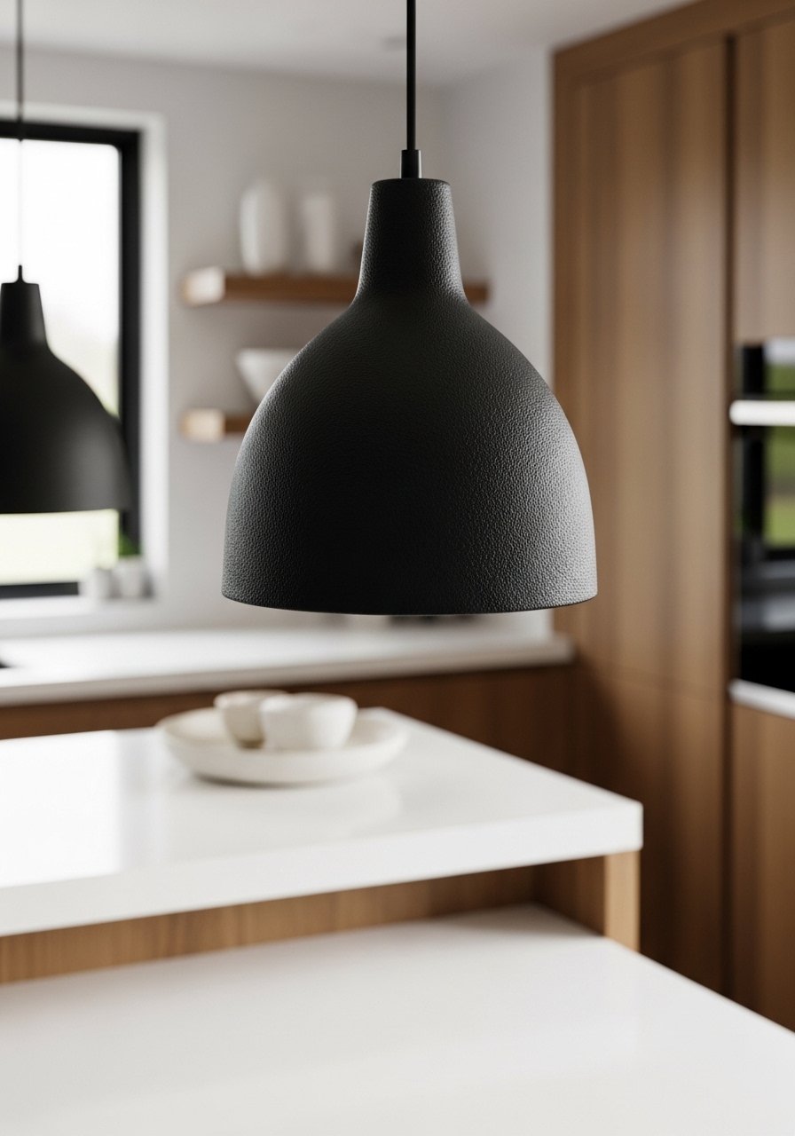
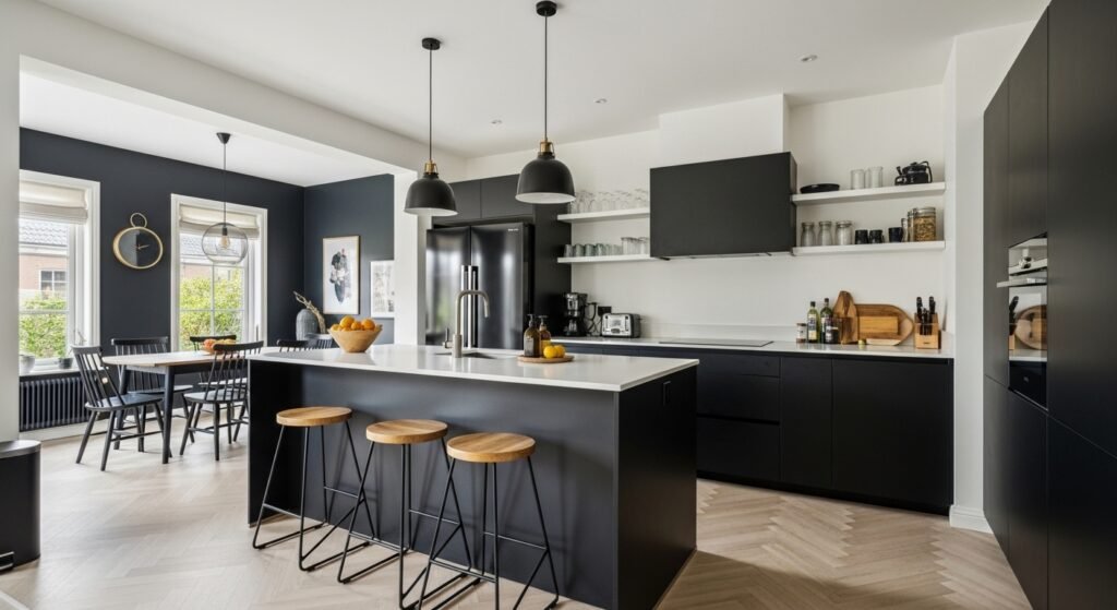
I start with one clear anchor—usually a pendant or a counter-height stool. I chose a black metal pendant because it draws the eye up and sets a tone without overwhelming the room. Visually, the kitchen gains a focal point and a sense of height.
People miss how much size matters: a tiny black fixture gets lost against white cabinets. The small mistake is adding lots of tiny black bits before you have an anchor. Let that anchor lead the rest of your choices.
Step 2: Repeat and distribute the color around the room
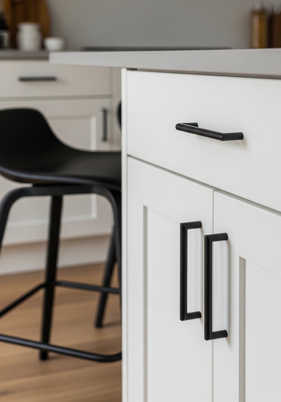
Once I have an anchor, I repeat black in two or three other places—pulls, stools, a frame. That repetition creates rhythm. I place these accents at different heights so the eye travels: low (stools), mid (pulls), and high (light or art).
One insight I rely on is the rule of three: use a black element in at least three zones. The mistake to avoid is clustering everything at the same level. Spread the weight so the black feels intentional, not accidental.
Step 3: Soften black with texture and warm materials
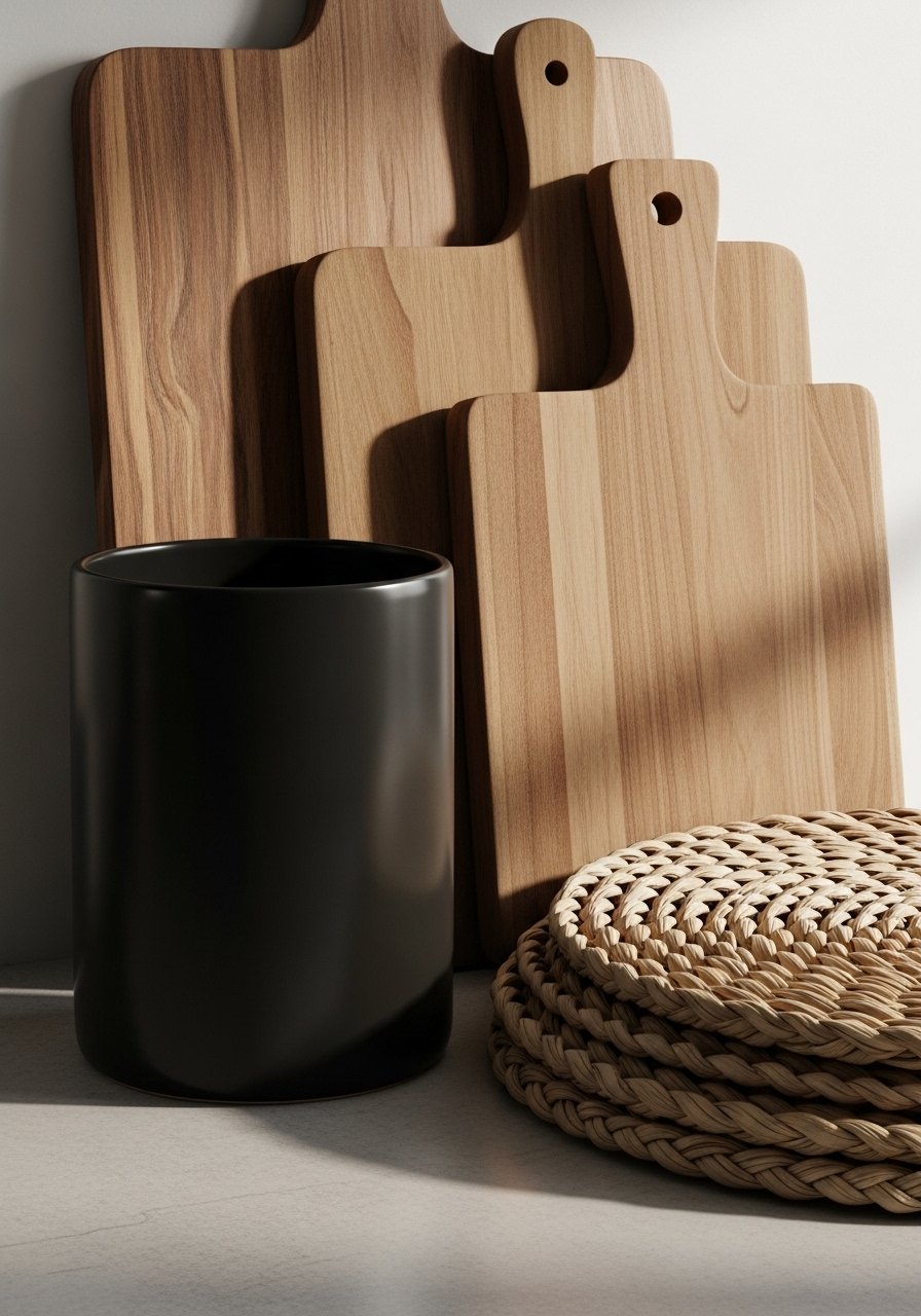
Black reads heavy if it’s all the same finish. I mix matte metals, ceramics, woven placemats, and warm wood to keep the look organic modern and approachable. Visually, the room stays warm because the black is offset by texture.
People often forget finishes: matte black feels softer than glossy. A common mistake is adding too many shiny black surfaces, which can read harsh. I balance texture to keep the mood comfortable and lived-in.
Step 4: Edit countertops into small, intentional vignettes
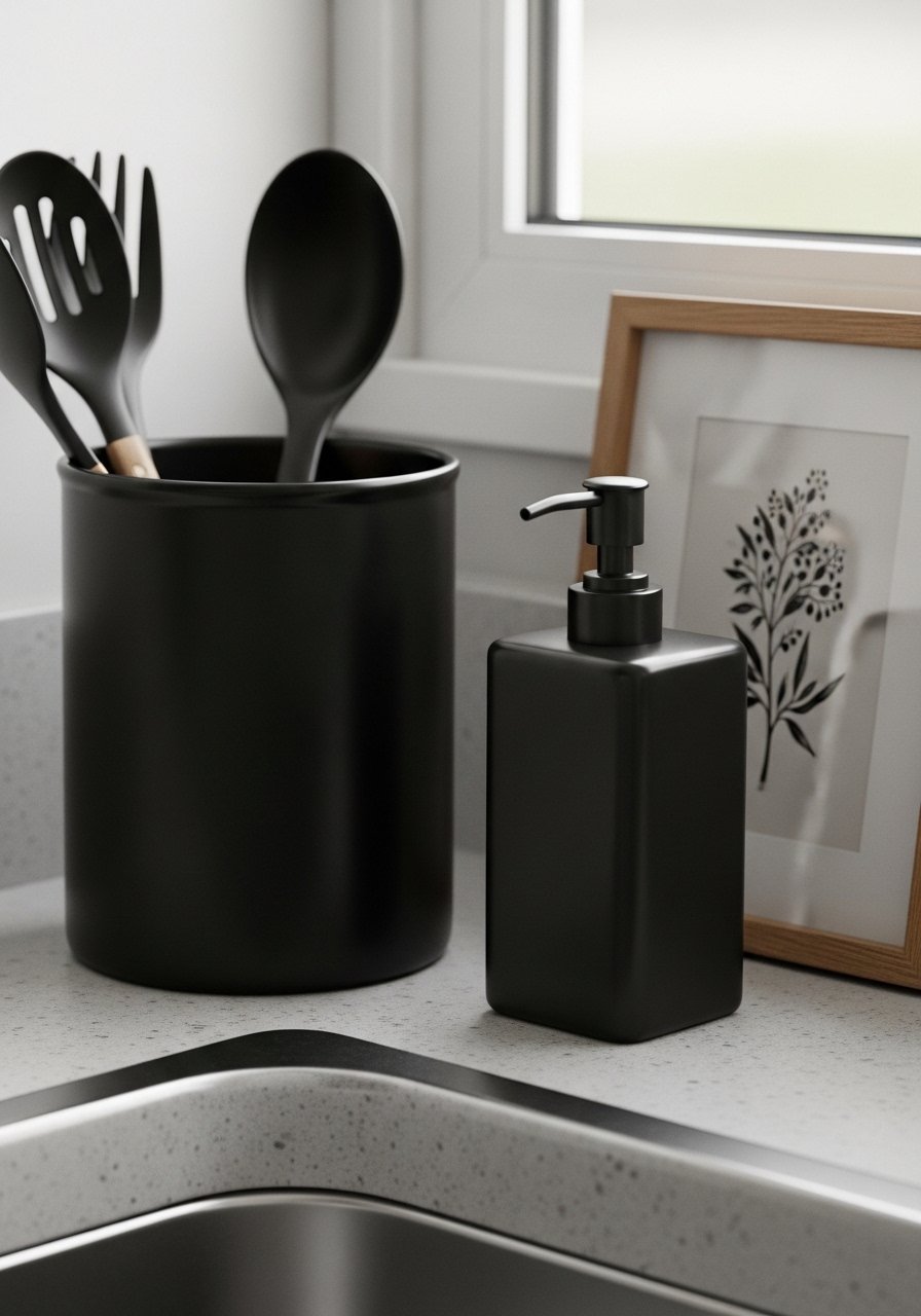
I clear everything, then build two or three small vignettes—near the sink, by the stove, and on an open shelf. I use the black utensil crock, a matte soap dispenser, and a framed print to make deliberate small moments. Visually, the counters look calm and curated.
One insight: group items in odd numbers and vary heights. The mistake I see is trying to fill every inch. Leave breathing room so each black piece reads purposeful.
Step 5: Keep brightness and contrast in mind
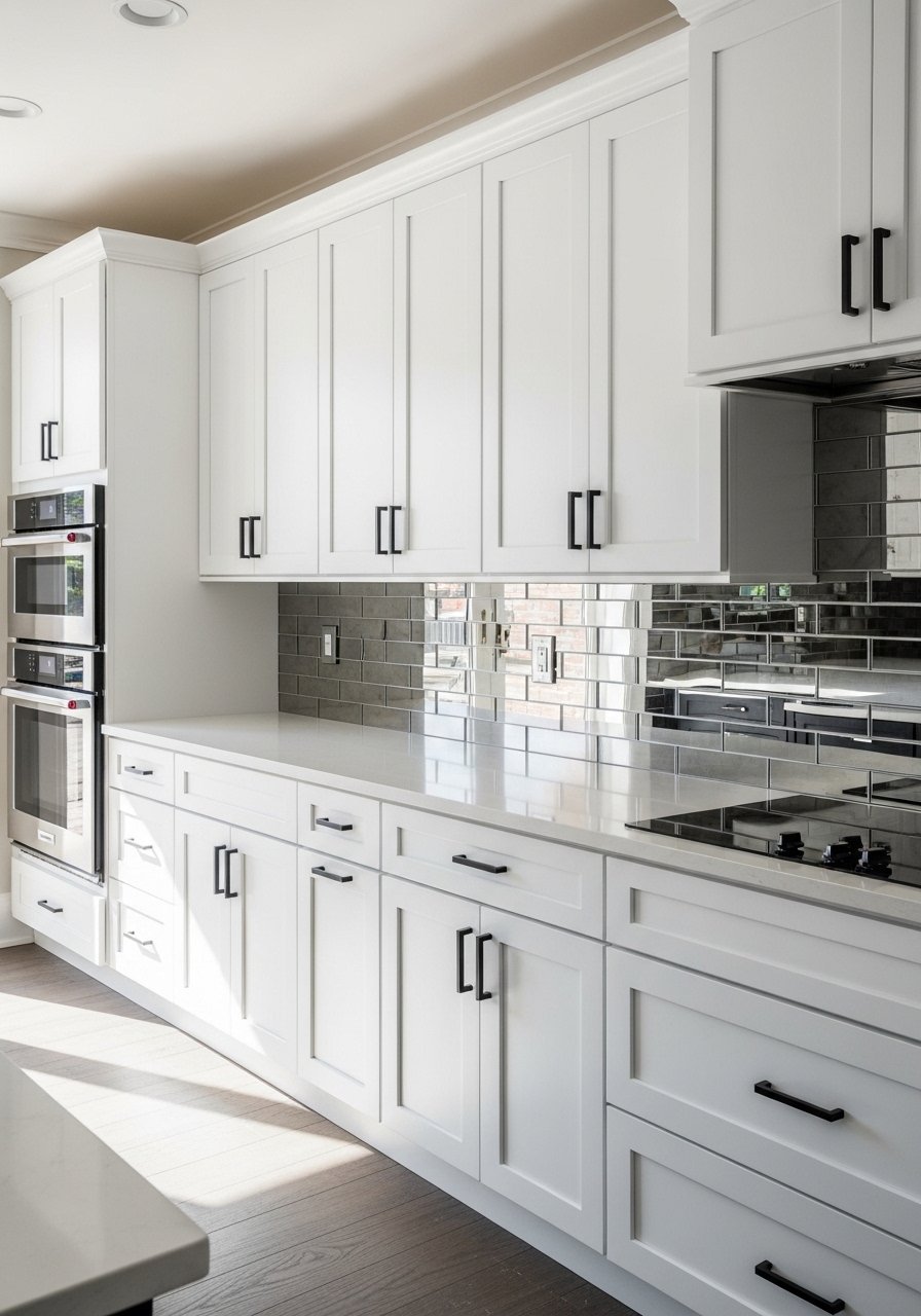
Black needs contrast to feel intentional. I keep plenty of white or light surfaces—backsplash, countertops, or open shelving—so accents pop without making the kitchen feel dark. Visually, this keeps the space airy while the black grounds it.
People sometimes rush to paint lower cabinets black in a small kitchen; that can swallow light. The safer move is starting with pulls or a pendant. You can always add more once the balance feels right.
Common mistakes when using black in kitchens
I see the same missteps often. First, overdoing black in one area—like all lower cabinets—without planning contrast. Second, using only glossy finishes, which read cold. Third, scattering tiny black items without a guiding anchor.
Quick fixes I use:
- Start with one anchor piece.
- Repeat black in 2–3 other zones.
- Mix matte, ceramic, wood, and woven textures.
Working with small kitchens and tight budgets
I work in small kitchens a lot, so I focus on low-commitment swaps. Change cabinet pulls, swap a light fixture, or add a framed print. These moves are inexpensive and reversible.
Budget tips:
- Cabinet pulls (~$12–30) are the easiest update.
- One black pendant (~$80–180) can do the heavy lifting.
- Use thrifted frames or DIY prints for art.
Mixing black accents with what you already own
I match black to the materials already in the kitchen. Warm woods and white countertops balance black nicely. If you have brass or copper, add a tiny touch—like a spoon or planter—to bridge finishes.
Pairing pointers:
- Use wood to soften black.
- Keep textiles light (linen towels, woven placemats).
- If you have colorful dishes, let them pop against a black frame or shelf.
Final Thoughts
Start small and live with one or two changes. I usually begin with matte black cabinet pulls because they’re inexpensive and immediate. Take a step back after each addition. If it feels balanced and comfortable, you’re done. If not, edit until the black reads intentional, not heavy.