
My kitchen used to feel cold and half-done. I’d pick warm paint and still face a space that read flat and unfinished. I’d stand there wondering why a warm color didn’t make the room feel cozy.
If that sounds familiar, you’re not missing a single thing. It’s about placement, texture, and a few well-chosen swaps.
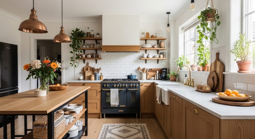
How to Decorate a Kitchen With Warm Tones
This is the method I use every time a kitchen still feels cool after paint. You’ll learn how to build a warm base, layer wood, metal, and ceramics, and bring in living touches so the room reads intentional and comfortable — not fussy. It’s practical and doable in small steps.
What You'll Need
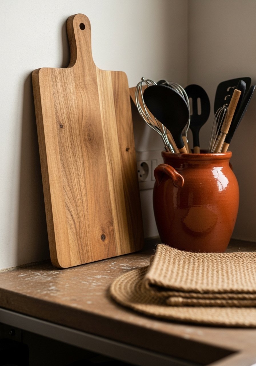
- Solid acacia wood cutting board, 18×12 (~$25–60)
- Amber glass soap or oil dispenser, 16 oz (~$15–30)
- Handmade terracotta utensil crock, 6×6 (~$20–35)
- Set of 6 jute woven placemats, 12" round (~$20–40)
- Striped natural fiber kitchen runner, 2×6 ft (~$40–120)
- Brass pendant light with amber glass shade (~$80–200)
- Pack of 10 brass cabinet pulls, 3.75” center-to-center (~$15–35)
- Seagrass woven storage basket, medium (~$25–60)
Step 1: Create a warm base with wood and neutral textiles
I start by adding a warm wooden anchor on the counters. A cutting board or bowl leaned vertically gives wood grain that reads as warmth even from across the room. Then I place a woven placemat or folded linen near the prep area to echo that texture.
Visually, the kitchen stops feeling like flat paint and starts feeling layered. People often forget how important vertical placement is — leaning items changes the light and shadow. Don’t overcrowd the counter; one or two pieces placed with purpose are more effective.
Step 2: Swap small hardware and one light fixture for warmth
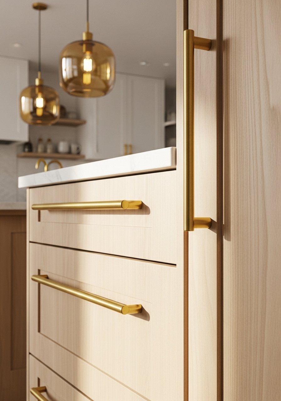
I replace cold finishes with warm metals. Swapping cabinet pulls to brass and adding an amber-glass pendant makes a big impact for relatively little money. I pick one light — usually over the sink or island — and let it set the tone.
The room reads warmer immediately because light and hardware are read at eye level. People miss how much hardware finishes do. Avoid changing everything at once; replace one fixture and handles in the busiest viewing angle first. If you rush, mismatched finishes can feel scattered.
Step 3: Add warm ceramics and glass where you use the kitchen
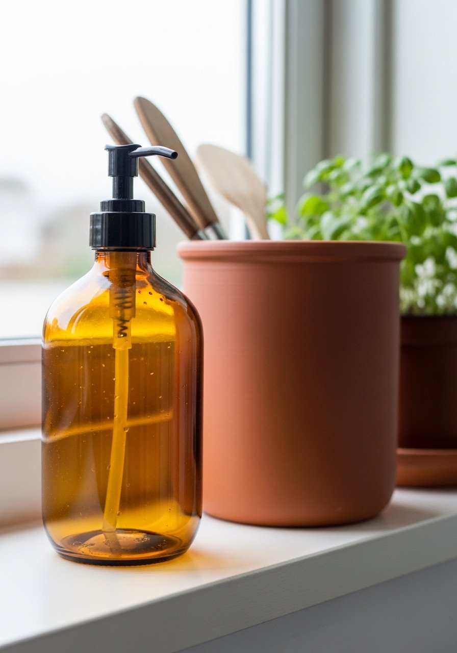
I swap plastic or stainless items for ceramic crocks, terracotta planters, and amber glass dispensers. I put the utensil crock by the stove and the soap dispenser by the sink. These small vessels carry color and matte texture that soften the room.
What changes visually is the kitchen’s foreground — the area you touch and see up close becomes tactile and calm. A common miss is keeping everything the same color family; I intentionally mix matte terracotta with glossy amber glass. Don’t overmatch finishes; let textures speak for warmth.
Step 4: Ground the floor and table with woven rugs and placemats
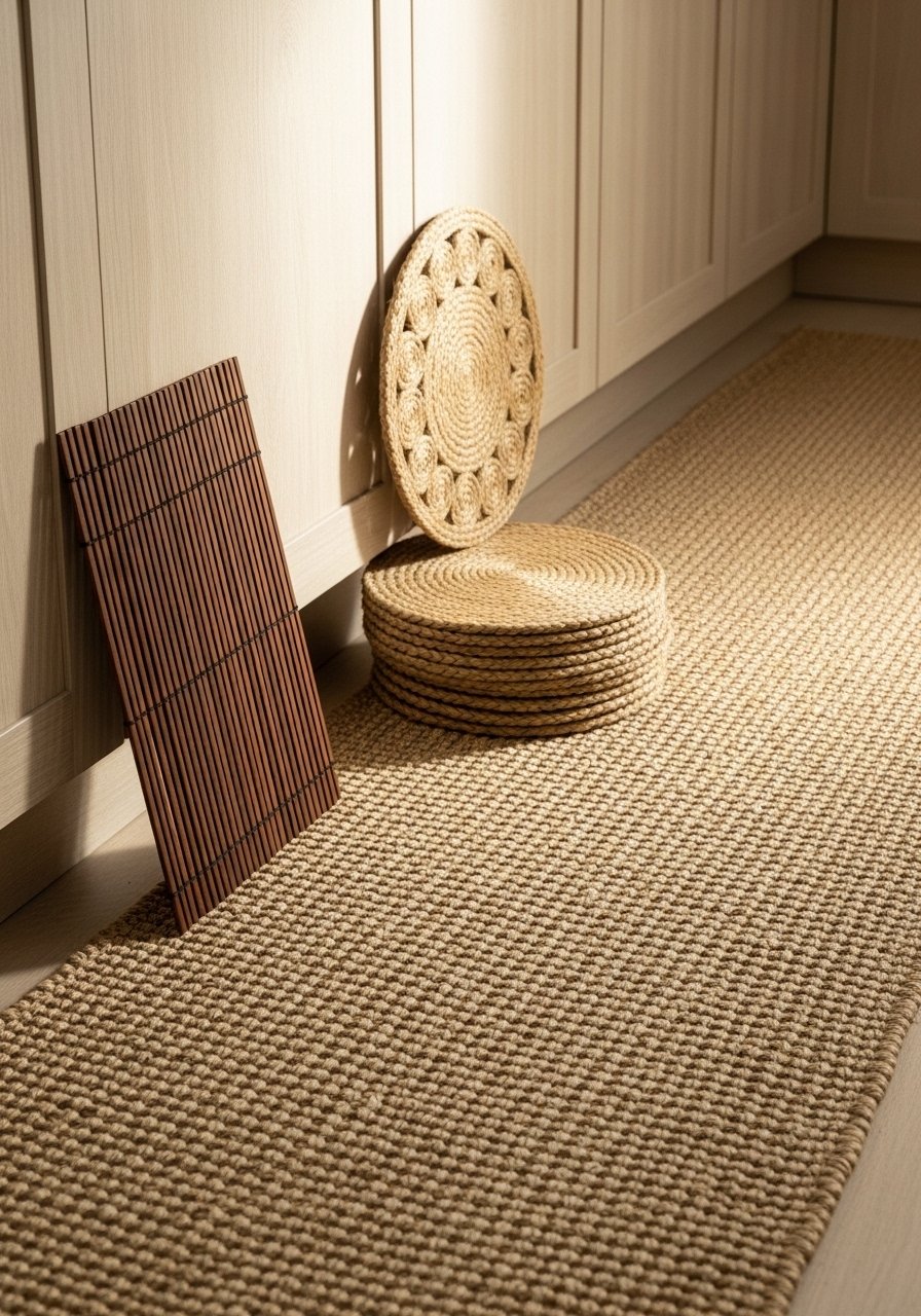
A runner or rug instantly lowers the visual temperature. I pick natural fibers with warm stripes or subtle terracotta tones. On the table, jute placemats create a lived-in, layered look without fuss.
This shifts the focus from cold tile to soft, anchored planes and ties the whole palette together. People often put a rug that’s too small; make the runner long enough to follow the work triangle. Also avoid slick synthetic fibers in high-traffic spots — they read cheaper and don’t layer the way natural fibers do.
Step 5: Finish with plants, baskets, and one curated color repeat
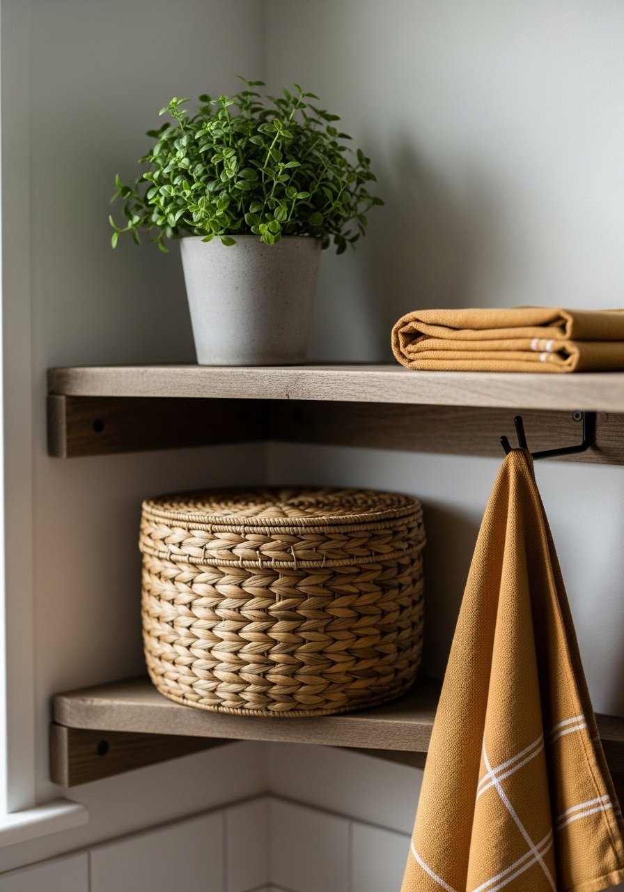
I always add at least one living plant and a woven basket for stray items. Then I repeat one warm color — a terracotta dish towel, a jar lid, or a ceramic mug — in three places. That repetition creates visual harmony.
Visually the room feels intentional and comfortable, not staged. A small insight: one repeated color ties unrelated items together. Don’t try to match everything; avoid placing all warm pieces on one side. Spread them so your eye moves around the room.
Common Mistakes with Warm Tones
I see two recurring mistakes. First, people paint warm tones and expect them to do the entire job. Paint helps, but warmth needs texture and contrast. Second, they over-match finishes — every metal and wood the same — which makes the space look flat.
Quick checklist I use:
- Avoid total matching; mix matte and glossy surfaces.
- Layer three textures (wood, metal, textile) in any zone.
- Use living elements (plant or herbs) to break built-in surfaces.
Adapting This Look to Small Kitchens or a Tight Budget
I do this in apartments all the time. Start with swap-outs: hardware and one fixture are high impact and low cost. Lean wood boards and a single woven runner are other budget wins.
Budget options:
- Swap only cabinet pulls and the soap dispenser first.
- Use a small terracotta planter for herbs instead of large pots.
- Thrift a wooden bowl or cutting board to avoid new expense.
How to Mix Warm Tones with What You Already Own
I never throw away what works. Instead I layer. If you have stainless appliances, let warm accents sit in the foreground — wood cutting board, amber glass, woven runner — so the stainless becomes backdrop rather than the focal point.
Tips I use:
- Place warm objects at eye level to shift perception.
- Repeat a warm accent three times around the kitchen.
- Use baskets to hide items that clash with the new palette.
Final Thoughts
Start with one small change — a brass pull or an amber glass dispenser — and live with it for a week. I find that small, deliberate swaps reveal what the room really needs next.
You don’t need to redo everything. Build warmth in layers and keep sightlines balanced. If you want a simple start, an amber glass dispenser makes the sink area feel warmer instantly.