
I used to stand in my kitchen, wanting it to feel calm but always finding it flat and a little cold. Neutrals can go either warm and lived-in or sterile and unfinished. I learned to treat neutral color as a starting point, not the whole story.
This short guide shows the simple choices I make so a neutral kitchen reads intentional, cozy, and balanced—often with just a few swaps.
How to Decorate a Kitchen With Neutral Colors
This is the method I use when a kitchen feels unfinished. You’ll learn how to create depth with tone, texture, and small accents so the room feels warm and purposeful. The result is an organic modern kitchen that looks calm and lived-in, not bland.
What You'll Need
- Linen café curtains in natural, 48×84 (~$25–60)
- Handwoven jute runner rug 2.5'x8' in natural (~$60–150)
- Stoneware dinnerware set, 16-piece, oatmeal (~$50–120)
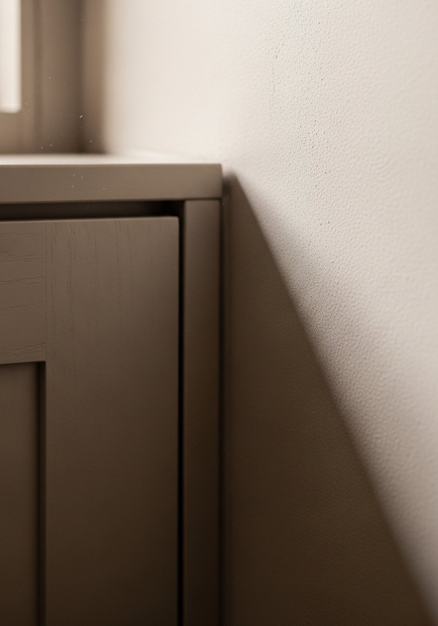
- Matte black cabinet knobs, 10-pack, 1.25-inch (~$10–25)
- Wooden live edge cutting board, 18×12, acacia (~$30–80)
- Glass apothecary canisters with bamboo lids, set of 3 (~$25–55)
- Brass pendant light 10" dome, brushed brass (~$60–150)
- Chunky knit throw in oatmeal, 50×60 (~$40–65)
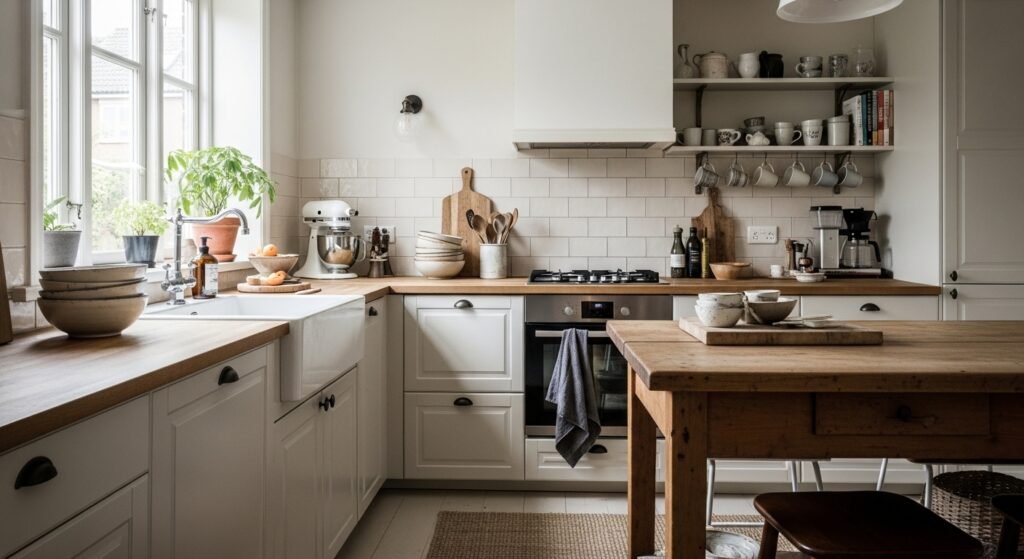
Step 1: Anchor the room with a warm neutral base
I start by choosing a base with a warm undertone—greige, warm white, or a soft sand. It makes everything else read warmer. Visually, it stays neutral but avoids that flat, clinical look people worry about. One detail people miss is undertone: two “whites” can look very different next to wood. Avoid picking a base that’s too cool if your floors or wood accents are warm. The wrong undertone leaves the room feeling disconnected, even with lovely accents.
Step 2: Layer texture in three places: floor, middle, and eye-level
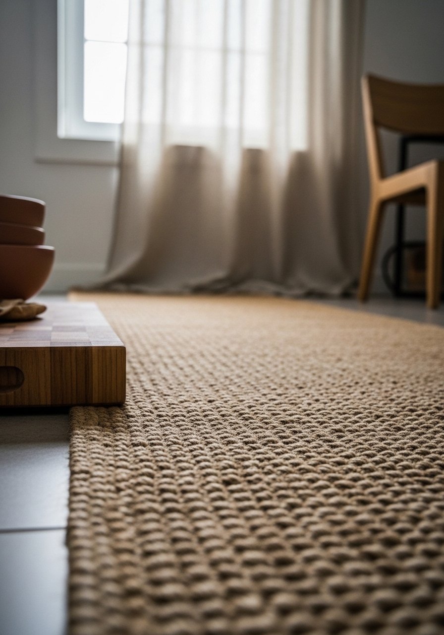
I add texture at three heights: a jute runner on the floor, wood or ceramic on counters, and linen at the window. That vertical layering makes a neutral scheme feel deliberate. The visual change is immediate: the space gains depth and a lived-in warmth. People often pile lots of pattern but forget scale—choose one large texture (rug), one medium (curtain), and one small (board). Don’t scatter too many tiny textures; that creates visual noise instead of calm cohesion.
Step 3: Introduce a single contrasting metal and repeat it
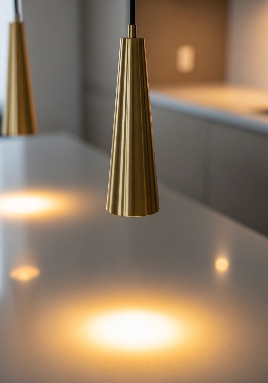
I pick one metal finish—brass, matte black, or satin nickel—and repeat it in lighting and hardware. Brass warms neutrals beautifully and pairs well with wood. Visually, the metal creates small bright anchors so the eye moves around the room. One insight is to keep the finish scale-consistent: a big brass pendant and tiny brass screws won’t read the same. Avoid mixing every metal available; too many finishes fragment the look. If you want contrast, introduce it sparingly and intentionally.
Step 4: Edit countertops into simple groups
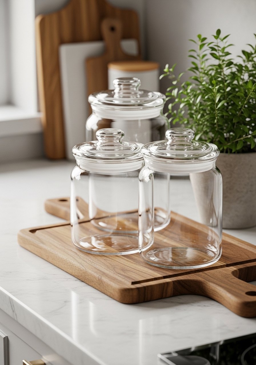
I clear the counters and style three small clusters: canisters, a cutting board with a mortar, and a bowl with fruit. Grouping keeps the space functional and calm. It changes the room from cluttered to purposeful and lets the neutral palette breathe. People underestimate the power of odd numbers—groups of three read quieter and more natural. The common mistake is arranging everything in a line; that looks staged. Keep edges soft and leave negative space so the neutrals feel intentional.
Step 5: Add soft contrast with dishware and living green
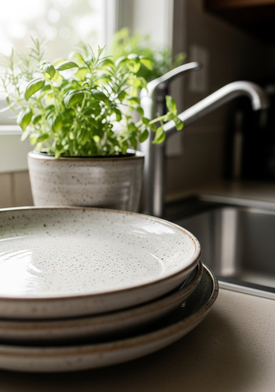
I use stoneware with subtle speckle or a warm oatmeal tone. It creates contrast without breaking the neutral story. Adding a small potted herb or a trailing plant brings life, color, and scale. The visual shift is immediate: the kitchen reads warmer and more lived-in. One insight is to let functional items be decorative. A mismatched wooden stool or open shelf of neutral dishes looks curated. Don’t overdo bright color; a single green plant goes a long way and keeps the calm, organic modern feel intact.
Common mistakes with a neutral kitchen
I see the same missteps: everything too matchy, ignoring scale, and forgetting mood lighting. A neutral palette needs variation in texture, tone, and finish to feel intentional.
- Avoid exact matches across surfaces (counters, floors, cabinets).
- Don’t skip warm light—soft bulbs and layered fixtures matter.
- Resist the urge to fill every surface; emptiness used well looks deliberate.
Adapting this look for small kitchens or a tight budget
You don’t need a full remodel. Small swaps give a big feel change.
- Paint upper cabinets or walls in a warm neutral (~$20–$60 for paint).
- Swap hardware (knobs or pulls) for a single metal finish (~$10–$25).
- Add a runner or small woven rug to change the floor’s tone (~$60–$120).
I often start with hardware and a runner. They’re cheap, reversible, and make the room feel thought-out.
How to mix a neutral kitchen with things you already own
I keep what I love and blend it in. Neutrals are forgiving with vintage finds or one colorful piece.
- Use a colorful artwork or hand towel as an accent. Keep it to one area.
- Pair modern neutrals with an older wooden stool or vintage brass piece.
- Let functional items (pots, bowls) live on open shelves—they add personality.
Final Thoughts
Start with one small change—curtains, a light, or hardware. I usually swap the window linen first; it softens the whole room. Work in layers and step back often. A neutral kitchen should feel calm and lived-in, not simplified to the point of being forgettable.